
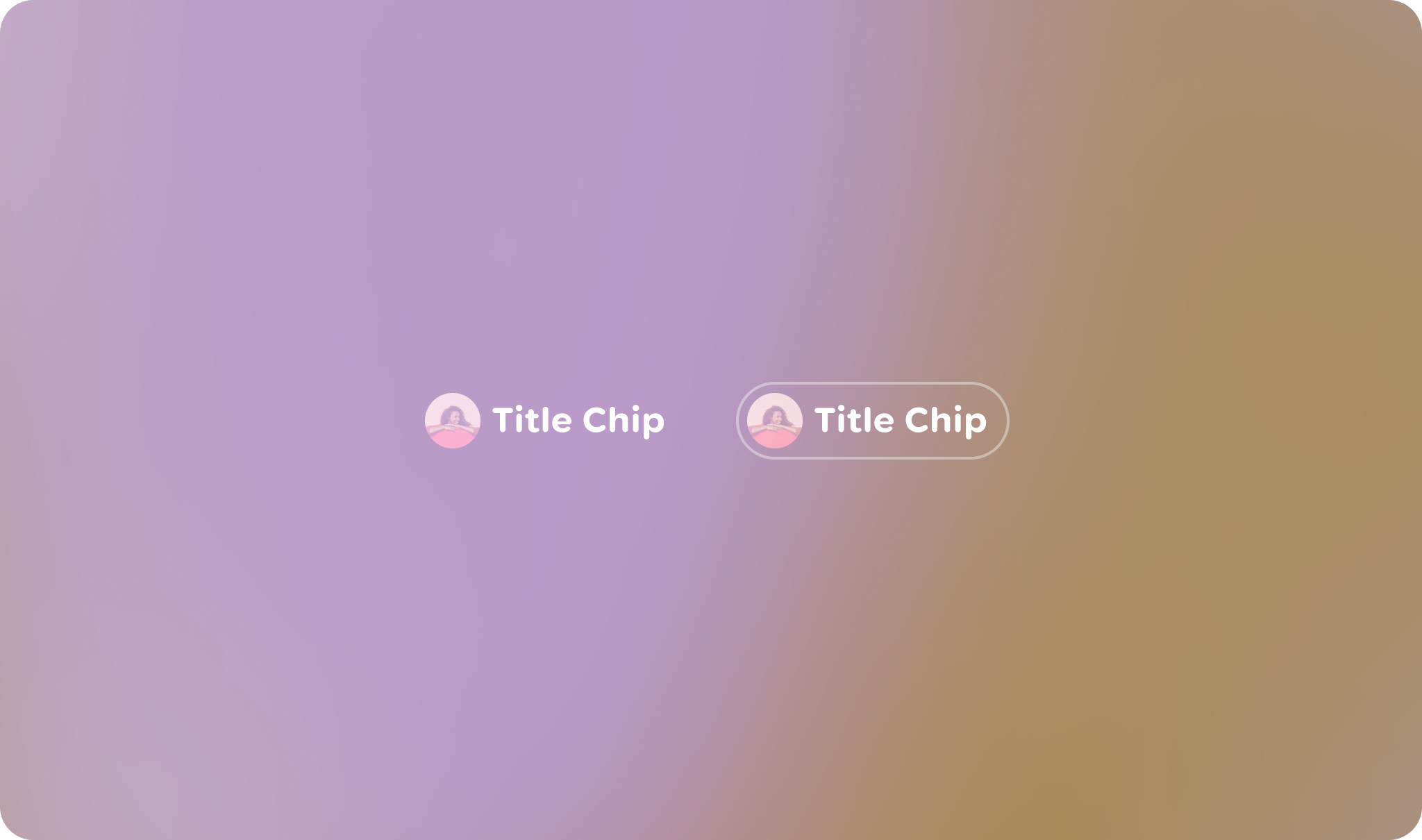
Title chips provide a small snippet of information.
Principles
Contextual: The primary purpose of a Title Chip is to provide clear and immediate context for the content it's associated with.
Concise: Title Chips are designed for brief information, typically a short title, name, or status.
Visually Distinct: While sharing the Jetpack Compose Glimmer aesthetic, its appearance should be distinct enough to be recognized as a label rather than an interactive button.
Usage & Placement
The title chip is a read-only component, by default.

Do
Don't
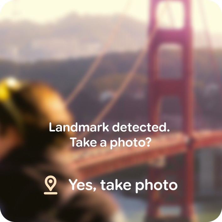
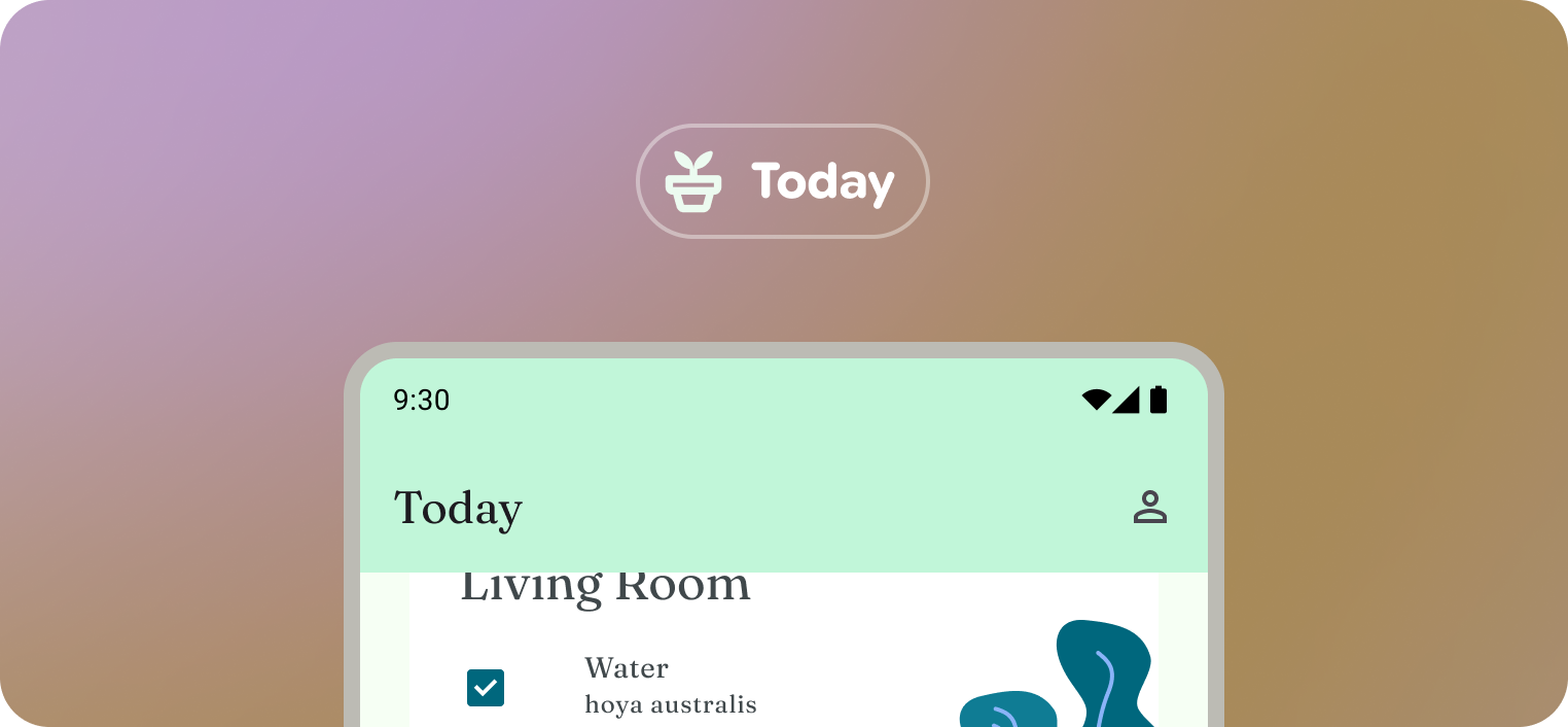 Title chips can be compared to a static mobile app bar.
Within a layout
The title chip is a read-only component, by default.
Anatomy
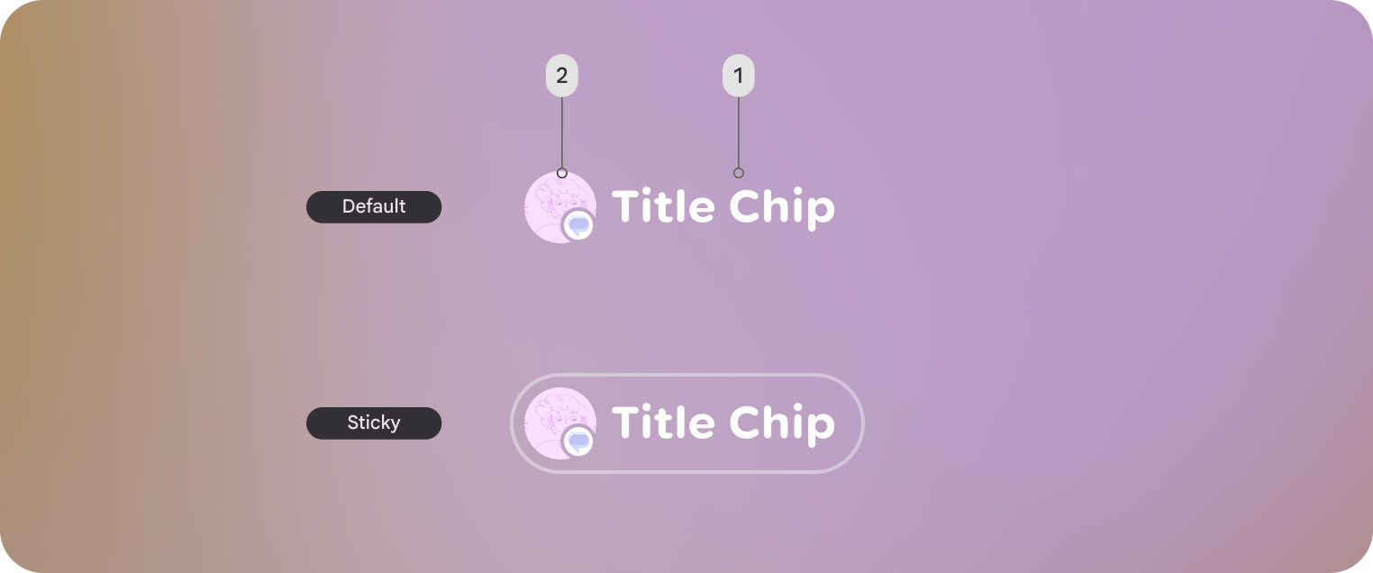
Default title chip and Sticky title chip shown. Sticky title chips are displayed with an outline.
1. Title chips label
2. Optional leading icon or entity
Customization
Title chips can be displayed with or without an icon along with other style properties.
| Properties | Customization | Defaults |
|---|---|---|
| Shape | Yes | Large, Circle |
| Padding | Yes | 16 dp, 8 dp |
| Border | Yes | 2 dp, #606460 |
| Text | Yes | Body Small |
| Leading icon | Yes | 40 dp |
| Depth | Yes | 0 |
| Max Width | No | 352 dp |
| Min Height | Yes | 56 dp |