widget 是自定义用户主屏幕的关键组件。通常,用户只需点按一下 widget 即可完成应用的关键用户历程,或者快速了解重要更新的摘要。用户还可以自定义 widget,使其符合个人偏好。
微件兼容性核对清单
微件质量会影响用户与应用内容和功能的互动度。兼容性核对清单定义了一些标准,可帮助您评估 widget 的质量。会员等级包括:
第 3 层级 - 低质量
这些 widget 未达到最低质量标准,导致用户体验不佳。如果微件不符合标准布局、颜色、发现和内容条件,则会被视为低质量微件。
层级 2 - 标准版
这些微件实用且易于使用,可提供优质体验。若要被视为标准微件,该微件必须满足以下所有布局、颜色、探索和内容条件。
第 1 层级 - 差异化
这些是模范微件,可提供个性化的主打体验,并帮助用户打造独特且高效的主屏幕。
三级
低质量 widget 特征
如果您的 widget 符合以下任一条件,则会被视为低质量 widget:
| 类别 | ID | 说明 |
|---|---|---|
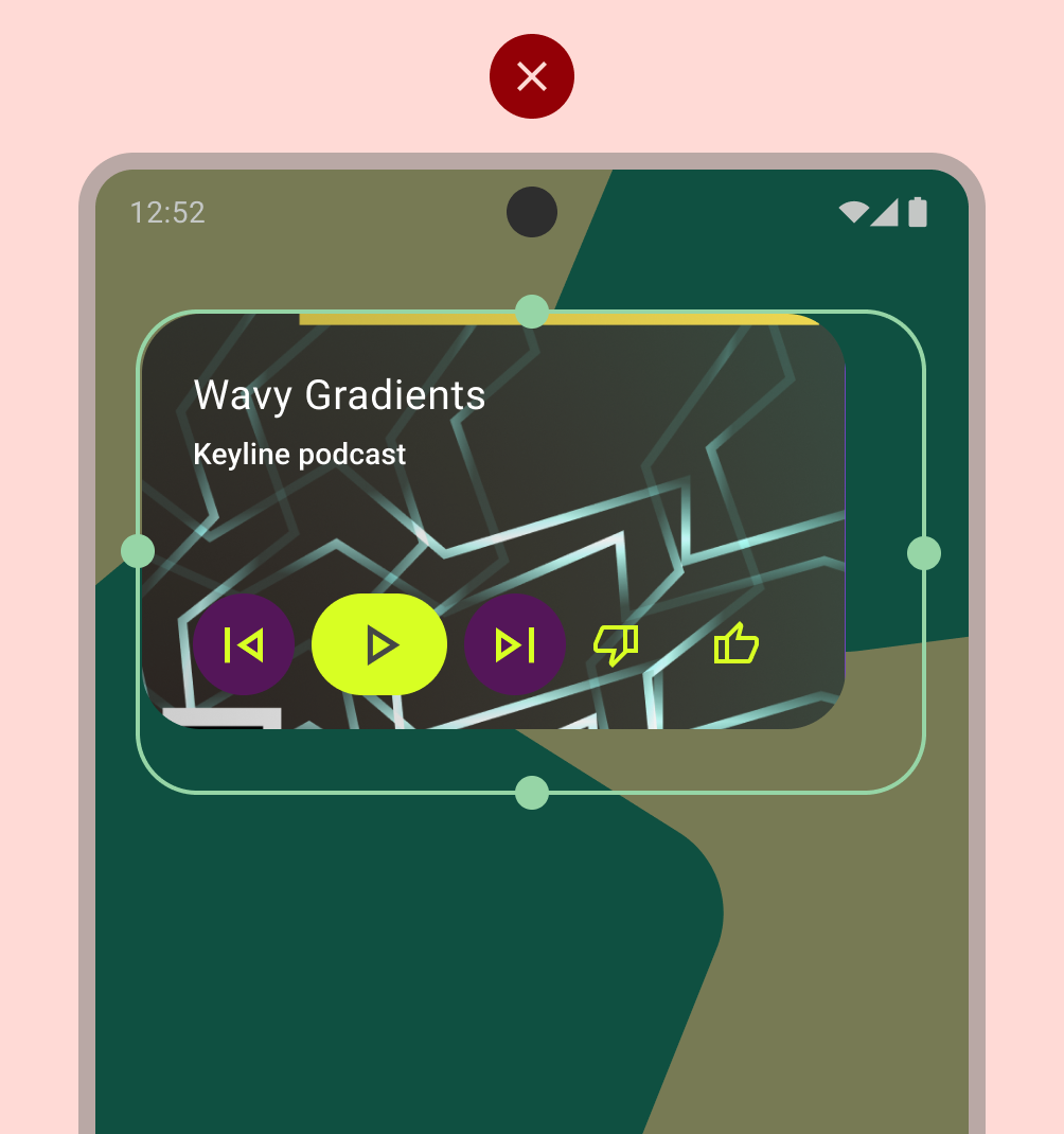
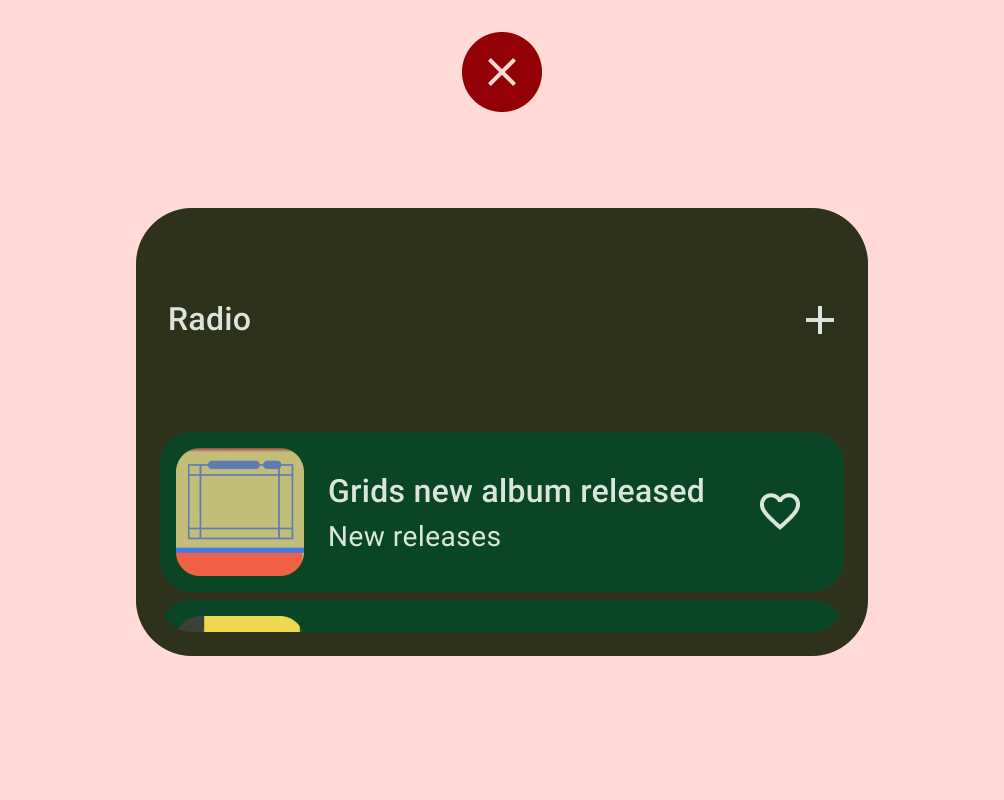
| 布局 | WL-1 | 当 widget 放置在主屏幕上时,不会填充启动器网格设置的边界。 |
| WL-1.1 | 微件未触及网格的至少 2 个相对边缘。换句话说,widget 不一定都是矩形,它们可以具有自定义形状,只要形状的边缘触及网格的至少 2 个边缘即可。 |
|
| 颜色 | WC-3 | 微件文本和图标按钮的颜色对比度不足,无法满足无障碍要求。 |
| 发现 | WD-4.2 | widget 名称未包含在 widget 设计中。 |
| WD-4.3 | widget 没有预览图片。 |
|
| 内容 | WT-3 | 微件内容始终过时或不合时宜。 |
| WT-3.1 | 用户通过 widget 完成某项操作后,widget 不会更新。 |
|
| WT-3.2 | 用户在应用内完成相关操作后,微件未更新。 |
|
| WT-4 | 微件界面无法正常运行或内容被裁剪。 |
二级
标准 widget 要求
达到此基准质量标准的 widget 被视为标准 widget,但不会被视为将获得推荐或展示的精选 widget。
| 类别 | ID | 说明 |
|---|---|---|
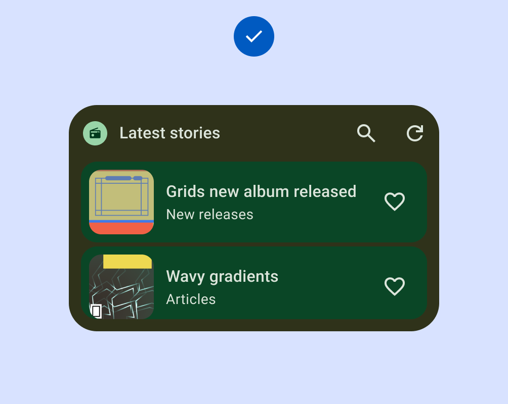
| 布局 | WL-1 | 微件在垂直或水平轴上与其他主屏幕元素对齐,不会占用不必要的空间。 |
| WL-1.2 | 所有形状都应至少触及网格边界的 2 条对边。 |
|
| WL-4 | 如果可调整大小,widget 必须具有适当的最小尺寸和最大尺寸。 |
|
| WL-4.1 | 如果调整微件大小只会添加空白空间,则应设置最大尺寸。 |
|
| WL-4.2 | 微件的最小尺寸仍应提供价值并满足触摸目标要求 (48x48)。 |
|
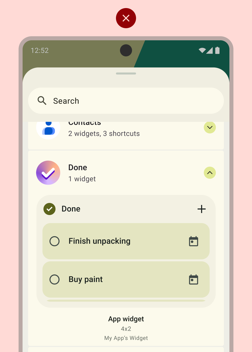
| 发现 | WD-4 | widget 在 widget 选择器中应具有准确的预览(静态资源)。 |
| 内容 | WT-1 | 零状态和空状态是故意设置的,用于在微件已安装但用户尚未登录时显示微件的价值和/或提供行动号召。 |
| WT-2 | 如果用户希望数据刷新频率高于界面刷新频率,则可以通过 widget 手动刷新内容。 |
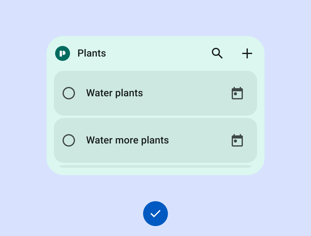
正确做法
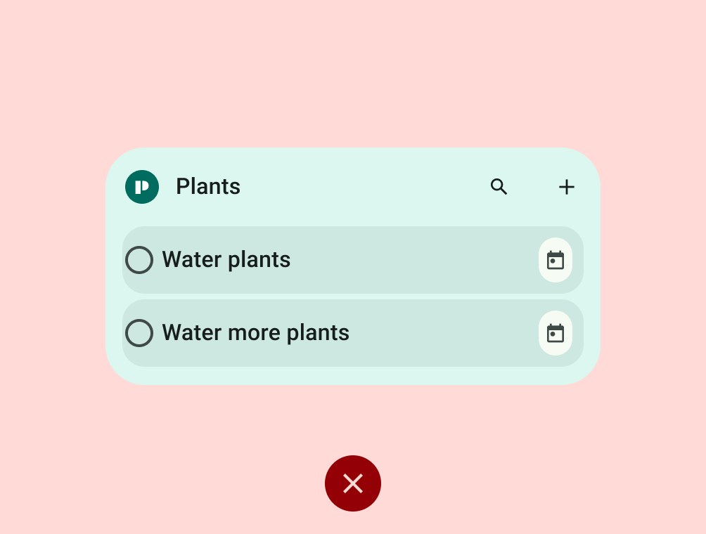
错误做法

正确做法
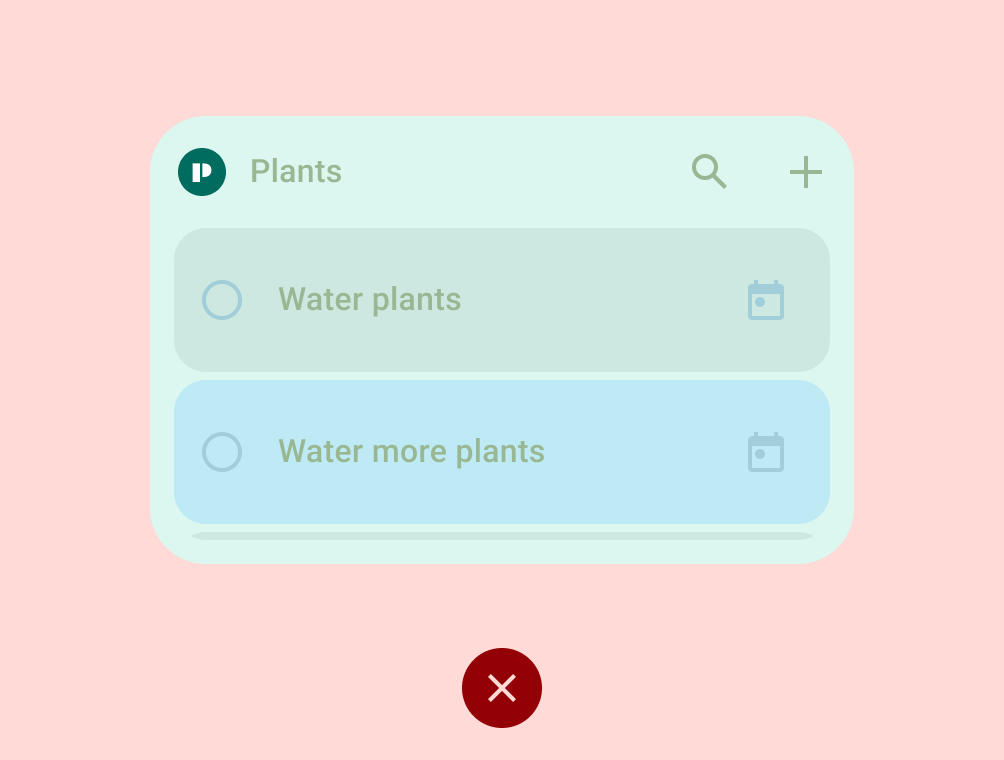
错误做法
一级
差异化 widget 要求
这些 widget 支持高级主屏幕自定义功能,并且会作为最佳实践向用户推荐,并向开发者重点介绍。差异化 widget 可提供出色的体验,Android 可利用它们来激发和活跃生态系统。它们符合所有差异化布局、颜色、发现和内容标准。
| 类别 | ID | 说明 |
|---|---|---|
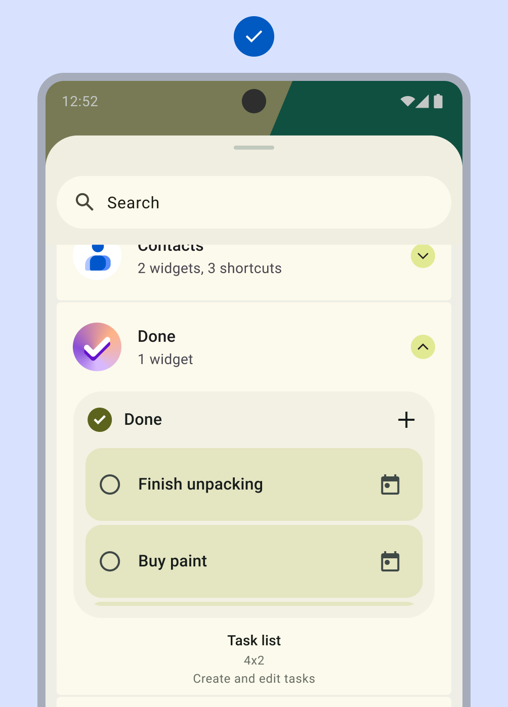
| 布局 | WL-1 | 微件在垂直或水平轴上与其他主屏幕元素对齐,且不会占用不必要的空间。 |
| WL-1.1 | 所有矩形 widget 必须触及网格边界的所有四个边缘。所有自定义形状的微件都必须触及方形网格边界的全部 4 条边。如果大小为 4x1 且包含搜索栏,则只允许触碰 2 个边缘。 |
|
| WL-2 | 微件可调整为以下至少一种尺寸:2x2、4x1、4x2。 |
|
| WL-3 | 微件标题的使用和应用方式一致。
|
|
| 颜色 | WC-1 | widget 支持基于设备或应用上下文的颜色主题。 |
| WC-2 | widget 支持浅色模式和深色模式调色板。 |
|
| 发现 | WD-1 | 预览包括用户内容和/或应用系统主题。 |
| WD-4.4 | 微件具有说明,可帮助用户了解微件的价值。 |
|
| WD-4.5 | 微件名称具有描述性,并且与应用的其他微件不同。 |
|
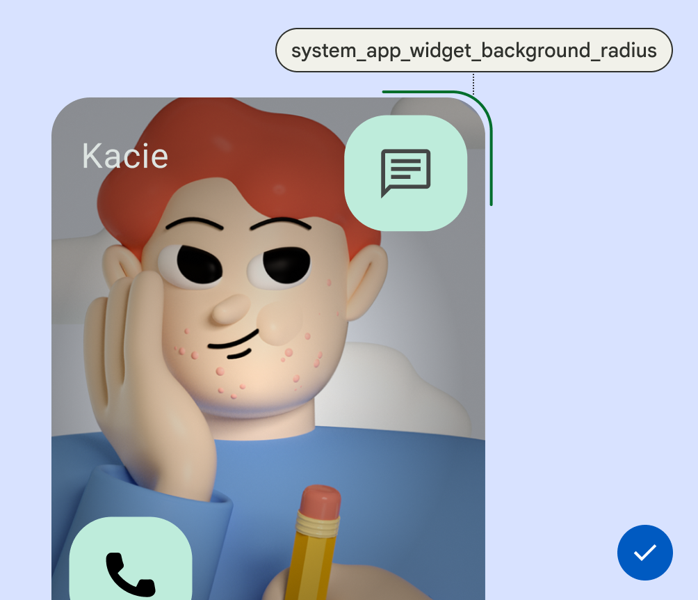
| 系统一致性 | WS-2 | 矩形 widget 必须使用系统(OEM 特有)提供的圆角半径。 |
| WS-3 | 微件使用加载状态规范。 |
|
| WS-4 | 微件使用系统配置,而不是自定义微件设置入口点。 |
|
| WS-5 | 当从 widget 进入/退出应用时,widget 使用系统启动过渡效果。 |
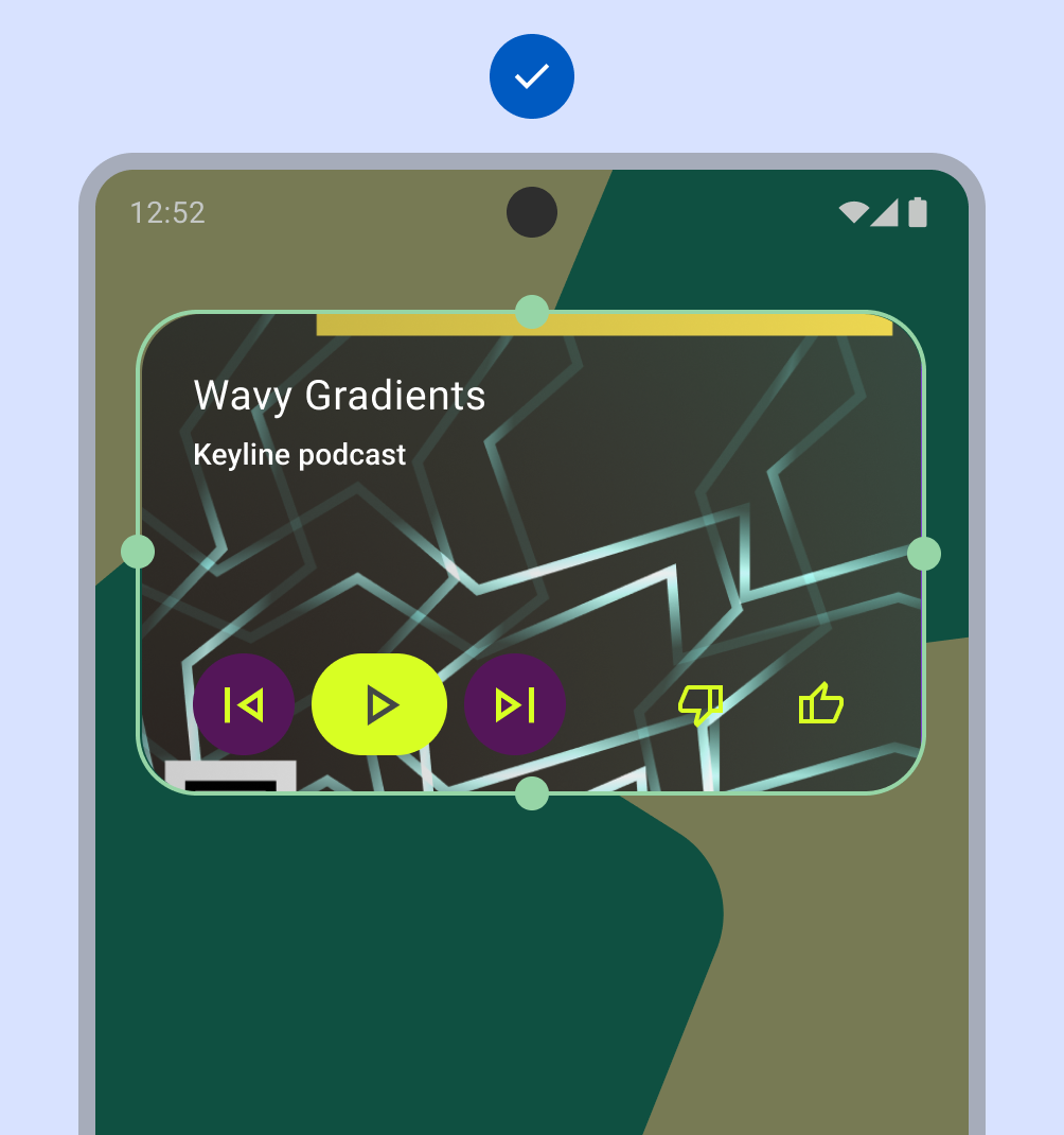
正确做法
错误做法
正确做法
错误做法
正确做法
错误做法
正确做法