אתם יכולים ליהנות מגישה חלקה לסרטים, לתוכניות טלוויזיה, למוזיקה ועוד, בכל זמן בבית, במסך הגדול.
משאבים
| סוג | קישור | סטטוס |
|---|---|---|
| עיצוב | מקור העיצוב (Figma) | יש גישה |
| Inter (Google Fonts) | יש גישה | |
| הטמעה | Jetpack Compose (Github) | יש גישה |
עיצוב
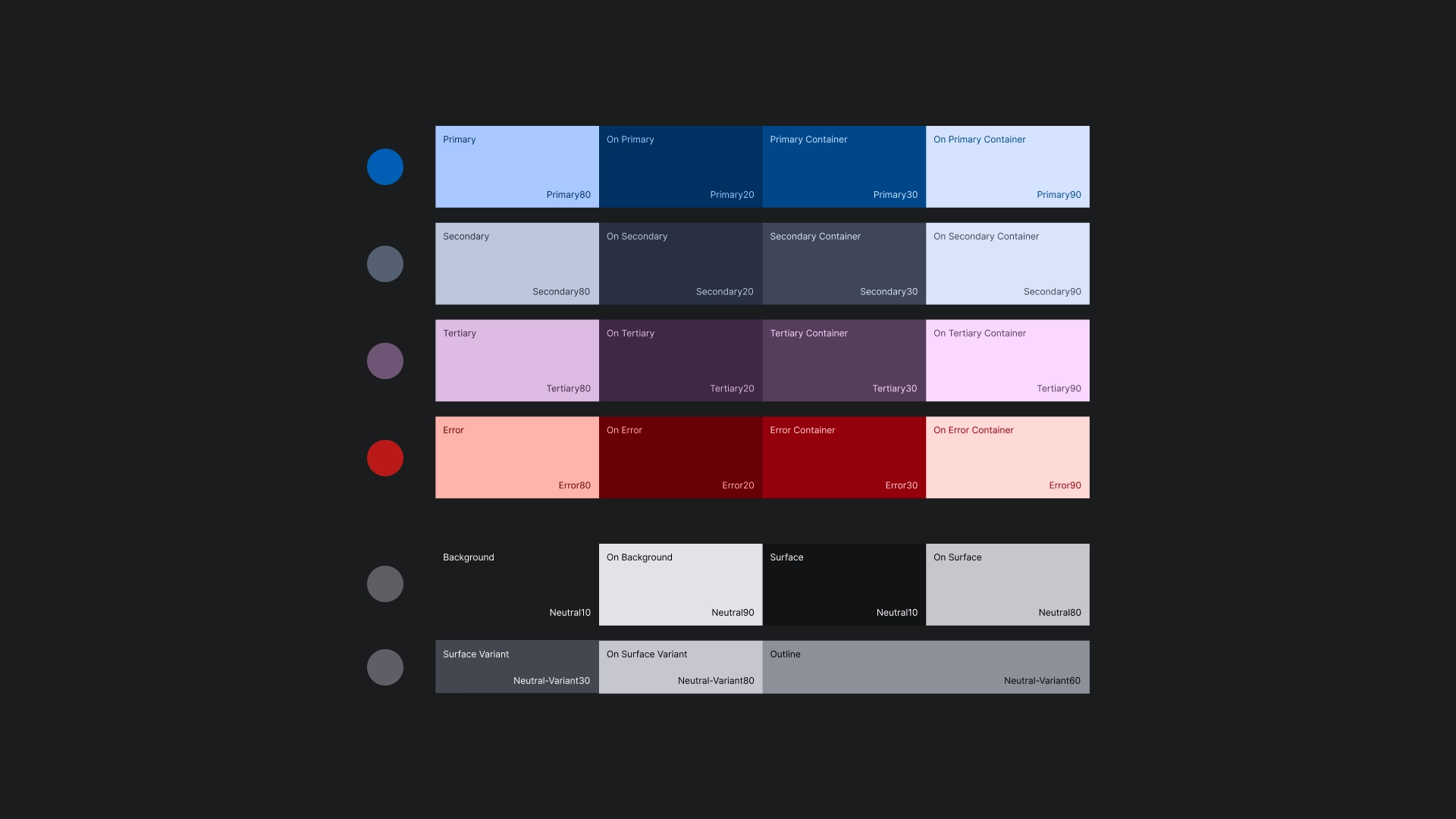
ערכת צבעים
נוצר עיצוב בצבעים באמצעות מחולל העיצובים של Material Design 3.
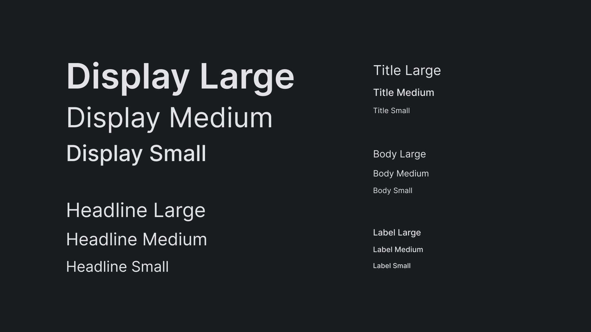
טיפוגרפיה
הסולם של סוגי הגופנים ב-JetStream משתמש בגופן Inter כדי ליצור מראה פשוט וברור למסכי טלוויזיה.
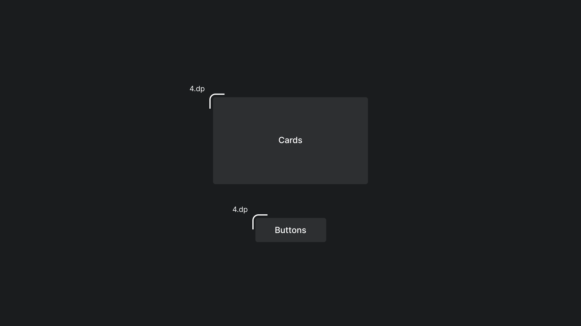
צורה
הקצוות של הכרטיסים והלחצנים מעוגלים קלות כדי ליצור מראה נעים ונגיש.
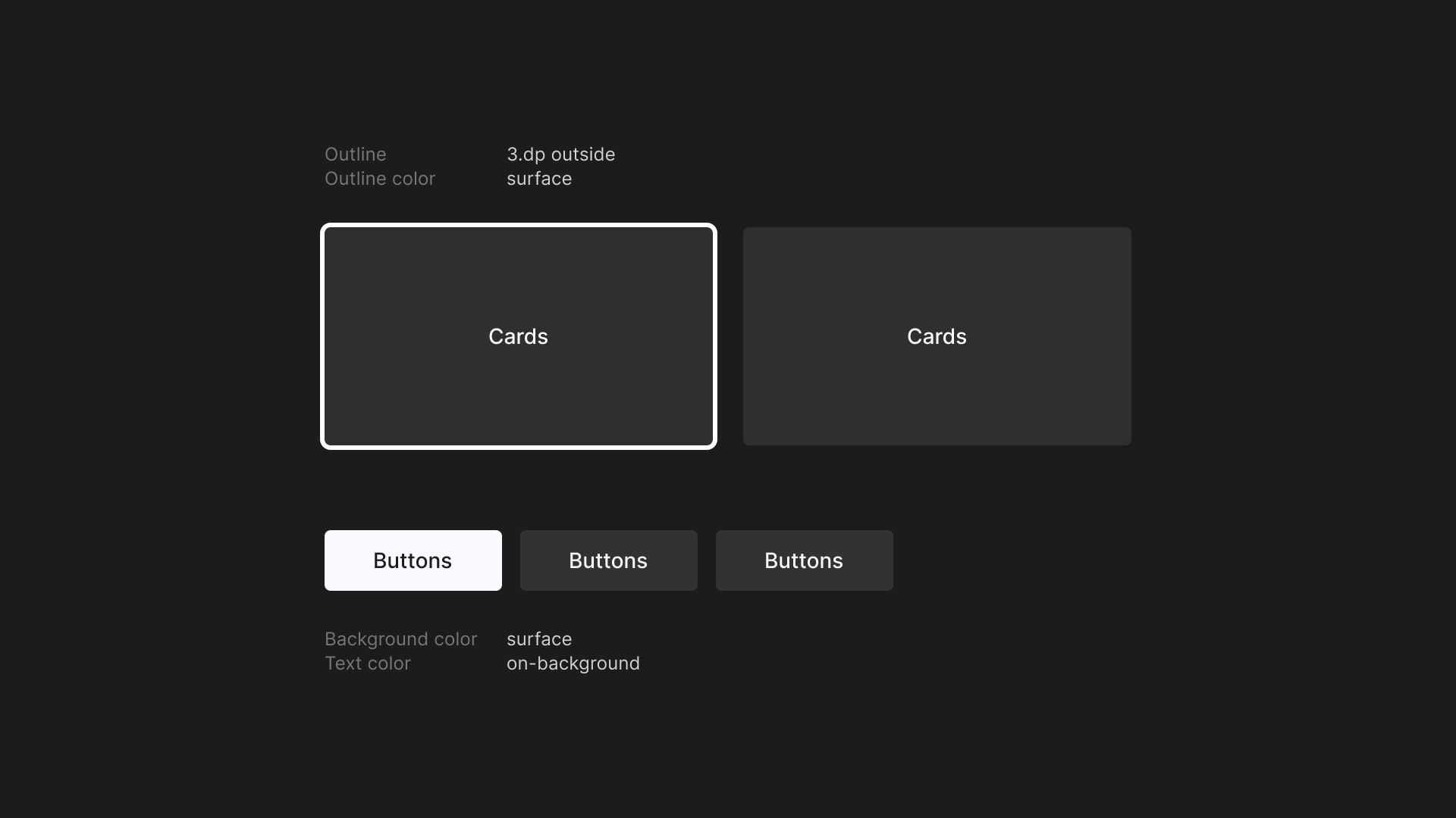
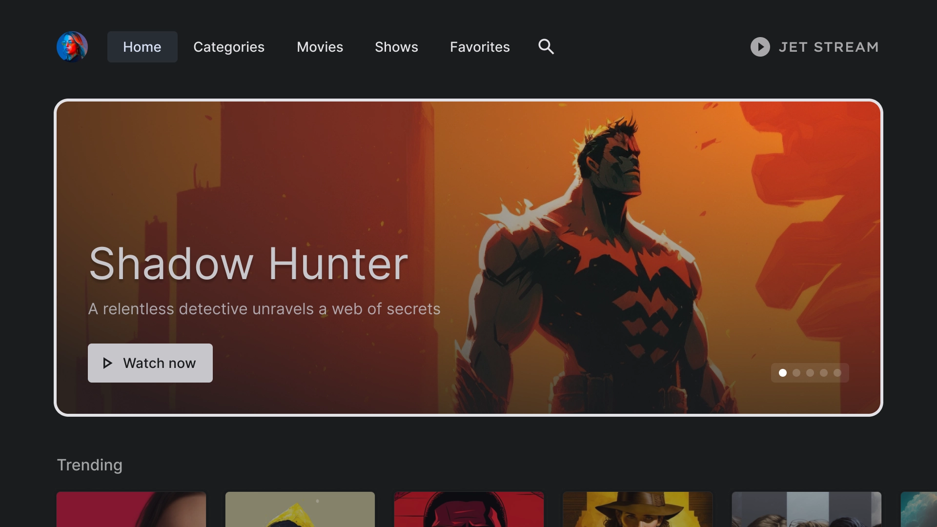
מיקוד
ב-JetStream נעשה שימוש בקו מתאר בעובי 3dp עם צבע קו מתאר.
דף הבית
דף הבית
דף הנחיתה של אפליקציית JetStream.
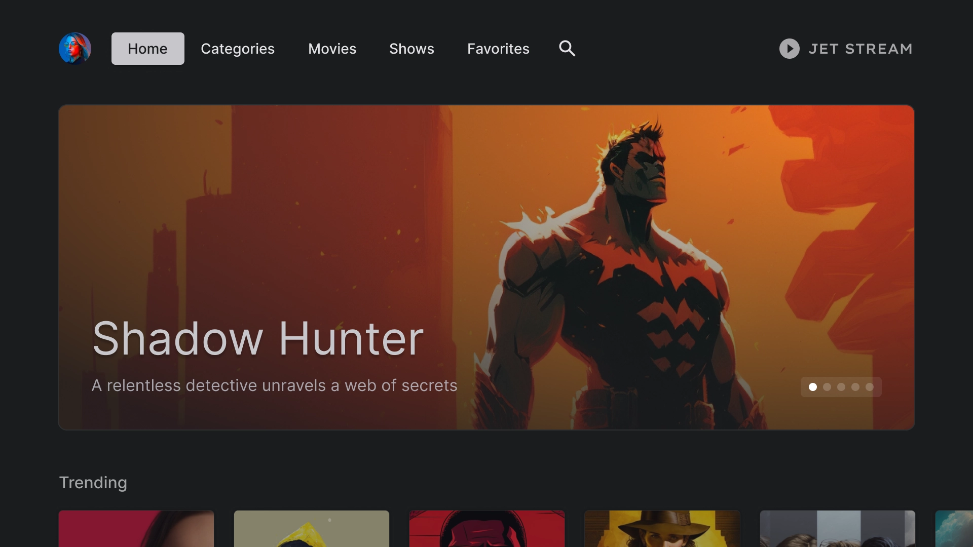
קרוסלה מומלצת
קרוסלה עם פריסה בסגנון כרטיס.
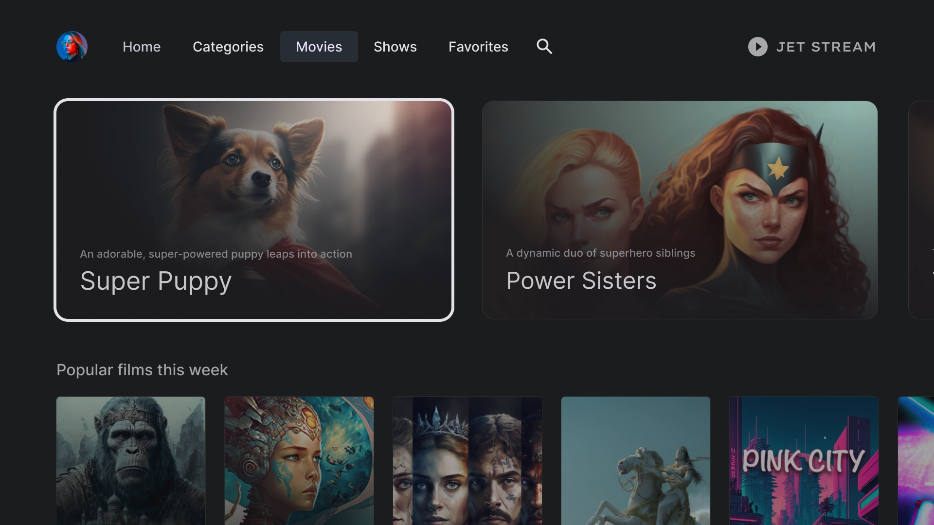
שורת תוכן
JetStream משתמש בסגנון כרטיס סטנדרטי עם יחס גובה-רוחב של 2:3 בפריסה של 5 עמודות.
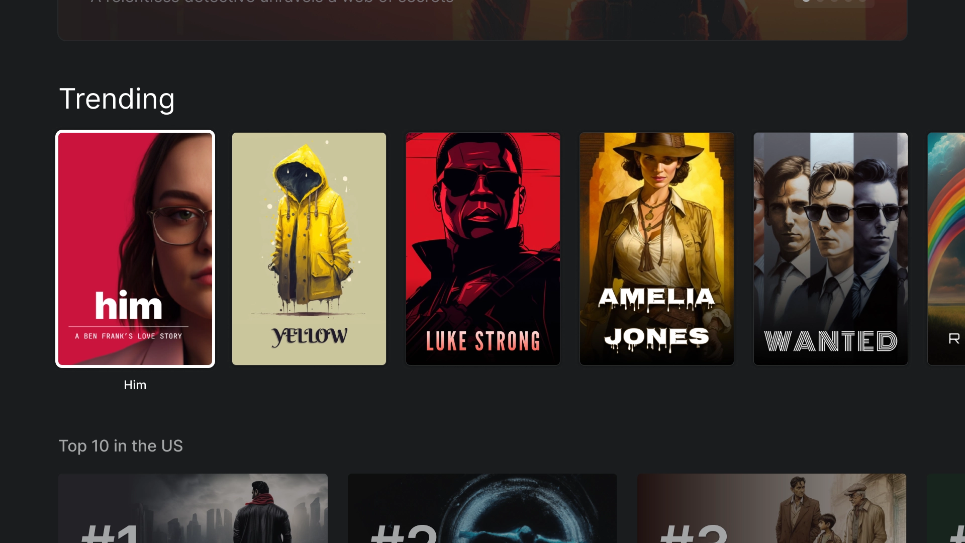
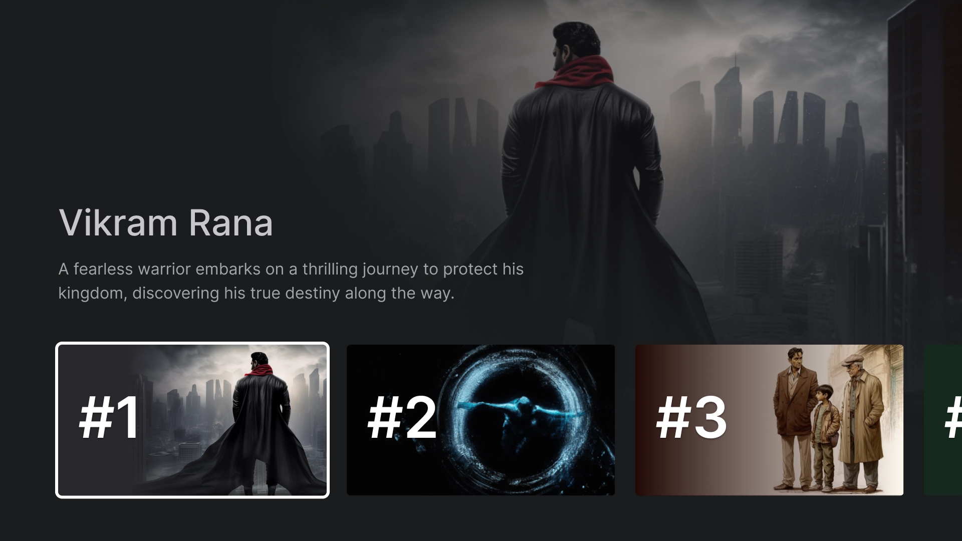
רשימה בתוך לב
הדגשת תוכן מיוחד באפליקציה באמצעות רכיב הרשימה המקיפה, כמו 10 הסרטים הפופולריים ביותר.
קטגוריות
קטגוריות
בדף 'קטגוריות' מוצגים ז'אנרים בפורמט רשת, כדי שיהיה קל לנווט ולגשת אליהם.
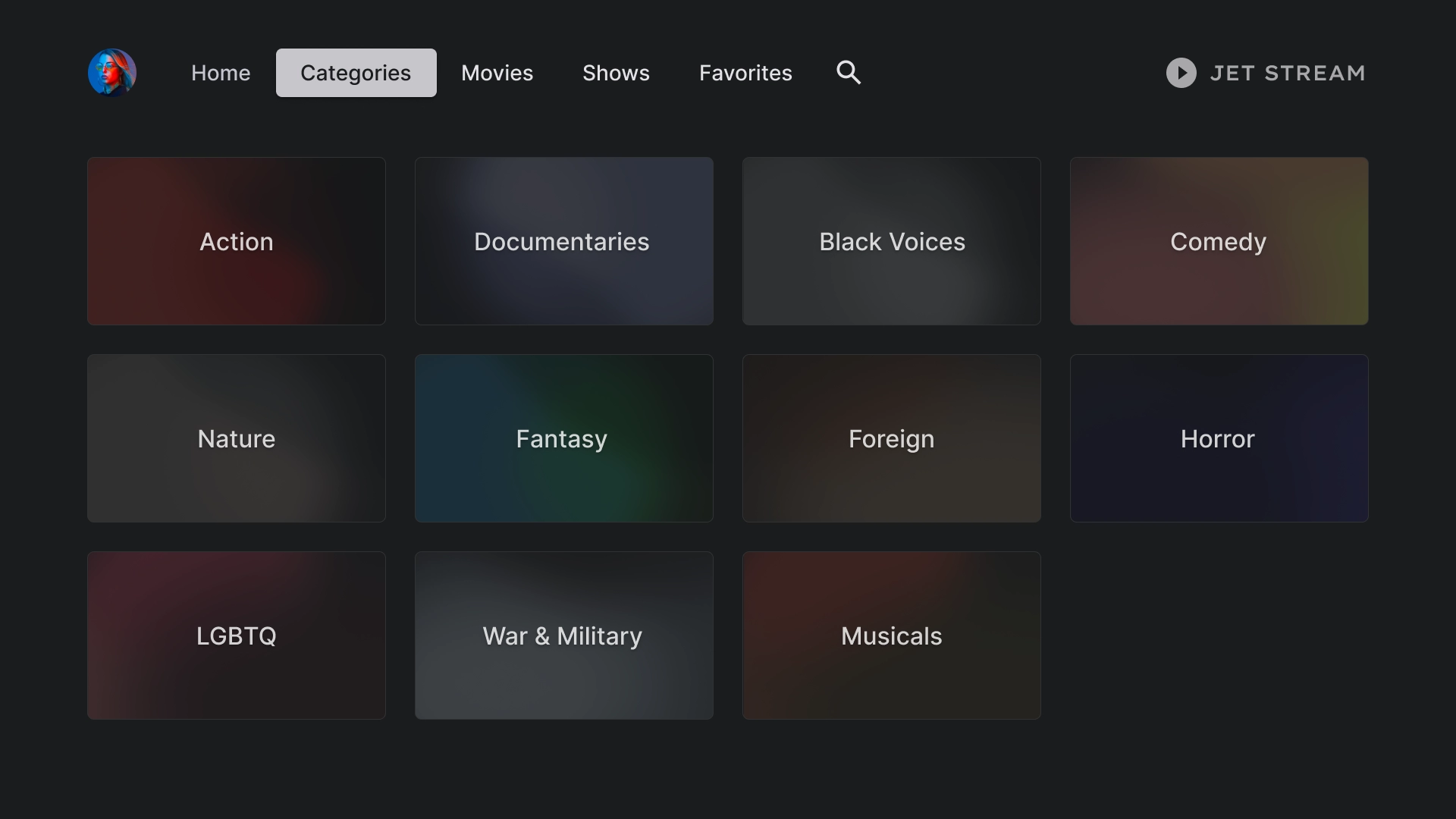
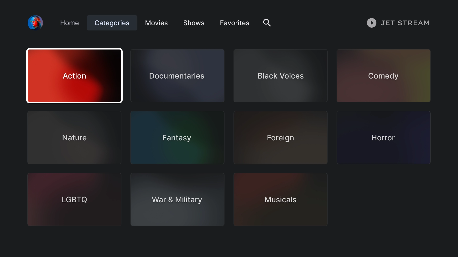
כרטיסי קטגוריה
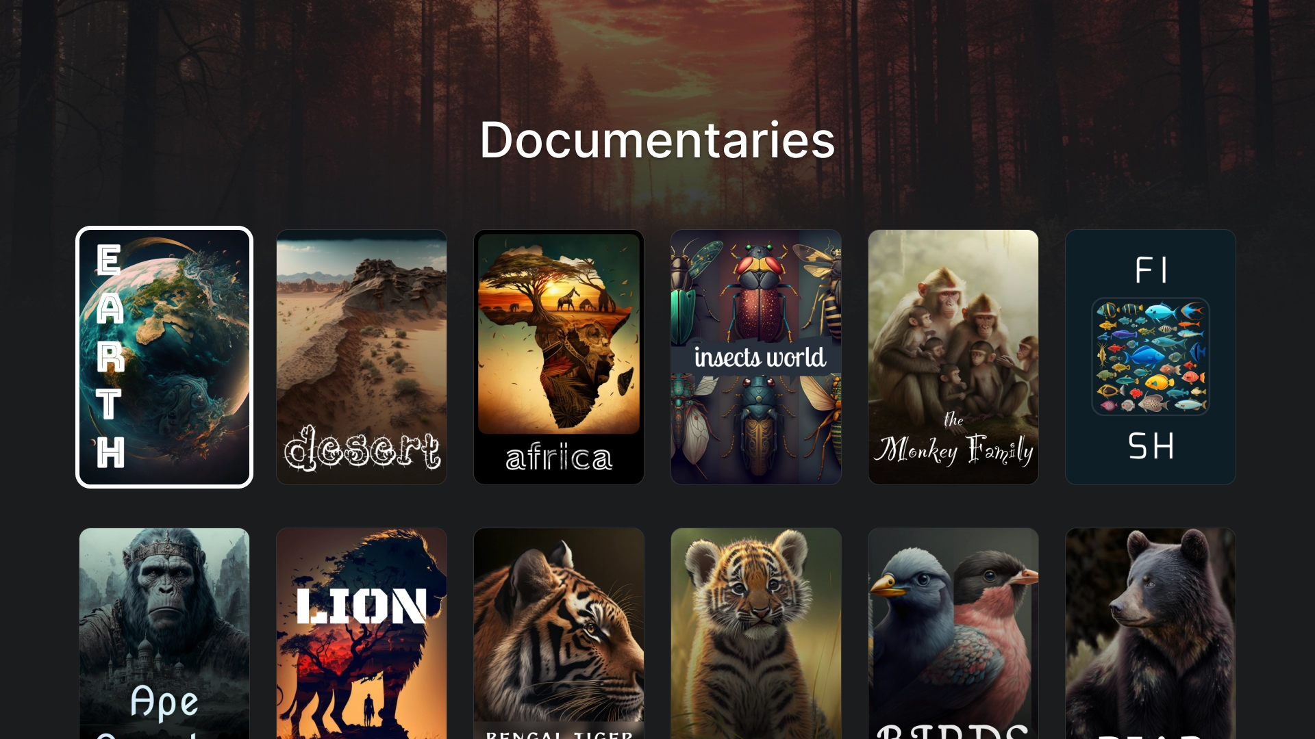
פרטי הקטגוריה
כדי ליצור את הדף 'פרטי קטגוריה' נעשה שימוש בפריסת כרטיסים של 2:3 עם כותרת.
מדיה
סרטים
כרטיסיית סרטים רגילה עם כרטיסים מומלצים ביחס גובה-רוחב של 16:9 בחלק העליון ורשת תוכן בחלק התחתון.
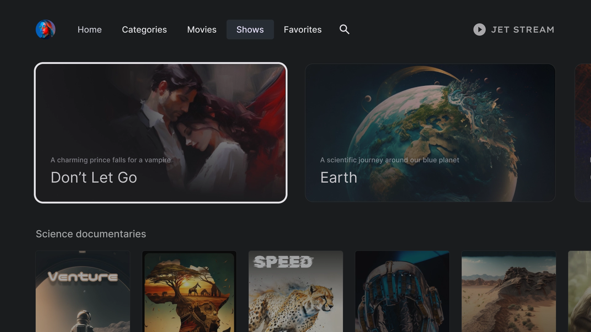
תוכניות
ספרייה
מועדפים
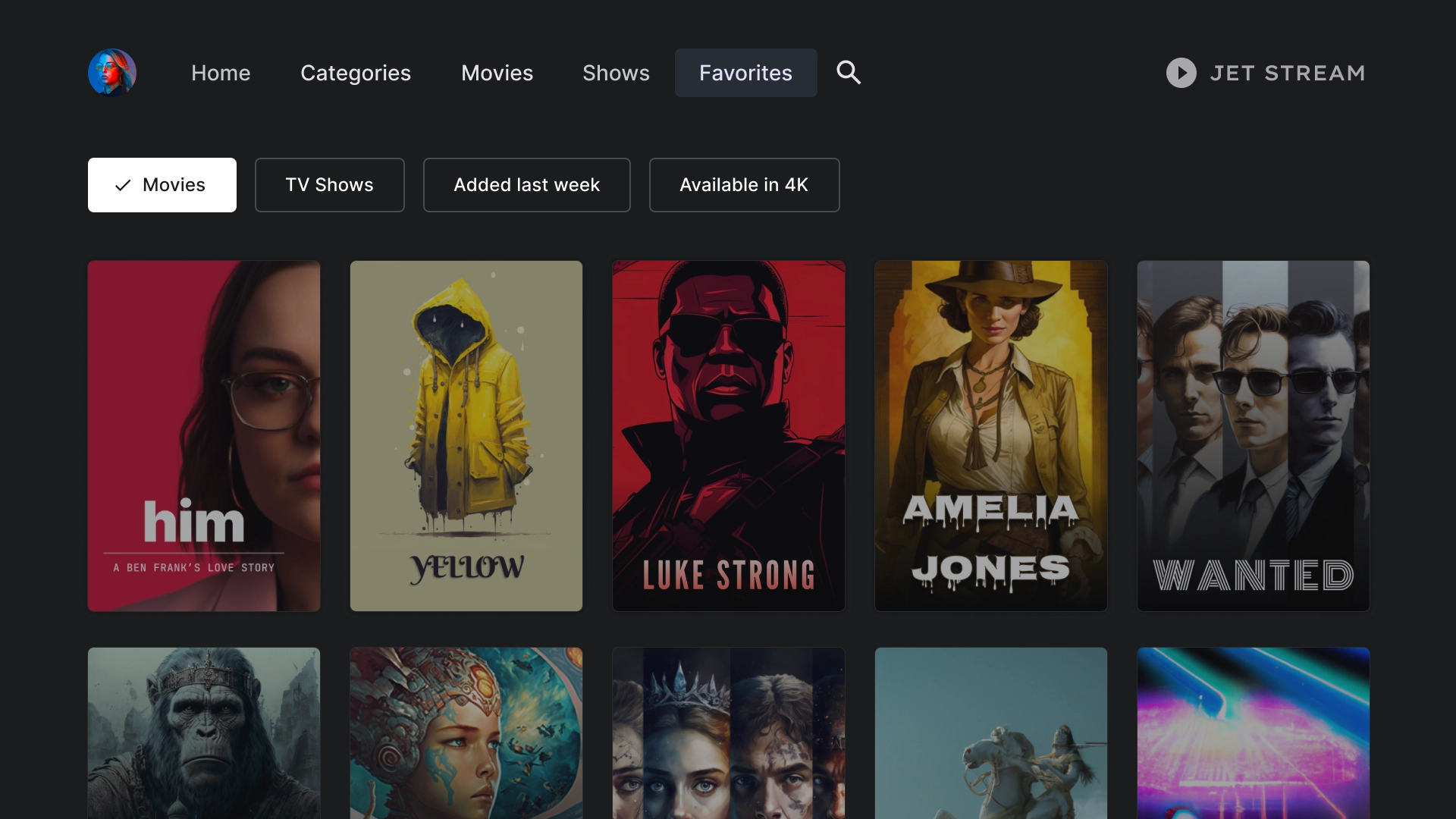
בכרטיסייה 'מועדפים' יש צ'יפים של מסננים בחלק העליון של המסך, כדי לאפשר חיפוש מהיר של תוכן.
חיפוש
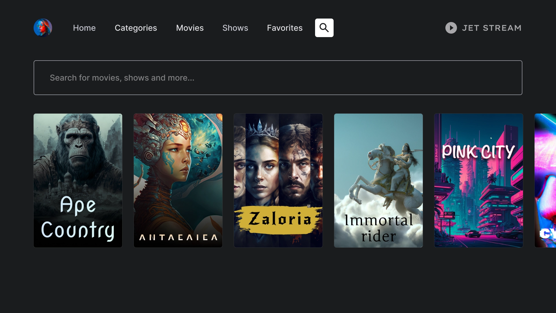
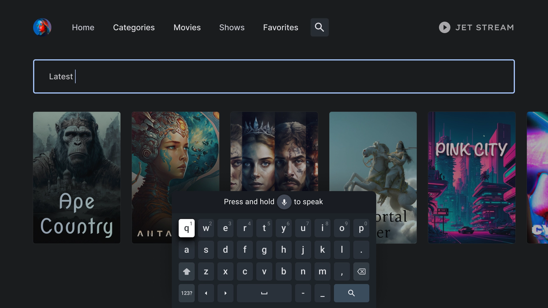
נחיתה בחיפוש
בדף חיפוש מוצג סרגל חיפוש עם הצעות לשאילתות חיפוש על סמך חיפושים אחרונים.
חיפוש פעיל
כשמעבירים את המיקוד לסרגל החיפוש, המקלדת קופצת, והתוצאות שמתחת מתעדכנות באופן דינמי בזמן שהמשתמש מקליד.
פרטי הישות
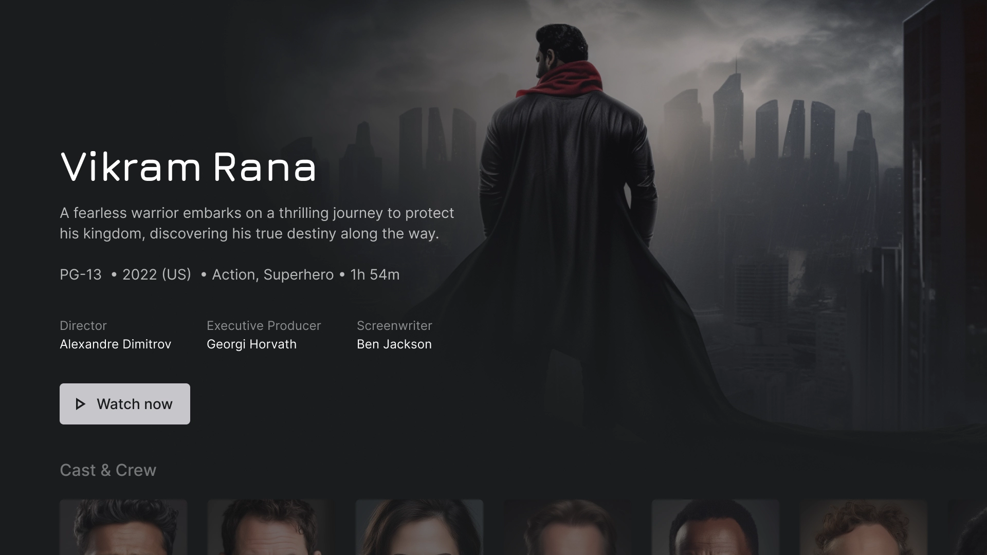
פרטים על דף הנחיתה
בדף הפרטים מוצגת תצוגה קולנועית עם סיכום קצר של העלילה ולחצן קריאה לפעולה בולט לצפייה בסרט.
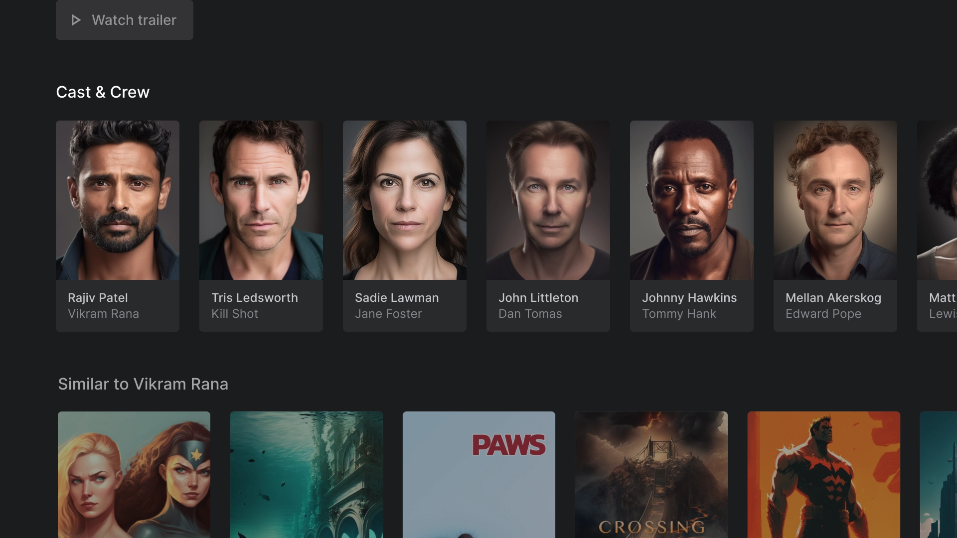
צוות השחקנים והיוצרים
בקטע 'צוות השחקנים וצוות ההפקה' מוצגות שורות של כרטיסים קלאסיים עם שמות ותיאורים, ולכל אחד מהם מצורף נכס תמונה ביחס רוחב-גובה של 2:3.
דירוגים
בקטע 'סיווגים' יש כרטיס רחב קלאסי בהתאמה אישית שכולל מידע נוסף.

הפעלה
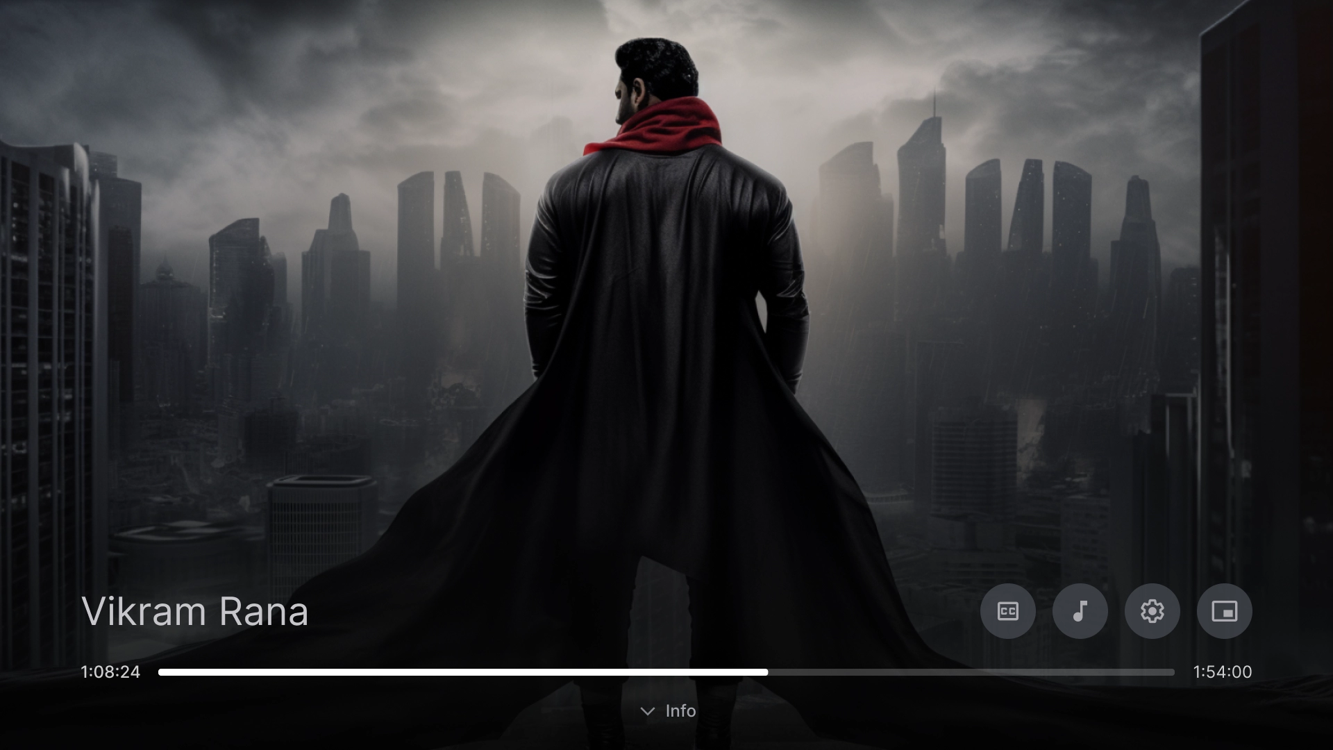
נגן וידאו
נגן וידאו רגיל עם שיטות מומלצות.
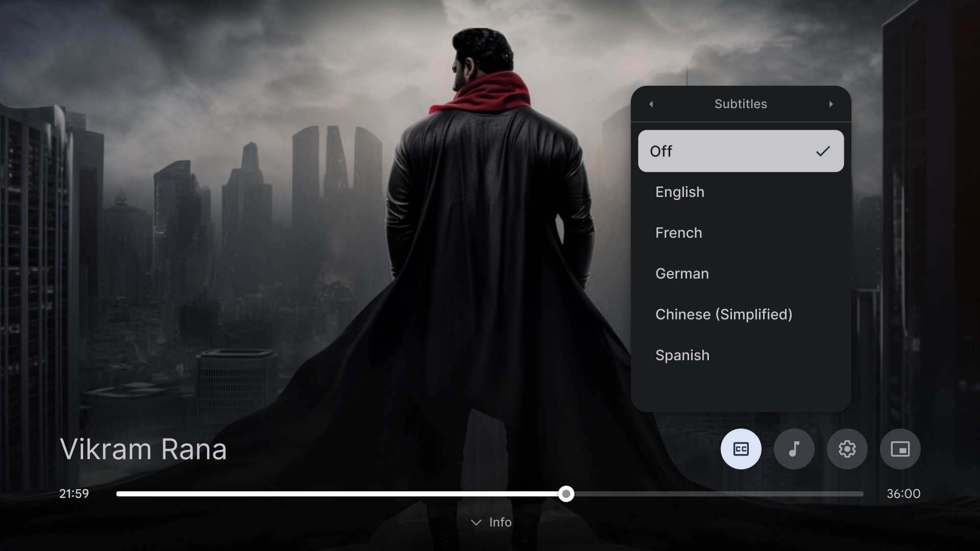
הגדרות של נגן הווידאו
חלון קופץ של כתוביות בנגן הווידאו.
הגדרות
הגדרות החשבון
פריסת הדף 'חשבונות' כוללת עיצוב של שתי עמודות עם רכיב רשימה בצד ימין ורכיבי כרטיסים מותאמים אישית בצד שמאל, שמסודרים בפורמט של רשת.

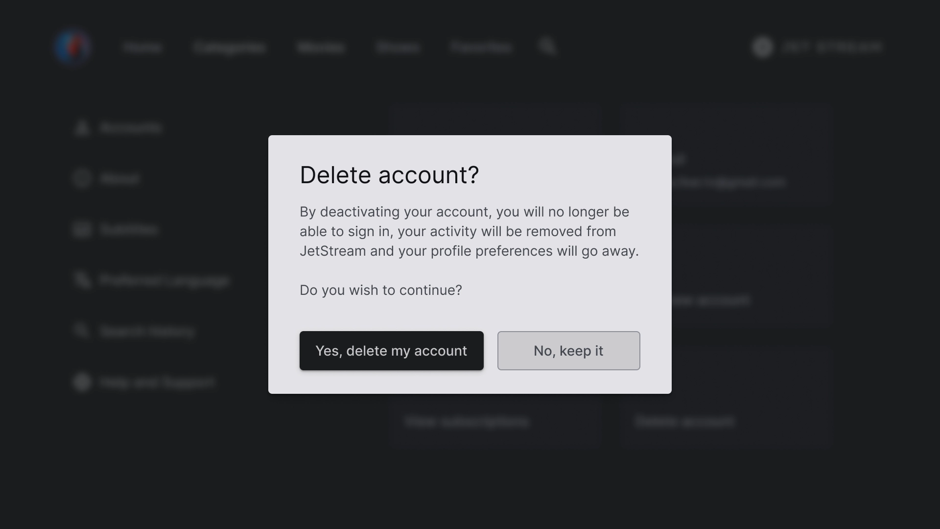
תיבת דו-שיח למחיקת החשבון
תיבת הדו-שיח מעוצבת עם רקע מנוגד כדי שתבלוט משאר המסך. שני הלחצנים בתיבת הדו-שיח מיושרים לימין כדי ליצור מראה נקי ומאורגן.
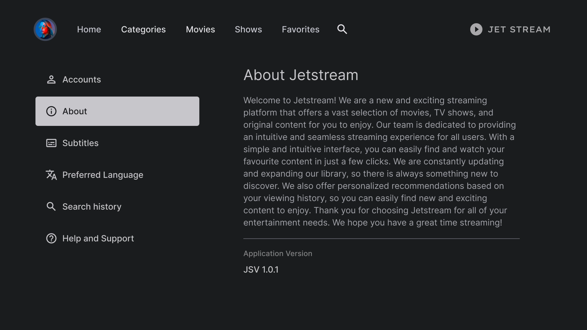
מידע כללי
בקטע 'מידע על הערוץ' יש חלונית שמאלית עם תצוגת טקסט שאפשר לגלול בה.
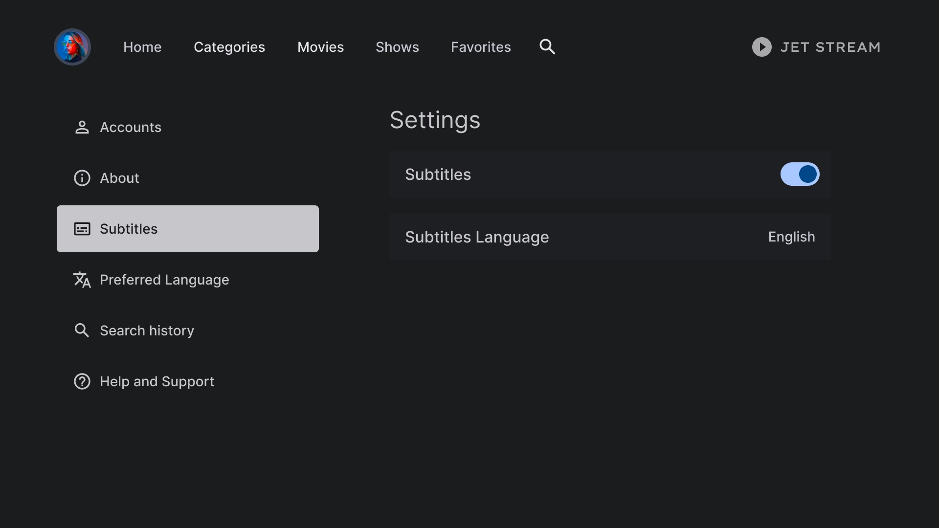
הגדרות הכתוביות
רכיב רשימה משמש להצגת הגדרות שונות בכותרת משנה, ומשתמש בפעולות כמו מתג או תווית.
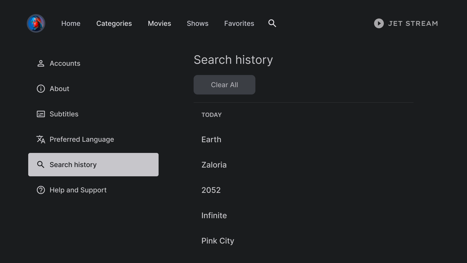
היסטוריה
היסטוריית החיפושים מוצגת בפריסה שכוללת רשימה של שאילתות שחיפשתם בעבר, יחד עם אפשרות למחוק את כל היסטוריית החיפושים.
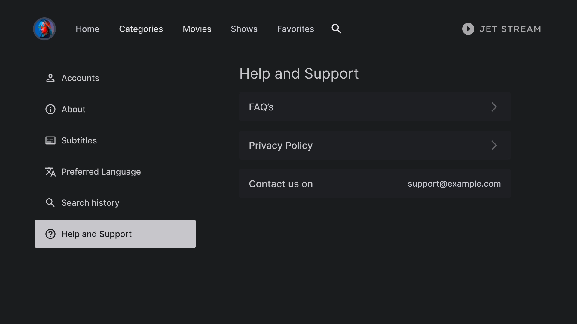
עזרה
בקטע 'עזרה ותמיכה' נעשה שימוש ברכיב רשימה מותאם אישית כדי להציג אפשרויות שונות, כולל פרטי קשר ושאלות נפוצות.