
Android users come to your app from all different types of form factors i.e., phones, tablets, foldables, and Chromebooks. When interacting with your application, especially on larger screens, users may also use some sort of pointing device like a three-button mouse. Android applications have support for applying different styling to the mouse pointer to help those users have a visual indication that they can interact with an object.
Use the system default cursors
Users are familiar with different conventions for interacting with different types of objects on large screen devices. Android provides developers with some of the most common cursor icons that users are familiar with. You can add these system default cursor icons with a few lines of code. Let's take a look at the following Kotlin snippet:
myView.setOnHoverListener { view, _ ->
      view.pointerIcon =
         PointerIcon.getSystemIcon(applicationContext, PointerIcon.TYPE_HAND)
      false // Listener did not consume the event.
}
In this example, myView is the view that will be set to a pointer icon under certain conditions. The condition demonstrated here is a hover state, which occurs when the mouse pointer is over a view. In other scenarios, you might want a waiting icon during processing or a crosshair in a game.
The setOnHoverListener listens for when the pointer enters the hover state and then acts upon that event. Inside the event listener, view.pointerIcon is called to set the pointer icon for that particular view. An existing system icon is used to set the pointer's icon.
There are several system icons built into Android; a full list is at the bottom of this page. The TYPE_HAND icon was used, which shows a closed hand with the index finger extended.
Use your own special cursor
// Loading a bitmap to use as a pointer icon
    BitmapFactory.decodeResource(
        this.resources,
        R.drawable.dollar_sign
    ), CURSOR_WIDTH, CURSOR_HEIGHT, false
)

// Creating the pointer icon and sending clicks from the center of the mouse icon
PointerIcon.create(dollarBitmap, (CURSOR_WIDTH/2).toFloat(), (CURSOR_HEIGHT/2).toFloat())
Note: The location of the hotspot depends on your use case. For example, a drawing app would set the hotspot to be the tip of the pen or paintbrush.
Examples
Adding pointer icons to your application is a great way to help enable your users to have more intuitive experiences across the different device form factors they use. There are plenty of great default system icons available and if those do not suit your needs, you are always able to load or create your own.
-
Drag and Drop - If your application supports dragging from another application and dropping into your application you could implement the
TYPE_NO_DROPicon. This would give a visual indication that your application does not support the mime type that is trying to be dropped into your app. -
Mapping - If you have a mapping application and you want to show users that they can pan the map, they could have an option to have the
TYPE_GRABicon when you are hovering over the map. When the user clicks, you can update the icon to a grabbing hand to show that they are panning the map. -
Photo Editing - Photo editing users like to have controls that allow them to select a magnifying glass to zoom in. You could change the cursor to a magnifying glass with the
TYPE_ZOOM_INicon when zoom in mode is selected. - And many more opportunities
Note: To see different pointer changes in action check out this GitHub Pointer Sample
Appendix
Additional Reading
- GitHub Pointer Sample
- PointerIcon Android Class Documentation
- Optimizing Apps for ChromeOS : Custom Cursors
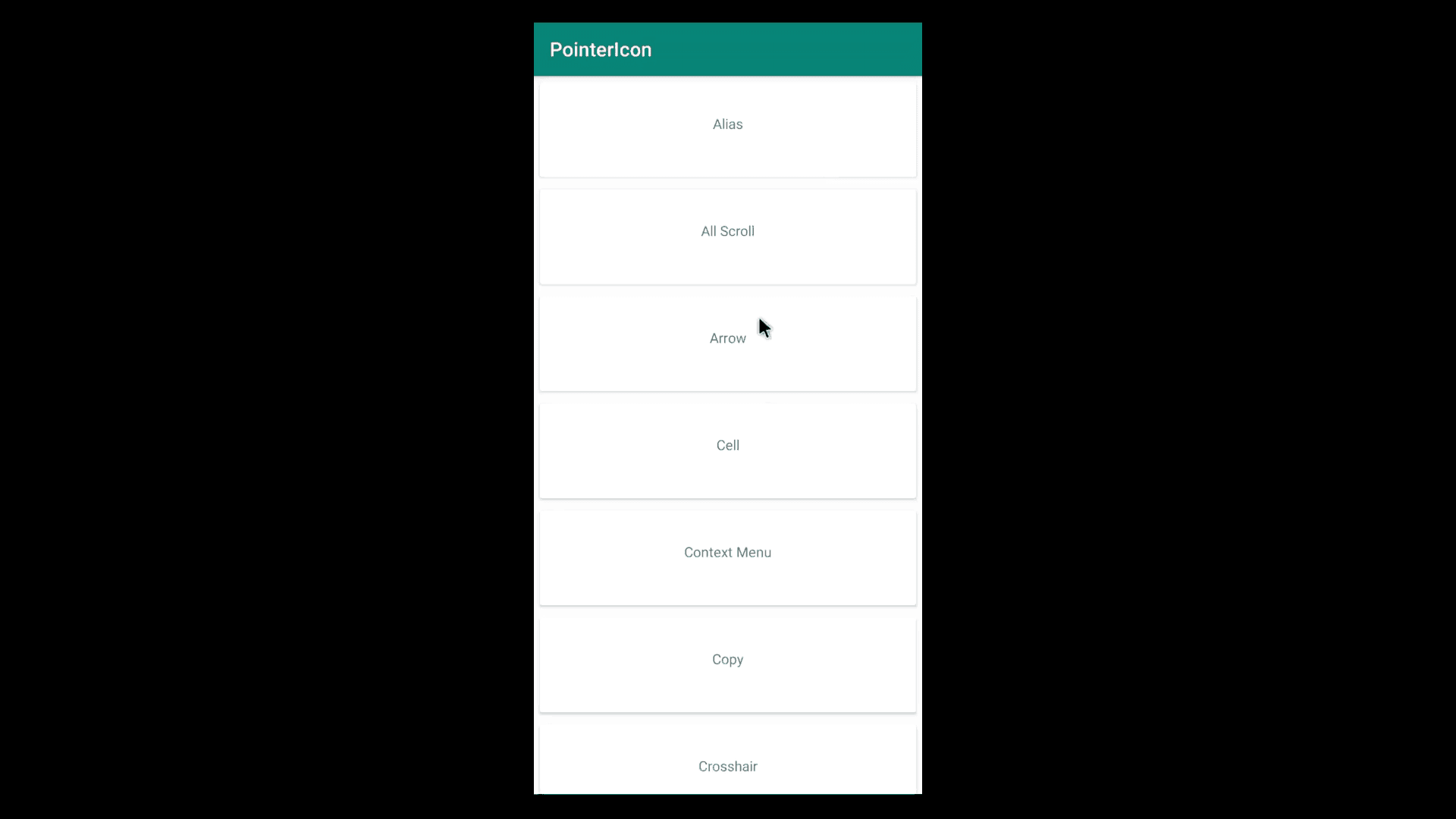
System Default Cursors
These are the available cursors by default in the Android System.
| Cursor Name | Icon |
|---|---|
| TYPE_ALIAS |  |
| TYPE_ALL_SCROLL |  |
| TYPE_ARROW |  |
| TYPE_CELL | Cell Cursor |
| TYPE_CONTEXT_MENU |  |
| TYPE_COPY |  |
| TYPE_CROSSHAIR |  |
| TYPE_DEFAULT |  |
| TYPE_GRAB |  |
| TYPE_GRABBING |  |
| TYPE_HAND |  |
| TYPE_HELP |  |
| TYPE_HORIZONTAL_DOUBLE_ARROW |  |
| TYPE_NO_DROP |  |
| TYPE_NULL | No Cursor Will Display |
| TYPE_TEXT |  |
| TYPE_TOP_LEFT_DIAGONAL_DOUBLE_ARROW |  |
| TYPE_TOP_RIGHT_DIAGONAL_DOUBLE_ARROW |  |
| TYPE_VERTICAL_DOUBLE_ARROW |  |
| TYPE_VERTICAL_TEXT |  |
| TYPE_WAIT |  |
| TYPE_ZOOM_IN |  |
| TYPE_ZOOM_OUT |  |