
הרכיב הניתן לקיבוץ Card פועל כקונטיינר של Material Design לממשק המשתמש.
כרטיסים מציגים קטע תוכן אחד עקבי, כמו:
- מוצר באפליקציית שופינג.
- כתבה חדשותית באפליקציית חדשות.
- הודעה באפליקציית תקשורת.
ההתמקדות בתיאור של פריט תוכן אחד מבדילה את Card ממאגרים אחרים. לדוגמה, Scaffold מספק מבנה כללי למסך שלם. כרטיס הוא רכיב UI קטן יותר בתוך פריסה גדולה יותר, בעוד שרכיב פריסה כמו Column או Row מספק ממשק API פשוט יותר וגנרלי יותר.
במאמר הזה נסביר איך להטמיע ארבעה סוגים של כרטיסים:
תאימות גרסאות
כדי להטמיע את האפשרות הזו, צריך להגדיר את minSDK של הפרויקט לרמת API 21 ואילך.
יחסי תלות
יצירת כרטיס בסיסי
Card פועל כמו מאגרים אחרים ב-Compose. כדי להצהיר על התוכן שלו, צריך להפעיל בו רכיבים אחרים. לדוגמה, שימו לב איך Card מכיל קריאה ל-Text בדוגמה המינימלית הבאה:
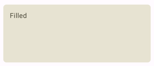
יצירת כרטיס מלא
המפתח כאן הוא השימוש במאפיין colors כדי לשנות את הצבע המלא:
תוצאות
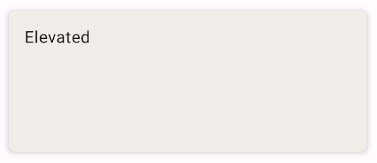
יצירת כרטיס ברמה גבוהה יותר
קטע הקוד הבא מראה איך מטמיעים כרטיס מורחב. משתמשים ב-composable הייעודי ElevatedCard.
אפשר להשתמש בנכס elevation כדי לשלוט במראה של הגובה ובצל שמתקבל.
תוצאות
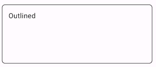
יצירת כרטיס עם מתאר
זו דוגמה לכרטיס עם קו מתאר. משתמשים ב-composable הייעודי OutlinedCard.
תוצאות
נקודות עיקריות
הגדרת ה-API של Card מפורטת בחומר העזרה. הוא מגדיר כמה פרמטרים שאפשר להשתמש בהם כדי להתאים אישית את המראה וההתנהגות של הרכיב.
חלק מהפרמטרים העיקריים כוללים:
elevation: הוספת צללית לרכיב כדי שהוא ייראה מוגבה מעל הרקע.colors: משתמש בסוגCardColorsכדי להגדיר את צבע ברירת המחדל של הקונטיינר ושל כל הצאצאים.enabled: אם מעבירים את הערךfalseלפרמטר הזה, הכרטיס מופיע כמושבת ולא מגיב לקלט של משתמשים.onClick: בדרך כלל,Cardלא מקבל אירועי קליקים. לכן, כדאי לשים לב לעומס יתר ראשי שמוגדר באמצעות פרמטרonClick. כדאי להשתמש בהעמסת יתר הזו כשרוצים שההטמעה שלCardתגיב לקליק מהמשתמש.
הכרטיסים לא כוללים פעולות גלילה או סגירה מובנות, אבל אפשר לשלב אותם ברכיבים מורכבים שמציעים את התכונות האלה. לדוגמה, כדי להטמיע את האפשרות להחליק כדי לסגור כרטיס, משלבים אותו עם הרכיב הניתן לקישור SwipeToDismiss. כדי לשלב את הרכיב עם גלילה, צריך להשתמש במודיפיקציות של גלילה כמו verticalScroll. מידע נוסף זמין במסמכי התיעוד של Scroll.
אוספים שמכילים את המדריך הזה
המדריך הזה הוא חלק מהאוספים הבאים של מדריכים מהירים, שמכסים יעדים רחבים יותר לפיתוח Android:
הצגת רכיבים אינטראקטיביים