יצירת תפריט הזזה באמצעות הרכיב של חלונית הניווט
קל לארגן דפים בעזרת אוספים
אפשר לשמור ולסווג תוכן על סמך ההעדפות שלך.
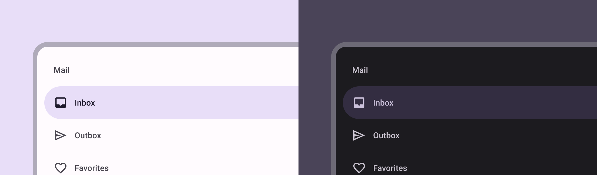
הרכיב תפריט הניווט הוא תפריט שנפתח בהחלקה ומאפשר למשתמשים לנווט לקטעים שונים באפליקציה. המשתמשים יכולים להפעיל אותו על ידי החלקה מהצד או הקשה על סמל התפריט.
ריכזנו כאן שלושה תרחישים לדוגמה להטמעת חלונית ניווט:
- ארגון תוכן: מאפשרים למשתמשים לעבור בין קטגוריות שונות, למשל באפליקציות חדשות או בבלוגים.
- ניהול חשבון: הצגת קישורים מהירים להגדרות החשבון ולקטעי הפרופיל באפליקציות עם חשבונות משתמשים.
- גילוי תכונות: ארגון של כמה תכונות והגדרות בתפריט אחד כדי להקל על המשתמשים לגלות את התכונות ולגשת אליהן באפליקציות מורכבות.
ב-Material Design יש שני סוגים של תיבות ניווט:
- רגיל: שיתוף שטח במסך עם תוכן אחר.
- מודל: מופיע מעל תוכן אחר במסך.
תאימות גרסאות
כדי להטמיע את האפשרות הזו, צריך להגדיר את minSDK של הפרויקט לרמת API 21 ואילך.
יחסי תלות
הטמעת חלונית הזזה לניווט
אפשר להשתמש ב-composable ModalNavigationDrawer
כדי להטמיע תפריט ניווט:
נקודות עיקריות
משתמשים בחריץ drawerContent
כדי לספק ModalDrawerSheet
ולספק את התוכן של התיבה.
ModalNavigationDrawer
מקבל מספר פרמטרים נוספים של תיבות נפתחות.
לדוגמה, אפשר להחליף את המצב של התגובה של התיבה הנשלפת לגרירה באמצעות הפרמטר gesturesEnabled
, כמו בדוגמה הבאה:
שליטה בהתנהגות של חלונית ההזזה לניווט
כדי לשלוט באופן שבו המגירה נפתחת ונסגרת, משתמשים ב-DrawerState
:
נקודות עיקריות
- מעבירים
DrawerState
אל ModalNavigationDrawer
באמצעות הפרמטר drawerState
.
DrawerState
מספק גישה לפונקציות open
ו-close
, וגם לנכסים שקשורים למצב הנוכחי של התפריט הנפתח. כדי להשתמש בפונקציות ההשהיה האלה, צריך CoroutineScope
. אפשר ליצור מופע של CoroutineScope
באמצעות rememberCoroutineScope
. אפשר גם להפעיל את הפונקציות להשהיה בתגובה לאירועים בממשק המשתמש.
תוצאות
איור 1. חלונית ניווט רגילה (משמאל) וחלונית ניווט מודאלית (מימין).
אוספים שמכילים את המדריך הזה
המדריך הזה הוא חלק מהאוספים הבאים של מדריכים מהירים, שמכסים יעדים רחבים יותר לפיתוח Android:
הצגת רכיבים אינטראקטיביים
איך פונקציות מורכבות מאפשרות ליצור בקלות רכיבי ממשק משתמש יפים על סמך מערכת העיצוב של Material Design.
דוגמאות התוכן והקוד שבדף הזה כפופות לרישיונות המפורטים בקטע רישיון לתוכן. Java ו-OpenJDK הם סימנים מסחריים או סימנים מסחריים רשומים של חברת Oracle ו/או של השותפים העצמאיים שלה.
עדכון אחרון: 2025-02-06 (שעון UTC).
[null,null,["עדכון אחרון: 2025-02-06 (שעון UTC)."],[],[],null,["\u003cbr /\u003e\n\nThe [navigation drawer](https://material.io/components/navigation-drawer) component is a slide-in menu that lets users navigate\nto various sections of your app. Users can activate it by swiping from the side\nor tapping a menu icon.\n\nConsider these three use cases for implementing a navigation drawer:\n\n- **Content organization:** Enable users to switch between different categories, such as in news or blogging apps.\n- **Account management:** Provide quick links to account settings and profile sections in apps with user accounts.\n- **Feature discovery:** Organize multiple features and settings in a single menu to facilitate user discovery and access in complex apps.\n\nIn Material Design, there are two types of navigation drawers:\n\n- **Standard:** Share space within a screen with other content.\n- **Modal:** Appears over the top of other content within a screen.\n\nVersion compatibility\n\nThis implementation requires that your project minSDK be set to API level 21 or\nhigher.\n\nDependencies\n\nImplement a navigation drawer\n\nYou can use the [`ModalNavigationDrawer`](/reference/kotlin/androidx/compose/material3/package-summary#ModalNavigationDrawer(kotlin.Function0,androidx.compose.ui.Modifier,androidx.compose.material3.DrawerState,kotlin.Boolean,androidx.compose.ui.graphics.Color,kotlin.Function0)) composable to implement a\nnavigation drawer:\n\nKey points\n\n- Use the `drawerContent` slot to provide a [`ModalDrawerSheet`](/reference/kotlin/androidx/compose/material3/package-summary#ModalDrawerSheet(androidx.compose.ui.Modifier,androidx.compose.ui.graphics.Shape,androidx.compose.ui.graphics.Color,androidx.compose.ui.graphics.Color,androidx.compose.ui.unit.Dp,androidx.compose.foundation.layout.WindowInsets,kotlin.Function1)) and\n provide the drawer's contents.\n\n- `ModalNavigationDrawer` accepts a number of additional drawer parameters.\n For example, you can toggle whether or not the drawer responds to drags with\n the `gesturesEnabled` parameter as in the following example:\n\nControl navigation drawer behavior\n\nTo control how the drawer opens and closes, use [`DrawerState`](/reference/kotlin/androidx/compose/material3/DrawerState):\n\nKey points\n\n- Pass a `DrawerState` to `ModalNavigationDrawer` using the `drawerState` parameter.\n- `DrawerState` provides access to the [`open`](/reference/kotlin/androidx/compose/material3/DrawerState#open) and [`close`](/reference/kotlin/androidx/compose/material3/DrawerState#close) functions, as well as properties related to the current drawer state. These suspending functions require a `CoroutineScope`, which you can instantiate using [`rememberCoroutineScope`](/reference/kotlin/androidx/compose/runtime/package-summary#remembercoroutinescope). You can also call the suspending functions in response to UI events.\n\nResults\n\n\n**Figure 1.** A standard navigation drawer (left) and a modal navigation drawer (right).\n\n\u003cbr /\u003e\n\nCollections that contain this guide\n\nThis guide is part of these curated Quick Guide collections that cover\nbroader Android development goals: \n\nDisplay interactive components \nLearn how composable functions can enable you to easily create beautiful UI components based on the Material Design design system. \n[Quick guide collection](/develop/ui/compose/quick-guides/collections/display-interactive-components) \n\nHave questions or feedback \nGo to our frequently asked questions page and learn about quick guides or reach out and let us know your thoughts. \n[Go to FAQ](/quick-guides/faq) [Leave feedback](https://issuetracker.google.com/issues/new?component=1573691&template=1993320)"]]