
סרגי האפליקציות הם מאגרים בחלק העליון או התחתון של המסך שמעניקים למשתמשים גישה לתכונות מרכזיות ולפריטי ניווט:
סוג |
מראה |
המטרה |
|---|---|---|
| סרגל האפליקציות העליון | בחלק העליון של המסך. |
נותן גישה למשימות ולמידע חשובים. בדרך כלל מוצגים בו כותרת, פעולות מרכזיות ופריטי ניווט מסוימים. |
| סרגל האפליקציה התחתון | בתחתית המסך. |
בדרך כלל כולל פריטים מרכזיים של ניווט. יכול להיות שהם יספקו גישה לפעולות אחרות, למשל באמצעות לחצן פעולה צף (FAB). |
תאימות גרסאות
כדי להטמיע את הקוד הזה, צריך להגדיר את minSDK של הפרויקט לרמת API 21 ואילך.
יחסי תלות
הטמעת סרגל אפליקציה בחלק העליון
בקוד הבא מוצגות הטמעות של ארבעת הסוגים של שורת האפליקציה העליונה, כולל דוגמאות שונות לאופן שבו אפשר לשלוט בהתנהגות הגלילה.
- סרגל אפליקציות קטן בחלק העליון
- סרגל האפליקציות העליון שממורכז
- סרגל אפליקציות בינוני בחלק העליון
- סרגל אפליקציות גדול בחלק העליון
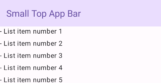
סרגל אפליקציה קטן בחלק העליון
כדי ליצור סרגל אפליקציות קטן בחלק העליון, משתמשים ב-composable TopAppBar. זהו סרגל האפליקציות העליון הפשוט ביותר שאפשר ליצור, ובדוגמה הזו הוא מכיל רק שם.
בדוגמה הבאה לא מועבר ל-TopAppBar ערך של scrollBehavior, ולכן סרגל האפליקציות העליון לא מגיב לגלילה של התוכן הפנימי.
התוצאה
סרגל האפליקציה העליון מיושר למרכז
סרגל האפליקציות העליון שממורכז באמצע זהה לסרגל האפליקציות הקטן, מלבד העובדה שהכותרת ממוקמת במרכז הרכיב. כדי להטמיע את הרכיב הזה, משתמשים ב-composable הייעודי CenterAlignedTopAppBar.
בדוגמה הזו נעשה שימוש ב-enterAlwaysScrollBehavior() כדי לקבל את הערך שהוא מעביר עבור scrollBehavior. הסרגל מתכווץ כשהמשתמש גולל את התוכן הפנימי של התבנית.
התוצאה

סרגל אפליקציה בינוני בחלק העליון
בסרגל האפליקציות הבינוני בחלק העליון, הכותרת ממוקמת מתחת לסמלים נוספים. כדי ליצור אחד, משתמשים ב-composable MediumTopAppBar.
בדומה לקוד הקודם, בדוגמה הזו נעשה שימוש ב-enterAlwaysScrollBehavior() כדי לקבל את הערך שהוא מעביר ל-scrollBehavior.
התוצאה
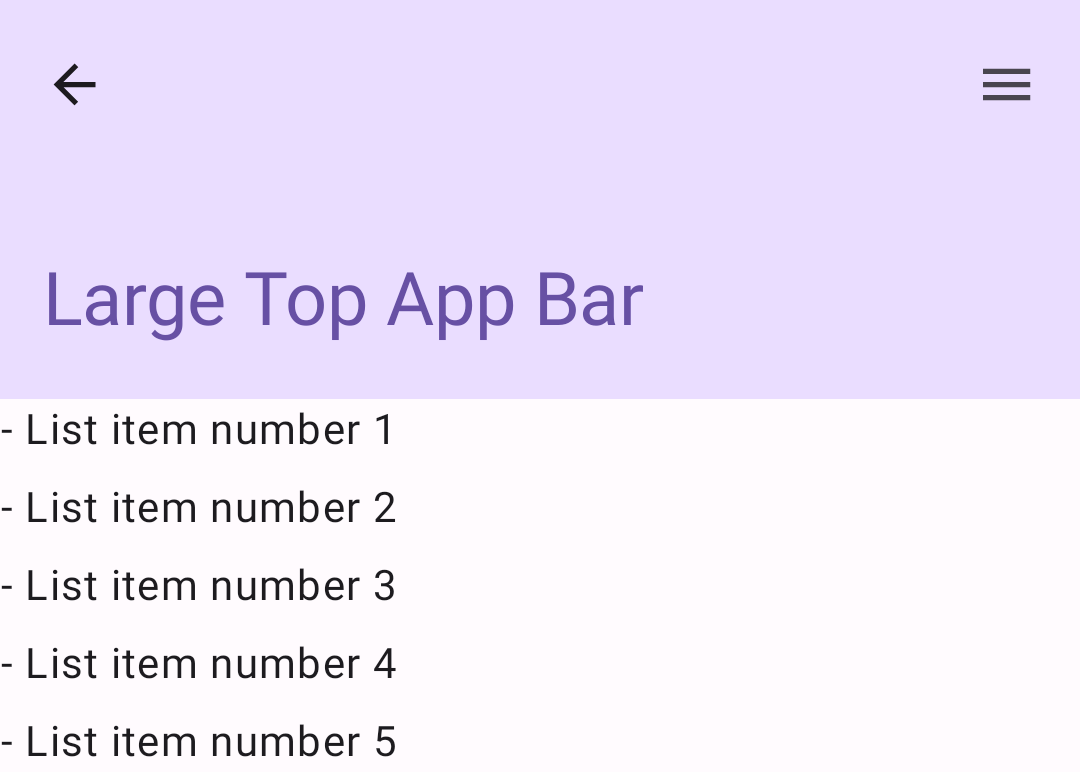
enterAlwaysScrollBehavior.סרגל אפליקציה גדול בחלק העליון
סרגל האפליקציות העליון הגדול דומה לסרגל האפליקציות הבינוני, אבל הריווח בין השם לסמלים גדול יותר והוא תופס יותר מקום במסך באופן כללי. כדי ליצור רכיב כזה, משתמשים ברכיב ה-composable LargeTopAppBar.
בדוגמה הזו נעשה שימוש ב-exitUntilCollapsedScrollBehavior() כדי לקבל את הערך שהוא מעביר ל-scrollBehavior. הסרגל מתכווץ כשהמשתמש גולל את התוכן הפנימי של התבנית, אבל מתרחב כשהמשתמש גולל עד סוף התוכן הפנימי.
התוצאה
הטמעת סרגל אפליקציה תחתון
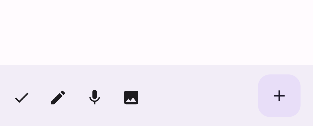
כדי ליצור סרגל אפליקציות בתחתית המסך, משתמשים ברכיב ה-Composable BottomAppBar, שהוא דומה לרכיב ה-Composable של סרגל האפליקציות בחלק העליון של המסך.
מעבירים רכיבים מורכבים לפרמטרים המרכזיים הבאים:
actions: סדרה של סמלים שמופיעים בצד ימין של הסרגל. בדרך כלל אלה פעולות מפתח במסך נתון או פריטים לניווט.floatingActionButton: לחצן הפעולה הצף שמופיע בצד שמאל של הסרגל.
התוצאה
נקודות עיקריות
- בדרך כלל מעבירים את שורת האפליקציות ל-composable
Scaffold, שיש לו פרמטרים ספציפיים לקבלת שורת האפליקציות. לרכיבי ה-Composables שבהם אתם משתמשים כדי להטמיע את שורת האפליקציות העליונה יש פרמטרים מרכזיים משותפים:
title: הטקסט שמופיע בסרגל האפליקציות.navigationIcon: הסמל הראשי לניווט, שמופיע בצד ימין של סרגל האפליקציות.actions: סמלים שמספקים למשתמש גישה לפעולות מפתח, שמופיעים בצד שמאל של סרגל האפליקציות.scrollBehavior: קובע איך סרגל האפליקציות העליון מגיב לגלילה של התוכן הפנימי של התבנית.colors: קובע איך סרגל האפליקציות יופיע.
אתם יכולים לקבוע איך שורת האפליקציה תגיב כשהמשתמש יגלול את התוכן הפנימי של התבנית. כדי לעשות זאת, יוצרים מופע של
TopAppBarScrollBehaviorומעבירים אותו לסרגל האפליקציות העליון עבור הפרמטרscrollBehavior. יש שלושה סוגים שלTopAppBarScrollBehavior:enterAlwaysScrollBehavior: כשהמשתמש גורר את התוכן הפנימי של התבנית למעלה, שורת האפליקציות העליונה מתכווצת. סרגל האפליקציות מתרחב כשהמשתמש מושך למטה את התוכן הפנימי.exitUntilCollapsedScrollBehavior: בדומה ל-enterAlwaysScrollBehavior, אבל סרגל האפליקציות מתרחב גם כשהמשתמש מגיע לסוף התוכן הפנימי של התבנית.pinnedScrollBehavior: סרגל האפליקציות נשאר במקום ולא מגיב לגלילה.
אוספים שמכילים את המדריך הזה
המדריך הזה הוא חלק מהאוספים הבאים של מדריכים מהירים, שמכסים יעדים רחבים יותר לפיתוח Android:
הצגת רכיבים אינטראקטיביים