קל לארגן דפים בעזרת אוספים
אפשר לשמור ולסווג תוכן על סמך ההעדפות שלך.
הרכיב Dialog מציג הודעות קופצות או מבקש קלט מהמשתמש בשכבה מעל תוכן האפליקציה הראשי. הוא יוצר חוויית ממשק משתמש מפריעה כדי למשוך את תשומת הלב של המשתמש.
תרחישים לדוגמה לשימוש בתיבת דו-שיח:
אישור הפעולה של המשתמש, למשל כשמוחקים קובץ.
בקשה לקלט של משתמש, למשל באפליקציה של רשימת משימות.
הצגת רשימה של אפשרויות לבחירת המשתמש, כמו בחירת מדינה בהגדרת פרופיל.
כדי להטמיע את הקוד הזה, צריך להגדיר את minSDK של הפרויקט לרמת API 21 ואילך.
יחסי תלות
יצירת תיבת דו-שיח של התראה
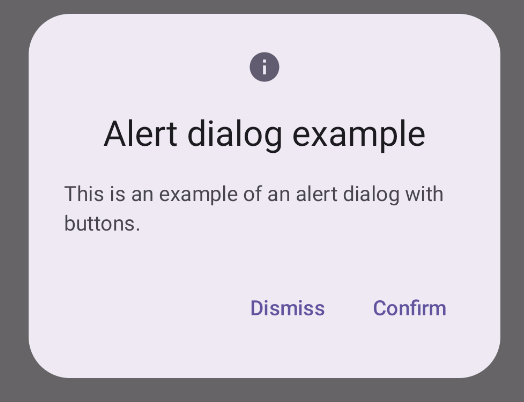
הרכיב הניתן לקיבוץ AlertDialog מספק ממשק API נוח ליצירת תיבת דו-שיח בסגנון Material Design. בדוגמה הבאה מוטמעים שני לחצנים בתיבת דו-שיח של התראה, אחד לסגירת תיבת הדו-שיח והשני לאישור הבקשה:
ההטמעה הזו מתייחסת לרכיב קומפוזיציה הורה שמעביר ארגומנטים לרכיב הקומפוזיציה הצאצא באופן הבא:
תוצאות
איור 1. תיבת דו-שיח עם התראה עם לחצנים.
נקודות עיקריות
ל-AlertDialog יש פרמטרים ספציפיים לטיפול ברכיבים מסוימים של תיבת הדו-שיח. בין היתר:
title: הטקסט שמופיע בחלק העליון של תיבת הדו-שיח.
text: הטקסט שמופיע במרכז תיבת הדו-שיח.
icon: הגרפיקה שמופיעה בחלק העליון של תיבת הדו-שיח.
onDismissRequest: הפונקציה שנקראת כשהמשתמש סוגר את תיבת הדו-שיח, למשל על ידי הקשה מחוץ אליה.
dismissButton: רכיב מורכב שמשמש כלחצן הסגירה.
confirmButton: רכיב מורכב שמשמש כלחצן אישור.
כשהמשתמש לוחץ על אחד מהלחצנים, תיבת הדו-שיח נסגרת. כשהמשתמש לוחץ על 'אישור', מתבצעת קריאה לפונקציה שמטפלת גם באישור. בדוגמה הזו, הפונקציות האלה הן onDismissRequest() ו-onConfirmRequest().
במקרים שבהם תיבת הדו-שיח דורשת קבוצה מורכבת יותר של לחצנים, מומלץ להשתמש ב-Dialog הניתן ליצירה ולהוסיף לו תוכן באופן חופשי יותר.
יצירת תיבת דו-שיח
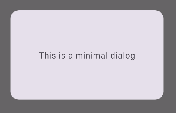
Dialog הוא רכיב מורכב בסיסי שלא מספק עיצוב או משבצות מוגדרות מראש לתוכן. זהו מאגר פשוט שצריך לאכלס אותו במאגר כמו Card. ריכזנו כאן כמה מהפרמטרים העיקריים של תיבת דו-שיח:
onDismissRequest: פונקציית הלוגריתם הרגולרי (lambda) שנקראת כשהמשתמש סוגר את תיבת הדו-שיח.
properties: מופע של DialogProperties שמספק היקף נוסף של התאמה אישית.
יצירת תיבת דו-שיח בסיסית
הדוגמה הבאה היא הטמעה בסיסית של ה-composable Dialog. שימו לב שהוא משתמש ב-Card בתור הקונטיינר המשני. בלי Card, הרכיב Text יופיע לבד מעל לתוכן הראשי של האפליקציה.
התוצאה
חשוב לזכור שכשהתיבה נפתחת, תוכן האפליקציה הראשי שמתחתיה מופיע כהה ואפור:
איור 2. תיבת דו-שיח מינימלית.
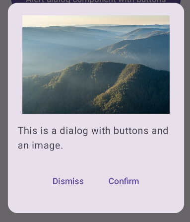
יצירת תיבת דו-שיח מתקדמת
בהמשך מופיעה הטמעה מתקדמת יותר של ה-composable Dialog. במקרה הזה, הרכיב מטמיע באופן ידני ממשק דומה לדוגמה AlertDialog שלמעלה.
התוצאה
איור 3. תיבת דו-שיח שכוללת תמונה.
אוספים שמכילים את המדריך הזה
המדריך הזה הוא חלק מהאוספים הבאים של מדריכים מהירים, שמכסים יעדים רחבים יותר לפיתוח Android:
הטקסט שיוצג
טקסט הוא רכיב מרכזי בכל ממשק משתמש. כאן מוסבר איך אפשר להציג טקסט באפליקציה כדי לספק חוויית משתמש נעימה.
דוגמאות התוכן והקוד שבדף הזה כפופות לרישיונות המפורטים בקטע רישיון לתוכן. Java ו-OpenJDK הם סימנים מסחריים או סימנים מסחריים רשומים של חברת Oracle ו/או של השותפים העצמאיים שלה.
עדכון אחרון: 2025-02-06 (שעון UTC).
[null,null,["עדכון אחרון: 2025-02-06 (שעון UTC)."],[],[],null,["\u003cbr /\u003e\n\nThe [`Dialog`](/reference/kotlin/androidx/compose/ui/window/package-summary#Dialog(kotlin.Function0,androidx.compose.ui.window.DialogProperties,kotlin.Function0)) component displays pop-up messages or requests user input on a\nlayer above the main app content. It creates an interruptive UI experience to\ncapture user attention.\n\nAmong the use cases for a dialog are the following:\n\n- Confirming user action, such as when deleting a file.\n- Requesting user input, such as in a to-do list app.\n- Presenting a list of options for user selection, like choosing a country in a profile setup.\n\nThis topic provides the following implementations:\n\n- [Alert](#alert)\n- [Basic dialog](#basic)\n- [Advanced dialog](#advanced)\n\nVersion compatibility\n\nThis implementation requires that your project minSDK be set to API level 21 or\nhigher.\n\nDependencies\n\nCreate an Alert dialog\n\nThe [`AlertDialog`](/reference/kotlin/androidx/compose/material3/package-summary#AlertDialog(kotlin.Function0,kotlin.Function0,androidx.compose.ui.Modifier,kotlin.Function0,kotlin.Function0,kotlin.Function0,kotlin.Function0,androidx.compose.ui.graphics.Shape,androidx.compose.ui.graphics.Color,androidx.compose.ui.graphics.Color,androidx.compose.ui.graphics.Color,androidx.compose.ui.graphics.Color,androidx.compose.ui.unit.Dp,androidx.compose.ui.window.DialogProperties)) composable provides a convenient API for creating a\nMaterial Design themed dialog. The following example implements two buttons in\nan alert dialog, one that dismisses the dialog, and another that confirms its\nrequest:\n\nThis implementation implies a parent composable that passes arguments to the\nchild composable in this way:\n\nResults **Figure 1.** An alert dialog with buttons.\n\nKey points\n\n`AlertDialog` has specific parameters for handling particular elements of the\ndialog. Among them are the following:\n\n- `title`: The text that appears along the top of the dialog.\n- `text`: The text that appears centered within the dialog.\n- `icon`: The graphic that appears at the top of the dialog.\n- `onDismissRequest`: The function called when the user dismisses the dialog, such as by tapping outside of it.\n- `dismissButton`: A composable that serves as the dismiss button.\n- `confirmButton`: A composable that serves as the confirm button.\n\n- When the user clicks either of the buttons, the dialog closes. When the user\n clicks confirm, it calls a function that also handles the confirmation. In\n this example, those functions are `onDismissRequest()` and\n `onConfirmRequest()`.\n\n In cases where your dialog requires a more complex set of buttons, you may\n benefit from using the `Dialog` composable and populating it in a more\n freeform manner.\n\nCreate a dialog\n\n[`Dialog`](/reference/kotlin/androidx/compose/ui/window/package-summary#Dialog(kotlin.Function0,androidx.compose.ui.window.DialogProperties,kotlin.Function0)) is a basic composable that doesn't provide any styling or\npredefined slots for content. It is a straightforward container that you should\npopulate with a container such as `Card`. The following are some of the key\nparameters of a dialog:\n\n- **`onDismissRequest`**: The lambda called when the user closes the dialog.\n- **`properties`** : An instance of [`DialogProperties`](/reference/kotlin/androidx/compose/ui/window/DialogProperties) that provides some additional scope for customization.\n\n| **Caution:** You must manually specify the size and shape of `Dialog`. You also must provide an inner container.\n\nCreate a basic dialog\n\nThe following example is a basic implementation of the `Dialog` composable. Note\nthat it uses a `Card` as the secondary container. Without the `Card`, the `Text`\ncomponent would appear alone above the main app content.\n\nResult\n\nNote that when the dialog is open, the main app content beneath it appears\ndarkened and grayed out:\n**Figure 2.** Minimal dialog.\n\nCreate an advanced dialog\n\nThe following is a more advanced implemented of the `Dialog` composable. In this\ncase, the component manually implements a similar interface to the preceding\n`AlertDialog` example.\n| **Caution:** If you only need to display a two-button dialog as in this example, you should use `AlertDialog` and its more convenient API. However, if you want to create a more complex dialog, perhaps with forms and multiple buttons, you should use `Dialog` with custom content, as in the following example.\n\nResult **Figure 3.** A dialog that includes an image.\n\nCollections that contain this guide\n\nThis guide is part of these curated Quick Guide collections that cover\nbroader Android development goals: \n\nDisplay text \nText is a central piece of any UI. Find out different ways you can present text in your app to provide a delightful user experience. \n[Quick guide collection](/develop/ui/compose/quick-guides/collections/display-text) \n\nRequest user input \nLearn how to implement ways for users to interact with your app by entering text and using other means of input. \n[Quick guide collection](/develop/ui/compose/quick-guides/collections/request-user-input) \n\nDisplay interactive components \nLearn how composable functions can enable you to easily create beautiful UI components based on the Material Design design system. \n[Quick guide collection](/develop/ui/compose/quick-guides/collections/display-interactive-components) \n\nHave questions or feedback \nGo to our frequently asked questions page and learn about quick guides or reach out and let us know your thoughts. \n[Go to FAQ](/quick-guides/faq) [Leave feedback](https://issuetracker.google.com/issues/new?component=1573691&template=1993320)"]]