


在 Jetpack Compose Glimmer 中,介面會使用形狀定義視覺邊界和圓角。Shapes 類別提供不同程度的圓角,適用於各種元件。
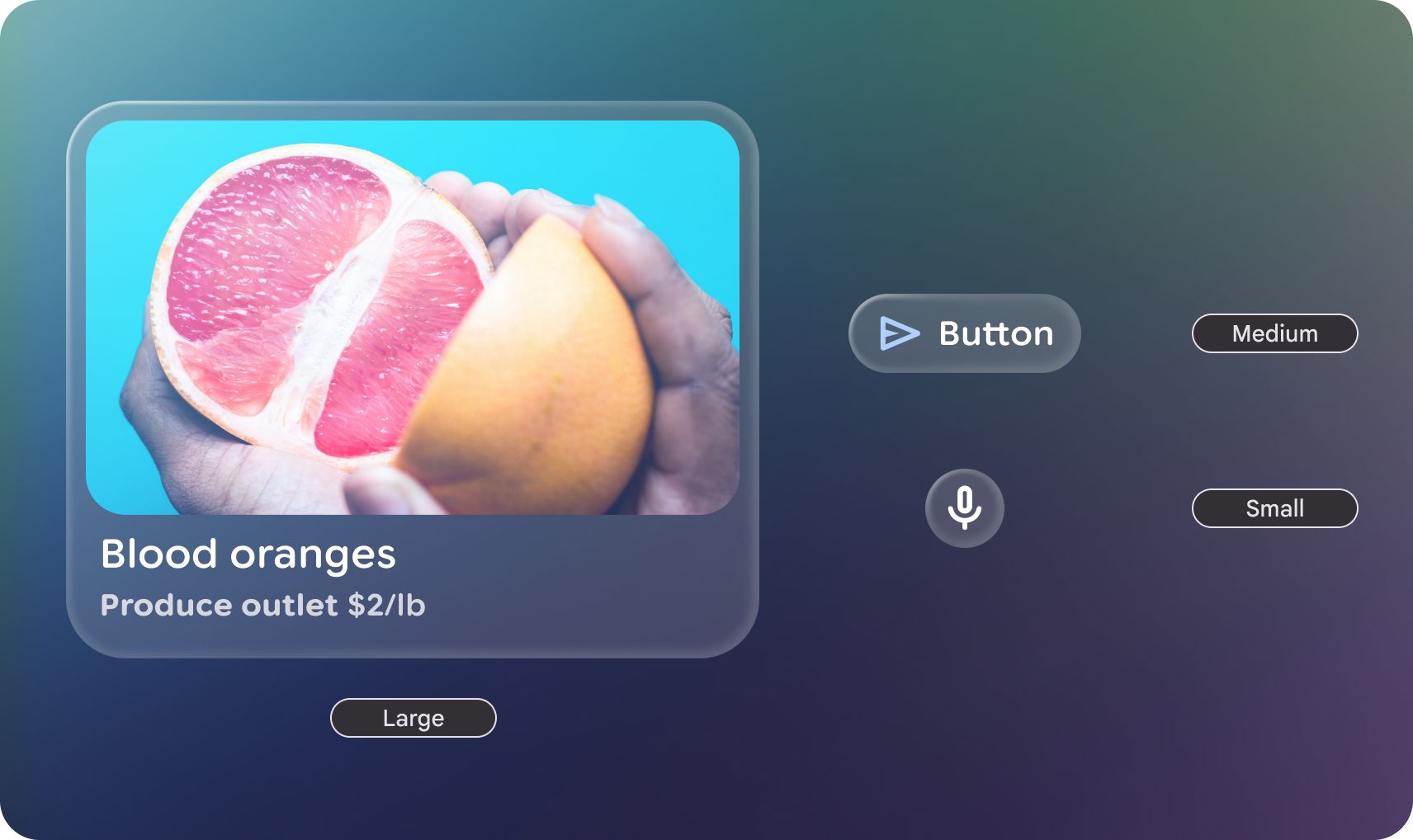
形狀類別
GlimmerTheme 類別定義了三種標準形狀大小:
- 小:四個角的大小相同,這項屬性適用於資訊卡等元件。根據預設,這是 24.dp 的
RoundedCornerShape。 - 中:四個邊角大小相同,介於「小」和「大」之間。這是最常用的形狀,也是介面預設使用的形狀。根據預設,這是 36.dp 的
RoundedCornerShape。 - 大:四個角完全圓弧的形狀。這個形狀用於按鈕等元件。預設值為
CircleShape。
範例:從 GlimmerTheme 取得形狀並套用至元件
首先,從 GlimmerTheme.shapes 取得定義的形狀,然後將這些形狀套用至部分元件:
@Composable fun ShapesSample() { val shapes = GlimmerTheme.shapes GlimmerLazyColumn { item { ShapeItem("small", shape = shapes.small) } item { ShapeItem("medium", shape = shapes.medium) } item { ShapeItem("large", shape = shapes.large) } } } @Composable private fun ShapeItem(name: String, shape: Shape, modifier: Modifier = Modifier) { val interactionSource = remember { MutableInteractionSource() } Box( modifier .aspectRatio(2.5f) .fillMaxWidth() .surface(interactionSource = interactionSource, shape = shape), contentAlignment = Alignment.Center, ) { Text(name) } }
自訂形狀
Shapes 類別為 @Immutable。您可以複製現有主題形狀,並使用複製函式覆寫特定值。這麼做可維持主題結構,同時調整應用程式品牌的特定半徑。
範例:覆寫特定形狀值
下列程式碼會覆寫特定形狀值:
@Composable fun CustomShapesSample() { val customShapes = GlimmerTheme.shapes.copy( small = RoundedCornerShape(12.dp), medium = RoundedCornerShape(20.dp) ) val interactionSource = remember { MutableInteractionSource() } Box( Modifier .aspectRatio(2.5f) .fillMaxWidth() .surface(interactionSource = interactionSource, shape = customShapes.small), contentAlignment = Alignment.Center, ) { Text("custom small") } }
預設值
如未在 GlimmerTheme 中另行指定,系統會預設為下列值:
| 權杖 | 預設形狀 | 大小或半徑 |
|---|---|---|
|
|
24.dp |
|
|
36.dp |
|
|
Fully Rounded |