
Concepts and Jetpack Compose implementation
Android Studio supports a variety of XML attributes in the tools namespace
that enable design-time features, such as which layout to show in a fragment, or
compile-time behaviors, such as which shrinking mode to apply to your XML
resources. When you build your app, the build tools remove these attributes so
that there is no effect on your APK size or runtime behavior.
To use these attributes, add the tools namespace to the root element of each
XML file where you'd like to use them, as shown here:
<RootTag xmlns:android="http://schemas.android.com/apk/res/android"
    xmlns:tools="http://schemas.android.com/tools" >
Error-handling attributes
The following attribute helps suppress lint warning messages:
tools:targetApi
Intended for: Any element
Used by: Lint
This attribute works the same as the @TargetApi annotation in Java
code. It lets you specify the API level (either as an integer or as a code name)
that supports this element.
This tells the tools that you believe this element and any children are
used only on the specified API level or higher. This stops lint from warning you
if that element or its attributes are not available on the API level you specify
as your minSdkVersion.
For example, you might use this attribute because GridLayout is only
available on API level 14 and higher, but you know this layout is not used in
your code for any lower versions:
<GridLayout xmlns:android="http://schemas.android.com/apk/res/android"
    xmlns:tools="http://schemas.android.com/tools"
    tools:targetApi="14" >
(However, note that we recommend that you use GridLayout
from the support library instead.)
Design-time view attributes
The following attributes define layout characteristics that are visible only in the Android Studio layout preview.
tools: instead of android:
Intended for: <View>
Used by: Android Studio layout editor
You can insert sample data in your layout preview by using the tools: prefix
instead of android: with any <View> attribute from the Android framework.
This is useful when the attribute's value isn't populated until runtime and you
want to see the effect in the layout preview.
For example, if the android:text attribute value is set at runtime, or you
want to see the layout with a value different than the default, you can add
tools:text to specify some text for the layout preview only.
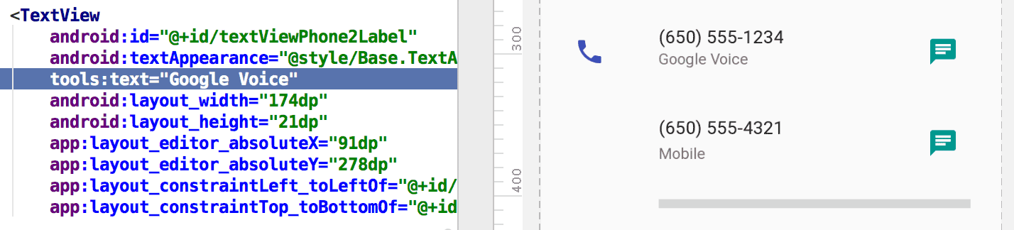
tools:text
attribute sets "Google Voice" as the value for the layout preview.You can add both the android: namespace attribute, which is used at
runtime, and the matching tools: attribute, which overrides the runtime
attribute in the layout preview only.
You can also use a tools: attribute to undo an attribute setting for the
layout preview only. For example, if you have a FrameLayout with two children
but you want to see only one child in the layout preview, you can set one of
them to be invisible in the layout preview, as shown here:
<Button
    android:id="@+id/button"
    android:layout_width="wrap_content"
    android:layout_height="wrap_content"
    android:text="First" />

<Button
    android:id="@+id/button2"
    android:layout_width="wrap_content"
    android:layout_height="wrap_content"
    android:text="Second"
    tools:visibility="invisible"  />
When using the Layout Editor in
design view, the Properties window lets you edit some design-time
view attributes. Each design-time attribute is indicated with
a wrench icon  next to the
attribute name to distinguish it from the real attribute of the same name.
next to the
attribute name to distinguish it from the real attribute of the same name.
tools:context
Intended for: Any root <View>
Used by: Lint, Android Studio Layout Editor
This attribute declares which activity this layout is associated with by
default. This enables features in the editor or layout preview that require
knowledge of the activity, such as what the layout theme is in the
preview and where to insert onClick handlers generated from a
quickfix, as shown in figure 2.
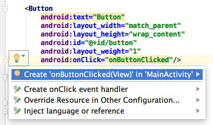
onClick
attribute works only if you've set tools:context.You can specify the activity class name using the same dot prefix as in the manifest file (excluding the full package name).
For example:
<android.support.constraint.ConstraintLayout
    xmlns:android="http://schemas.android.com/apk/res/android"
    xmlns:tools="http://schemas.android.com/tools"
    tools:context=".MainActivity" >
tools:itemCount
Intended for: <RecyclerView>
Used by: Android Studio Layout Editor
For a given RecyclerView this attribute specifies the number of items the
Layout Editor should render in the Preview window.
For example:
<androidx.recyclerview.widget.RecyclerView
    android:id="@+id/recyclerView"
    android:layout_width="match_parent"
    android:layout_height="match_parent"
    tools:itemCount="3"/>
tools:layout
Intended for: <fragment>
Used by: Android Studio Layout Editor
This attribute declares which layout you want the layout preview to draw inside the fragment because the layout preview can't execute the activity code that normally applies the layout.
For example:
<fragment android:name="com.example.main.ItemListFragment"
    tools:layout="@layout/list_content" />
tools:listitem, tools:listheader, tools:listfooter
Intended for: <AdapterView> (and subclasses like <ListView>)
Used by: Android Studio Layout Editor
These attributes specify which layout to show in the layout preview for a list's items, header, and footer. Any data fields in the layout are filled with numeric contents, such as "Item 1," so that the list items are not repetitive.
For example:
<ListView xmlns:android="http://schemas.android.com/apk/res/android"
    xmlns:tools="http://schemas.android.com/tools"
    android:id="@android:id/list"
    android:layout_width="match_parent"
    android:layout_height="match_parent"
    tools:listitem="@layout/sample_list_item"
    tools:listheader="@layout/sample_list_header"
    tools:listfooter="@layout/sample_list_footer" />
tools:showIn
Intended for: Any root <View> in a layout that's referred to by an
<include>
Used by: Android Studio Layout Editor
This attribute lets you point to a layout that uses this layout using
<include>, so you can
preview and edit this file as it appears while embedded in its parent layout.
For example:
<TextView xmlns:android="http://schemas.android.com/apk/res/android"
    xmlns:tools="http://schemas.android.com/tools"
    android:text="@string/hello_world"
    android:layout_width="wrap_content"
    android:layout_height="wrap_content"
    tools:showIn="@layout/activity_main" />
Now the layout preview shows this TextView layout as it appears inside the
activity_main layout.
tools:menu
Intended for: Any root <View>
Used by: Android Studio Layout Editor
This attribute specifies which menu the layout preview shows in the
app bar. The value is one or more menu IDs,
separated by commas, without @menu/ or any such ID prefix and without
the .xml extension.
For example:
<?xml version="1.0" encoding="utf-8"?>
<LinearLayout xmlns:android="http://schemas.android.com/apk/res/android"
    xmlns:tools="http://schemas.android.com/tools"
    android:orientation="vertical"
    android:layout_width="match_parent"
    android:layout_height="match_parent"
    tools:menu="menu1,menu2" />
tools:minValue, tools:maxValue
Intended for: <NumberPicker>
Used by: Android Studio Layout Editor
These attributes set minimum and maximum values for a NumberPicker view.
For example:
<NumberPicker xmlns:android="http://schemas.android.com/apk/res/android"
    xmlns:tools="http://schemas.android.com/tools"
    android:id="@+id/numberPicker"
    android:layout_width="match_parent"
    android:layout_height="wrap_content"
    tools:minValue="0"
    tools:maxValue="10" />
tools:openDrawer
Intended for: <DrawerLayout>
Used by: Android Studio Layout Editor
This attribute lets you open a DrawerLayout in the preview.
You can also modify how the Layout Editor renders the layout by passing one of the following values:
Table 1. Values to modify how the
Layout Editor renders a DrawerLayout
| Constant | Value | Description |
|---|---|---|
end | 800005 | Push object to the end of its container, not changing its size. |
left | 3 | Push object to the left of its container, not changing its size. |
right | 5 | Push object to the right of its container, not changing its size. |
start | 800003 | Push object to the beginning of its container, not changing its size. |
For example:
<androidx.drawerlayout.widget.DrawerLayout
    xmlns:android="http://schemas.android.com/apk/res/android"
    xmlns:tools="http://schemas.android.com/tools"
    android:id="@+id/drawer_layout"
    android:layout_width="match_parent"
    android:layout_height="match_parent"
    tools:openDrawer="start" />
"@tools:sample/*" resources
Intended for: Any view that supports UI text or images
Used by: Android Studio Layout Editor
This attribute lets you inject placeholder data or images into your view. For example, to test how your layout behaves with text before you have finalized UI text for your app, you can use placeholder text as follows:
<TextView xmlns:android="http://schemas.android.com/apk/res/android"
    xmlns:tools="http://schemas.android.com/tools"
    android:layout_width="wrap_content"
    android:layout_height="wrap_content"
    tools:text="@tools:sample/lorem" />
The following table describes the types of placeholder data you can inject into your layouts:
Table 2. Placeholder data for layouts
| Attribute value | Description of placeholder data |
|---|---|
@tools:sample/full_names |
Full names randomly generated from the combination of
@tools:sample/first_names and
@tools:sample/last_names |
@tools:sample/first_names |
Common first names |
@tools:sample/last_names |
Common last names |
@tools:sample/cities |
Names of cities from around the world |
@tools:sample/us_zipcodes |
Randomly generated US ZIP codes |
@tools:sample/us_phones |
Randomly generated phone numbers with the following format:
(800) 555-xxxx |
@tools:sample/lorem |
Placeholder text in Latin |
@tools:sample/date/day_of_week |
Randomized dates and times for the specified format |
@tools:sample/date/ddmmyy | |
@tools:sample/date/mmddyy | |
@tools:sample/date/hhmm | |
@tools:sample/date/hhmmss | |
@tools:sample/avatars |
Vector drawables that you can use as profile avatars |
@tools:sample/backgrounds/scenic |
Images that you can use as backgrounds |