
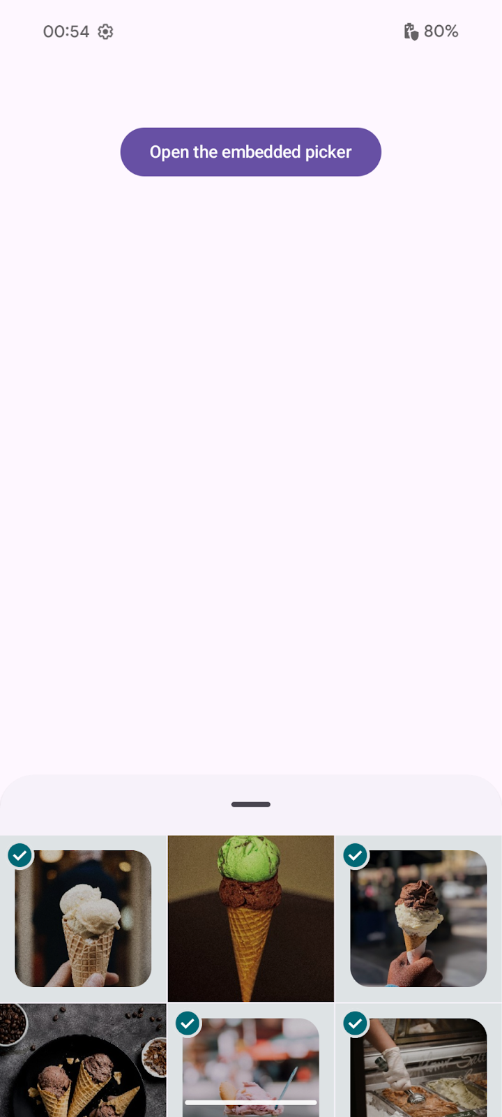
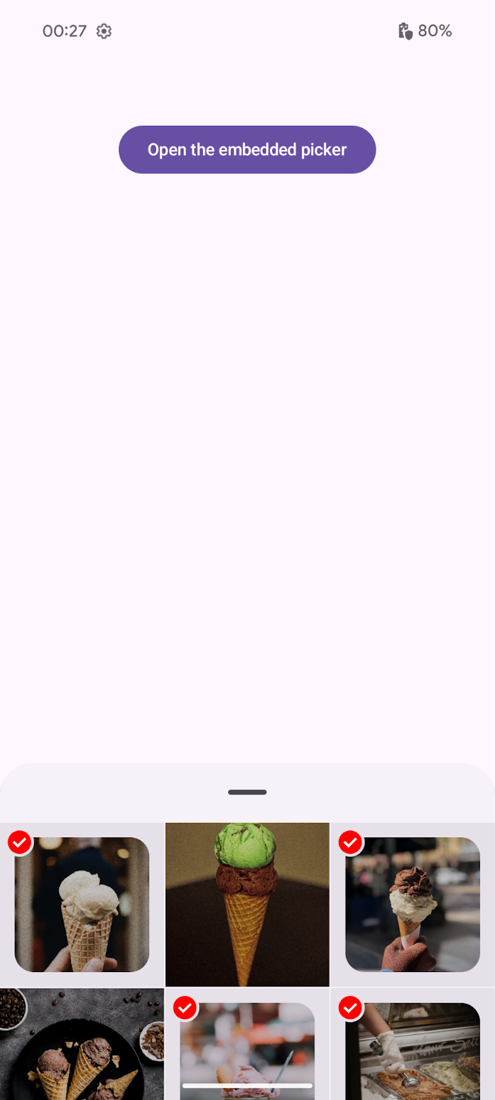
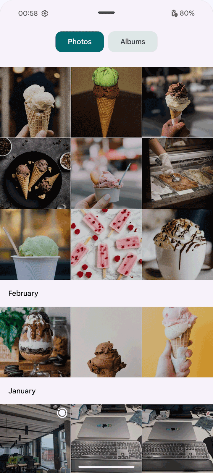
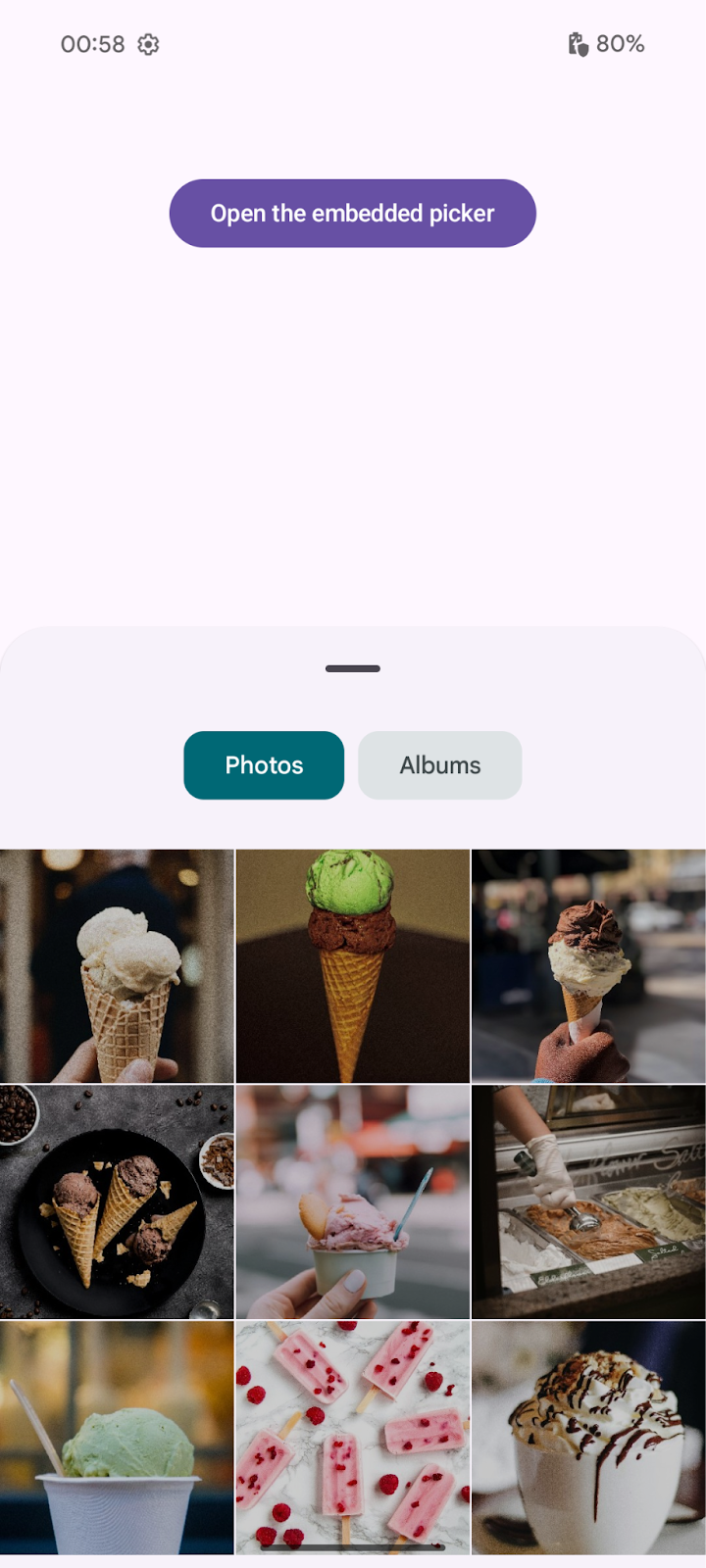
The embedded photo picker is a different form of photo picking experience,
allowing it to be interacted directly within apps's user interfaces. It offers
enhanced integration and customization options compared to the classic photo
picker. As it is rendered on a SurfaceView using the setChildSurfacePackage
method, it maintains the same security and privacy features of the non-embedded
version.
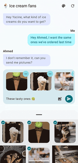
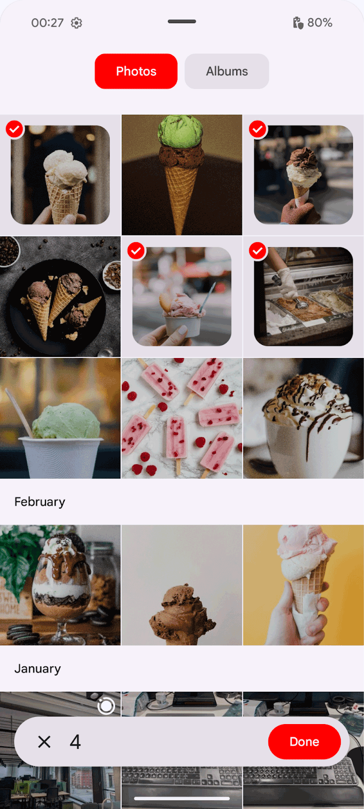
With the embedded photo picker, users can continuously select photos and videos from both their device and their cloud photo library without losing focus in the client app. The client app remains active, its activity is in a resumed state and can respond to user selections in real time.
The embedded photo picker offers more seamless UI integration but maintains the
same security and privacy features as the standard photo picker because it is
rendered on a special SurfaceView.
Device availability
The embedded photo picker is supported on devices running Android 14 (API level 34) with SDK Extensions version 15 or higher.
Devices that don't match these capabilities can rely on the classic photo picker or the backported version using Google Play services.
Jetpack library dependency
Include the Jetpack photo picker library as a dependency:
// For apps using Jetpack Compose
implementation("androidx.photopicker:photopicker-compose:1.0.0-alpha01")

// For apps using Views
implementation("androidx.photopicker:photopicker:1.0.0-alpha01")
You can integrate the embedded photo picker using Jetpack Compose (recommended) or Views.
Jetpack Compose integration
The EmbeddedPhotoPicker composable function provides a mechanism to include
the embedded photo picker UI directly within your Jetpack Compose screen. This
composable creates a SurfaceView which hosts the embedded photo picker UI. It
manages the connection to the EmbeddedPhotoPicker service, handles user
interactions, and communicates selected media URIs to the calling application
with few parameters to work:
val coroutineScope = rememberCoroutineScope()
val pickerState = rememberEmbeddedPhotoPickerState()

EmbeddedPhotoPicker(
    state = pickerState,
    onUriPermissionGranted = { uris ->
        _attachments.value += uris
    },
    onUriPermissionRevoked = { uris ->
        _attachments.value -= uris
    },
    onSelectionComplete = {
        // Hide the embedded photo picker as the user is done with the
        // photo/video selection
    },
)
Continuous selection
The embedded photo picker allows users to continuously select and deselect items from the photo library without closing the picker. The items selected and deselected in the app's UI are synchronized with the photo picker, providing a seamless user experience.
Deselect Uri using the deselectUri or deselectUris method from
pickerState to notify the embedded picker that the user has unselected an item
from the app's UI. Updating your own app UI state manually is necessary, as
calling these methods won't notify your app of any newly-revoked URIs through
the onUriPermissionRevoked callback.
coroutineScope.launch {
    // Signal unselected media to the picker
    pickerState.deselectUris(uris)
    // Remove them from the list of selected media to be reflected in the app's UI
    _attachments.value -= uris
}
Personalize the photo picker
The embedded photo picker offers options for personalization, allowing you to tailor its appearance and behavior to better integrate with your app's design and user experience.
Accent color
By default, the embedded photo picker is relying on the dynamic colors provided
by the system that the user can set across apps in the device
theming options. The accent color will be used for various primary elements in
the photo picker. All other colors will be set based on Android material
guidelines. To personalise the accent color of the picker, define the
EmbeddedPhotoPickerFeatureInfo option:
val info = EmbeddedPhotoPickerFeatureInfo.Builder().setAccentColor(0xFF0000).build()

EmbeddedPhotoPicker(
    embeddedPhotoPickerFeatureInfo = info,
    ...
)
| Without setting accent color | With accent color (peak) | With accent color (expanded) |
|---|---|---|
|
|
|
The accent color must be fully opaque. The alpha (transparency) value is ignored. Only colors with a luminance (brightness) value between 0.05 and 0.9 are permitted.
Dimensions
By default, the size of the embedded picker isn't limited but you can specify a modifier to limit it:
EmbeddedPhotoPicker(
    modifier = Modifier.height(500.dp),
    ...
)
| Without limit (expanded) | With 500 dp limit (expanded) |
|---|---|
|
|
Views integration
To add the embedded photo picker using Views, add an entry to your layout file:
<view class="androidx.photopicker.EmbeddedPhotoPickerView"
    android:id="@+id/photopicker"
    android:layout_width="match_parent"
    android:layout_height="match_parent" />
Then, initialize the photo picker in your activity's onCreate method by doing
the following:
- Obtain a reference to your
EmbeddedPhotoPickerViewfrom the layout - Add the
EmbeddedPhotoPickerStateChangeListenerto handle selection events - Configure the photo picker with
EmbeddedPhotoPickerFeatureInfo, including any custom settings like accent color
// Keep track of the selected media
private val _attachments = MutableStateFlow(emptyList<Uri>())
val attachments = _attachments.asStateFlow()

private lateinit var picker: EmbeddedPhotoPickerView
private var openSession: EmbeddedPhotoPickerSession? = null

val pickerListener = object : EmbeddedPhotoPickerStateChangeListener {
    override fun onSessionOpened(newSession: EmbeddedPhotoPickerSession) {
        // Keep reference to the session to notify the embedded picker of user
        // interactions on the calling app
        openSession = newSession
    }

    override fun onSessionError(throwable: Throwable) {}

    override fun onUriPermissionGranted(uris: List<Uri>) {
        // Add newly selected media to our tracked list
        _attachments += uris
    }

    override fun onUriPermissionRevoked(uris: List<Uri>) {
        // Remove newly unselected media from our tracked list
        _attachments -= uris
    }

    override fun onSelectionComplete() {
        // Hide the embedded photo picker as the user is done with the
        // photo/video selection
    }
}

override fun onCreate(savedInstanceState: Bundle?) {
    super.onCreate(savedInstanceState)

    setContentView(R.layout.main_view)
    picker = findViewById(R.id.photopicker)

    // Attach the embedded picker event listener to update the app's UI
    picker.addEmbeddedPhotoPickerStateChangeListener(pickerListener)

    // Customize embedded picker's features: accent color, max selectable items,
    // pre-selected URIs, filter out mime types
    picker.setEmbeddedPhotoPickerFeatureInfo(
        // Set a custom accent color
        EmbeddedPhotoPickerFeatureInfo.Builder().setAccentColor(0xFF0000).build()
    )
}
You can call with the different methods of EmbeddedPhotoPickerSession to
interact with the embedded picker:
// Notify the embedded picker of a configuration change
openSession.notifyConfigurationChanged(newConfig)

// Update the embedded picker to expand following a user interaction
openSession.notifyPhotoPickerExpanded(/* expanded: */ true)

// Resize the embedded picker
openSession.notifyResized(/* width: */ 512, /* height: */ 256)

// Show/hide the embedded picker (after a form has been submitted)
openSession.notifyVisibilityChanged(/* visible: */ false)

// Remove unselected media from the embedded picker after they have been
// unselected from the host app's UI
openSession.requestRevokeUriPermission(removedUris)