רשימה סוחפת היא שילוב של שורה של תוכן תצוגה מקדימה של נבחר. הוא מציג תוכן באזור תצוגה גדול יותר.
משאבים
| סוג | קישור | סטטוס |
|---|---|---|
| עיצוב | עיצוב של מקור (Figma) | יש גישה |
| הטמעה | דוגמה | לא רלוונטי |
המיטב
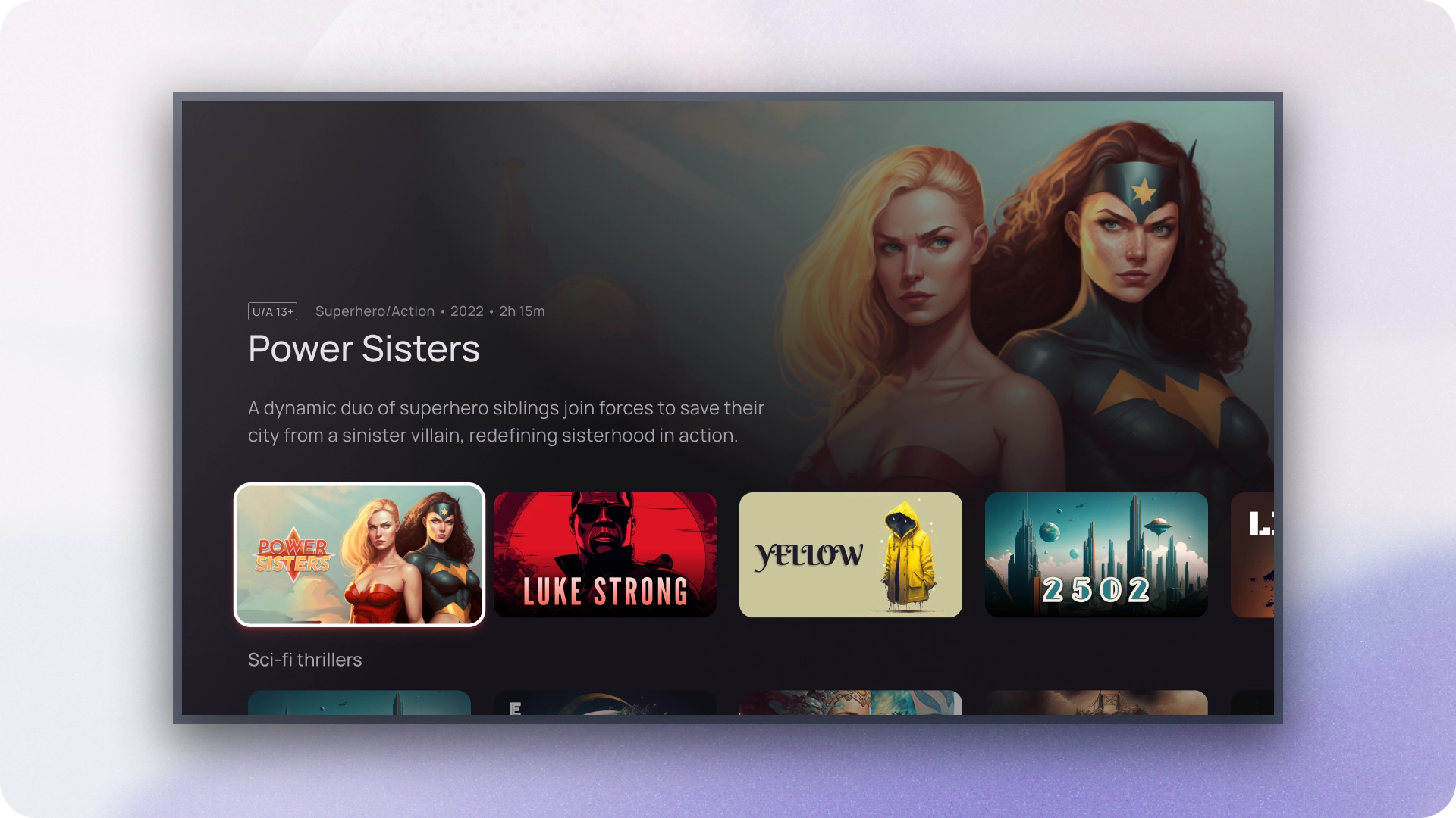
- תצוגה מקדימה של תוכן דינמי. כשמשתמש מנווט בשורה של תוכן, אזור התצוגה המקדימה יתעדכן באופן אוטומטי כדי להציג הפריט הנוכחי שבו מתמקדים.
- רכיב הרשימה הסוחפת כולל אזור תצוגה גדול יותר להציג תוכן, ולהקל על המשתמשים לראות ולהעריך הפרטים החזותיים של הפריט שבו מתמקדים.
- רשימות עשירות מספקות מידע רלוונטי ולפי הקשר לגבי הפריט שבו מתמקדים, עוזרים למשתמשים לקבל החלטות מושכלות ויוצאים מחוויית הגלישה.
- רכיב הרשימה העשירה משתמש בחשיפה הדרגתית כדי לחשוף פרטים נוספים על התוכן ככל שהמשתמשים מנווטים בו, צמצום קוגניטיביות טעינה ושמירה על מעורבות המשתמשים.
- רכיב הרשימה העשירה מבטיח אינטראקציות עקביות בכל האפליקציה, לספק למשתמשים חוויה מוכרת וצפויה.
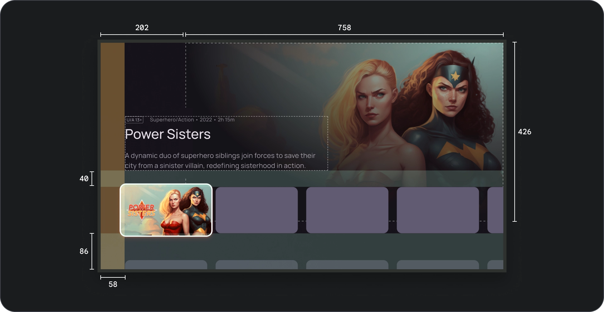
אנטומיה
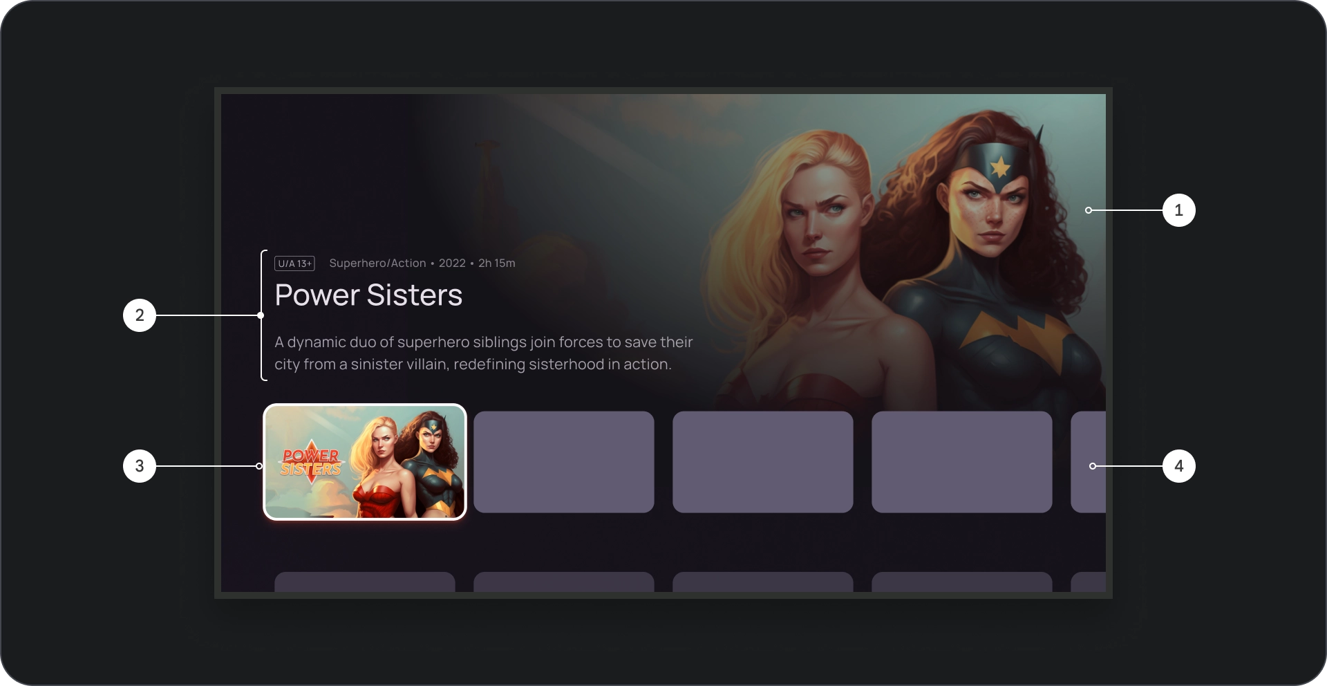
- רקע של תמונה
- חסימת תוכן
- הכרטיס בפוקוס
- רשת תוכן
- מיסוך קולנועי
- Poster
- צבע הרקע
מפרטים
התנהגות
כשמנווטים בין כרטיסים ברשימה העשירה, הפרטים של הכרטיס שנבחר נחשפות בהדרגה ברקע.
כשהרשימה העשירה ממוקדת, הגובה שלה גדל כדי לחשוף את הרשימה מידע נוסף, כמו כותרת הרקע של Google, כמו שאפשר לראות בסרטון הבא.
שימוש
כדאי להשתמש בקרוסלות סוחפות כשרוצים למשוך תשומת לב למודעות שמוצגות או תוכן מקודם, כמו סרטים חדשים, תוכניות פופולריות או תכנים בלעדיים כותרות. אזור התצוגה הגדול והתצוגה המקדימה הדינמית מספקות זו דרך להציג פריטים בעלי עדיפות גבוהה.
תצוגת תמונה
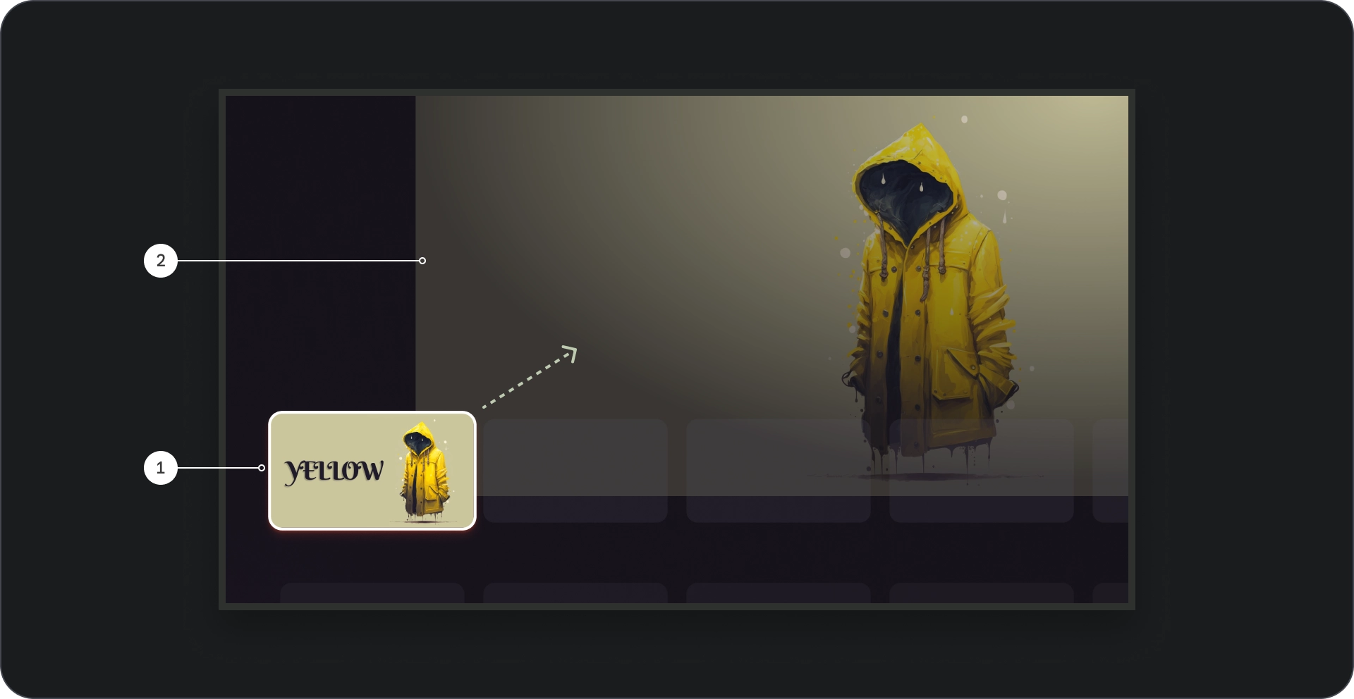
- מיקוד הכרטיס: כשהמשתמש מנווט בקרוסלה, כרטיס ממוקד מודגש מבחינה חזותית, שינוי גודל הכרטיס ב-1.1, באמצעות שוליים, וסימנים חזותיים אחרים כגובה כדי לציין את הבחירה שלו. מוודאים שהתוכן בתוך התמונה הממוזערת של הכרטיס שבו מתמקדים מוצגים בבירור גלויים וקל יותר לקרוא אותם.
- תמונת רקע: כשהכרטיס במוקד, רקע תואם מוצגת באזור התצוגה הגדול יותר. מומלץ להשתמש ברקע הזה היא באיכות גבוהה ומושכת מבחינה ויזואלית, כי היא מספקת רקע מעורר עניין של התוכן.
יצירה מוזיקלית
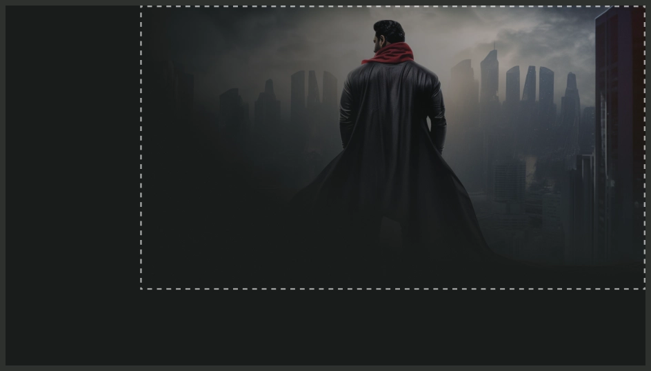
מה מותר לעשות
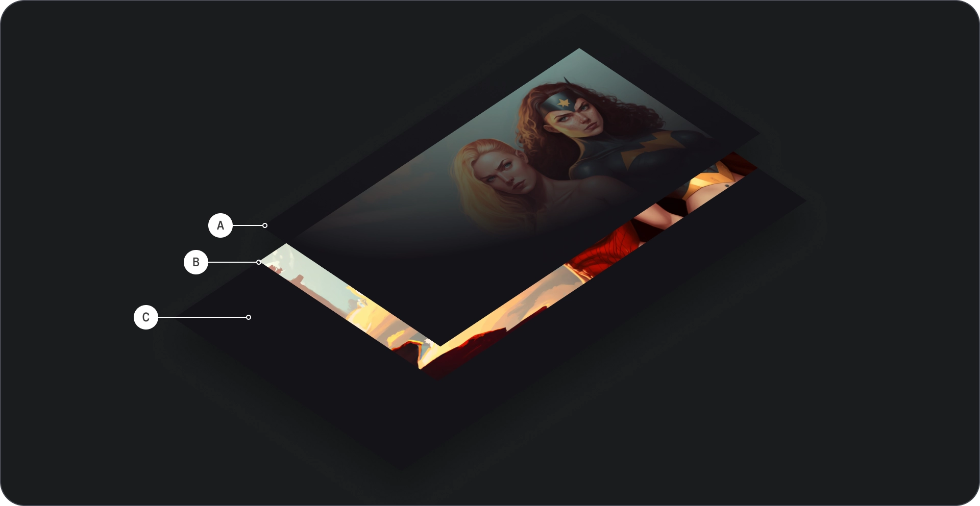
שינוי קנה המידה ויישור הנושא לפינה השמאלית העליונה כדי ליצור חוויה קולנועית.
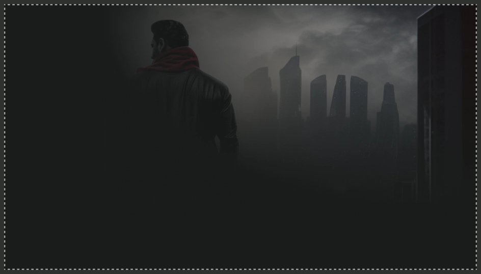
מה אסור לעשות
נמנעים משימוש בחיתוך מסך מלא שעלול לחתוך את נושא התמונה מתחת לתוכן.
כדי לוודא שהתמונות ישמשו כרקעים ברכיב של הרשימה העשירה נראות טוב, חשוב לשנות את הגודל שלהן בהתאם כדי שהן לא יהיו מטושטשות או מעוותות.
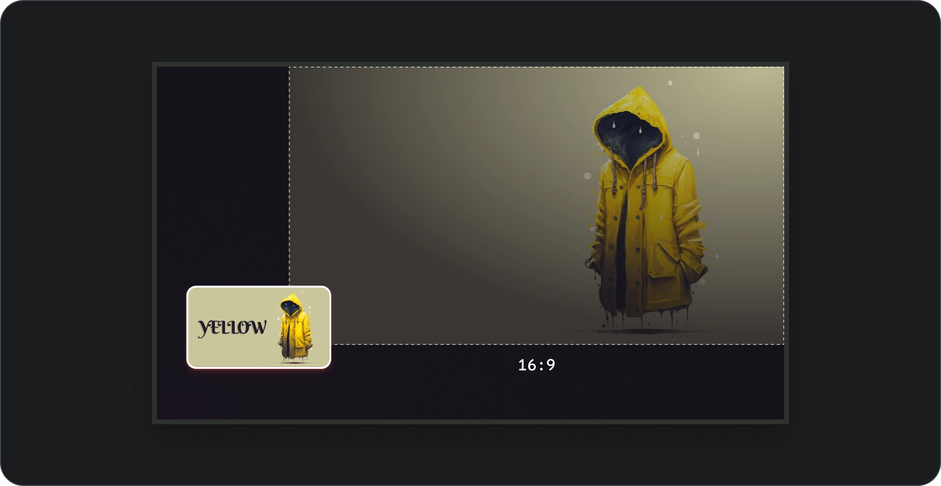
יחס גובה-רוחב
כשאפשר, כדאי להשתמש ביחס של 16:9 לתמונות רקע פריסה מעניינת ועקבית.