תיבות הניווט הן רכיבים חיוניים בכל אפליקציה לטלוויזיה, כי הן מאפשרות למשתמשים לגשת ליעדים ולתכונות שונים. תפריט הניווט הוא עמוד השדרה של ארכיטקטורת המידע של האפליקציה, והוא מספק דרך ברורה ואינטואיטיבית לנווט באפליקציה.
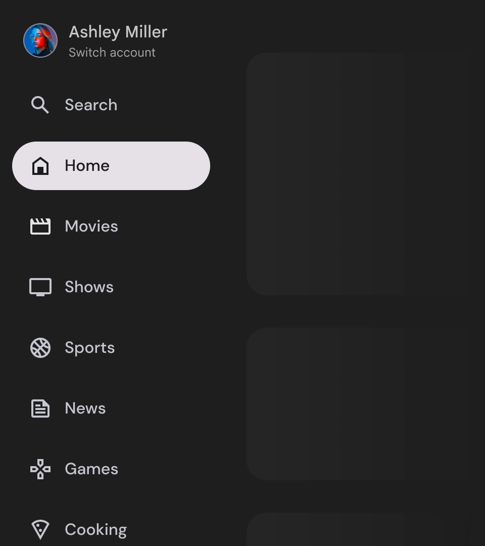
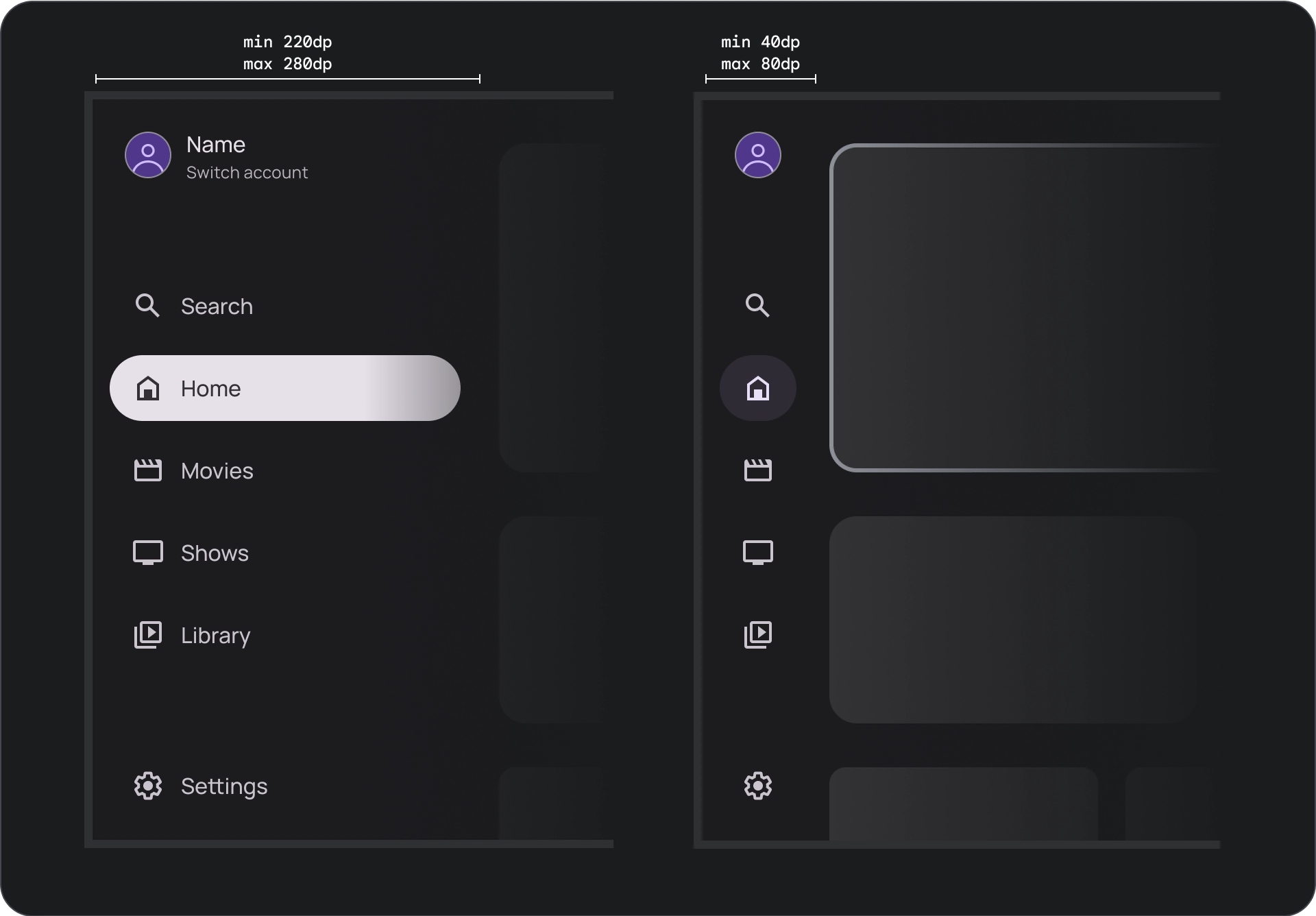
בניגוד למגירה הניווט בנייד, במגירה הניווט בטלוויזיה יש מצבים מורחבים ומוקטנים שגלויים למשתמש.
משאבים
| סוג | קישור | סטטוס |
|---|---|---|
| עיצוב | מקור העיצוב (Figma) | יש גישה |
| הטמעה |
Jetpack Compose (NavigationDrawer)
Jetpack Compose (ModalNavigationDrawer) |
יש גישה |
המיטב
- היעדים ממוינים לפי מידת החשיבות שלהם למשתמשים, כאשר היעדים הנפוצים מופיעים קודם ויעדים קשורים מקובצים יחד.
- כשמסנני הניווט מצומצמים, צריך להשתמש בסרגל הניווט גם בחלוניות הניווט הרגילות וגם בחלוניות הניווט המודאליות.
וריאנטים
יש שני סגנונות של תיבות ניווט:
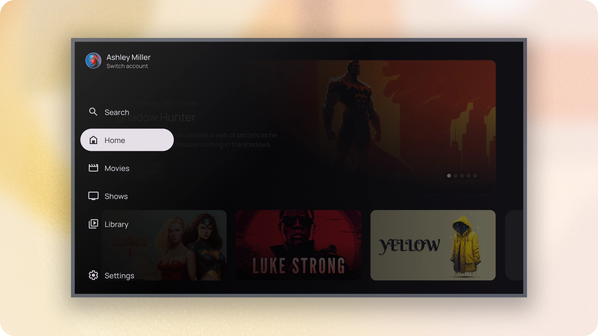
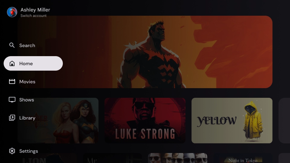
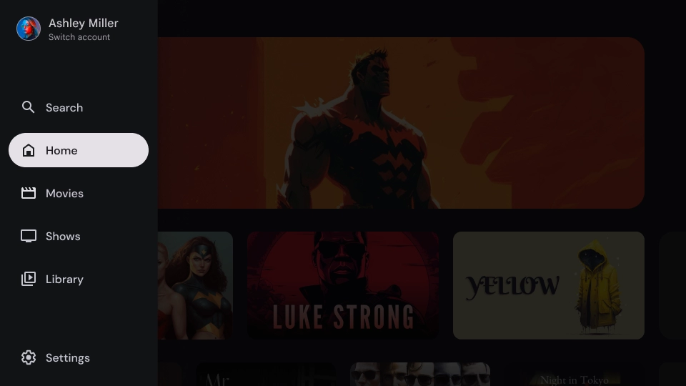
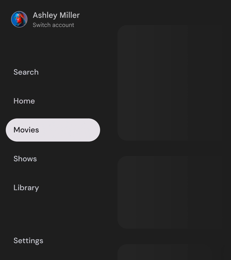
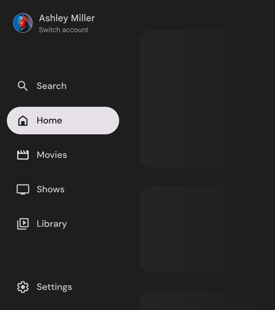
- חלונית ניווט רגילה – היא מתרחבת כדי ליצור מקום נוסף לניווט, ומזיזה את תוכן הדף הצידה.
- חלונית ניווט מודאלית – מוצגת כשכבת-על מעל התוכן של האפליקציה, עם שכבת-מסך שמסייעת לשפר את הקריאוּת כשהחלונית מורחבת.
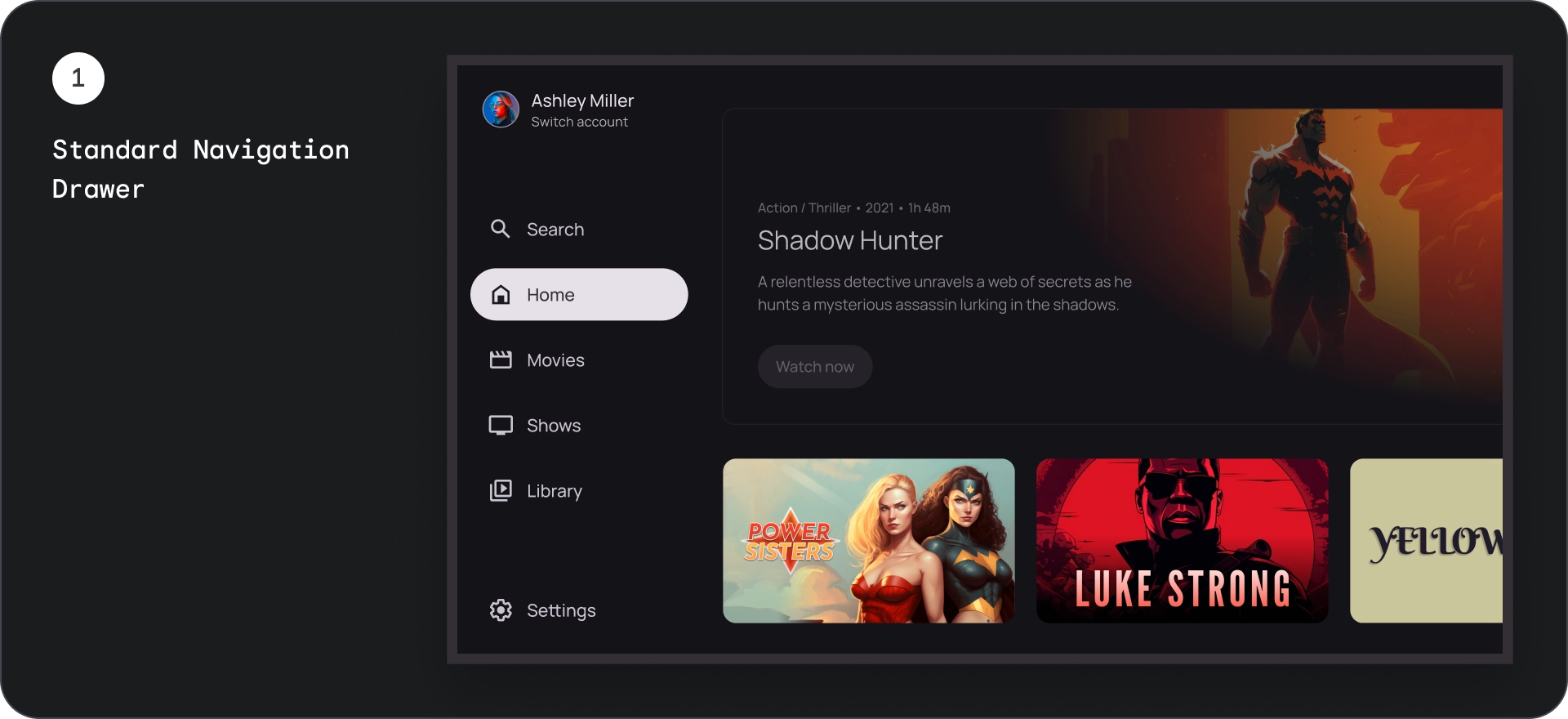
חלונית ההזזה לניווט הרגילה
אנטומיה
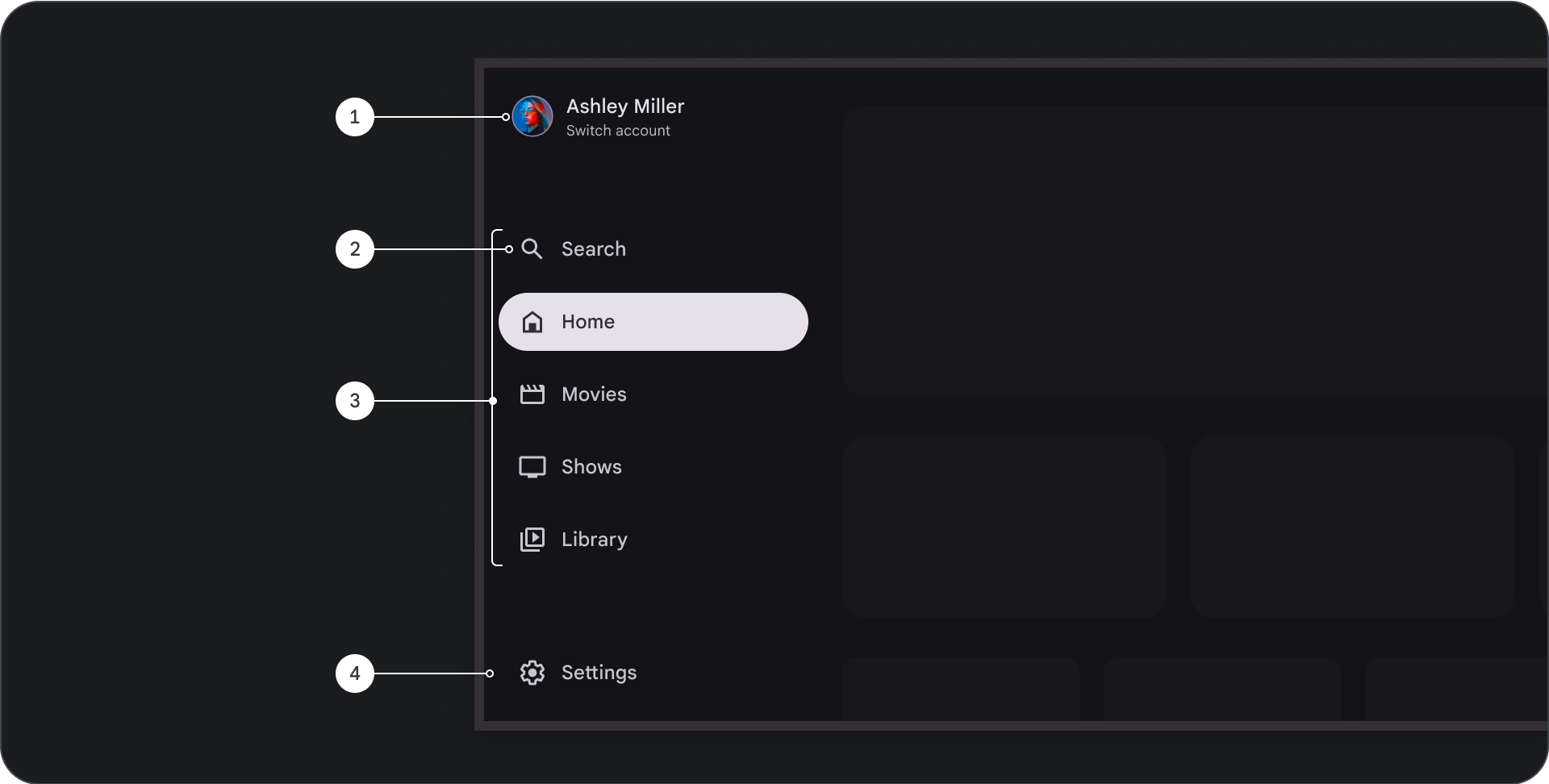
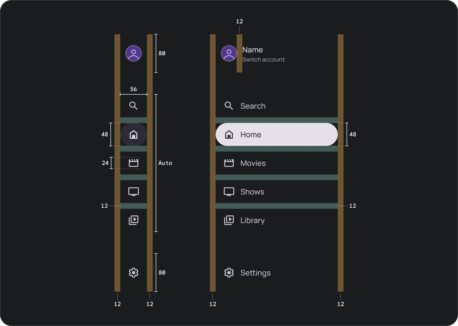
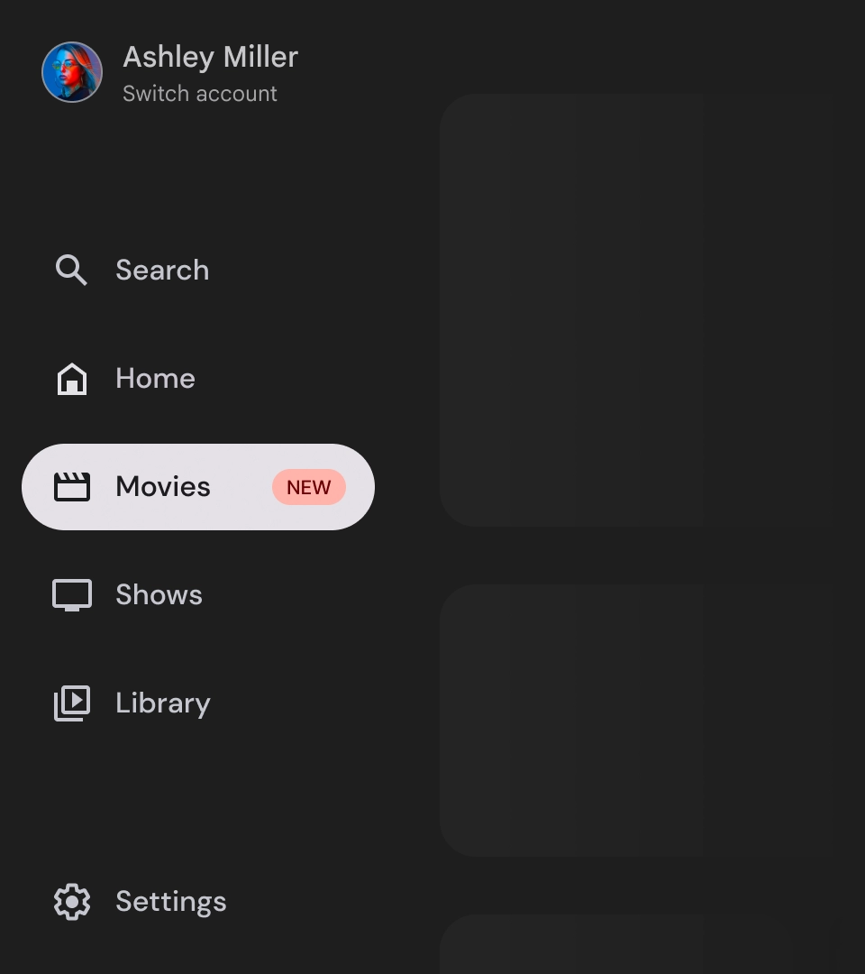
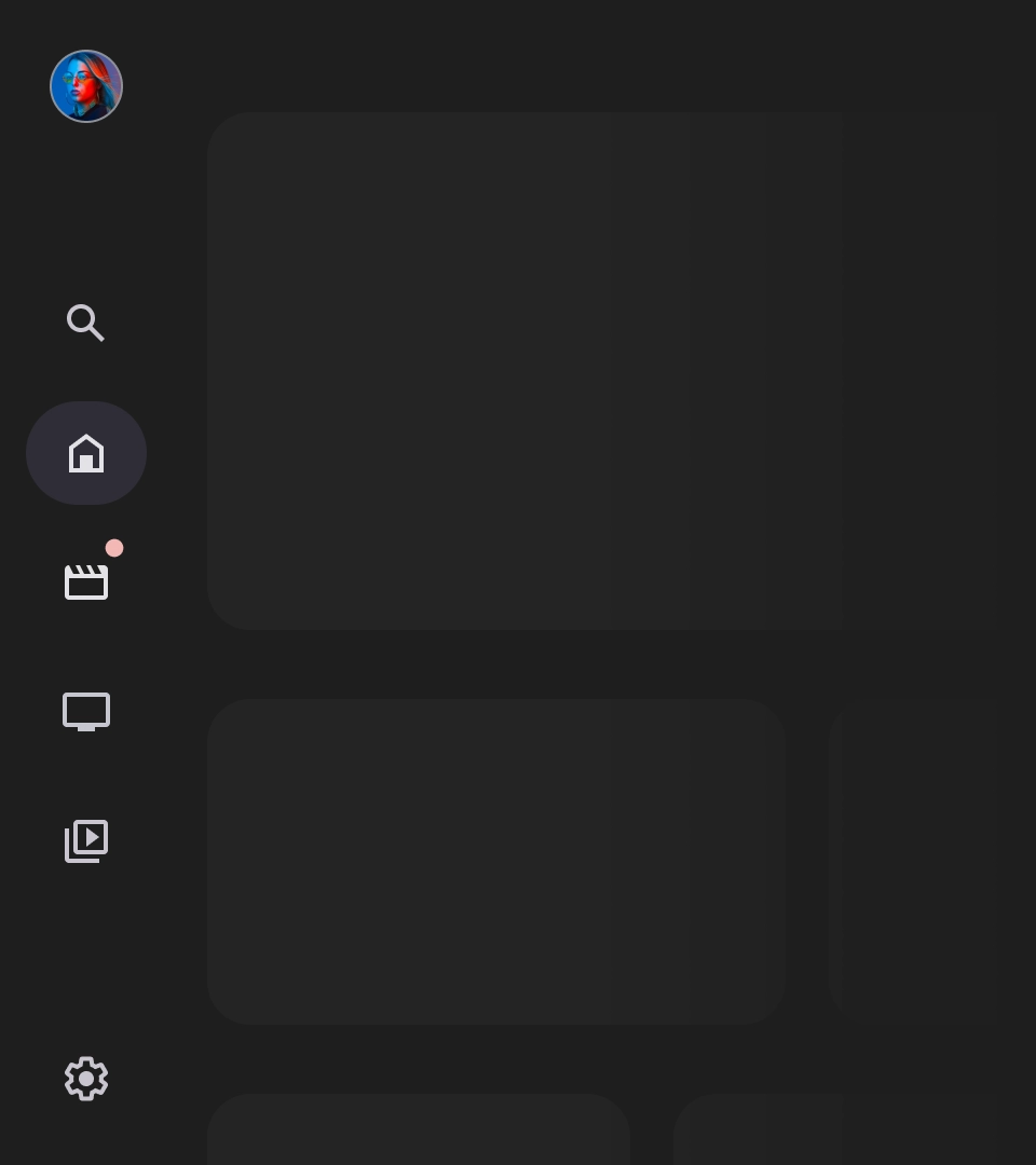
- החלק העליון: הלוגו של האפליקציה. משמש כלחצן להחלפת פרופילים או להפעלת פעולת חיפוש. במצב מכווץ, רק הסמל נשאר גלוי במכל העליון.
- פריט ניווט: כל פריט בסרגל הניווט כולל שילוב של סמל וטקסט, כאשר רק הסמל גלוי במצב מכווץ.
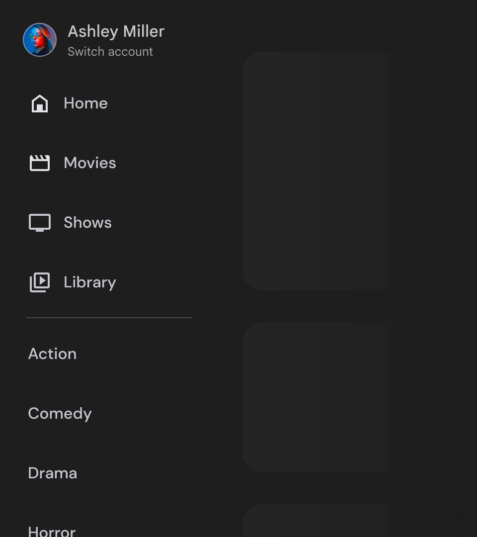
- סרגל הניווט: סרגל הניווט הוא עמודה שמציגה 3 עד 7 יעדי אפליקציות, והוא משמש בתור התפריט הראשי. לכל יעד יש תווית טקסט וסמל אופציונלי, ואפשר לקבץ את הפריטים בתפריט כדי לשפר את ההקשר.
- הקטע התחתון: יכול לכלול בין אחד לשלושה לחצני פעולה, שמתאימים לדפים כמו הגדרות, עזרה או פרופיל.
התנהגות
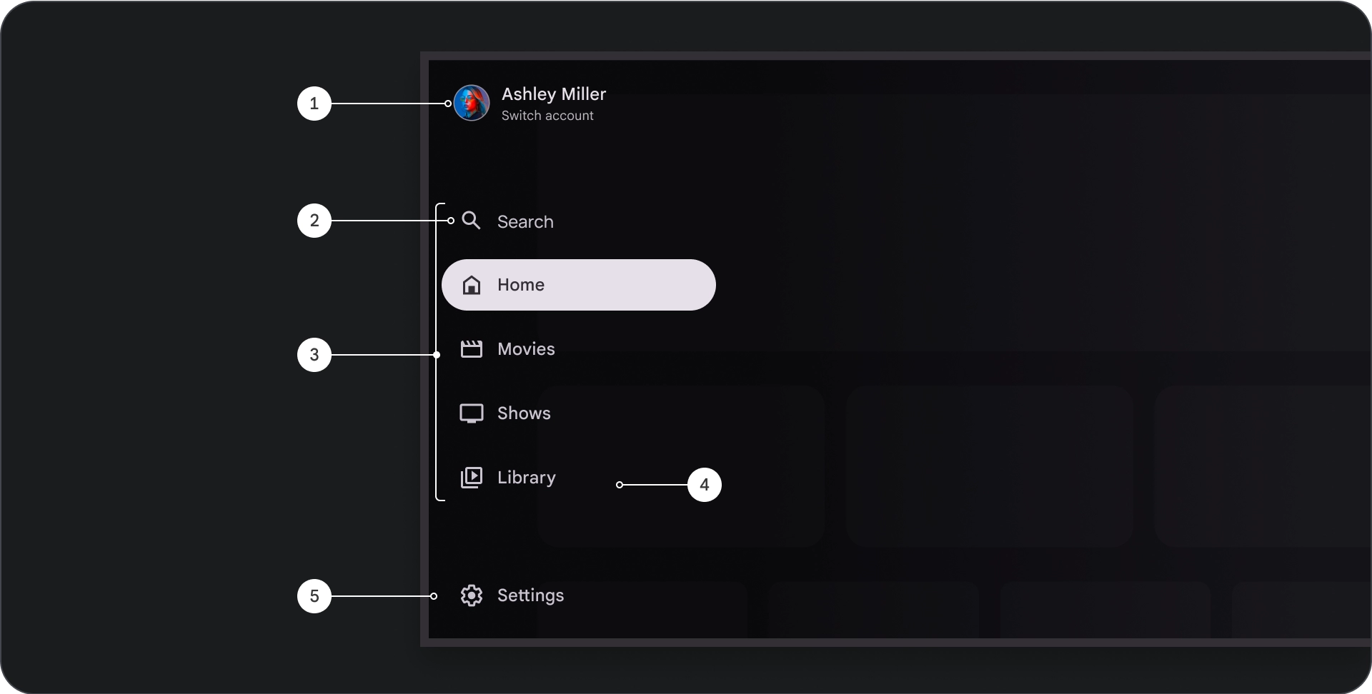
- הרחבה של חלונית הניווט: כשהיא מורחבת, חלונית הניווט הרגילה דוחפת את תוכן הדף כדי לפנות מקום לגרסה המורחבת של הניווט.
- עדכוני ניווט: כשעוברים מפריט ניווט אחד לפריט אחר, הדף מתעדכן באופן אוטומטי ליעד החדש.
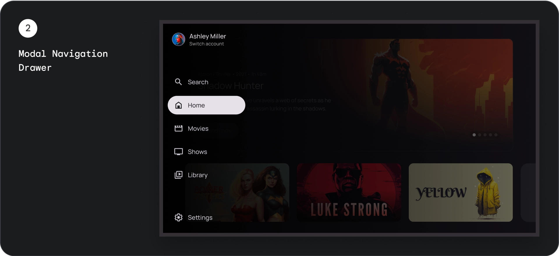
חלונית הזזה מודלית לניווט
אנטומיה
- החלק העליון: הלוגו של האפליקציה. משמש כלחצן להחלפת פרופילים או להפעלת פעולת חיפוש. במצב מכווץ, רק הסמל יישאר גלוי במאגר העליון.
- פריט ניווט: כל פריט בסרגל הניווט כולל שילוב של סמל וטקסט, כאשר רק הסמל גלוי במצב מכווץ.
- פס הניווט: עמודה שמציגה שלושה עד שבעה יעדים של אפליקציות, ומתפקדת בתור התפריט הראשי. לכל יעד יש תווית טקסט וסמל אופציונלי, ואפשר לקבץ את הפריטים בתפריט כדי לשפר את ההקשר.
- Scrim: לשיפור הקריאות של הטקסט של פריטי הניווט.
- הקטע התחתון: יכול לכלול בין אחד לשלושה לחצני פעולה, שמתאימים לדפים כמו הגדרות, עזרה או פרופיל.
התנהגות
- הרחבת התפריט: מופיע כשכבת-על מעל התוכן של האפליקציה, עם שכבת-על שקופה שמשפרת את הקריאוּת כשהתפריט מורחב.
- עדכוני ניווט: מתרחשים כשהמשתמש בוחר פריט ניווט.
מיסוך
בחלונית הניווט המוצגת בחלון עזר, שכבת 'מסך מעבר' מאחורי התיבה מבטיחה שתוכלו לקרוא את התוכן שבה. אפשר להשתמש בצבעים כהים או בהדרגה מאחורי חלונית הניווט כדי ליצור וריאציות שונות של ממשק המשתמש.
מיסוך בגוון מדורג
מיסוך מלא
המפרט

שימוש
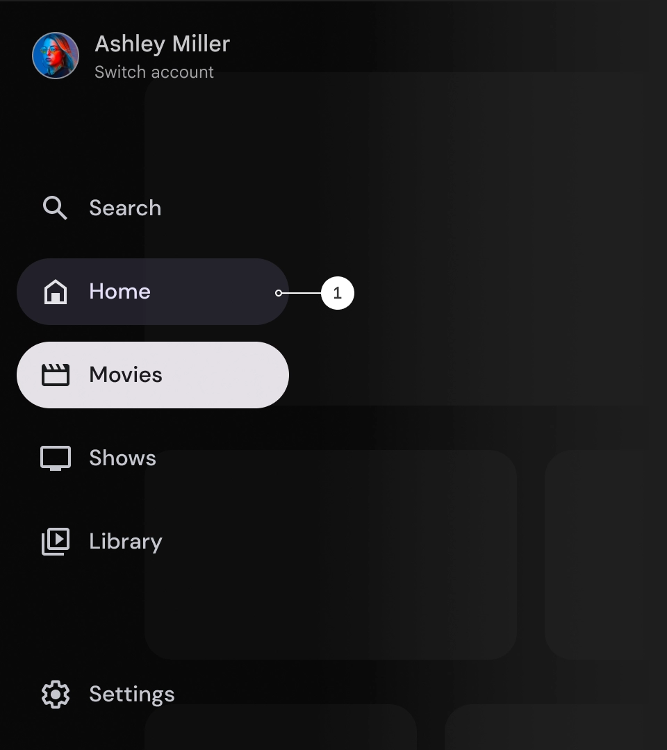
אינדיקטור פעיל
האינדיקטור הפעיל הוא סימן חזותי שמדגיש את היעד שמוצג בחלונית הניווט. בדרך כלל, האינדיקטור מיוצג על ידי צורה ברקע ששונה מבחינה ויזואלית מהפריטים האחרים בחלונית. האינדיקטור הפעיל עוזר למשתמשים להבין איפה הם נמצאים באפליקציה ואת היעד שבו הם צופים. חשוב לוודא שהסמל של המצב הפעיל גלוי בבירור וקל יותר להבדיל אותו מהפריטים האחרים בחלונית הניווט.
מחוגות וקליפרים (אופציונלי)
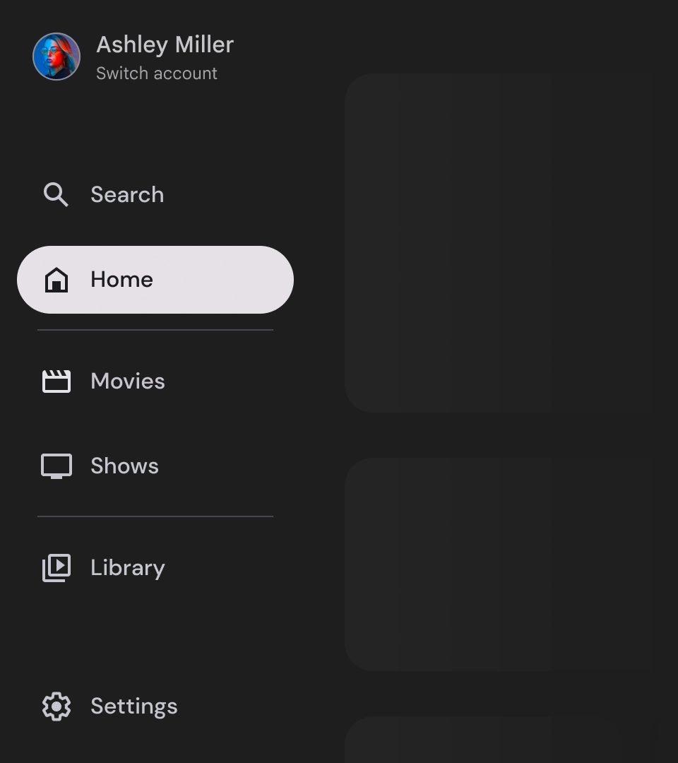
אפשר להשתמש בקווים מפרידים כדי להפריד בין קבוצות של יעדים בחלונית הניווט, וכך לארגן אותם טוב יותר. עם זאת, חשוב להשתמש בהם במשורה, כי יותר מדי מחיצות עלולות ליצור רעש חזותי ולהעמיס על המשתמשים מבחינה קוגניטיבית.
תגים
תגים הם סימנים חזותיים שאפשר להוסיף לפריטי הניווט כדי לספק מידע נוסף. לדוגמה, אפשר להשתמש בתג כדי לציין את מספר הסרטים החדשים שזמינים באפליקציית סטרימינג. מומלץ להשתמש בתגים במשורה ורק כשצריך, כי הם עלולים להפוך את ממשק המשתמש לעמוס ומבולגן. כשמשתמשים בתגים, חשוב לוודא שהם ברורים וקלים להבנה, ושהם לא מפריעים למשתמש לנווט באפליקציה.
תג מורחב
התג כוּוץ
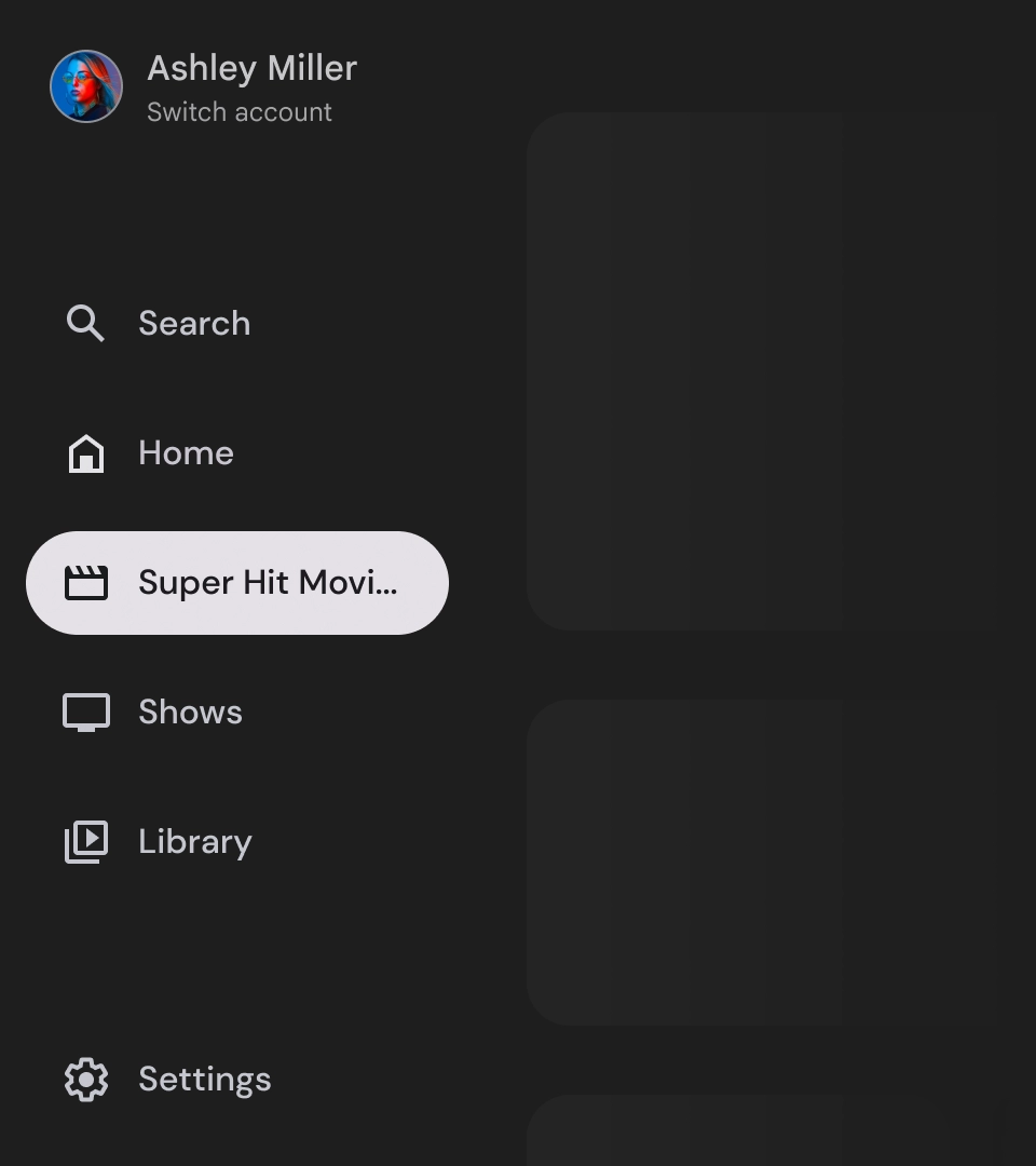
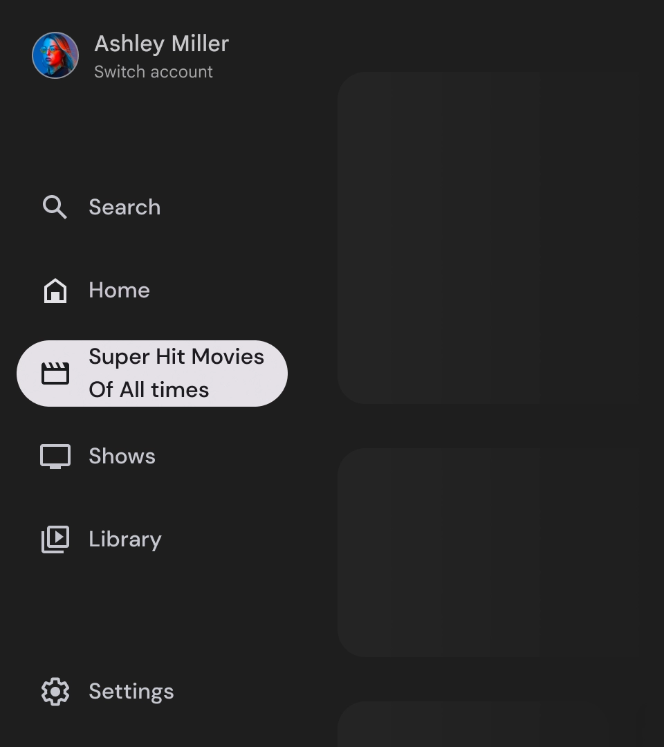
תוויות
התוויות במגירה הניווט צריכות להיות ברורות ותמציתיות כדי שיהיה קל יותר לקרוא אותן.
זהירות
מה אסור לעשות
מה אסור לעשות
מה אסור לעשות
תיבות הניווט הן רכיבים בסיסיים שמייצגים את היררכיית האפליקציה, וצריך להשתמש בהן כדי לרשום רק חמישה עד שישה יעדים ראשיים לניווט.
מה צריך לעשות