רשימות
קל לארגן דפים בעזרת אוספים
אפשר לשמור ולסווג תוכן על סמך ההעדפות שלך.
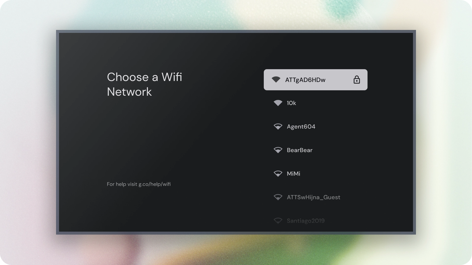
רשימות הן ייצוג חזותי של פריט אחד או יותר שקשורים זה לזה.
בדרך כלל נעשה בהם שימוש כדי להציג אוסף של אפשרויות.

משאבים
המיטב
- רשימות הן אוסף רציף של טקסט או תמונות.
- רשימות צריכות להיראות טבעיות ואפשריות לקריאה.
- רשימות מורכבות מפריטים שמכילים פעולות ראשיות ופעולות משלימות, שמיוצגות על ידי סמלים וטקסט.
וריאנטים
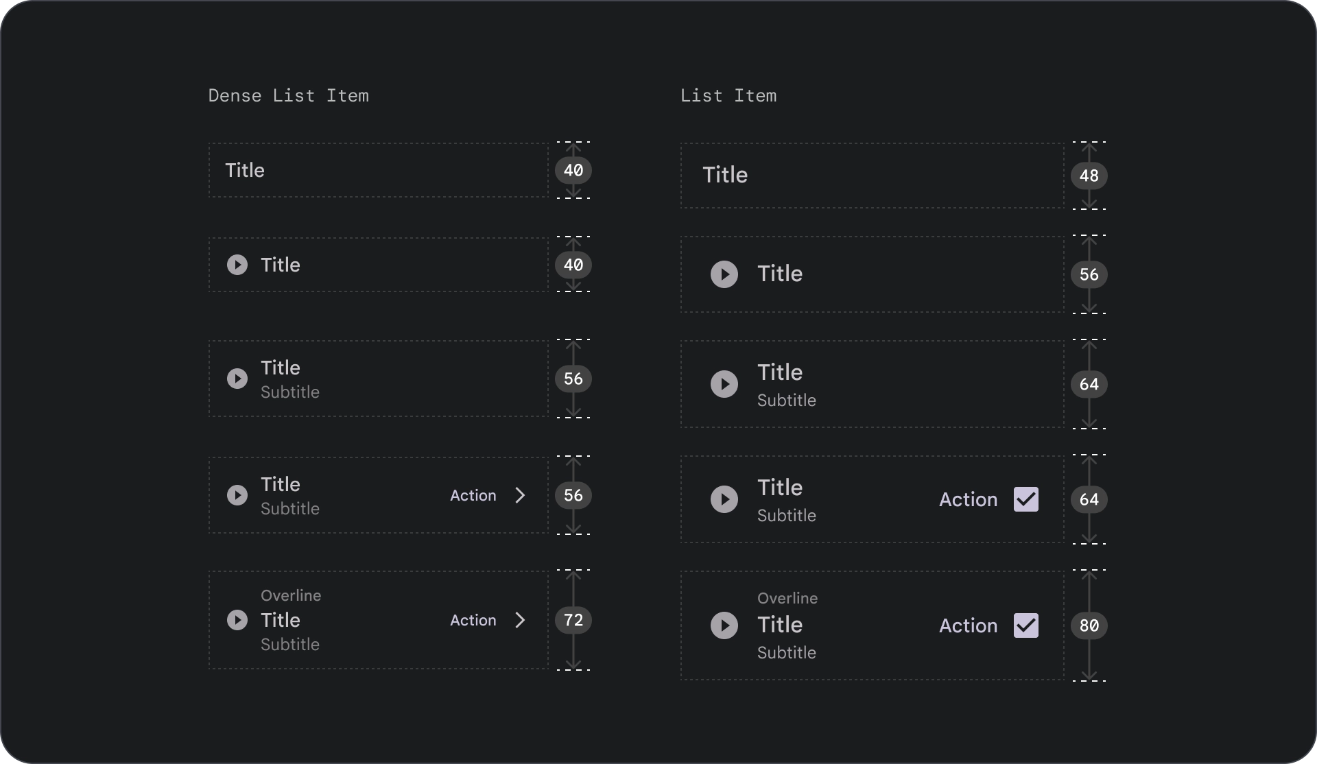
יש שלושה סוגים של רשימות: רשימה של שורה אחת, רשימה של שתיים ושלושה שורות.

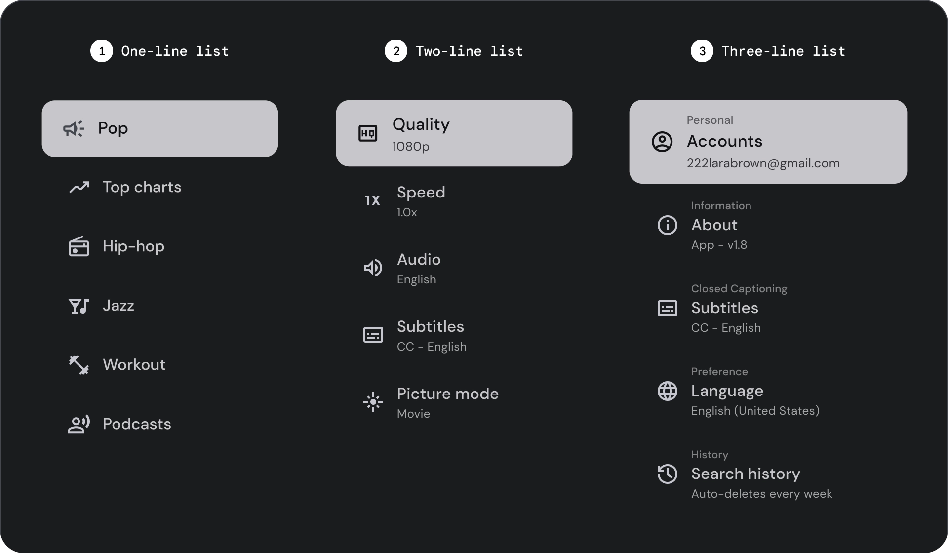
- רשימה של שורה אחת: שורה אחת שבה מוצג כל פריט. העיצוב הפשוט הזה מבטיח שכל פריט יהיה ברור ומוחשי.
- רשימת שורות כפולות: נעשה שימוש בשתי שורות מקבילות כדי להציג כל פריט.
העיצוב המובנה הזה מבטיח קריאה טבעית ומונעת עומס קוגניטיבי.
- רשימה של שלוש שורות: הרשימה מוצגת באמצעות שלוש שורות מקבילות שמייצגות כל פריט.
העיצוב הדקורטיבי הזה יוצר רמה גבוהה של בולטות ויזואלית.
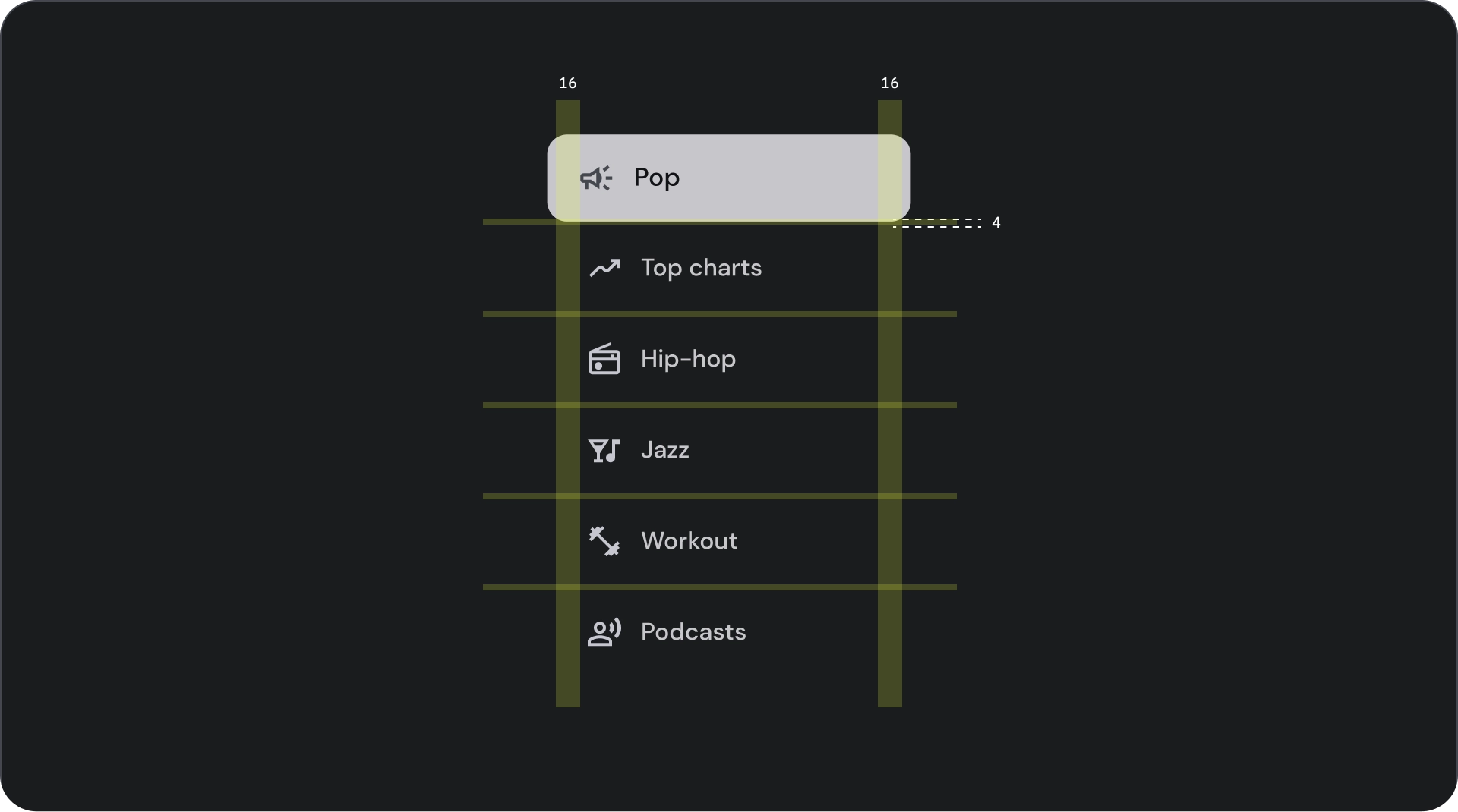
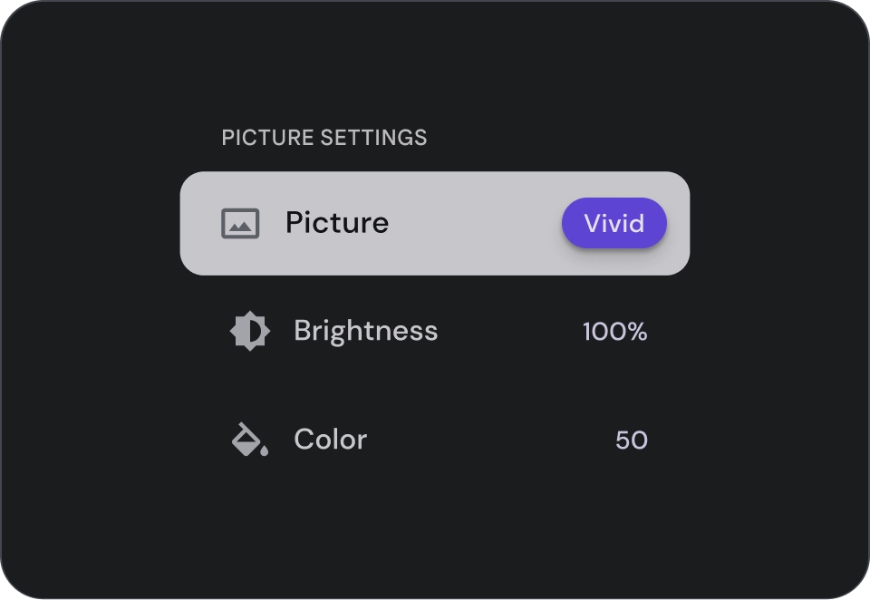
אנטומיה

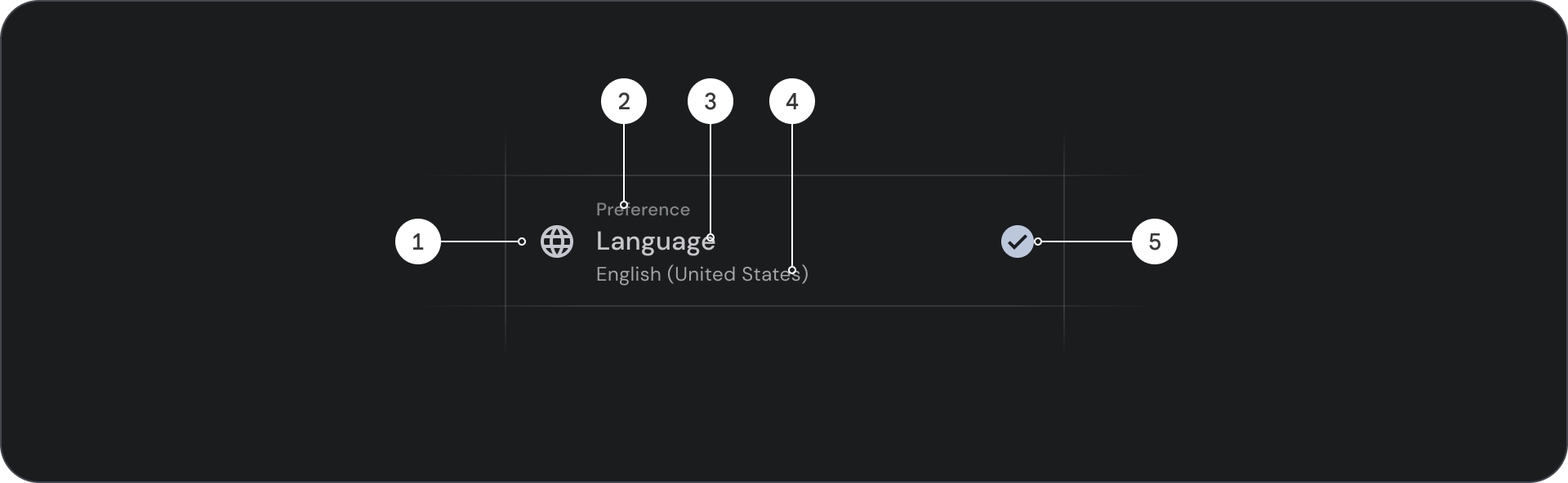
- סמל: גרפיקה קטנה שמייצגת אובייקט או פעולה ספציפיים, ולעיתים קרובות משמשת להעברת רעיון או מושג באופן חזותי.
- קו מעל: שורה קצרה של טקסט שמופיעה מעל הכותרת או הכותרת המשנית, ומשמשת בדרך כלל להוספת הקשר או הדגשה.
- כותרת: שורה גדולה של טקסט מודגש שמשמשת ככותרת הראשית של רכיב עיצוב או דף.
- כותרת משנה: שורה קטנה יותר של טקסט שמספקת מידע נוסף או הקשר נוסף מתחת לכותרת הראשית.
- אמצעי בקרה: אלמנט אינטראקטיבי שמאפשר למשתמש להזין החלטה.
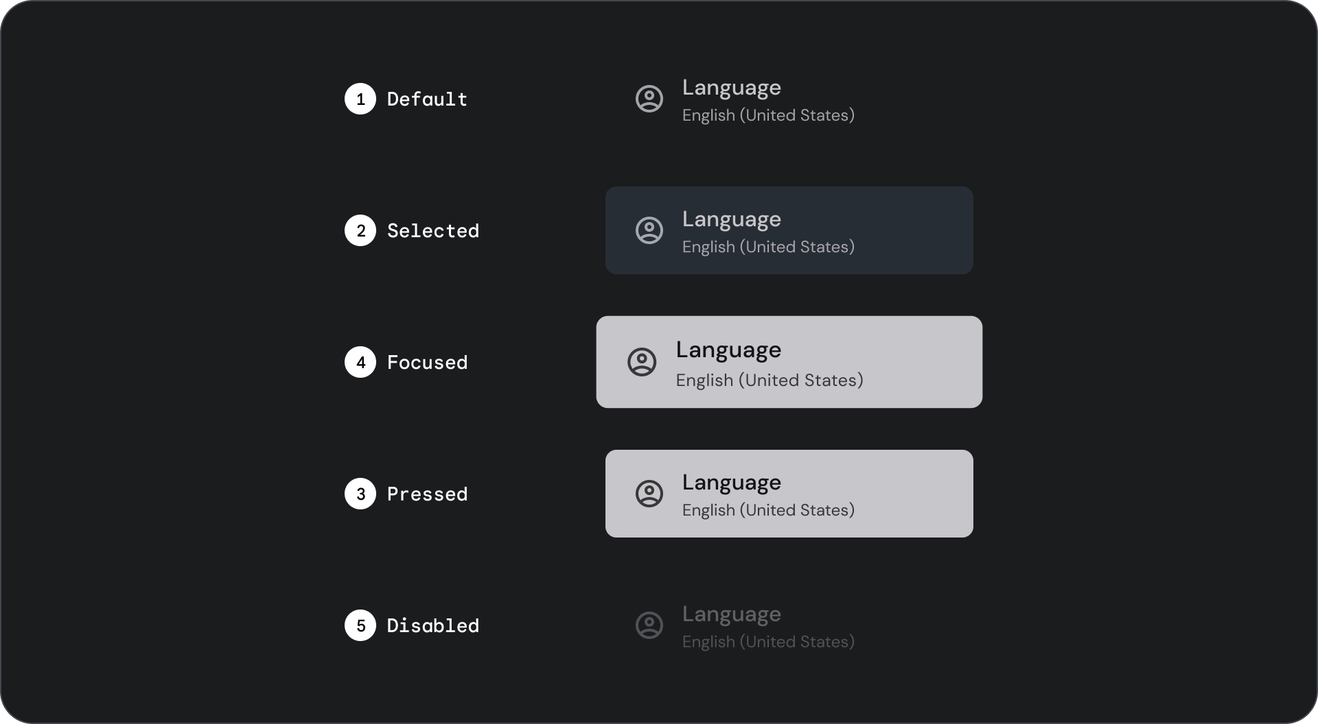
מדינות

המפרט


שימוש
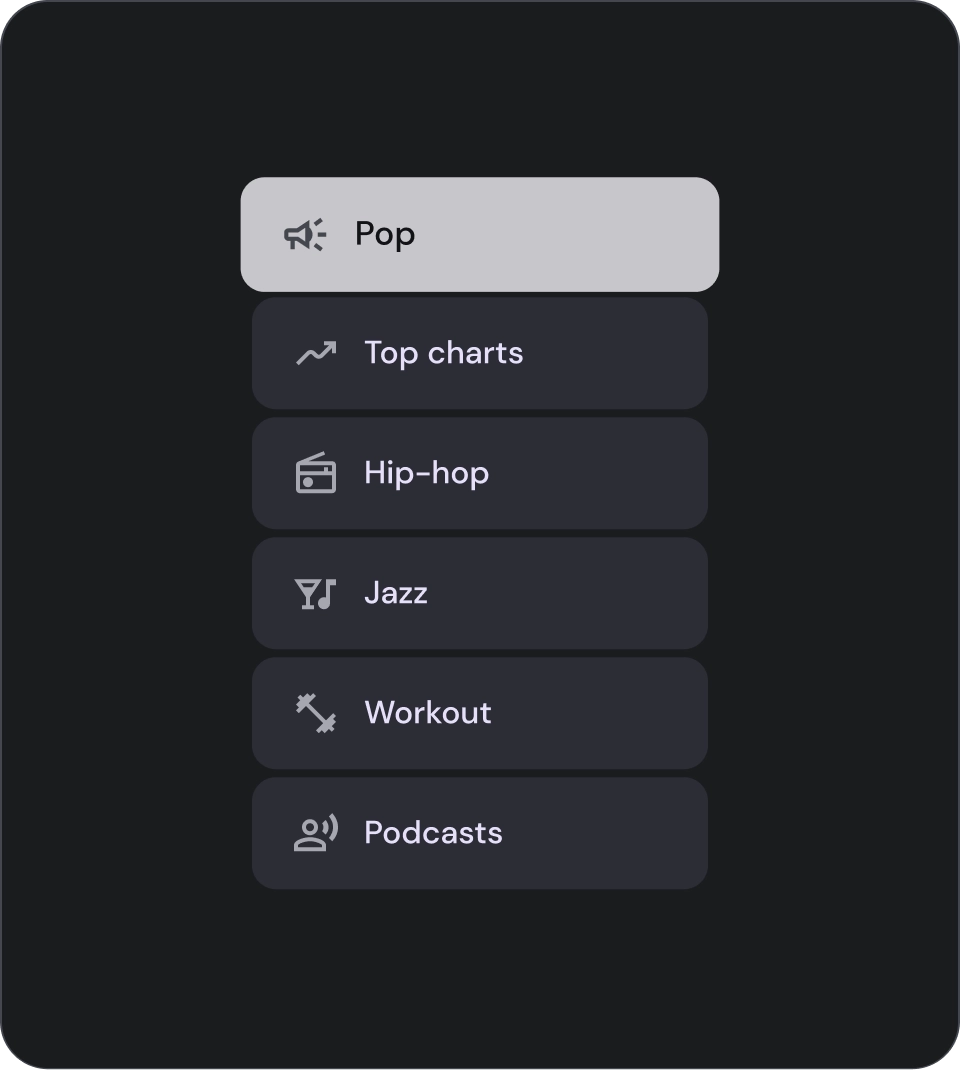
רשימות הן קבוצות של טקסט ותמונות שמאורגנות אנכית.
רשימה שעברה אופטימיזציה להבנת קריאה, מורכבת מעמודה אחת של פריטים רציפה.
הפריטים ברשימה יכולים לכלול פעולות ראשיות ומשניות שמיוצגות באמצעות סמלים וטקסט.
check_circle
מה צריך לעשות
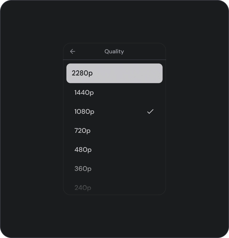
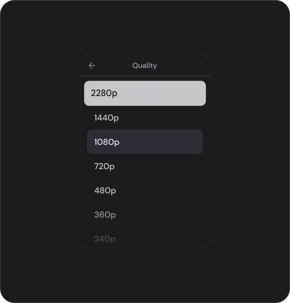
פריטים ברשימות הם לא כפתורים. לפריטים אין מאגרים. כברירת מחדל, פריטי הרשימה לא נבחרים ולא מתמקדים.
warning
זהירות
כדאי להשתמש ברקע של מאגר לפריטי רשימה רק במקרים שבהם יש צורך בכך.
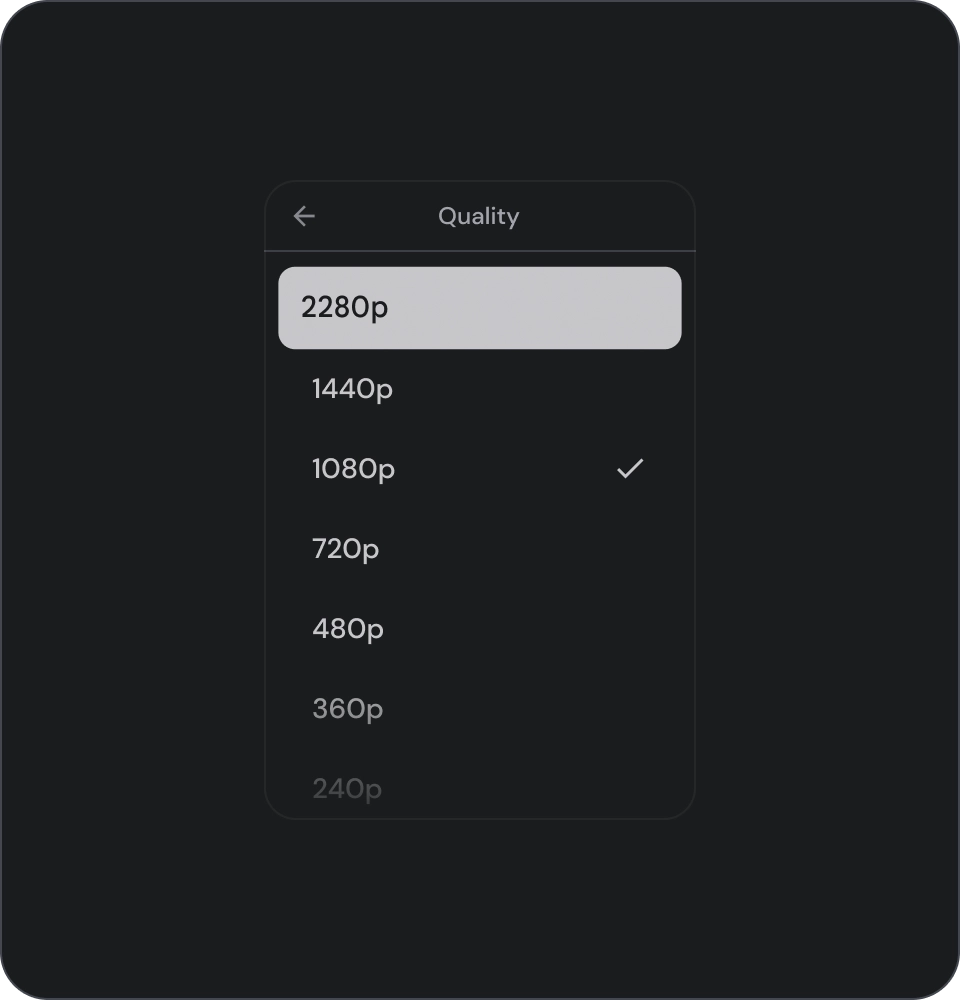
בקרות לבחירה
שדה שמוצגים בו פרטים ופעולות לגבי פריטים ברשימה. אפשר ליישר אותם לקצה הקדמי או לקצה האחורי של פריט הרשימה.
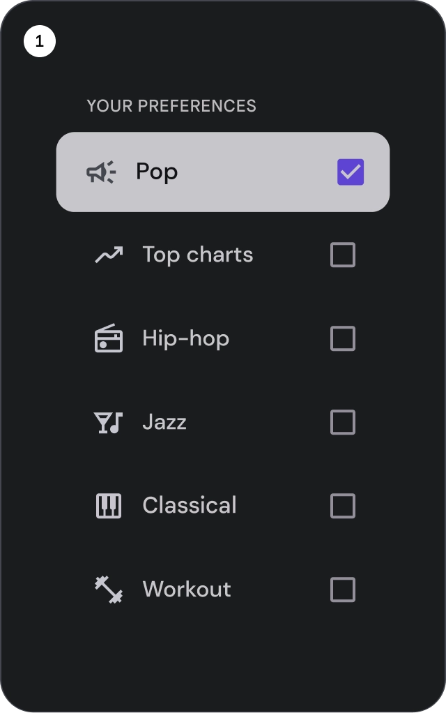
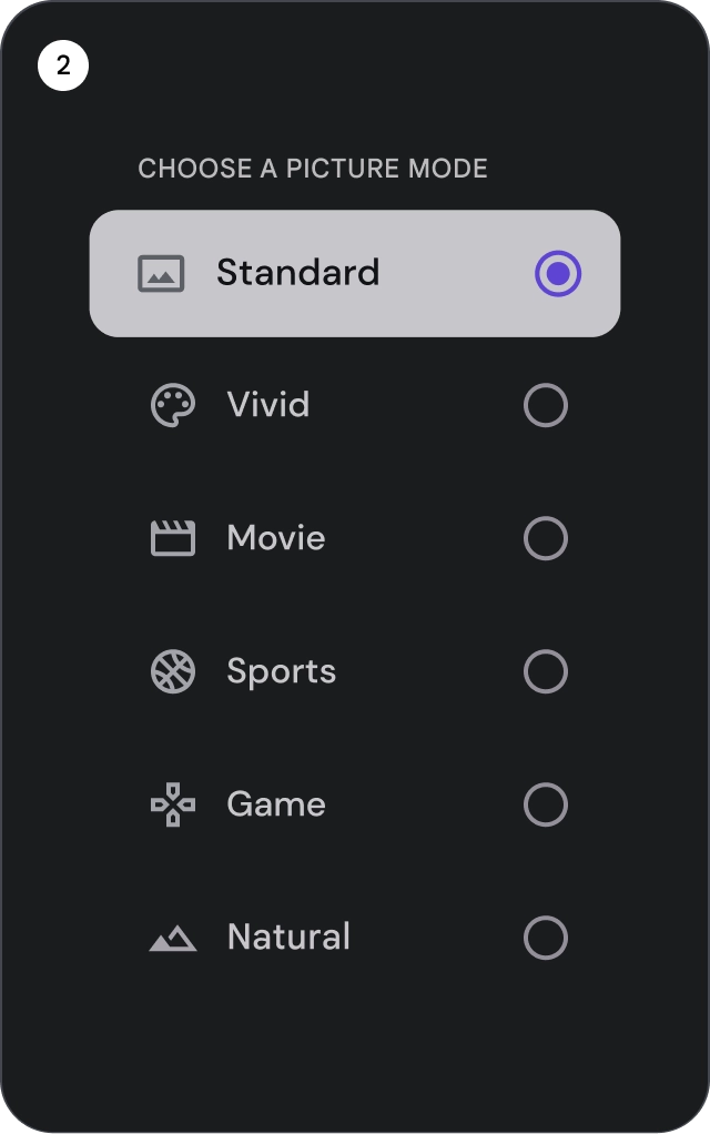
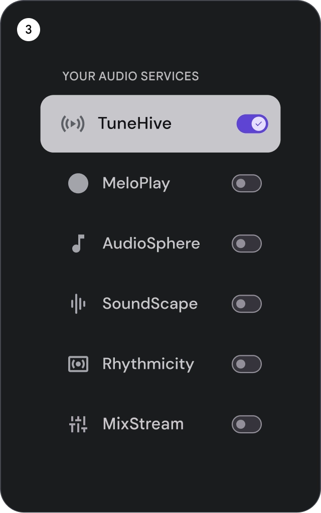
- תיבות סימון: בוחרים פריט אחד או יותר ברשימה.
- לחצני בחירה: בוחרים בדיוק פריט אחד ברשימה.
- מתגים: מפעילים או משביתים את אמצעי הבקרה.
check_circle
מה צריך לעשות
אפשר להשתמש בסמלי אינדיקציה לבחירה כדי להציג בבירור את הפריט שנבחר ברשימה. כך המשתמשים יוכלו לזהות בקלות את הפריט שבחרתם וליהנות מחוויית משתמש משופרת.
cancel
מה אסור לעשות
מומלץ לא להסתמך רק על צבע הרקע כדי לציין בחירה ברשימה.
cancel
מה אסור לעשות
מומלץ לא למקם לחצנים בתוך פריט ברשימה, כי זה עלול לגרום לבלבול לגבי הרכיב שבו המיקוד נמצא כרגע.
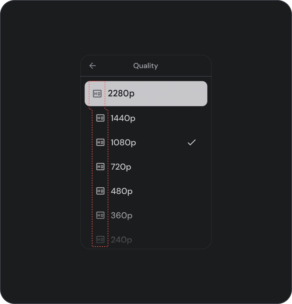
סמלים
check_circle
מה צריך לעשות
אם אתם מציגים ברשימה את אותו סוג תוכן, כדאי להשמיט את הסמלים כדי לצמצם את הרעש החזותי ולשפר את חוויית המשתמש. מומלץ להימנע משימוש בסמלים ברשימות אם הם לא משמשים למטרה כלשהי ולא מספקים מידע נוסף.
cancel
מה אסור לעשות
מומלץ להימנע משימוש באותו סמל לכל הפריטים ברשימה. המצב הזה עלול להיות מבלבל ומסחרר מבחינה חזותית עבור המשתמשים. במקום זאת, כדאי להשתמש בסמלים רק כשהם מוסיפים ערך או מספקים מידע נוסף.
דמויות ותמונות
פריטים ברשימה יכולים לכלול תמונות חתוכות בצורה עגולה שמייצגות אדם או ישות.

דוגמאות התוכן והקוד שבדף הזה כפופות לרישיונות המפורטים בקטע רישיון לתוכן. Java ו-OpenJDK הם סימנים מסחריים או סימנים מסחריים רשומים של חברת Oracle ו/או של השותפים העצמאיים שלה.
עדכון אחרון: 2025-07-27 (שעון UTC).
[null,null,["עדכון אחרון: 2025-07-27 (שעון UTC)."],[],[],null,["# Lists are a visual representation of one or more related items.\nThey are commonly used to display a collection of options.\n\nResources\n---------\n\n| Type | Link | Status |\n|----------------|----------------------------------------------------------------------------------------------------------------------------------------------------------------------------------------------------------------------------------------------------------------------------------------------------------------------------------------------------------------------------------------------------------------------------------------------------------------------------------------------------------------------------------------------------------|-----------|\n| Design | [Design source (Figma)](https://goo.gle/tv-desing-kit) | Available |\n| Implementation | [Jetpack Compose](/reference/kotlin/androidx/tv/material3/package-summary#ListItem(kotlin.Boolean,kotlin.Function0,kotlin.Function0,androidx.compose.ui.Modifier,kotlin.Boolean,kotlin.Function0,kotlin.Function0,kotlin.Function0,kotlin.Function1,kotlin.Function0,androidx.compose.ui.unit.Dp,androidx.tv.material3.ListItemShape,androidx.tv.material3.ListItemColors,androidx.tv.material3.ListItemScale,androidx.tv.material3.ListItemBorder,androidx.tv.material3.ListItemGlow,androidx.compose.foundation.interaction.MutableInteractionSource)) | Available |\n\nHighlights\n----------\n\n- Lists are a continuous collection of text or images.\n- Lists should feel natural and be scannable.\n- Lists are made up of items containing primary and supplemental actions represented by icons and text.\n\nVariants\n--------\n\nThere are three types of lists: one-line list, two-line list, and\nthree-line list.\n\n1. **One-line list**: A single line to communicate each item. This simple design ensures each item is clearly distinct from the other.\n2. **Two-line list**: Uses two parallel lines to communicate each item. This structured design ensures natural readability and avoids cognitive overload.\n3. **Three-line list**: Uses three parallel lines to represent each item. This decorative design creates a high level of visual prominence.\n\nAnatomy\n-------\n\n1. **Icon**: A small graphic that represents a specific object or action, often used to visually communicate an idea or concept.\n2. **Overline**: A short line of text that appears above title or subtitle, often used to provide additional context or emphasis.\n3. **Title**: A large, bold line of text that serves as the main heading of a design element or page.\n4. **Subtitle**: A smaller line of text that provides additional information or context below a main title.\n5. **Control**: An interactive element that allows the user to input a decision.\n\nStates\n------\n\nSpec\n----\n\nUsage\n-----\n\nLists are vertically organized groups of text and images.\nOptimized for reading comprehension, a list consists of a single\ncontinuous column of items.\nList items can contain primary and supplemental actions represented\nby icons and text. \ncheck_circle\n\n### Do\n\nList items are not buttons. The items don't have containers. List items are, by default, unselected and unfocused. \nwarning\n\n### Caution\n\nUse container background for list items only when necessary.\n\n### Selection controls\n\nControls display information and actions for list items. They can be aligned\nto the leading or trailing edge of the list item.\n\n\n\u003cbr /\u003e\n\n1. **Checkboxes**: Select one or more list items.\n2. **Radio buttons**: Select exactly one item in the list.\n3. **Switches**: Toggle a control on or off.\n\ncheck_circle\n\n### Do\n\nUse an icon selection indicator to clearly show the selected item in a list. This will help users easily identify which item they have selected and improve the overall user experience. \ncancel\n\n### Don't\n\nAvoid relying solely on the background color to indicate selection in a list. \ncancel\n\n### Don't\n\nAvoid placing buttons inside a list item as it can cause confusion about which element is currently in focus.\n\n### Icons\n\ncheck_circle\n\n### Do\n\nIf you're showing the same type of content in the list, omit icons to reduce visual noise and improve the user experience. Avoid using icons in a list when they serve no purpose and don't provide additional information. \ncancel\n\n### Don't\n\nAvoid using the same icon for all items in a list. This can be visually overwhelming and confusing for users. Instead, use icons only when they add value or provide additional information.\n\n### Avatars and images\n\nList items can include images in a circular crop to represent a\nperson or entity."]]