
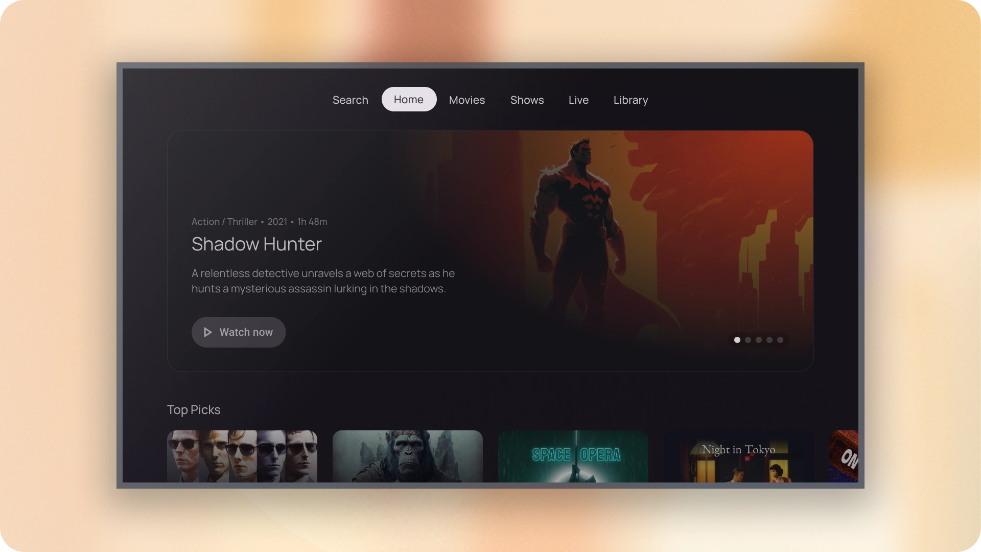
הכרטיסיות מארגנות תוכן במסכים שונים, בקבוצות נתונים שונות האינטראקציות. ניתן להשתמש בכרטיסיות כדי לעבור בין תצוגות של קבוצות מידע קשורות.
משאבים
| סוג | קישור | סטטוס |
|---|---|---|
| עיצוב | עיצוב של מקור (Figma) | יש גישה |
| הטמעה | Jetpack פיתוח נייטיב | יש גישה |
המיטב
- ניתן לגלול את הכרטיסיות לרוחב. ממשק משתמש יכול לכלול כמה כרטיסיות שצריך.
- בעזרת הכרטיסיות, התוכן מחולק לקטגוריות כדי לעזור למשתמשים למצוא את סוגי מידע שונים במהירות.
- הכרטיסיות מוצגות זו לצד זו בתור אפליקציות להשוואה, בקטגוריות בעלי חשיבות זהה.
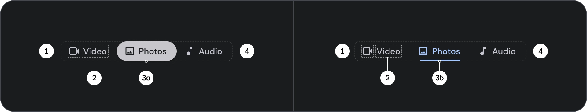
וריאנטים
יש שני סוגים של אינדיקטורים לכרטיסיות:


- אינדיקטור של כדור
- אינדיקטור של עמודה
בוחרים את הסוג המתאים לפי ההדגשה. הכרטיסיות של סימון הכדור מומלץ לארגון דפים שלמים. הם מציגים את התוכן העיקרי יעדים. משתמשים בכרטיסיות של אינדיקטור העמודות בתוך אזור תוכן כדי להמשיך תוכן קשור נפרד וליצור היררכיה.
אנטומיה
- סמל (אופציונלי)
- לייבל
- אינדיקטור פעיל
- גלולה
- בר
- מאגר
מדינות
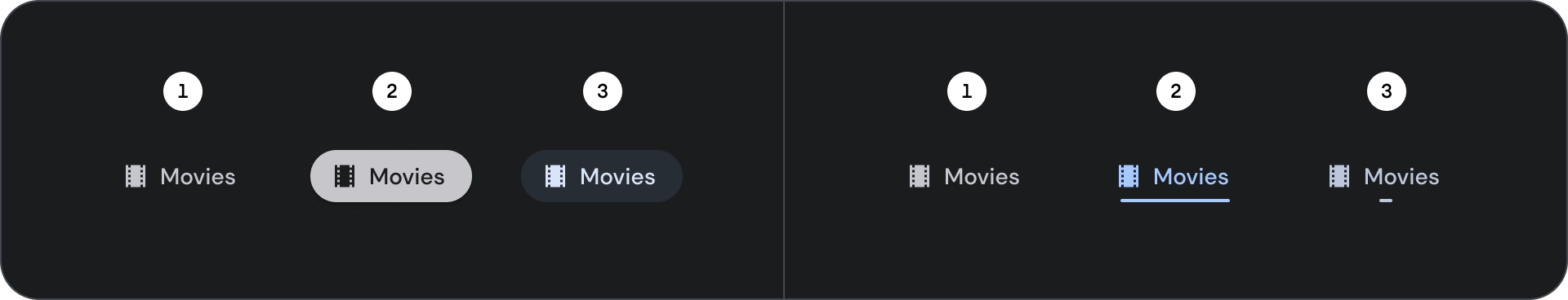
- ברירת מחדל
- ממוקד
- נבחר
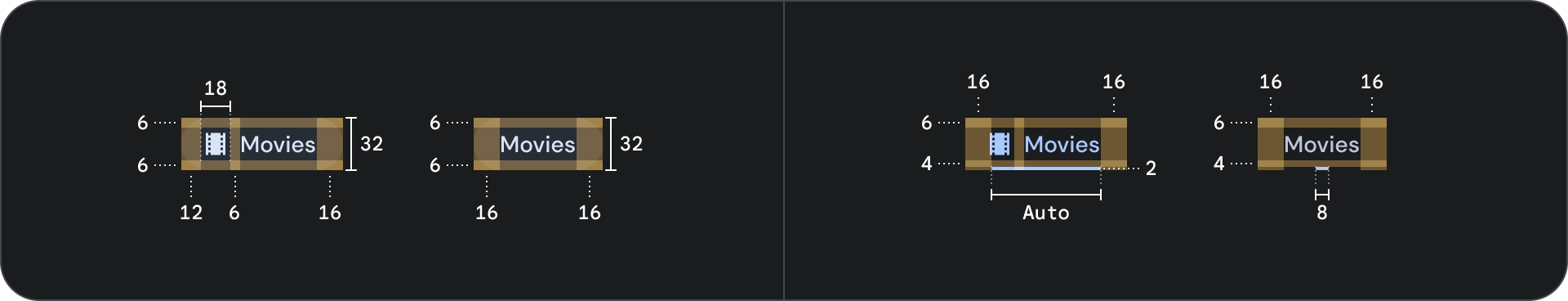
מפרטים
התנהגות
כשעוברים מכרטיסייה אחת לכרטיסייה הבאה, התוכן שלמטה מחליק גם שמאלה או מימין בהתאם לתנועת הכרטיסיות.