
This guide helps you get started with Android design by translating existing iOS mobile designs to Android using fundamental Android UX patterns, along with Material Design.
Outlined for design parity and ordered for efficiency. If you are following a shared base design system, then you can translate designs with your own system instead of Material 3. Both Android and iOS adhere to the idea that content comes first.
After that, branding can come through as color, type, and shape. Not only does this allow for content legibility, but creating cohesion becomes easier.
Start with your iOS designs
Before getting started, make a copy of your iOS app. iOS apps are broken down into three areas: Bars, Views, and Controls. You can use this structure to work through to translation, with styling last.
Check out parts of an Android app.
1. Delete the iOS system UI
Delete the status bar and home indicator. It's simpler to do this now.
2. Resize your frames
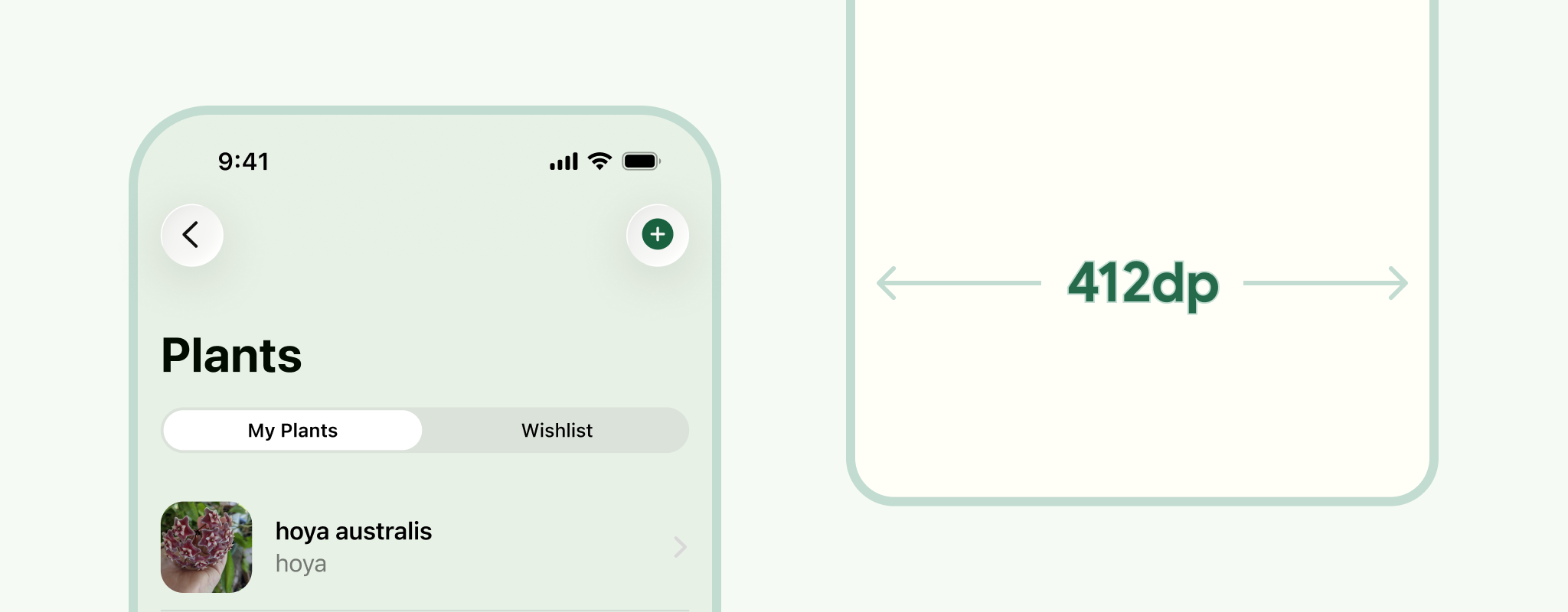
You can use Android compact sizing, 412 dp. Although, consider a range of devices even within a window class size. For example, test at 360 dp, to accommodate smaller screens, and adapt across all window classes sizes.
3. Replace with Android System Bars
Android system UI can vary depending on the user's device and settings, but showing a stock system UI can help give your designs more context. Place the notification bar at the top and either a gesture navigation or three button navigation bar at the bottom.
For more information, see Android system bars.
4. Depending on your navigation
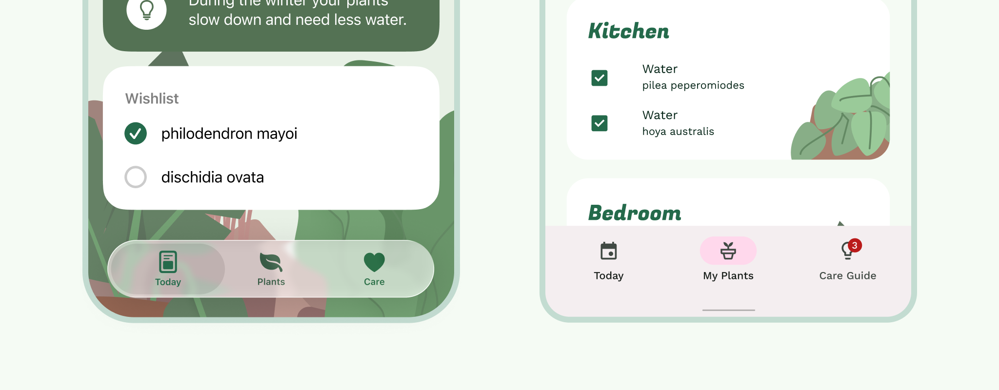
Swap the Tabbar (bottom navigation) for the Navigation Bar.
Take a look back at your flow map. Is your iOS app using a more menu? (HIG best practices suggest not to use this pattern). Stick to five or less items, keep the bottom navigation bar to primary navigation, evaluate if anything secondary, like profile or settings, can be moved into the Top App Bar, or maybe you have a primary action that can translate to a FAB?
Your primary navigation should always be present on parent views (the top level for a section in your flow map). Child views (anything under the parent view) can include primary navigation if they are higher up in the navigation hierarchy and not a modal.
Update the Bottom Navigation Bar with the appropriate icons and labels. Both platforms avoid lateral motion between navigation destinations.
5. Navbars to Top App Bars
Break these down section by section; parent views first, then child views. The App Bar is composed of the left side: navigation and title, and right side: action items.
If your app uses a nav drawer menu instead of a bottom nav bar, on all parent views, a drawer icon will be shown.
If your app does not have a rail, or drawer, then parent views don't show a primary navigation icon.
The title is left aligned by default in the App Bar for Android.
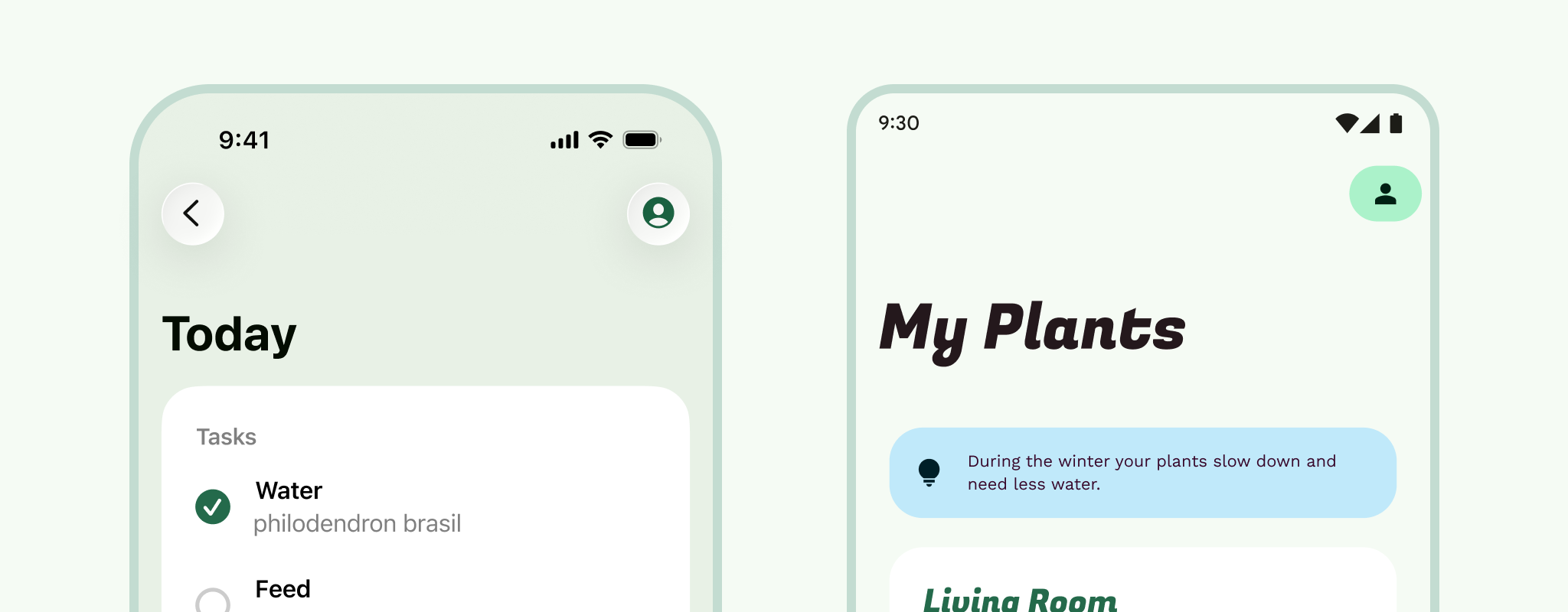
Child views hold an up arrow in the navigation icon spot. Not to be confused with back. The up arrow moves the user up a level through an app's navigation hierarchy in a user flow, while back or edge swipe lives in the system navigation, moving the user backwards and even taking the user out of the app.
What about modal views? For full-screen modals (like video players and images), this will be similar to the child view App Bar, except the navigation icon should change to close, which dismisses the modal.
6. A bit more modality
Start with large modal views, best used to focus the user's attention on a task. On iOS these are often seen as sheets, where the user can swipe them down.
Finish up swapping out App Bars. For iOS sheet modals, swap out the top sheet portion and background peek with a fullscreen dialog App Bar.
Bonus: Take a look at whether any of your iOS modal sheets can translate to bottom sheets.
Action and Activity sheets to Bottom sheets. (The share sheets can be translated now too).
For alerts, use system dialogs. If you are using them for important information that you need the user to acknowledge in some way, swap them for system dialogs. Remember to swap any inputs and pickers at this point too.
7. Sibling content
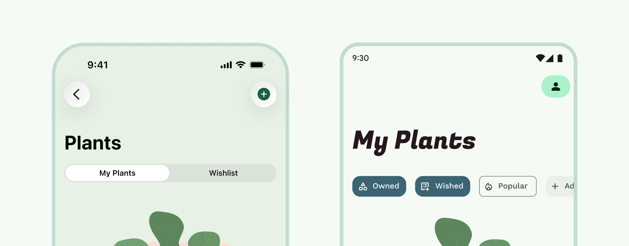
Tabs or view pagers or swiping tabs. If you are using segmented controls on iOS these translate over to tabs on Android. They both act as a way to filter between views of information that is similar, but not the same. Android tabs are typically attached to the App Bar, and come with the added benefit of being able to swipe between content.
8. Content & Controls
Depending how you have constraints or resizing behavior setup, most of your content possibly resized already. But take this time to go through and set your margins. 16dp is a good standard on small screens.
The baseline grid is based on an 8dp grid for components and 4dp for type and icons. An 8pt grid functions well on iOS, so possibly consider it as a starting point for both platforms.
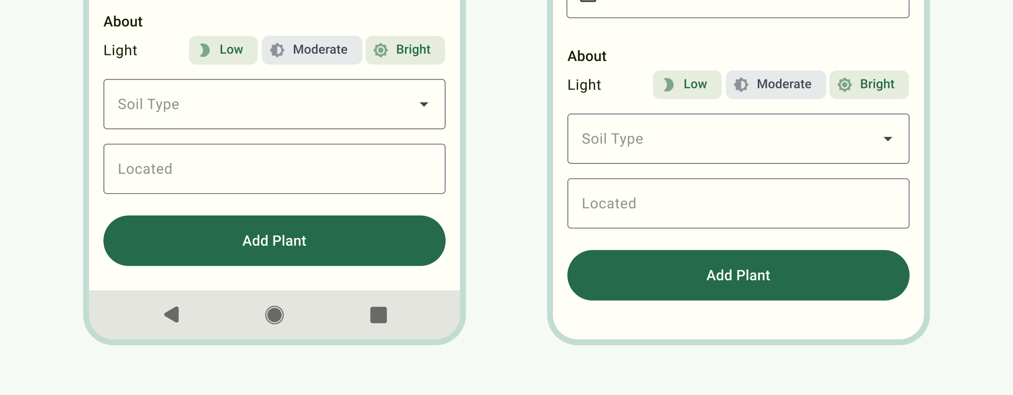
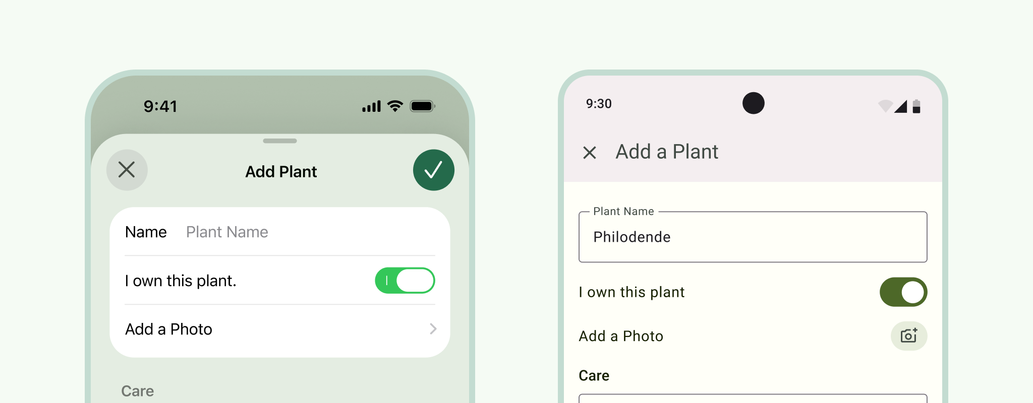
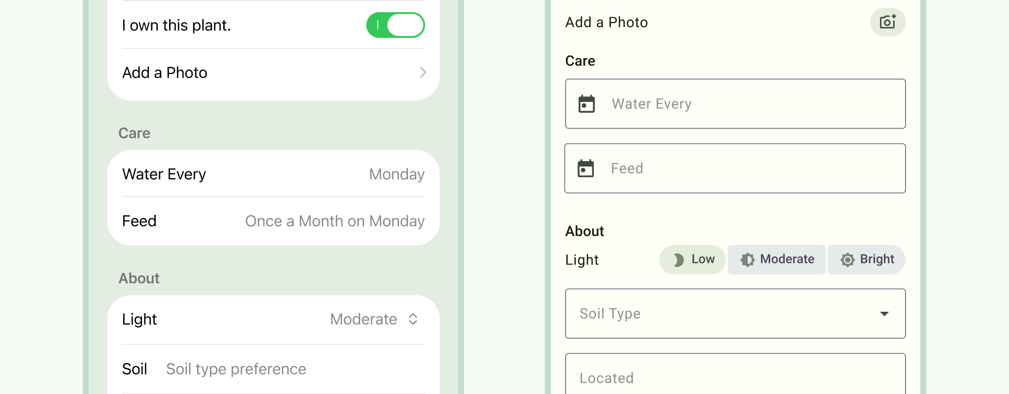
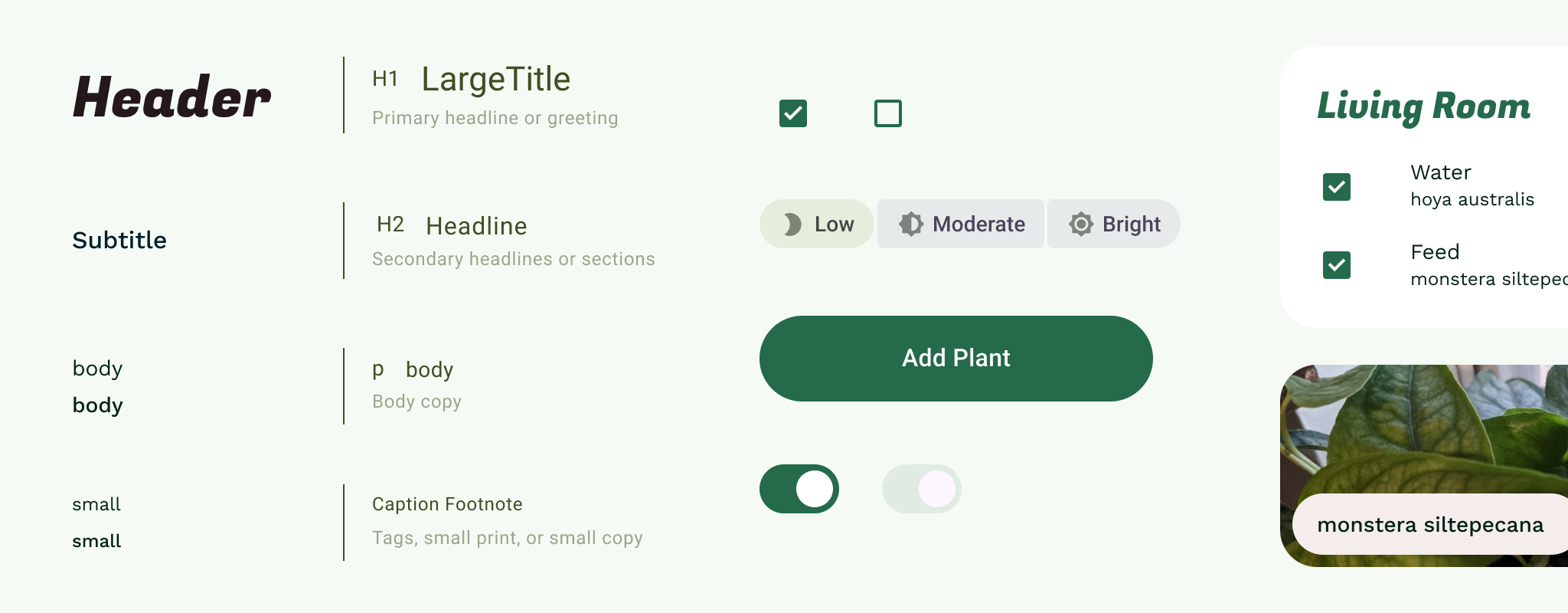
Controls. Switch those toggles to Android switches. Use Android checkboxes and radio buttons. Android comes with all of these.
If you have forms, swap the iOS text fields for Android ones. Material comes with options like outline or filled, so pick which one fits your branding best.
Material Lists have some differences when compared to iOS table cells:
- Divider lines are used sparingly.
- Indicators are not used on lists to help keep visual noise to a minimum.
- Dimensions adhere to the 8dp grid.
9. Style
Color: UI color consists of accent, semantic, and surface colors assembled in a color scheme. These colors are applied to UI by their roles.
Type: If using a system font, replace San Francisco. Roboto is the default system font for Android. That said, we encourage you to express your brand's unique style with theming and downloadable Google fonts.
Icons: Same here. If using SF symbols, double check that all have been converted to Material Icons or Symbols. Pick the variation that is right for your brand. Did you know you can use material icons on any platform?
Motion: Android and iOS have distinct motion design, which should be respected for each platform. Material motion is informative, focused, and expressed. The Ripple is a distinct highlight used in components to provide touch feedback. The Motion System is a set of transition patterns to take advantage of container transform, shared axis, fade through, and fade animations. Consider if elements in your design have persistent containers, the relationship between elements, and how they need to enter or exit.
10. Tidy up
If you are translating a prototype, this is a good point to rewire things. Go back through your primary navigation. Then your App Bars, remembering the difference between up and back, and making sure to select page transitions that are Android appropriate (mentioned in step 9).
You should have a fully functioning prototype ready, and since you resized it, it's ready for handoff.
Style and component guide
If you have an existing design system or style guide, you may have your own foundational styles (color, type, icons, shape) that can be used along with Material Design, just as you would use them alongside iOS guidance. Using Material Theming, you can customize Material components with your brand's unique style with color, type, and shape.
Having platform-specific guidelines is not uncommon among multi-platform products and can make your own design system more user-centered.
Finally, if you're working without one, know that not every app or product needs a full custom design system! Consider creating a one-sheet style guide. A style guide is a document that outlines the foundational specifications for designs. Branding guidelines will often contain a style guide within them.
This can be copied for Android and used as the source for updating styles (or symbols, components, or a library).