
Density independent pixels (dp) and scalable pixels (sp) are essential for building layouts and presenting fonts that respond uniformly to the wide range of screen densities, size classes, form factors, and aspect ratios that make up Android devices.
Takeaways
- If using a baseline grid, stick to measurements of 4 and 8.
- Notate specs in dp and sp, instead of pixels.
- Export bitmap (raster) graphics for all buckets.
- Design with a responsive mindset with different size classes, resolutions, and aspect ratios in mind.
- Density-independent pixels (dp): density-independent pixels are flexible units that scale to have uniform dimensions on any screen. They are based on the physical density of the screen. These units are relative to a 160 dpi (dots per inch) screen, on which 1 dp is roughly equal to 1 px.
- Scalable pixels (sp): Scalable pixels serve the same function as dp, but for fonts. The default value of an sp is the same as the default value for a dp. The Android system calculates the actual font size to use based on the device and the user's preference set in the device's settings.

The primary difference between these units of measurement is that scalable pixels preserve a user's font settings. Users who have larger text settings for accessibility see font sizes match their text size preferences. See how to change font size in Compose.
Android uses these units to help scale and translate across the range of devices and resolutions.
Density buckets
High-density screens have more pixels per inch than low-density ones. As a result, UI elements of the same pixel dimensions appear larger on low-density screens, and smaller on high-density screens. This is why you shouldn't declare measurements in pixels.
Android groups ranges of screen densities into "buckets" and uses them to
deliver the optimal set of assets to your device. The most commonly used density
buckets are mdpi, hdpi, xhdpi, xxhdpi, and xxxhdpi (nodpi and
anydpi refer to a bucket that does not scale per device resolution, typically
used for vector drawables) each correspond to a resource file of your app.
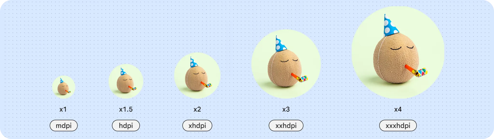
To calculate dp:
dp = (width in pixels * 160) / screen density
Baseline grid
Building with an underlying grid helps create consistent spacing and alignment across your UI. Android UI utilizes an 8 dp grid for layout, components, and spacing.
Smaller elements such as icons, type, and some elements within components are best aligned to a 4 dp grid.

Layout grids
Grids are the backbone of any layout. Consider the content's hierarchy, amount, and even message.
Hierarchical grid
A hierarchical grid is created with the content's hierarchy, or importance, in mind. Think of a newspaper layout: a consistent top story takes most of the layout while a smaller column displays past articles.
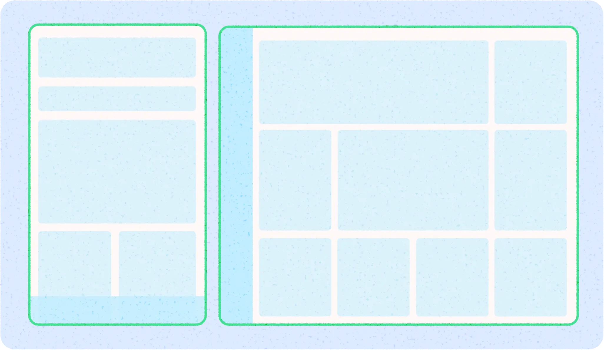
When adapting across screen sizes, a hierarchical layout can reflow, resize, and reveal grid cells.
Modular grid
A modular grid is set up in consistent columns and rows, creating a rectangular grid system to align content to. Modular grids work well for content with a similar importance and sizing, like a card gallery.
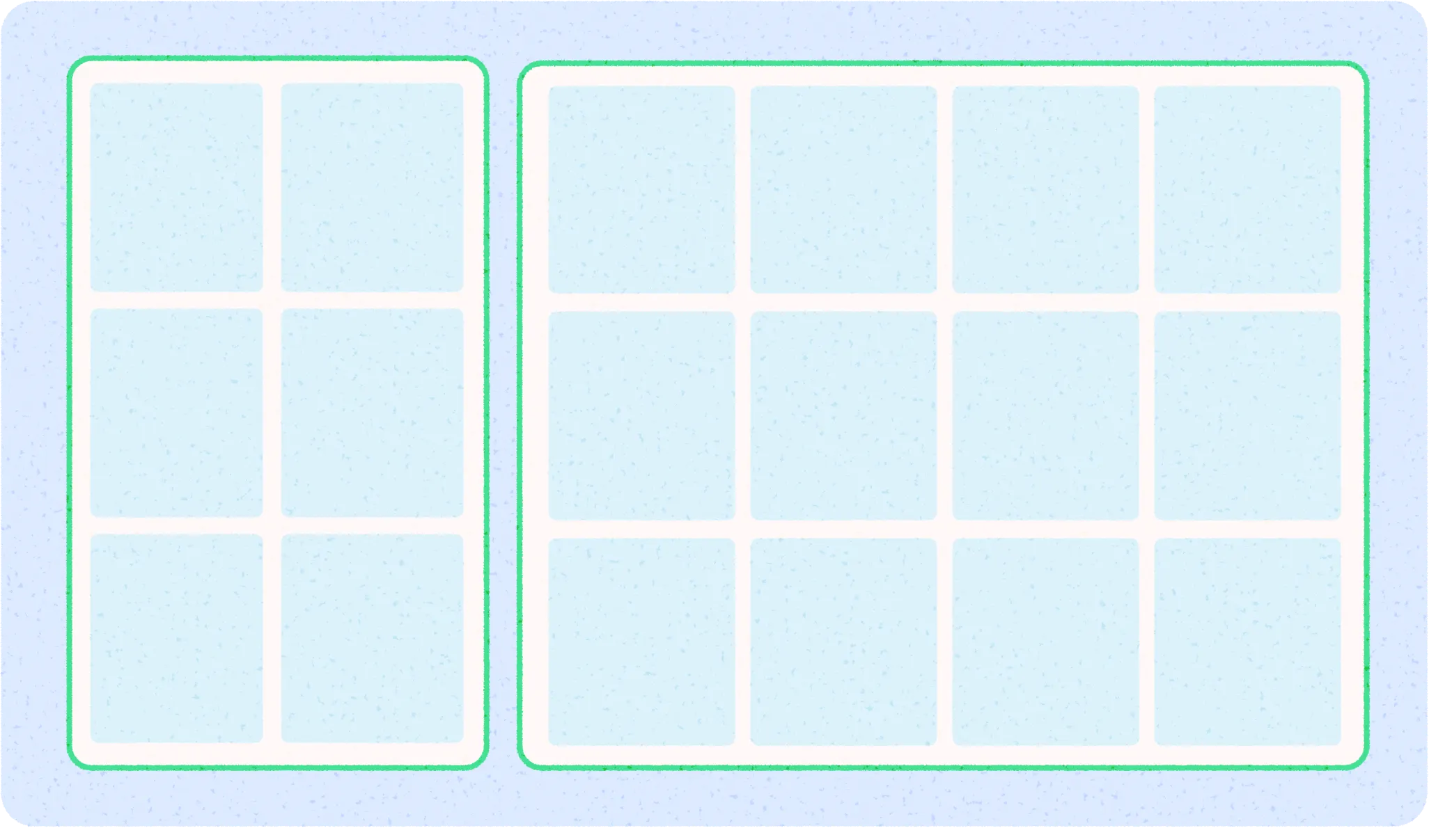
An adaptive modular grid can add more grid cells, and content within can snap, or wrap, to different grid cells. Grid cells can stay consistent across sizes or resize depending on needs of content.
Column grid
Columns build a grid structure to provide vertical definition to a layout by dividing content within the body area. Content is placed in the areas of the screen that contain columns. Align with an underlying grid to align content, but should keep flexible sizing.
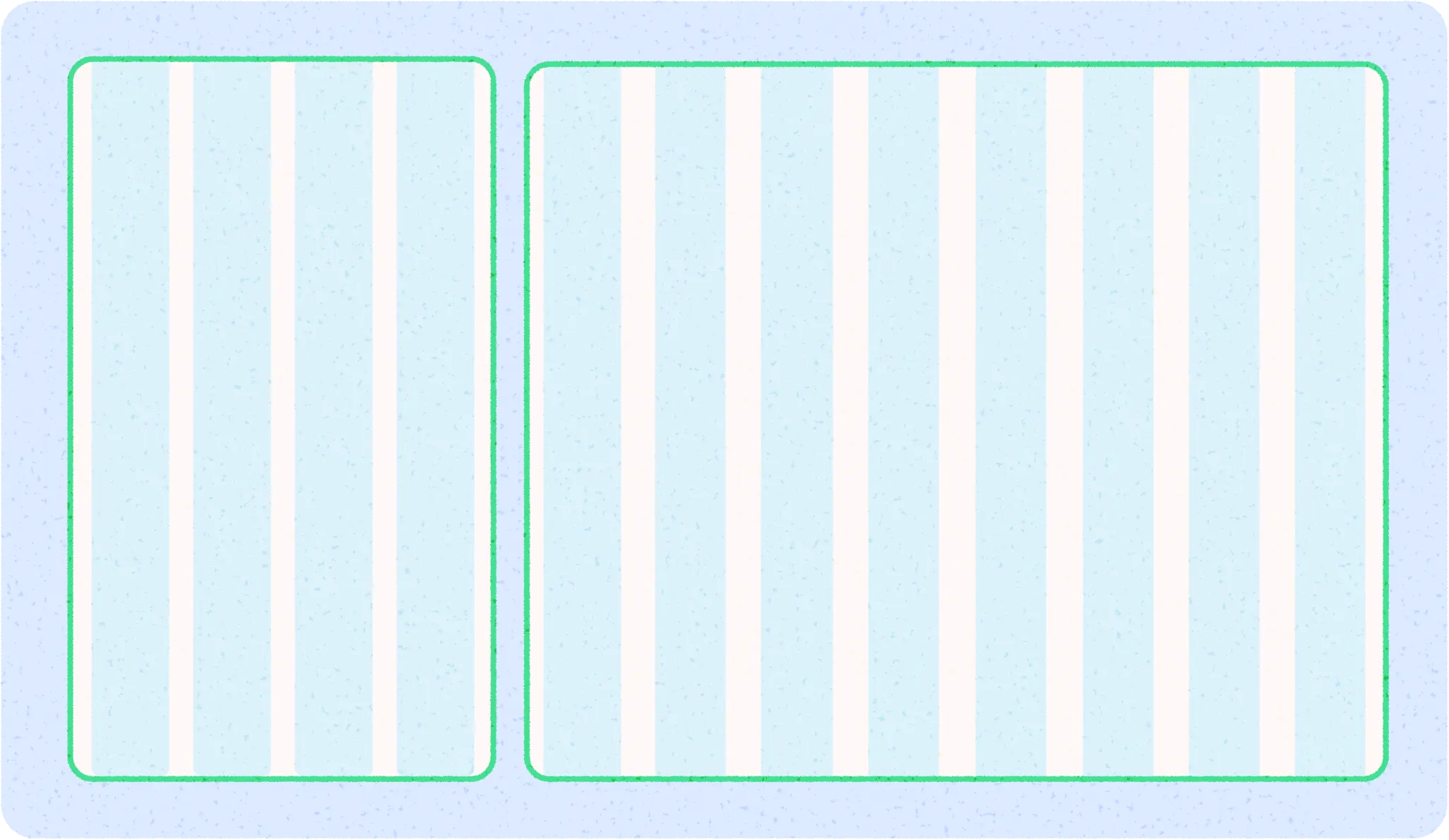
Learn the basics on how to set up a column grid and apply content in Layout basics. The column grid can accommodate different form factors by changing the column sizes and number of columns as needed by the screen size at certain points while allowing content to also scale.

Size classes
Window size classes are a set of opinionated viewport breakpoints that help you design, develop, and test responsive and adaptive application layouts. Android breaks window size classes into 3: Compact, Medium, and Expanded. Read more on Window size classes.
Aspect ratios
An aspect ratio is the proportion of an element's width to its height. Aspect ratios are written as width:height.
To maintain consistency in your layout, use a consistent aspect ratio on elements like images, surfaces, and screen size.
The following aspect ratios are recommended for use across your UI:
- 16:9
- 3:2
- 4:3
- 1:1
- 3:4
- 2:3