
On Wear OS devices, tiles are rendered by two key components with independent versioning. To help your app's tiles function correctly across all devices, it's important to understand this underlying architecture.
- Jetpack tile-related libraries: These libraries (including Wear Tiles
and Wear ProtoLayout) are embedded in your app, and you, as the developer,
control their versions. Your app uses these libraries to construct a
TileBuilder.Tileobject (the data structure representing your Tile) in response to the system'sonTileRequest()call. - ProtoLayout Renderer: This system component is responsible for rendering
the
Tileobject on the display and handling user interactions. The version of the renderer is not controlled by the app developer and can vary across devices, even those with identical hardware.
A Tile's appearance or behavior can vary based on both your app's Jetpack Tiles library versions and the ProtoLayout Renderer version on the user's device. For example, one device might support rotation or the display of heart rate data, while another might not.
This document explains how to make your app compatible with different versions of the Tiles library and ProtoLayout Renderer. It also explains how to migrate to higher Jetpack library versions.
Consider compatibility
To create a Tile that functions correctly across a range of devices, consider accounting for varying feature support. You can do this through two main strategies: detecting renderer capabilities at runtime and providing built-in fallbacks.
Detect renderer capabilities
You can dynamically change your tile's layout based on the features available on a given device.
Detect the renderer version
- Use the
getRendererSchemaVersion()method of theDeviceParametersobject passed to youronTileRequest()method. This method returns the major and minor version numbers of the ProtoLayout Renderer on the device. - You can then use conditional logic in your
onTileRequest()implementation to adapt your Tile's design or behavior based on the detected renderer version.
The @RequiresSchemaVersion annotation
- The
@RequiresSchemaVersionannotation on ProtoLayout methods indicates the minimum renderer schema version required for that method to behave as documented (example).- While calling a method that requires a higher renderer version than is available on the device won't cause your app to crash, it could lead to content not being displayed or the feature being ignored.
Example of version detection
val rendererVersion = requestParams.deviceConfiguration.rendererSchemaVersion val arcElement = // DashedArcLine has the annotation @RequiresSchemaVersion(major = 1, minor = 500) // and so is supported by renderer versions 1.500 and greater if ( rendererVersion.major > 1 || (rendererVersion.major == 1 && rendererVersion.minor >= 500) ) { // Use DashedArcLine if the renderer supports it … DashedArcLine.Builder() .setLength(degrees(270f)) .setThickness(8f) .setLinePattern( LayoutElementBuilders.DashedLinePattern.Builder() .setGapSize(8f) .setGapInterval(10f) .build() ) .build() } else { // … otherwise use ArcLine. ArcLine.Builder().setLength(degrees(270f)).setThickness(dp(8f)).build() }
Provide fallbacks
Some resources allow you to define a fallback directly in the builder. This is often simpler than checking the renderer version and is the preferred approach when available.
A common use case is providing a static image as a fallback for a Lottie animation. If the device doesn't support Lottie animations, it will render the static image instead.
val lottieImage = ResourceBuilders.ImageResource.Builder() .setAndroidLottieResourceByResId( ResourceBuilders.AndroidLottieResourceByResId.Builder(R.raw.lottie) .setStartTrigger(createOnVisibleTrigger()) .build() ) // Fallback if lottie is not supported .setAndroidResourceByResId( ResourceBuilders.AndroidImageResourceByResId.Builder() .setResourceId(R.drawable.lottie_fallback) .build() ) .build()
Test with different renderer versions
To test your tiles against different renderer versions, deploy them to different versions of the Wear OS emulator. (On physical devices, ProtoLayout Renderer updates are delivered by the Play Store or system updates. It's not possible to force a specific renderer version to be installed.)
Android Studio's Tile Preview feature makes use of a renderer embedded in the Jetpack ProtoLayout library your code depends on, so another approach is to depend on different Jetpack library versions when testing tiles.
Migrate to Tiles 1.5 / ProtoLayout 1.3 (Material 3 Expressive)
Update your Jetpack Tile libraries to take advantage of the latest enhancements, including UI changes to make your Tiles integrate seamlessly with the system.
Jetpack Tiles 1.5 and Jetpack ProtoLayout 1.3 introduce several notable improvements and changes. These include:
- A Compose-like API for describing the UI.
- Material 3 Expressive components, including the bottom-hugging edge button and support for enhanced visuals: Lottie animations, more gradient types, and new arc line styles. - Note: some of these features can also be used without migrating to the new API.
Recommendations
Follow these recommendations when migrating your tiles:
- Migrate all your tiles simultaneously. Avoid mixing tiles versions
within your app. While the Material 3 components reside in a separate
artifact (
androidx.wear.protolayout:protolayout-material3)—making it technically possible to use both M2.5 and M3 Tiles in the same app—we strongly advise against this approach unless absolutely necessary (for example, if your app has a large number of tiles that cannot all be migrated at once). - Adopt Tiles UX guidance. Given the highly structured and templated nature of tiles, use the designs in the existing samples as starting points for your own designs.
- Test across a variety of screen and font sizes. Tiles are often information-dense, making text (especially when placed on buttons) susceptible to overflow and clipping. To minimize this, use the prebuilt components and avoid extensive customization. Test using Android Studio's tile preview feature as well as on multiple real devices.
Migration process
To migrate your tiles, follow these steps:
Update dependencies
First, update your build.gradle.kts file. Update the versions and change the
protolayout-material dependency to protolayout-material3, as shown:
// In build.gradle.kts

//val tilesVersion = "1.4.1"
//val protoLayoutVersion = "1.2.1"

// Use these versions for M3.
val tilesVersion = "1.5.0"
val protoLayoutVersion = "1.3.0"

 dependencies {
     // Use to implement support for wear tiles
     implementation("androidx.wear.tiles:tiles:$tilesVersion")

     // Use to utilize standard components and layouts in your tiles
     implementation("androidx.wear.protolayout:protolayout:$protoLayoutVersion")

     // Use to utilize components and layouts with Material Design in your tiles
     // implementation("androidx.wear.protolayout:protolayout-material:$protoLayoutVersion")
     implementation("androidx.wear.protolayout:protolayout-material3:$protoLayoutVersion")

     // Use to include dynamic expressions in your tiles
     implementation("androidx.wear.protolayout:protolayout-expression:$protoLayoutVersion")

     // Use to preview wear tiles in your own app
     debugImplementation("androidx.wear.tiles:tiles-renderer:$tilesVersion")

     // Use to fetch tiles from a tile provider in your tests
     testImplementation("androidx.wear.tiles:tiles-testing:$tilesVersion")
 }
TileService remains largely unchanged
The primary changes in this migration affect the UI components. Consequently,
your TileService implementation, including any resource-loading mechanisms,
should require minimal to no modifications.
The main exception involves tile activity tracking: if your app uses
onTileEnterEvent() or onTileLeaveEvent(), we recommend that you
migrate to onRecentInteractionEventsAsync(). Starting with API 36, these
events will be batched.
Adapt your layout-generation code
In ProtoLayout 1.2 (M2.5), the onTileRequest() method returns a
TileBuilders.Tile. This object contained various elements, including a
TimelineBuilders.Timeline, which in turn held the LayoutElement
describing the tile's UI.
With ProtoLayout 1.3 (M3), while the overall data structure and flow have not
changed, the LayoutElement is now constructed using a Compose-inspired
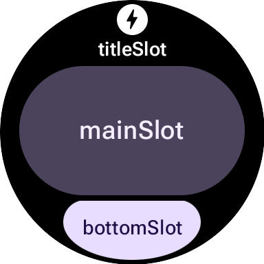
approach with a layout based on defined slots which are (from top to bottom)
the titleSlot (optional; typically for a primary title or header), mainSlot
(mandatory; for the core content), and bottomSlot (optional; often for actions
like an edge button or supplemental information like short text). This layout is
constructed by the primaryLayout() function.
Comparison of M2.5 and M3 layout functions
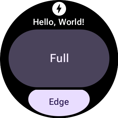
M2.5
fun myLayout( context: Context, deviceConfiguration: DeviceParametersBuilders.DeviceParameters ) = PrimaryLayout.Builder(deviceConfiguration) .setResponsiveContentInsetEnabled(true) .setContent( Text.Builder(context, "Hello World!") .setTypography(Typography.TYPOGRAPHY_BODY1) .build() ) .build()
M3
fun myLayout( context: Context, deviceConfiguration: DeviceParametersBuilders.DeviceParameters, ) = materialScope(context, deviceConfiguration) { primaryLayout(mainSlot = { text("Hello, World!".layoutString) }) }
To highlight the key differences:
- Elimination of builders. The previous builder pattern for Material UI components is replaced by a more declarative, Compose-inspired syntax. (Non-UI components such as String/Color/Modifiers also get new Kotlin wrappers.)
- Standardized initialization and layout functions. M3 layouts rely on
standardized initialization and structure functions:
materialScope()andprimaryLayout(). These mandatory functions initialize the M3 environment (theming, component scope usingmaterialScope) and define the primary slot-based layout (usingprimaryLayout). Both must be called exactly once per layout.
Theming
Material 3 introduces several changes to theming, including dynamic color and an expanded set of typography and shape options.
Color
A standout feature of Material 3 Expressive is "dynamic theming:" tiles which enable this feature (on by default) will be displayed in system-provided theme (availability dependent on the user's device and configuration).
Another change in M3 is an expansion of the number of color tokens, which has
increased from 4 to 29. The new color tokens can be found in the
ColorScheme class.
Typography
Similar to M2.5, M3 relies heavily on predefined font size constants—directly
specifying a font size is discouraged. These constants are located in the
Typography class and offer a slightly expanded range of more expressive
options.
For full details, refer to the Typography documentation.
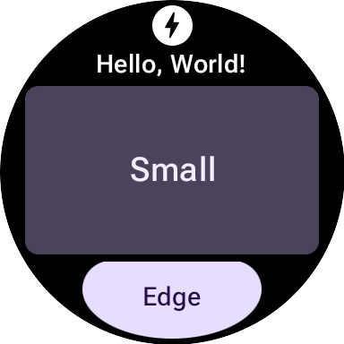
Shape
Most M3 components can vary along the dimension of shape as well as color.
A textButton (in the mainSlot) with shape full:
The same textButton with shape small:
Components
M3 components are more flexible and configurable than their M2.5 counterparts. M2.5 often required distinct components for varied visual treatments, while M3 frequently uses a generalized, highly configurable base component with good defaults.
This principle also applies to the root layout. In M2.5, this was either a
PrimaryLayout or an EdgeContentLayout. In M3, after you
establish a single top-level MaterialScope, you call the
primaryLayout() function. This function returns the root layout
directly—no builders needed—and accepts LayoutElements for several slots, such
as titleSlot, mainSlot, and bottomSlot. You can populate these slots with
concrete UI components—such as those returned by text(),
button(), or card()—or with layout structures, such as Row or
Column from LayoutElementBuilders.
Themes are another key M3 enhancement. By default, UI elements automatically adhere to M3 styling specifications and support dynamic theming.
| M2.5 | M3 |
|---|---|
| Interactive Elements | |
Button or Chip |
|
| Text | |
Text |
text() |
| Progress Indicators | |
CircularProgressIndicator |
circularProgressIndicator() or segmentedCircularProgressIndicator() |
| Layout | |
PrimaryLayout or EdgeContentLayout |
primaryLayout() |
| — | buttonGroup() |
| Images | |
| — | icon(), avatarImage() or backgroundImage() |
Modifiers
In M3, Modifiers, which you use to decorate or augment a component, are
more Compose-like. This change can reduce boilerplate by automatically
constructing the appropriate internal types. (This change is orthogonal to the
use of M3 UI components; if necessary, you can use builder-style modifiers from
ProtoLayout 1.2 with M3 UI components, and the other way around.)
M2.5
// Uses Builder-style modifier to set opacity fun myModifier(): ModifiersBuilders.Modifiers = ModifiersBuilders.Modifiers.Builder() .setOpacity(TypeBuilders.FloatProp.Builder(0.5F).build()) .build()
M3
// Uses Compose-like modifiers to set opacity fun myModifier(): LayoutModifier = LayoutModifier.opacity(0.5F)
You can construct modifiers using either API style, and you can also use the
toProtoLayoutModifiers() extension function to convert a
LayoutModifier to a ModifiersBuilders.Modifier.
Helper Functions
While ProtoLayout 1.3 allows many UI components to be expressed using a
Compose-inspired API, foundational layout elements like rows and
columns from LayoutElementBuilders continue to use the builder
pattern. To bridge this stylistic gap and promote consistency with the new M3
component APIs, consider using helper functions.
Without Helpers
primaryLayout( mainSlot = { Column.Builder() .setWidth(expand()) .setHeight(expand()) .addContent(text("A".layoutString)) .addContent(text("B".layoutString)) .addContent(text("C".layoutString)) .build() } )
With Helpers
// Function literal with receiver helper function fun column(builder: Column.Builder.() -> Unit) = Column.Builder().apply(builder).build() primaryLayout( mainSlot = { column { setWidth(expand()) setHeight(expand()) addContent(text("A".layoutString)) addContent(text("B".layoutString)) addContent(text("C".layoutString)) } } )
Migrate to Tiles 1.2 / ProtoLayout 1.0
As of version 1.2, most Tiles layout APIs are in the androidx.wear.protolayout
namespace. To use the latest APIs, complete the following migration steps in
your code.
Update dependencies
In your app module's build file, make the following changes:
Groovy
// Removeimplementation 'androidx.wear.tiles:tiles-material:version'// Include additional dependencies implementation "androidx.wear.protolayout:protolayout:1.4.0" implementation "androidx.wear.protolayout:protolayout-material:1.4.0" implementation "androidx.wear.protolayout:protolayout-expression:1.4.0" // Update implementation "androidx.wear.tiles:tiles:1.6.0"
Kotlin
// Removeimplementation("androidx.wear.tiles:tiles-material:version")// Include additional dependencies implementation("androidx.wear.protolayout:protolayout:1.4.0") implementation("androidx.wear.protolayout:protolayout-material:1.4.0") implementation("androidx.wear.protolayout:protolayout-expression:1.4.0") // Update implementation("androidx.wear.tiles:tiles:1.6.0")
Update namespaces
In your app's Kotlin- and Java-based code files, make the following updates: Alternatively, you can execute this namespace renaming script.
- Replace all
androidx.wear.tiles.material.*imports withandroidx.wear.protolayout.material.*. Complete this step for theandroidx.wear.tiles.material.layoutslibrary, too. Replace most other
androidx.wear.tiles.*imports withandroidx.wear.protolayout.*.Imports for
androidx.wear.tiles.EventBuilders,androidx.wear.tiles.RequestBuilders,androidx.wear.tiles.TileBuilders, andandroidx.wear.tiles.TileServiceshould stay the same.Rename a few deprecated methods from TileService and TileBuilder classes:
TileBuilders:getTimeline()togetTileTimeline(), andsetTimeline()tosetTileTimeline()TileService:onResourcesRequest()toonTileResourcesRequest()RequestBuilders.TileRequest:getDeviceParameters()togetDeviceConfiguration(),setDeviceParameters()tosetDeviceConfiguration(),getState()togetCurrentState(), andsetState()tosetCurrentState()