
Wear OS 上的应用采用与其他 Android 设备相同的布局技术,但在设计时需要遵循手表所特有的约束。
注意:请不要将具体功能和界面从移动应用移植到 Wear OS 上,这样不会带来良好的用户体验。
如果您设计的应用用于矩形手持设备,那么在圆形手表上,屏幕角落附近的内容可能会被剪裁掉。如果您使用的是可滚动的垂直列表,这就没什么问题,因为用户可以滚动屏幕,居中显示内容。但是,对于单屏,这样可能会导致用户体验不佳。
如果您为布局使用以下设置,文本在圆形屏幕的设备上会无法正确显示:
<androidx.constraintlayout.widget.ConstraintLayout
    xmlns:android="http://schemas.android.com/apk/res/android"
    xmlns:app="http://schemas.android.com/apk/res-auto"
    xmlns:tools="http://schemas.android.com/tools"
    android:layout_width="match_parent"
    android:layout_height="match_parent">

    <TextView
        android:id="@+id/text"
        android:layout_width="0dp"
        android:layout_height="0dp"
        android:text="@string/very_long_hello_world"
        app:layout_constraintBottom_toBottomOf="parent"
        app:layout_constraintEnd_toEndOf="parent"
        app:layout_constraintStart_toStartOf="parent"
        app:layout_constraintTop_toTopOf="parent" />

</androidx.constraintlayout.widget.ConstraintLayout>
如要解决此问题,请使用支持圆形设备的 Wear OS 界面库中的布局。
- 您可以使用
BoxInsetLayout防止视图在圆形屏幕边缘附近被剪裁。 - 当您想显示和操作针对圆形屏幕而优化的垂直项目列表时,可以使用
WearableRecyclerView创建曲线布局。
如需详细了解如何设计应用,请参阅 Wear OS 设计准则。
使用 BoxInsetLayout
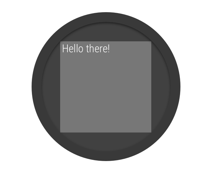
图 2. 圆形屏幕上的窗口边衬区。
您可以使用 Wear OS 界面库中的 BoxInsetLayout 类定义适用于圆形屏幕的布局。利用这个类,便可以轻松地在屏幕中心或边缘附近对齐视图。
图 2 中的灰色方形显示了在应用所需的窗口边衬区后,BoxInsetLayout 可在圆形屏幕上自动放置其子视图的区域。若要使子视图显示在此区域内,可使用以下值指定 layout_boxedEdges 属性:
top、bottom、left和right的组合。例如,"left|top"值可将子视图的左侧边缘和顶部边缘定位在图 2 中的灰色方形区域内。"all"值可确定图 2 灰色方形中所有子视图内容的位置。这是包含ConstraintLayout的最常用方法。
图 2 中显示的布局使用了 <BoxInsetLayout> 元素,适用于圆形屏幕:
<androidx.wear.widget.BoxInsetLayout
    xmlns:android="http://schemas.android.com/apk/res/android"
    xmlns:app="http://schemas.android.com/apk/res-auto"
    android:layout_height="match_parent"
    android:layout_width="match_parent"
    android:padding="15dp">

    <androidx.constraintlayout.widget.ConstraintLayout
        android:layout_width="match_parent"
        android:layout_height="match_parent"
        android:padding="5dp"
        app:layout_boxedEdges="all">

        <TextView
            android:layout_height="wrap_content"
            android:layout_width="match_parent"
            android:text="@string/sometext"
            android:textAlignment="center"
            app:layout_constraintEnd_toEndOf="parent"
            app:layout_constraintStart_toStartOf="parent"
            app:layout_constraintTop_toTopOf="parent" />

        <ImageButton
            android:background="@android:color/transparent"
            android:layout_height="50dp"
            android:layout_width="50dp"
            app:layout_constraintBottom_toBottomOf="parent"
            app:layout_constraintStart_toStartOf="parent"
            android:src="@drawable/cancel" />

        <ImageButton
            android:background="@android:color/transparent"
            android:layout_height="50dp"
            android:layout_width="50dp"
            app:layout_constraintBottom_toBottomOf="parent"
            app:layout_constraintEnd_toEndOf="parent"
            android:src="@drawable/ok" />

    </androidx.constraintlayout.widget.ConstraintLayout>

</androidx.wear.widget.BoxInsetLayout>
请注意该布局中以粗体标记的部分:
-
android:padding="15dp"此行用于为
<BoxInsetLayout>元素指定内边距。 -
android:padding="5dp"此行用于为内部
ConstraintLayout元素指定内边距。 -
app:layout_boxedEdges="all"此行可确保
ConstraintLayout元素及其子项位于圆形屏幕上的窗口边衬区所定义的区域内。
使用曲线布局
您可以通过 Wear OS 界面库中的
WearableRecyclerView 类选择使用针对圆形屏幕进行了优化的曲线布局。如需为应用中的可滚动列表启用曲线布局,请参阅在 Wear OS 上创建列表。