Tabletop posture layout with Grid and mediaQuery

4 star rating icon

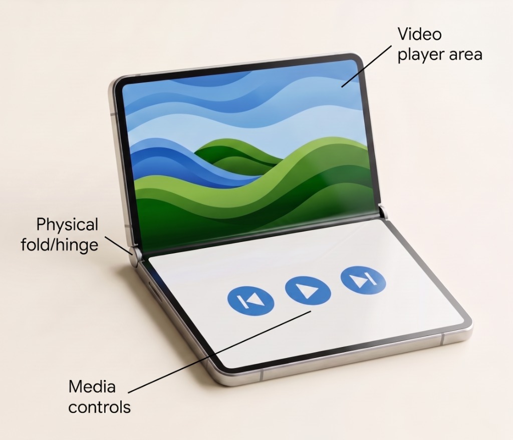
Tabletop posture on foldable devices splits a single screen into two functional display areas divided by the physical fold (or hinge). Tabletop posture lets you place your app's main content (like a video player or game canvas) on the top half, while positioning interactive elements (like media controls or control pads) on the bottom half.

Foldable device in tabletop posture showing video content on the top screen and playback controls on the bottom screen.
Figure 1. Tabletop posture splits content and interactive controls across the physical fold.

Best practices

To add tabletop support to your app, use the Grid API to define a layout with two rows and one column, and apply the tabletop window posture media query.

  • Detect tabletop posture reactively: Use the mediaQuery composable to observe the device state. When the device is folded into tabletop posture (windowPosture == Posture.Tabletop), dynamically shift your layout without requiring activity restarts or complex lifecycle handling.
  • Structure layouts with Grid: When in tabletop posture, use the Grid API (2 rows, 1 column) to cleanly separate primary visual content into the top row above the fold and interactive controls into the bottom row below the fold.
  • Leverage implicit z-indexing for overlays: In standard (non-tabletop) postures, assign multiple area IDs to the same cell to overlay controls over the player. Grid automatically renders items back-to-front in their declaration order.
  • Provide smooth transitions: Ensure state and scroll positions are preserved when transitioning between standard full-screen layouts and tabletop posture.

Ingredients

  • Grid: An adaptive layout container that lets you position items in configurable rows and columns, ideal for splitting content across distinct screen regions.
  • mediaQuery: A Jetpack Compose API used to query the app's current window posture, size classes, and hardware characteristics directly within your composables.

Steps

Query the device posture using mediaQuery(). When the device is in tabletop posture, arrange your app's content into a vertical grid with two rows and one column, ensuring primary content stays on top and controls stay accessible at the bottom.

1. Define Grid configurations for tabletop mode

Inside a composable function, define layout area IDs using an enum and set up GridConfigurationScope blocks for default and tabletop postures.

In defaultConfig, both areas are assigned to the same cell (row = 1, column = 1). Grid uses implicit z-indexing where composables declared later in the layout are rendered on top of earlier ones, allowing the controller to overlay the player without extra container nesting (see UI element overlays with Grid for more details).

enum class VideoPlayerArea { Player, Controller }

object PlayerGridConfig {
    // Default: Single area layout with overlay (controls on top of player)
    val defaultConfig: GridConfigurationScope.() -> Unit = {
        row(1f)
        column(1f)
        area(areaId = VideoPlayerArea.Player, row = 1, column = 1)
        area(areaId = VideoPlayerArea.Controller, row = 1, column = 1)
    }

    // Tabletop: Two rows splitting content across the fold
    val tabletopConfig: GridConfigurationScope.() -> Unit = {
        row(0.5f)
        row(0.5f)
        column(1f)
        area(areaId = VideoPlayerArea.Player, row = 1, column = 1) // Top half above fold
        area(areaId = VideoPlayerArea.Controller, row = 2, column = 1) // Bottom half below fold
    }
}

2. Detect tabletop posture and apply configuration to Grid

Use mediaQuery to select the active configuration based on windowPosture, pass config to Grid, and bind composable content to the area IDs. Declaring VideoPlayerArea.Player before VideoPlayerArea.Controller ensures that when both share a cell in defaultConfig, the controls render above the player:

val config = mediaQuery {
    when (windowPosture) {
        Posture.Tabletop -> PlayerGridConfig.tabletopConfig
        else -> PlayerGridConfig.defaultConfig
    }
}

Grid(config = config) {
    Box(
        modifier = Modifier
            .gridItem(areaId = VideoPlayerArea.Player)
    ) {
        // VideoPlayerContent
    }

    Box(
        modifier = Modifier
            .gridItem(areaId = VideoPlayerArea.Controller)
    ) {
        // PlaybackControlsContent
    }
}

Results

By combining mediaQuery and Grid, your app dynamically detects when a foldable device is partially folded into tabletop posture and automatically adjusts its UI into two functional display areas divided by the fold.

Additional resources