非滚动式应用的常见布局
使用集合让一切井井有条
根据您的偏好保存内容并对其进行分类。
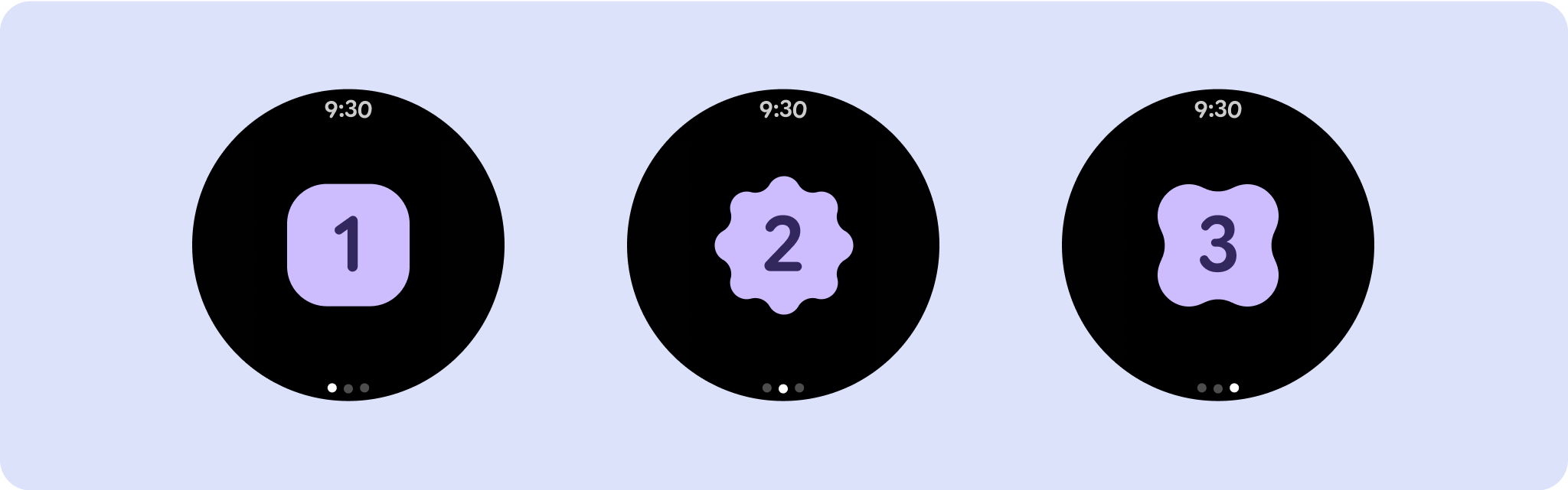
非滚动应用视图布局包括媒体播放器、确认对话框、选择器、切换器,以及使用进度指示器的特殊健身或跟踪屏幕。您可以限制任何屏幕的高度,以确保用户专注于一项任务或一组控件,而无需浏览选项列表。为了适应屏幕尺寸较小的设备,请在设计时考虑到尺寸限制,确保一目了然,并在适用时采用圆形屏幕。

制作自适应且经过优化的设计
非滚动视图侧重于提供一目了然的信息,并通过最少的互动为用户提供价值。不过,要将自适应行为构建到这些布局中可能并非易事。为解决此问题,我们更新了 Android 界面库布局和组件,使其具有内置的自适应行为,包括基于百分比的内边距和内边距。如果您使用的是我们的 Compose 组件,则可以自动继承这种响应能力。
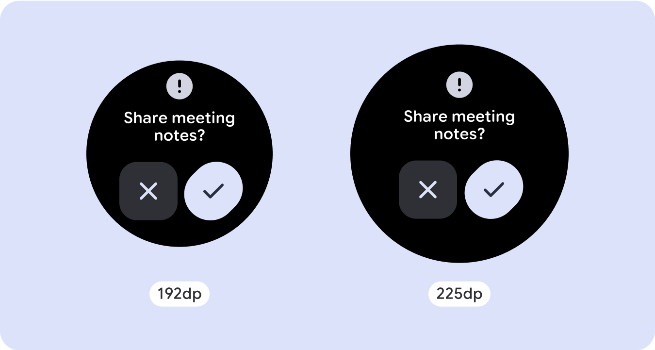
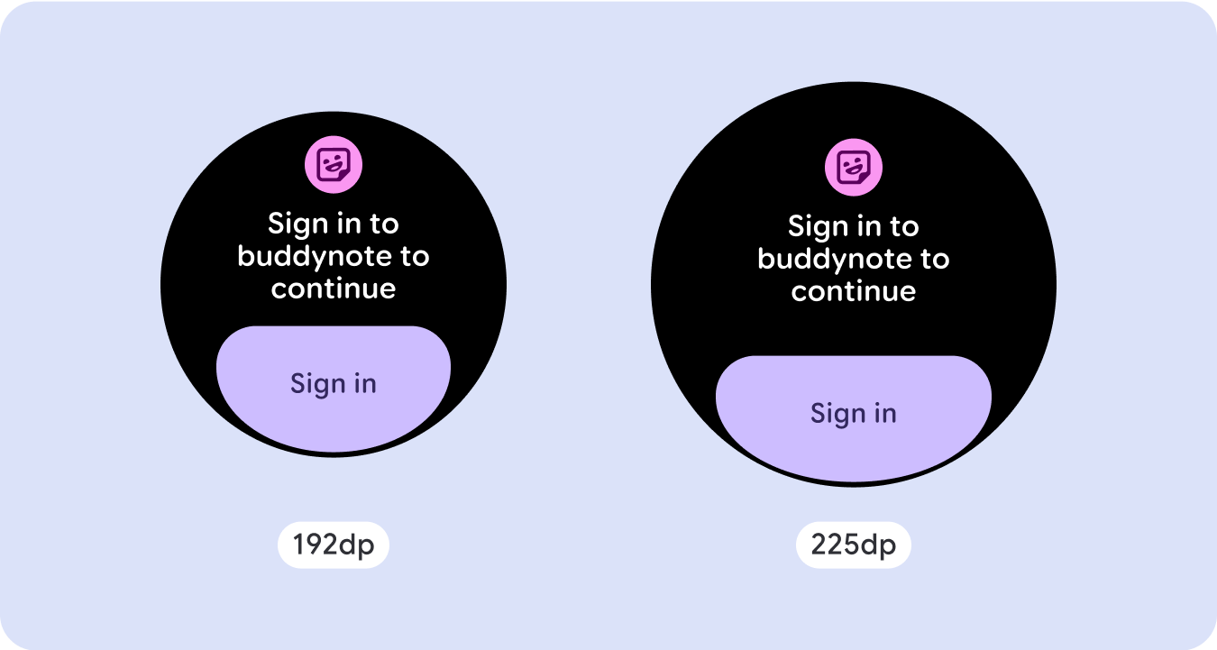
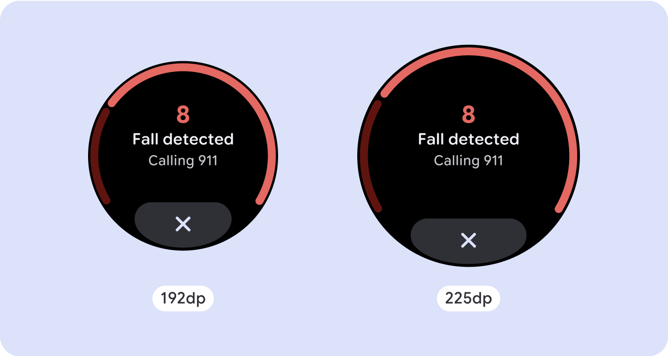
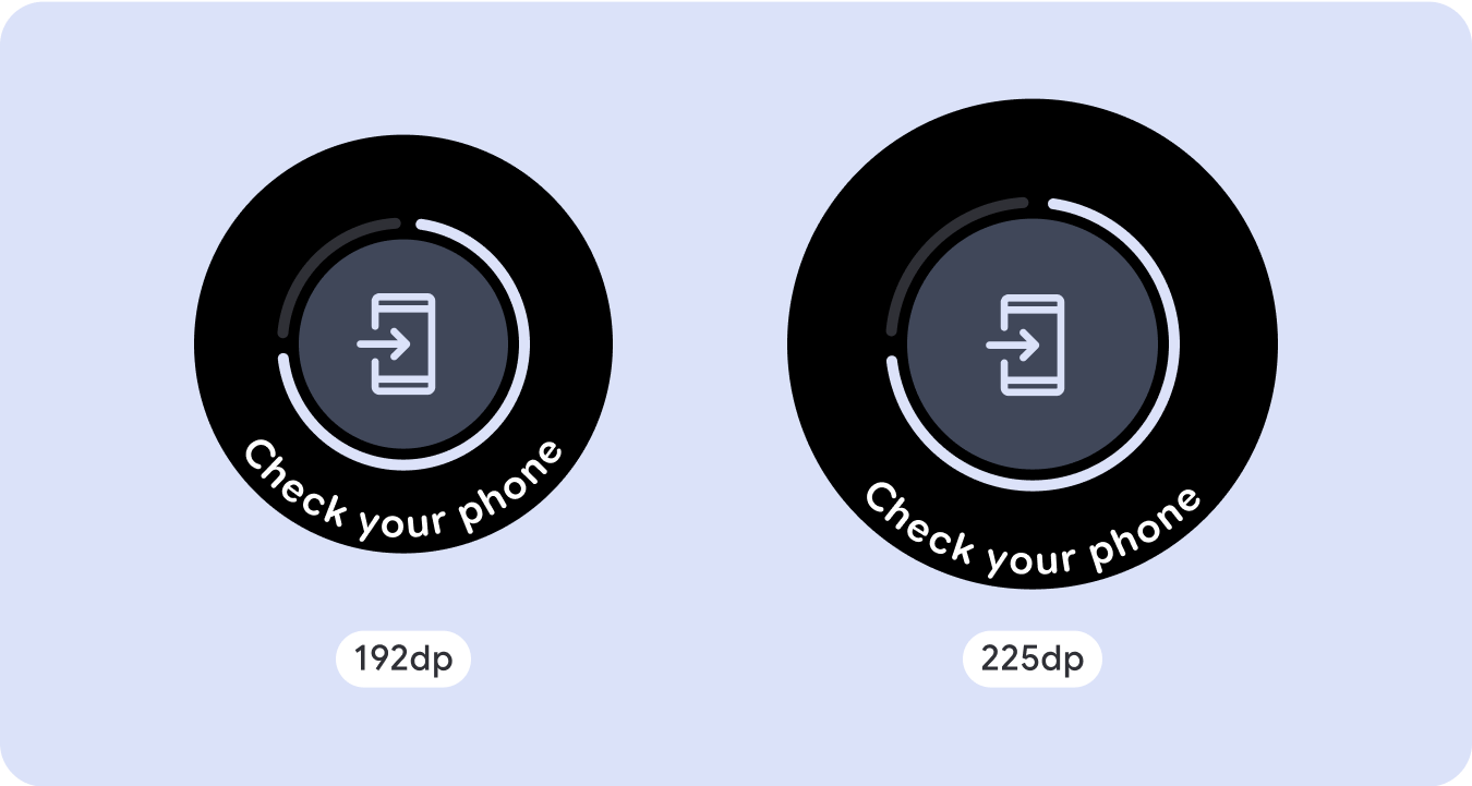
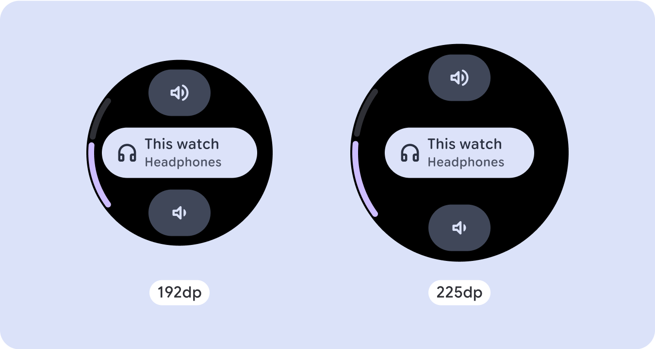
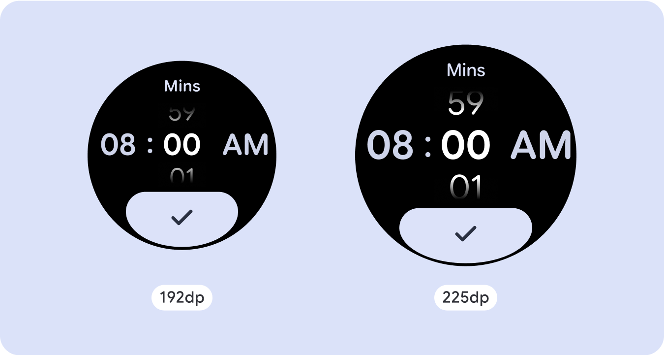
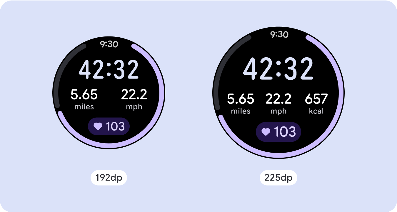
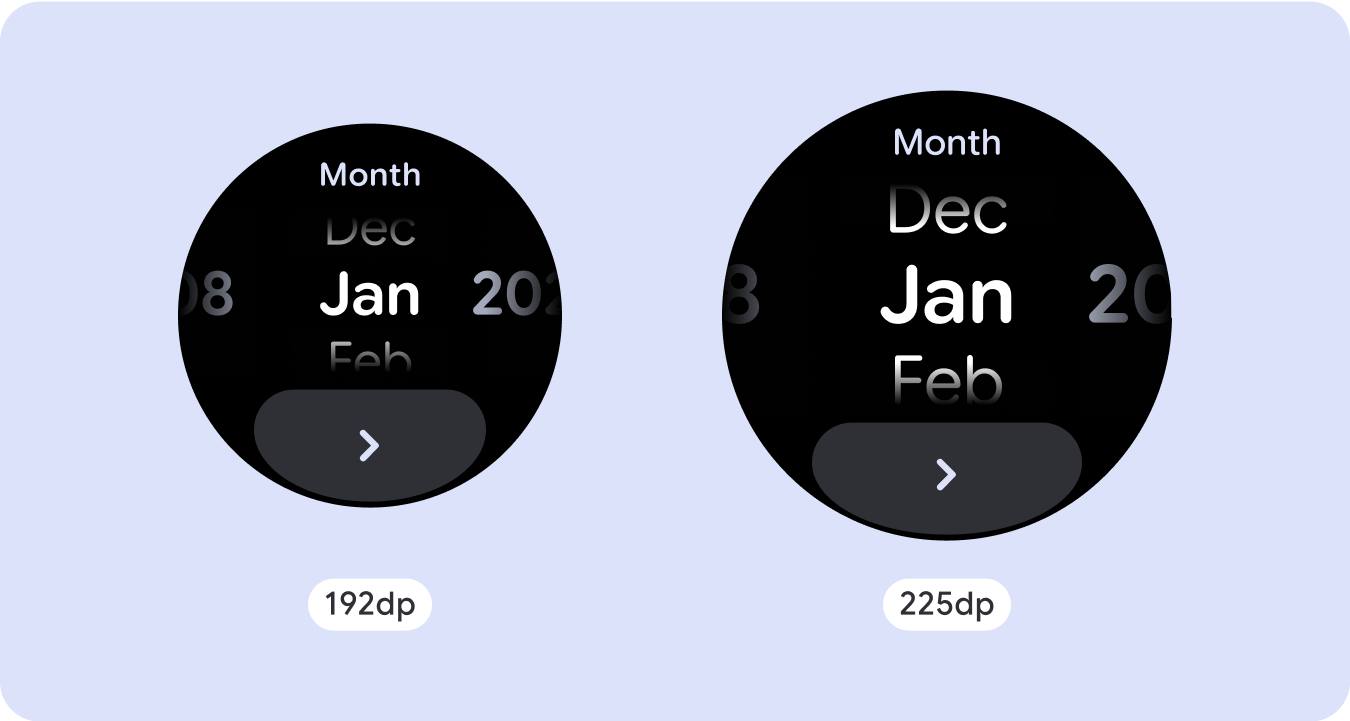
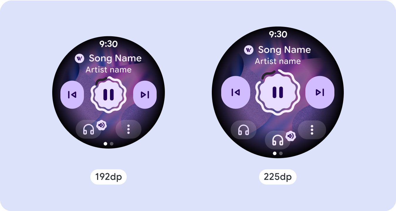
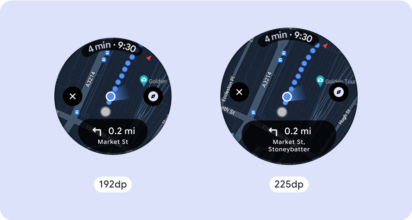
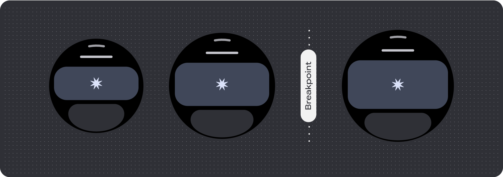
对于独特的屏幕设计,请在各种屏幕尺寸上进行全面测试,确保组件和元素能够顺畅自适应,并避免内容被剪裁。百分比边距有助于有效缩放分隔符,我们建议在 225dp 处使用断点,以便在较大的手表屏幕上显示更多信息和增强功能。
检查组件是否会根据可用宽度和高度进行自适应
所有组件均采用自适应方式构建,这意味着它们会根据可用宽度(以及全屏时的高度)进行调整。请确保您设置了必要的外边距,以确保内容不会被屏幕的圆角剪裁。此外,请确保必要的布局行为,以确保非滚动屏幕内容不会推送布局以进行滚动或被截断。
构建自适应且差异化的设计
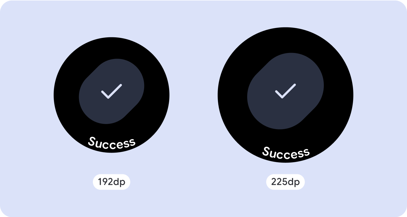
为了充分利用大屏幕尺寸的额外空间,请在 225dp 处添加尺寸断点。借助此断点,您可以显示更多内容、添加更多信息、选项和数据,或更改布局以更好地适应较大的屏幕尺寸。
这需要为每个断点采用不同的设计。较大的屏幕设计(225 英寸以上)可以包含以下额外元素:
增加现有组件的大小或更改其状态
使用断点可显示更多详细信息或让内容更一目了然。只需确保在小屏幕上体验或功能不会中断,并且大屏幕更改只是额外的更改即可。
在当前布局中添加内容
通过添加组件或内容,布局可以提供更多选项和细节,最终提升价值。
但这绝不应以牺牲一目了然为代价。
如果某个体验需要更多内容,但希望保留非滚动布局,不妨考虑采用采用垂直或水平分页的多页面布局。

响应式和自适应行为
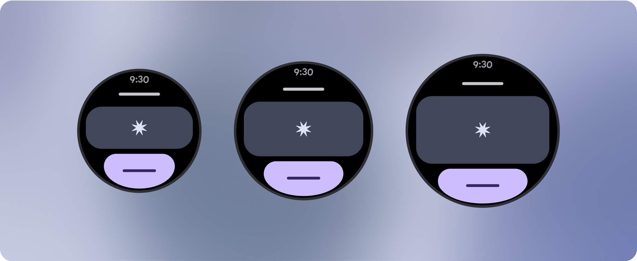
Compose 库中的所有组件都会自动适应更大的屏幕尺寸,并获得宽度和高度。特别是对于这些视图,利用断点可以为所有用户提供特别丰富且有价值的体验。以百分比定义所有边距,并定义垂直约束条件,以便中间的主内容可以延伸以填充可用的显示区域。
在设计时,最好将非滚动屏幕分为顶部、中部和底部三部分。这样,您就可以为顶部和底部部分添加内边距以避免剪裁,同时让中间部分充分利用屏幕的整个宽度。如果屏幕尺寸有限,不妨考虑使用旋转滚动按钮来控制屏幕元素,因为仅点按互动可能无法提供最佳体验。
核对清单
- 创建在所有屏幕尺寸上看起来合理的灵活布局。
- 应用建议的顶部、底部和侧边外边距。
- 在内容可能会被剪裁的位置,以百分比值定义边距。
- 利用布局约束条件,让元素尽可能充分利用屏幕空间,并在不同设备尺寸之间保持平衡。
- 留出显示时间文本(如果使用)的位置,但不能与页面顶部重叠(如需了解详情,请参阅顶部留有间隙的进度指示器)
- 考虑使用紧贴边缘的按钮,以充分利用有限的空间。
- 考虑在 225dp 处应用断点,以在更大的屏幕尺寸上显示更多内容或使现有内容更易于浏览。

全屏进度指示器
进度指示器的行为不会发生变化,因为它会自动适应屏幕大小,不过,请考虑在中央区域应用比例(百分比)外边距和内边距,以充分利用空间。此外,还应考虑使用断点来增加大屏幕上的组件大小或数量。

打造差异化体验
非滚动布局可自定义,但在可向屏幕添加的内容量和最适合使用的组件类型方面受到更多限制。使用图标按钮(而非更宽的药丸形按钮)可以更好地利用有限的空间,进度指示器和大数据点等直观图形有助于以图形方式传达关键信息。贴合屏幕边框的所有元素都会自动随屏幕尺寸而增大,从而产生更大的视觉冲击力。

本页面上的内容和代码示例受内容许可部分所述许可的限制。Java 和 OpenJDK 是 Oracle 和/或其关联公司的注册商标。
最后更新时间 (UTC):2025-07-27。
[null,null,["最后更新时间 (UTC):2025-07-27。"],[],[],null,["# Common layouts for non-scrolling apps\n\nNon-scrolling app view layouts include media players, confirmation dialogs,\npickers, switchers, and special fitness or tracking screens using progress\nindicators. You can restrict the height of any screen, which ensures the user is\nfocused on one task or set of controls, rather than needing to browse through a\nlist of options. To accommodate devices with smaller screen sizes, design with\nthe limited size in mind, ensuring glanceability and embracing the circular\nscreen where relevant.\n\nBuild responsive and optimized designs\n--------------------------------------\n\nNon-scrolling views focus on glanceable information and offer users value with\nminimal interaction. However, building responsive behavior into these layouts\ncan be challenging. To address this, we have updated our Android UI library\nlayouts and components with built-in responsive behavior, including\npercentage-based margins and padding. If you're utilizing our Compose\ncomponents, you can automatically inherit this responsiveness.\n\nFor unique screen designs, thoroughly test across a variety of screen sizes,\nensuring components and elements adapt smoothly and avoid content clipping. Our\npercentage margins help spacers scale effectively, and we recommend using a\nbreakpoint at 225dp to introduce additional information and enhanced\nfunctionality on larger watch screens.\n\nCheck that components adapt to the available width and height\n-------------------------------------------------------------\n\n\nAll components are built responsively, meaning they adapting to the available\nwidth (and height when full screen). Make sure you have the necessary margins to\nensure content doesn't get clipped by the rounding curve of the screen.\nAdditionally, ensure the necessary layout behavior to ensure your non-scrolling\nscreen content doesn't push the layout to scroll or get cut off. \n\n\n\u003cbr /\u003e\n\nBuild adaptive and differentiated designs\n-----------------------------------------\n\nIn order to best use the additional space on larger screen sizes, add a size\nbreakpoint at 225dp. This breakpoint makes it possible to reveal additional\ncontent, include more information, options, data, or change the layout to better\nsuit the larger screen size.\n\nThis requires a different design for each breakpoint. The larger screen design\n(225+) could include the following additional elements:\n\n### Increase the size or change the state of the existing components\n\n\nUse the breakpoint to show more detail or make the content more glanceable. Just\nmake sure the experience or functionality isn't broken on small screen and the\nlarge screen changes are only additional. \n\n\n\u003cbr /\u003e\n\n### Add content within the current layout\n\n\nBy adding components or content, the layout provides additional options, detail\nand ultimately, value.\n\nThis should never come at the cost of the glanceability. \n\n\u003cbr /\u003e\n\nUse pagination\n--------------\n\nIn scenarios where an experience requires more content but wants to retain a\nnon-scrolling layout, consider a multi-page layout with either vertical or\nhorizontal pagination.\n\nResponsive and adaptive behavior\n--------------------------------\n\nAll components in the Compose library will automatically adapt to the wider\nscreen size, and gain width and height. For these views in particular, utilizing\nbreakpoints can deliver a particularly rich and valuable experience for all\nusers. Define all margins in percentages, and define vertical constraints such\nthat the main content in the middle can stretch to fill the available display\narea.\n\nIt's best to break a non-scrolling screen into a top, middle, and bottom section\nwhen designing. This way, you can add inner margins to the top and bottom\nsection to avoid clipping, but allow your middle section to take advantage of\nthe full width of the screen. Consider the use of the rotary scroll button to\ncontrol elements of the screen when its size is limited, as tapping interactions\nalone may not provide the best experience.\n\n### Checklist\n\n- Create flexible layouts that look reasonable on all screen sizes.\n- Apply the recommended top, bottom, and side margins.\n- Define margins in percentage values in places where content might otherwise be clipped.\n- Utilize layout constraints so that elements make the best possible use of the space within the screen and maintain balance across different device sizes.\n- Accommodate Time Text if used, but not overlapping the top section of the page (see progress indicators with a top gap for more)\n- Consider using edge-hugging buttons to utilize more of the limited space.\n- Consider applying a breakpoint at 225dp to introduce additional content or make existing content more glanceable when on bigger screen sizes.\n\n**Full screen progress indicators**\n\nThere is no behavior change on the progress indicator as it automatically adapts\nto the screen size, however, consider applying proportional (percentage) margins\nand padding on the central area to best utilize space. Also consider a\nbreakpoint to increase the size or number of components on larger screen.\n\nCreate differentiated experiences\n---------------------------------\n\nNon-scrolling layouts are customizable, but are more limited in how much content\ncan be added to the screen and what kind of components work best. Using Icon\nButtons instead of wider pill shaped Buttons makes better use of the limited\nspace, and visual graphics like Progress Indicators and large data points help\ncommunicate key information in a graphical way. All elements that hug the screen\nbezel automatically grow with the screen size, so they become even more\nimpactful."]]