应用可利用在关键屏幕尺寸断点*处实现的新布局,专门针对屏幕尺寸打造用户体验,为屏幕较大的设备用户提供额外价值,从而提供小屏设备无法比拟的用户体验。
*在界面 (UI) 设计中,断点是指特定的屏幕宽度或视口大小,在该大小下,系统会更改内容的布局和呈现方式,以优化各种设备上的用户体验。开发者使用代码(例如 CSS 媒体查询)来定义这些点,建议您在设计规范中为这些断点提供两种设计。Wear OS 屏幕尺寸从 192dp 开始,大屏幕的默认断点为 225dp。
在 Wear OS 上使用断点
在 225dp 处使用断点 (BP) 有助于优化各种尺寸的布局。
正确做法
- 在 225dp 或更高分辨率下设计自定义布局和行为,以使用额外的屏幕空间。
- 尽可能在断点后添加值。
- 在 BP 后面使用较大的组件选项,以便一目了然地查看界面。
- 富有表现力且大胆。
错误做法
- 仅针对一种设备尺寸进行设计。在多种屏幕尺寸上测试您的设计。
- 仅依赖响应式行为。
- 让您的应用或功能块平平无奇。
示例
以下图片展示了自适应且具有差异化的应用示例。
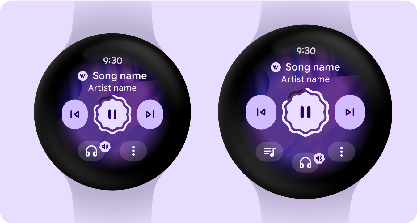
媒体播放器
在 225dp 断点之后增加了主控件大小和底部按钮,从而增强了价值,更好地利用了较大屏幕上的额外空间,并提高了一目了然性。
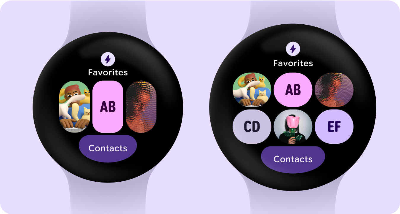
包含按钮组的功能块
在 225dp 断点后添加了一行按钮 - 通过额外的按钮增加了价值。
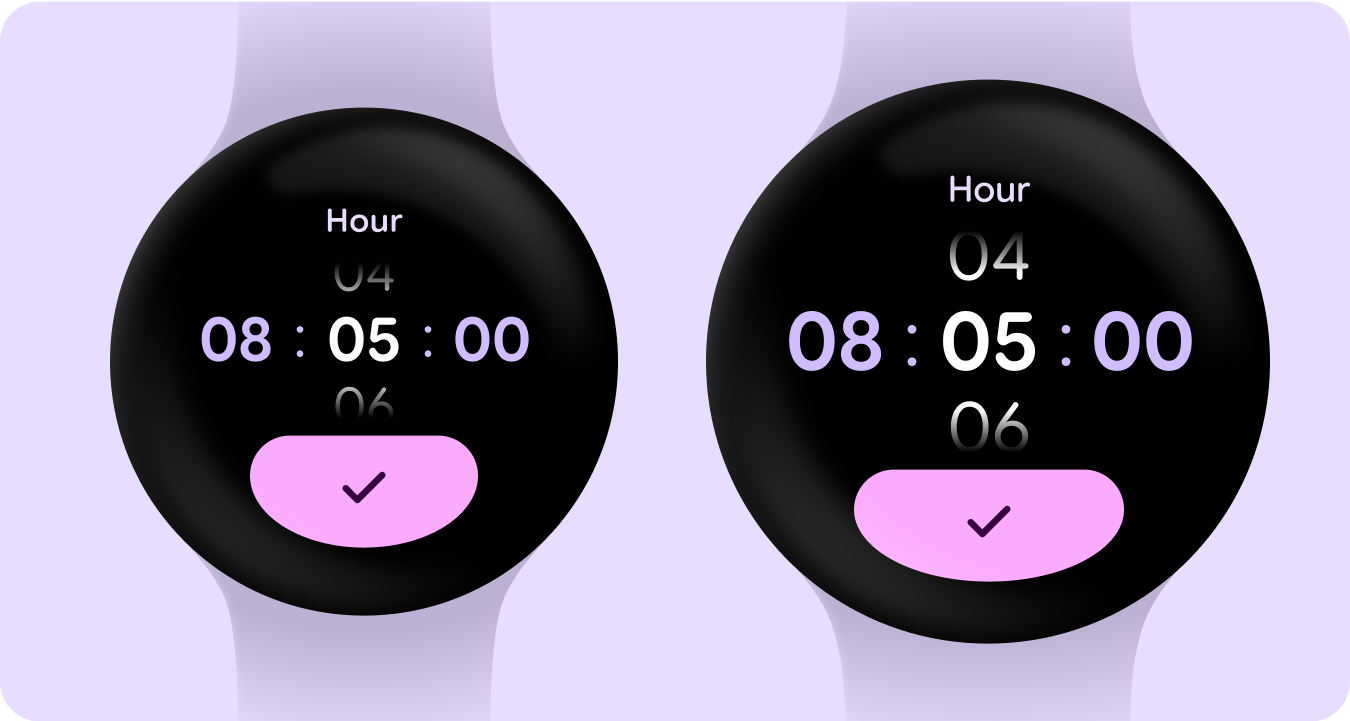
Picker
在 225dp 断点之后,数字会增大,以便更好地利用大屏设备上的额外空间,并提高一目了然的效果。
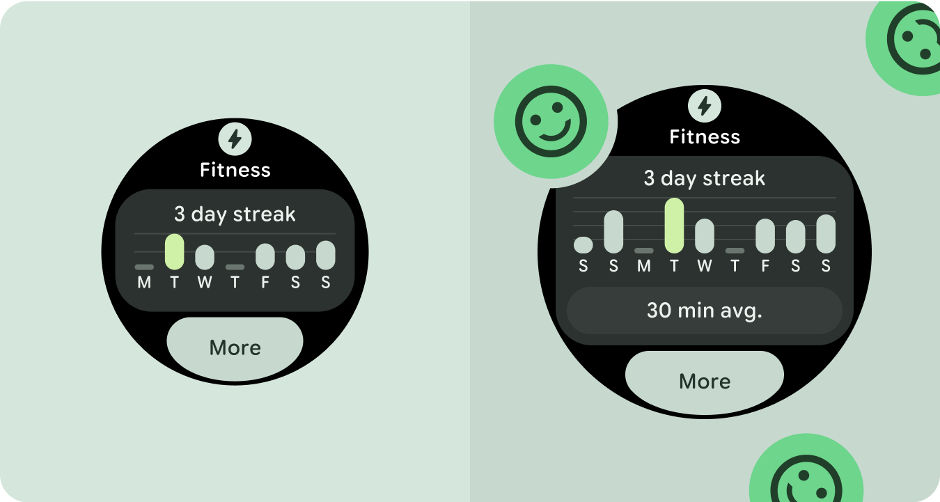
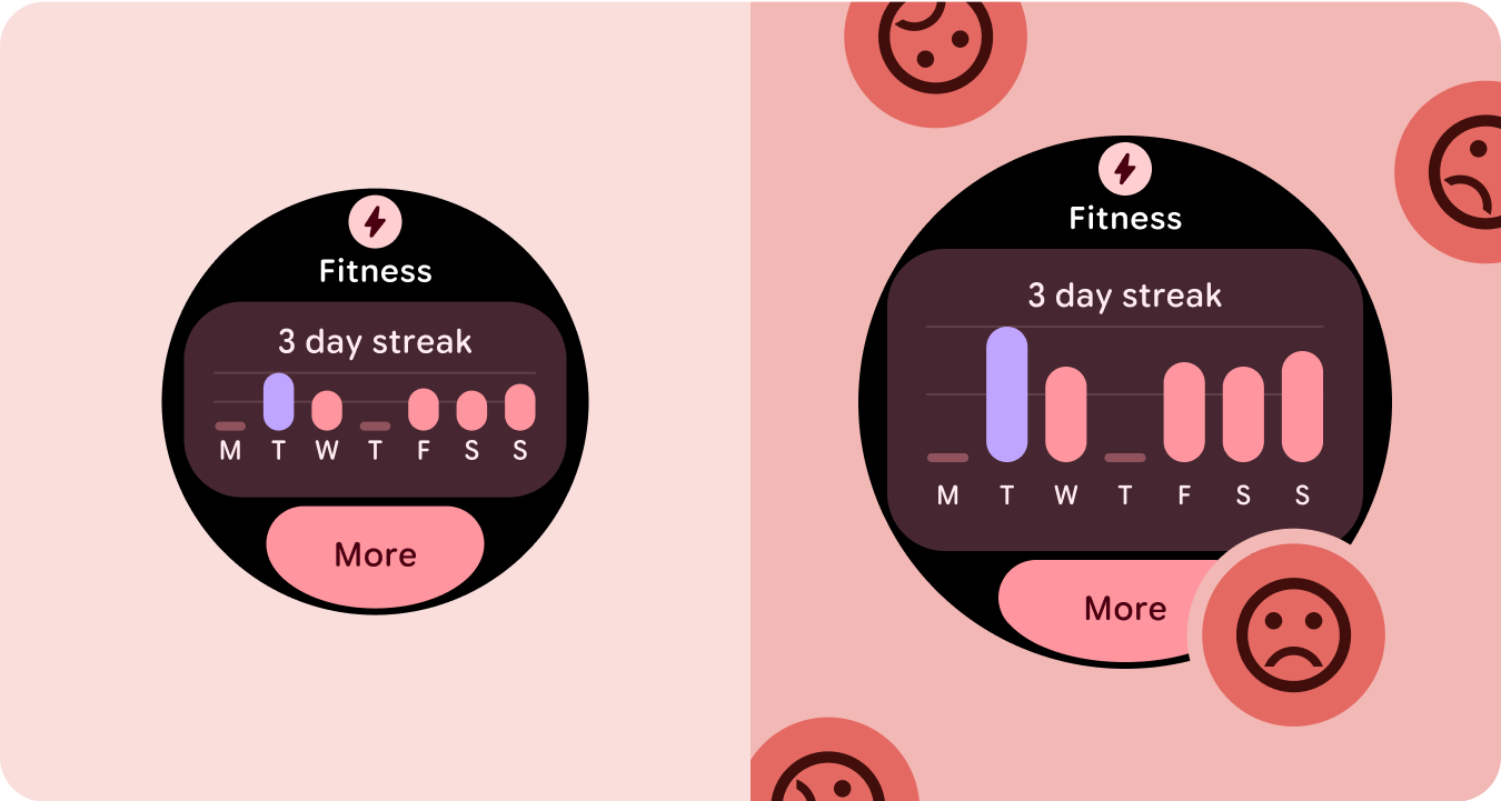
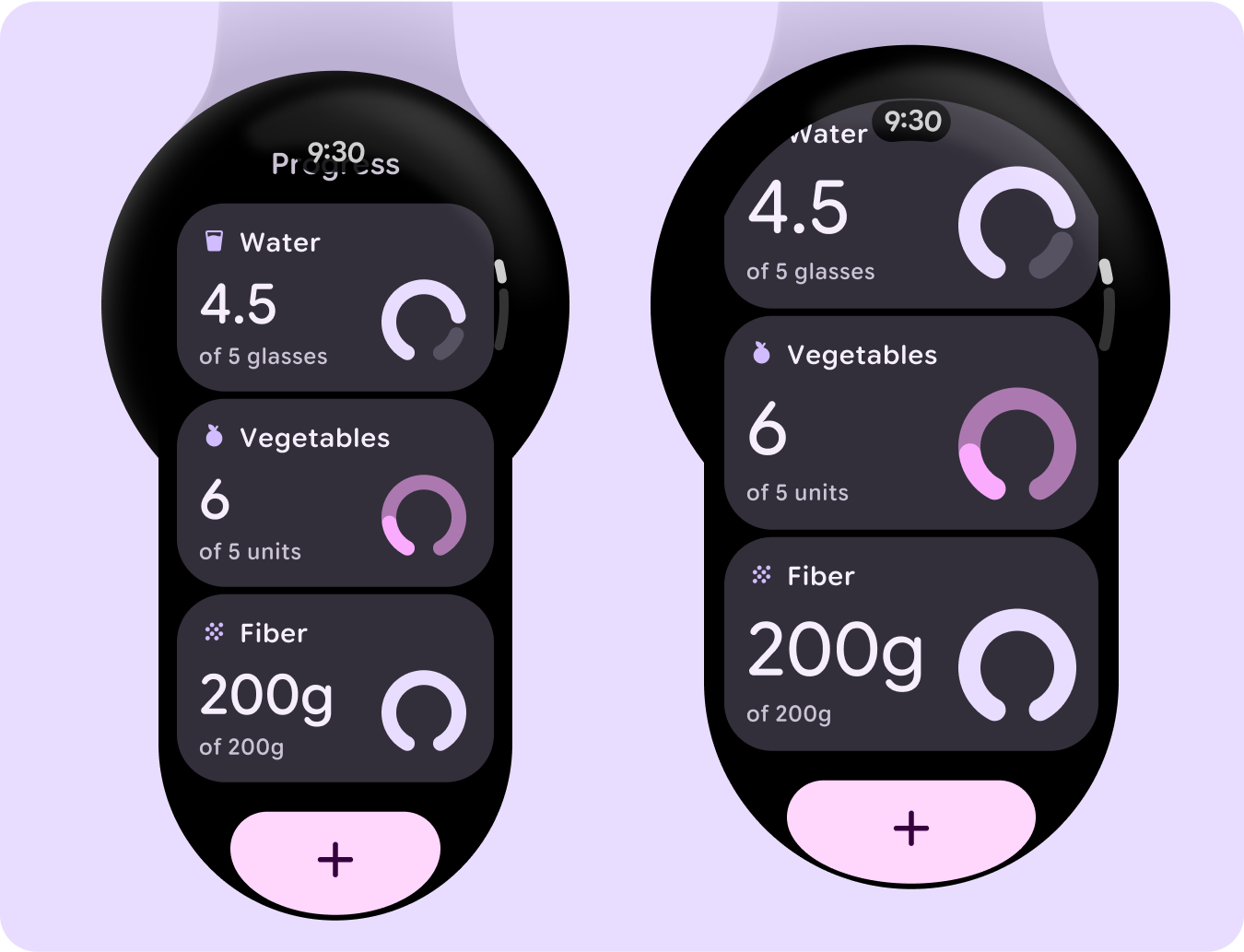
包含图表的卡片列表
在 225dp 断点之后增加了主数字和图表,以便更好地利用大屏幕上的额外空间,并提高一目了然的效果。
包含卡片的功能块
在 225dp 断点后添加了包含卡片的额外行,通过额外的卡片增强了价值。
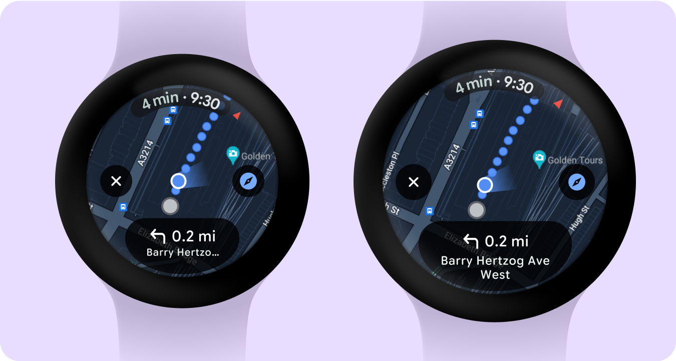
Google 地图
在 225dp 断点后添加了包含卡片的额外行,通过额外的卡片增强了价值。
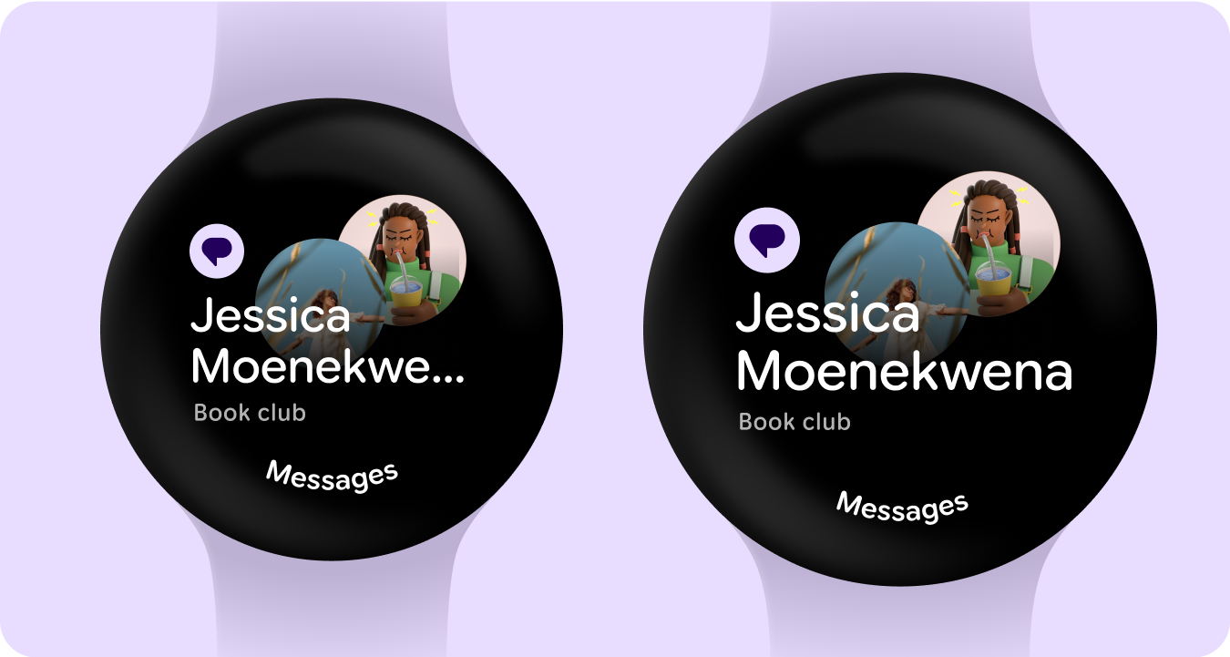
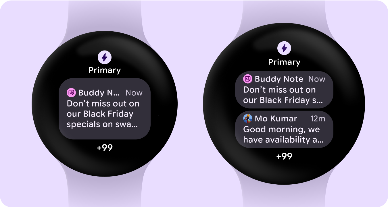
一目了然的通知
在 225dp 断点之后增加图片、应用图标和文字大小,以便更好地利用大屏幕上的额外空间并提高一目了然的效果。