
实践证明,Material 3 Expressive 可打造更具吸引力且更易于访问的产品,支持顺畅的跨产品体验,并提高团队的开发速度。打造用户喜爱的产品。

更出色、更简单、更具情感的用户体验
Google 大胆采用全新设计方向背后的研究
Material 3 Expressive 是 Google 设计系统有史以来经过最多调研的更新。在本视频中,Material Design 研究人员分享了设计背后的数据,以及有关用户对情感驱动型用户体验偏好的新见解。
Material 3 Expressive 源自研究,但不是通过将设计决策委托给数据来确定 41 种蓝色,而是通过涵盖研究、设计和工程的协作式调查来确定。早在 2022 年,我们的研究实习生就曾研究过用户对 Google 应用中 Material Design 的看法。在向同事提及初步发现后,团队开始了设计辩论:为什么所有这些应用看起来都如此相似?很无聊吗?您能否进一步强化这种感觉?
在过去三年里,我们探索了这一对话的意义,进行了数十轮设计和研究迭代,以寻找 Material Design 的下一步演变。通过数十项涉及数百种设计的独立研究,以及来自世界各地的数万名参与者,我们精心优化了这个既美观又易用的系统。
Material 3 富有表现力的设计原则植根于扎实的研究,并以长期以来的易用性最佳实践为基础。设计师可以充满信心地应用这些组件和原则,因为他们知道自己正在构建的是用户能够感同身受的内容。
研究 Material 3 Expressive
在设计团队构思初始概念并探索如何在各种 Google 产品中运用更具表现力的设计理念时,我们采用了多种方法开展了一系列研究,包括:
- 眼动跟踪:分析用户将注意力集中在哪些位置。
- 调查问卷和焦点小组:衡量用户对不同设计的情绪反应。
- 实验:收集情感和偏好。
- 易用性:了解参与者能多快理解和使用界面。
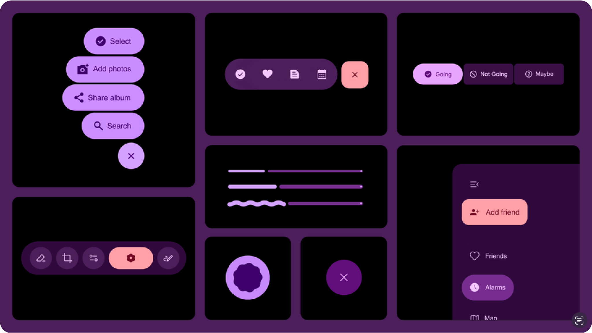
为了打下坚实的基础,我们首先研究了各个组件。示例如下:
- 我们评估了进度指示器的各种选项,以确定哪种选项能让等待时间感觉更短,同时看起来像是高端手机上的进度指示器。
- 我们研究了按钮的大小,力求缩短点按时间,同时又不会让屏幕上的其他内容显得过于繁杂。
- 我们对新的浮动工具栏进行了多项研究,优化了设计,使其看起来现代、简洁、充满活力,同时又醒目且易于使用。
在进行这项研究时,我们非常注重遵循无障碍功能要求和最佳实践。在许多情况下,我们选择超越现有标准,在点按目标大小、颜色对比度和其他可提高界面易用性的方面做得更好。这项研究帮助我们打造了 Material Design 这一新演变所需的构建块和准则。

但顶级偏好设置只能告诉我们这么多。我们希望深入探讨导致用户做出此偏好的设计方面。
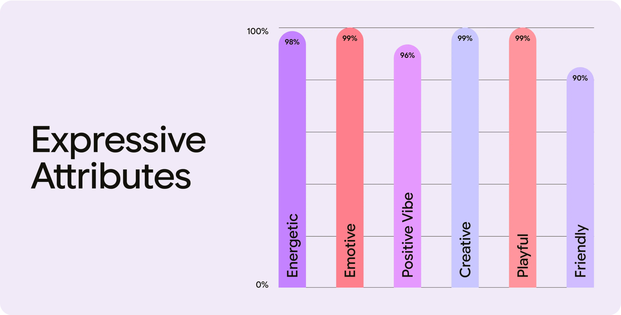
在去年的 Google I/O 大会上,我们推出了一组 Material Design 团队用于比较设计的属性。您可能已经注意到,其中许多都是情感词语。例如,“活泼”“充满活力”“富有创意”“友好”和“积极氛围”。
在开发 Material 3 Expressive 的过程中,我们的研究人员与设计师合作,根据这些属性迭代测试新的屏幕设计,帮助优化设计,以获得预期的情感反应。此外,我们还致力于确保使用此新系统创建的设计看起来更现代、更具视觉吸引力。
用户调研结果
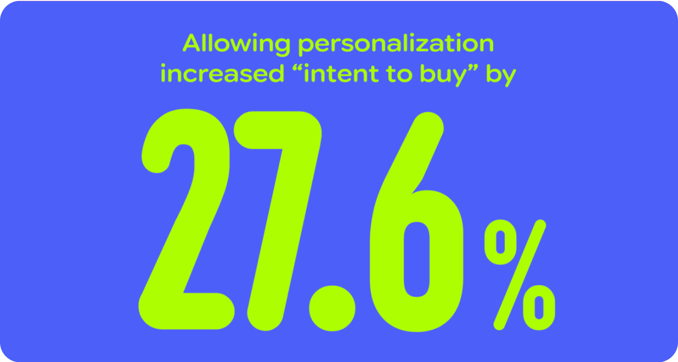
研究表明,Google 用户将其移动设备和软件体验视为自己的延伸,并且用户希望应用体验能够反映用户对样式(颜色、类型和对比度)和行为(例如优先显示常用的应用和操作)的个人偏好。这种需求在年轻一代不断变化的口味和期望中尤为普遍。
平均而言,在偏好度(增加约 100%)和美感(最多增加 170%)方面,表现更出色的设计变体优于基准变体。
打造令人向往且更易于使用的产品
添加用户喜爱的功能,例如个性化、富有表现力的组件和新的配色算法。
使用 Material 3 富有表现力的样式和组件,让您的产品默认可访问。
开始使用
现在,我们应该超越“简洁”和“乏味”的设计,打造能够在情感层面与用户建立联系的界面。准备好亲自试用一下了吗?我们提供了一些提示:
- 开始试验:深入了解经过更新的适用于 Figma 的 Material 3 富有表现力的设计套件,并开始使用富有表现力的设计选项。
- 尝试这些策略:探索使用 Material 3 富有表现力的设计策略,同时定制界面以支持核心用户体验历程。
- 有目的地从用户需求出发:虽然富有活力且富有表现力的设计广受欢迎,但少数用户更喜欢色彩较为柔和、强度较低的版本。始终从用户需求入手。在确定合适的策略和组件之前,请先了解他们的要求和关键用户历程。
- 优先考虑功能:请勿为了视觉效果而牺牲产品的核心功能。再多的感情也无法弥补信息不明确的问题。
- 遵循无障碍标准:遵循有关颜色对比度、屏幕阅读器兼容性、导航和其他无障碍功能最佳实践的既定准则。
- 迭代、迭代、迭代:通过研究,在新颖性和熟悉感、趣味性和专业性之间找到恰当的平衡。我们的设计尺度可助您快速上手。别忘了开展易用性研究,以验证您没有过度使用。