创建更易于访问的个性化配色方案,传达产品的层次结构、状态和品牌。在为穿戴式设备设计时,颜色在提高可辨性、易用性、视觉吸引力和表达力方面发挥着至关重要的作用,尤其是在小屏幕上。
以下原则介绍了如何在各个主题中使用颜色。
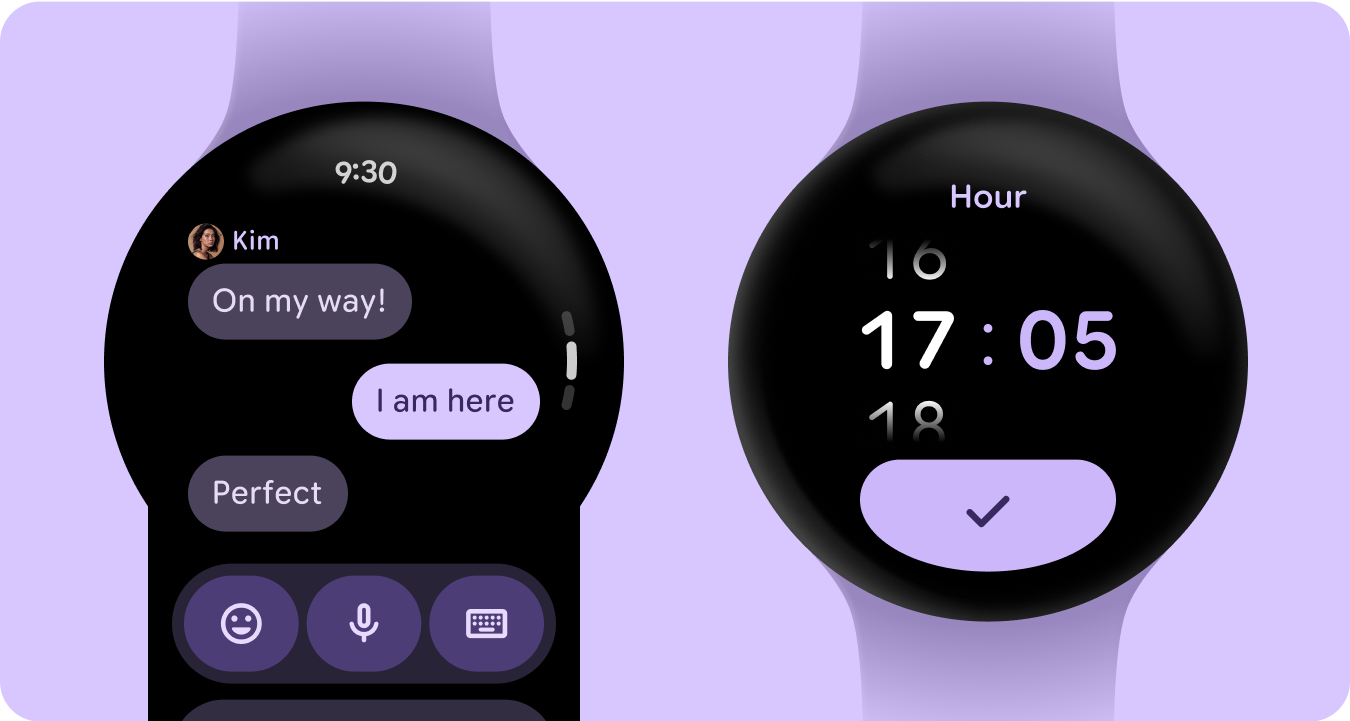
从黑色开始构建
手表采用黑色背景,而不是手机设备使用的有色背景。虽然深色主题适用于弱光环境,浅色主题适用于白天,但手表界面需要在白天和夜晚都能顺畅运行。因此,必须为手表专门定制颜色令牌。
新的颜色角色
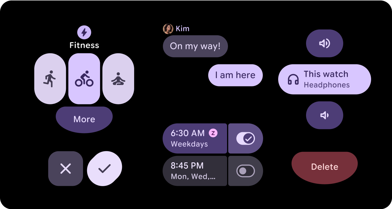
Material 3 颜色系统保留了三个强调色和两个中性 Surface 颜色的结构,但在强调色角色中引入了容器颜色。这些新角色可在不破坏视觉层次结构的情况下实现更强的表现力,从本质上讲,可提供色相更高的 Surface 颜色变体。容器角色特别适合突出显示状态(例如切换按钮),或者在已使用主强调色时提供补充样式。
语义含义
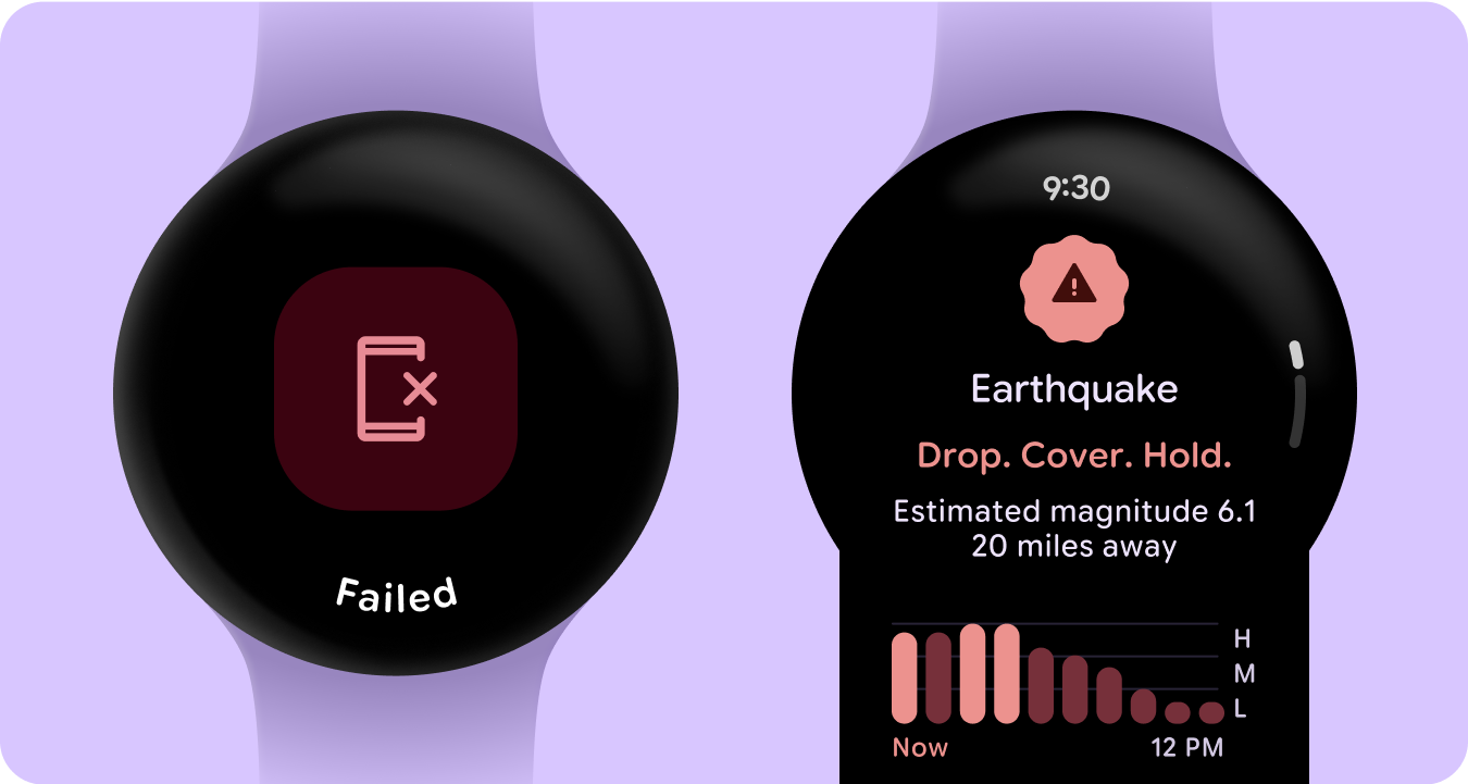
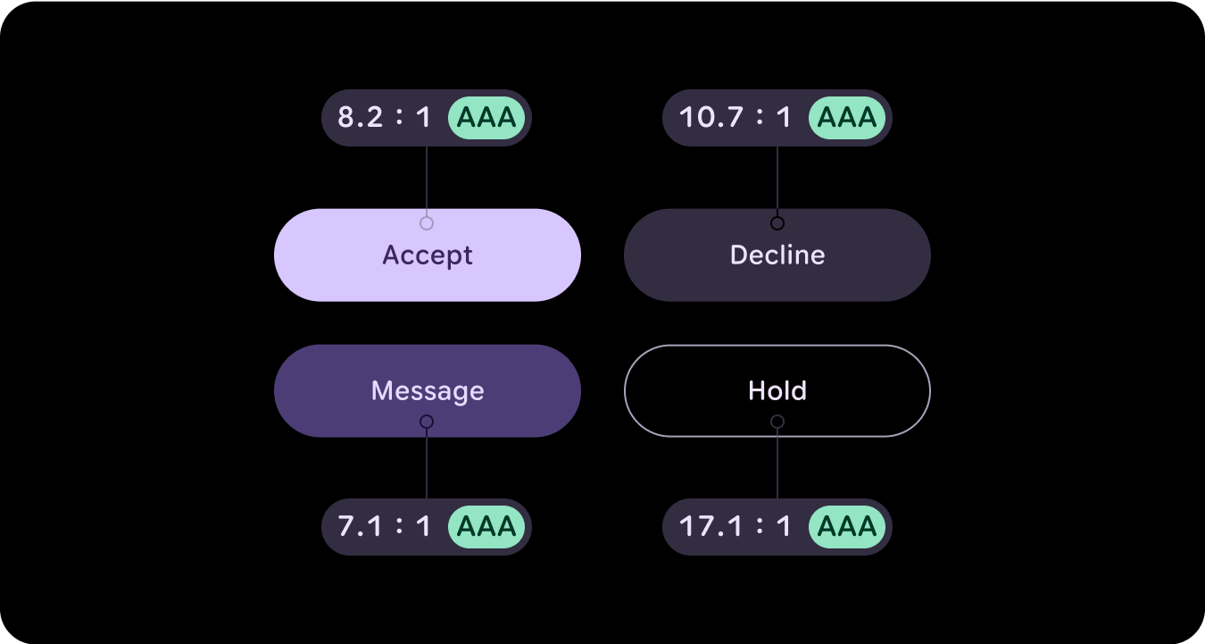
在手表界面中,颜色需要清晰直观地传达含义。例如,红色表示错误,绿色表示成功,有助于用户快速了解操作或状态,而无需额外说明。这种对颜色的语义使用有助于用户浏览界面并充满信心地执行操作。
颜色无障碍功能(对比度合规性)
在手表界面中,颜色需要清晰直观地传达含义。例如,红色表示错误,绿色表示成功,有助于用户快速了解操作或状态,而无需额外说明。这种对颜色的语义使用有助于用户浏览界面并充满信心地执行操作。
新变化
我们对视觉设计系统进行了重大更新,并更新了样式基础、组件和功能块设计库,以提升表达效果。
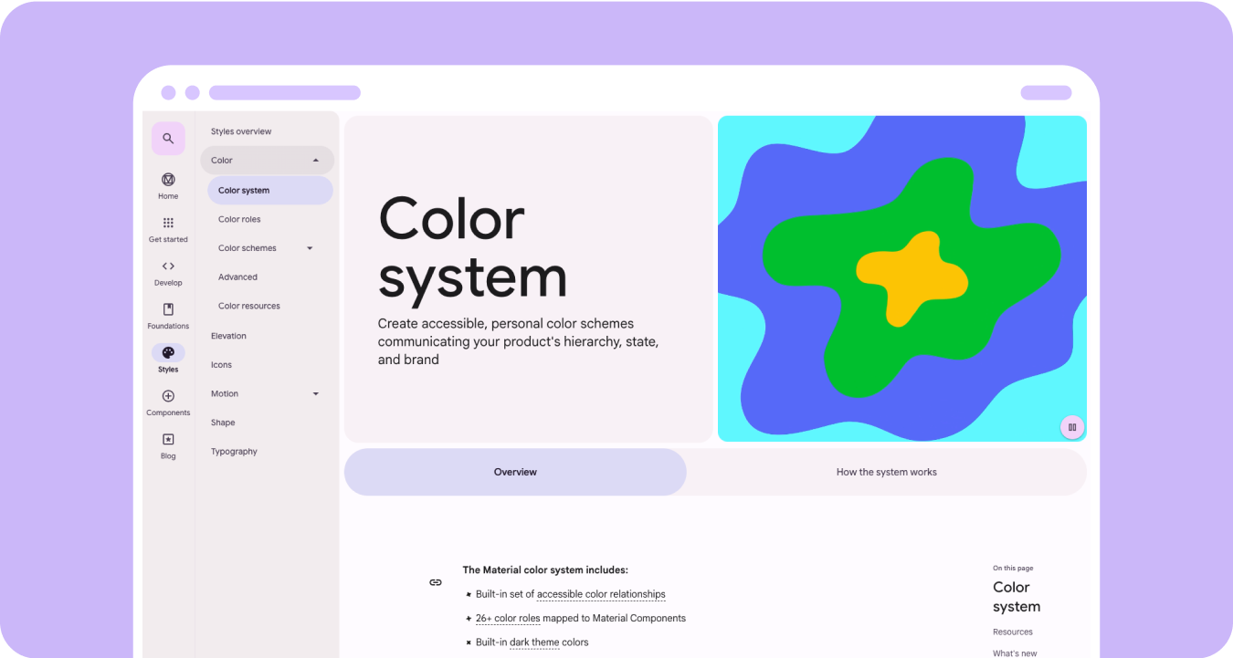
Material 3 富有表现力的配色系统具有以下特点:
- 内置的一组易于分辨的颜色关系
- 28 多种颜色角色映射到 Material 组件
- 用于从黑色构建的深色主题内置颜色
- 改进了停用颜色值
- 其他错误颜色
- 静态基准颜色,为每个颜色角色分配了默认颜色
- 动态配色功能,包括系统/表盘和基于图片的配色主题
资源
如需了解详情,请参阅以下资源。
Material Design 颜色准则