排版中的无障碍功能
使用集合让一切井井有条
根据您的偏好保存内容并对其进行分类。
Wear OS 提供了一系列功能,以支持更易于访问的排版。这包括确保文本与背景之间的颜色对比度足够高,以及支持用户配置文本大小。这些功能有助于为所有用户打造更舒适、更包容的用户体验。
颜色和对比度
为产品的文本和背景选择适当的颜色对比度,以支持视觉无障碍功能。对比度是指两种颜色的亮度或深度之间的感知差异,并通过对比度比率进行量化。关键对比度比率表示足以满足无障碍要求的对比度水平。对于排版,这还包括粗细、比例之间的对比,以及不同类型样式之间的大小关系。
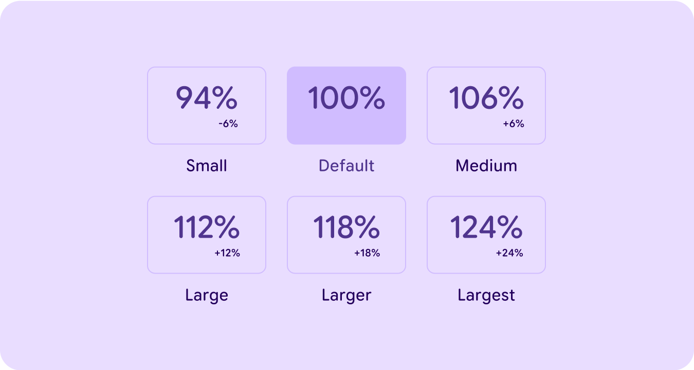
用户可配置的尺寸
布局中的每个文本块都使用 Wear OS 用户可配置的字号框架,其中每种类型样式和角色的缩放比例都会根据用户在系统设置中设置的值按 +/- 6% 的增量增加/减少。
在设计布局时,应考虑最大文本大小和最小文本大小对界面的影响。
本页面上的内容和代码示例受内容许可部分所述许可的限制。Java 和 OpenJDK 是 Oracle 和/或其关联公司的注册商标。
最后更新时间 (UTC):2025-07-27。
[null,null,["最后更新时间 (UTC):2025-07-27。"],[],[],null,["# Accessibility in typography\n\nWear OS provides a range of features to support more accessible typography. This\nincludes ensuring sufficient color contrast between text and background, and\nsupporting user-configurable text sizes. These features help create a more\ncomfortable and inclusive user experience for all users.\n\nColor and contrast\n------------------\n\n\nSupport visual accessibility by choosing the appropriate [color contrast](https://m3.material.io/foundations/designing/color-contrast)\nbetween your product's text and background. Contrast is the perceived difference\nbetween the lightness or darkness of two colors, and is quantified by a contrast\nratio. Key contrast ratios indicate levels of contrast that are sufficient for\naccessibility. In the case of typography this also includes the contrast between\nweight, scale and the size relationship between different type styles. \n\n\u003cbr /\u003e\n\nUser-configurable sizes\n-----------------------\n\n\nEach block of text within a layout uses the Wear OS user-configurable font size\nframework, where each of the type styles and roles increase / decrease in scale\nby +/- 6% increments based on what is set by the user within system settings.\n\nLayouts should be designed while considering the impact of the largest and\nsmallest text sizes on the UI. \n\n\u003cbr /\u003e"]]