קל לארגן דפים בעזרת אוספים
אפשר לשמור ולסווג תוכן על סמך ההעדפות שלך.
Material 3 Expressive מתבסס על שפת הצורות בצורה הרבה יותר מורחבת ומשמעותית, באמצעות שימוש בצורות גמישות של קונטיינרים כדי להחיל עיגול וחידוד של רדיוסים של פינות, לתמיכה ברשימות של שינוי צורה ובמצבי לחצנים.
בנוסף, מערכת העיצוב מציגה לחצנים שצמודים לקצה המסך כדפוס עיצוב ייחודי וסמלי למכשירים עגולים ב-Wear OS.
שמירה על קנה מידה של רכיבים בממשק המשתמש
כשמעצבים פריסות במסך עגול, לתצוגות עם גלילה ולתצוגות ללא גלילה יש דרישות ייחודיות כדי לשמור על קנה מידה של רכיבי ממשק המשתמש ועל פריסה והרכב מאוזנים.
תצוגות בגלילה
בתצוגות עם גלילה, צריך להשתמש באחוזים כדי להגדיר את כל השוליים העליונים, התחתונים והצדדיים, כדי למנוע חיתוך ולספק קנה מידה יחסי של האלמנטים.
כדי למנוע חיתוך ולספק קנה מידה יחסי של רכיבים, צריך להגדיר את כל השוליים העליונים, התחתונים והצדדיים באחוזים.
צפיות ללא גלילה
בתצוגות שאי אפשר לגלול בהן, צריך להשתמש באחוזים ובמגבלות אנכיות לכל השוליים. כך התוכן העיקרי באמצע יכול להתרחב כדי למלא את האזור הזמין.
צריך להגדיר את כל השוליים באחוזים, ואת האילוצים האנכיים כך שהתוכן העיקרי באמצע יוכל להימתח כדי למלא את האזור הזמין.
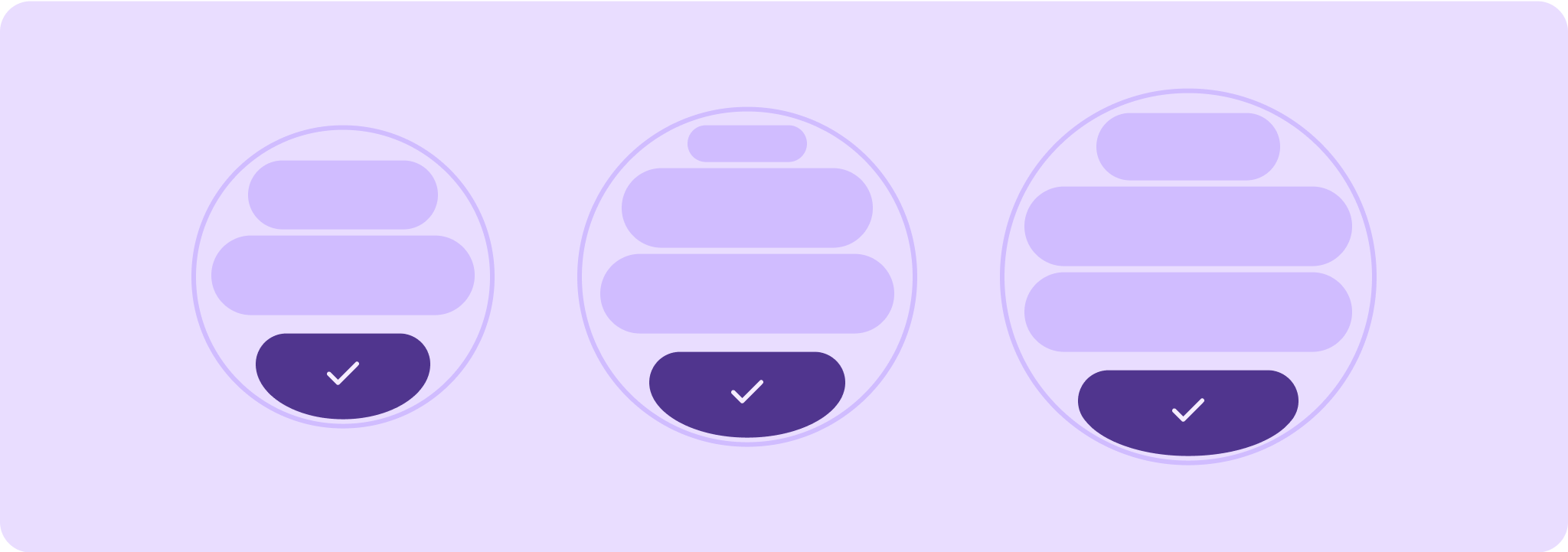
רמות של הנחיות איכות
ההנחיות שלנו בנוגע לאיכות מחולקות לשלוש רמות. כדי לספק למשתמשים חוויה טובה ככל האפשר, חשוב לעמוד בהנחיות בכל שלוש הרמות.
מוכן לכל גדלי המסכים
חשוב לוודא שהאפליקציה מספקת חוויה איכותית בכל גדלי המסך.
ליצור פריסות שמנצלות את כל השטח הזמין באפליקציה.
רספונסיביות ואופטימיזציה
הצגת יותר תוכן למשתמשים במכשירים שמאפשרים זאת, ושימוש בפריסות רספונסיביות שמותאמות באופן אוטומטי לגדלים שונים של מסכים.
מותאם ומגוון
כדי לנצל את השטח הנוסף, אפשר להשתמש בנקודות עצירה (breakpoints) כדי להציע חוויות חדשות ומשמעותיות במסכים גדולים יותר, שלא ניתן להציע במכשירים עם מסכים קטנים יותר.
דוגמאות התוכן והקוד שבדף הזה כפופות לרישיונות המפורטים בקטע רישיון לתוכן. Java ו-OpenJDK הם סימנים מסחריים או סימנים מסחריים רשומים של חברת Oracle ו/או של השותפים העצמאיים שלה.
עדכון אחרון: 2025-07-26 (שעון UTC).
[null,null,["עדכון אחרון: 2025-07-26 (שעון UTC)."],[],[],null,["# Design quality tiers\n\nMaterial 3 Expressive leans into shape language in a much more expansive and\nmeaningful way by utilizing flexible container shapes to apply rounding and\nsharpening of corner radii to support shape morphing lists and button states.\nThe design system also introduces edge-hugging buttons as an ownable and iconic\ndesign pattern for round devices on Wear OS.\n\nMaintain UI element scaling\n---------------------------\n\nWhen designing layouts on a round screen, scrolling and non-scrolling\nviews each have unique requirements to maintain UI element scaling and preserve\na balanced layout and composition.\n\n\n**Scrolling views**\n\nFor scrolling views, use percentages to define all top, bottom, and side\nmargins to avoid clipping and provide proportional scaling of elements.\n\nAll top, bottom, and side margins should be defined in percentages to avoid\nclipping and provide proportional scaling of elements. \n**Non-scrolling views**\n\nFor non-scrolling views, use percentages and vertical constraints for all\nmargins. That way, the main content in the middle can stretch to fill the\navailable area.\n\nAll margins should be defined in percentages and vertical constraints should be\ndefined such that the main content in the middle can stretch to fill the\navailable area.\n\n\u003cbr /\u003e\n\nTiers of quality guidelines\n---------------------------\n\nOur quality guidelines are organized into three tiers. Enable the best possible\nexperience for your users by meeting guidelines in all three tiers.\n\n\n**Ready for all screen sizes**\n\nEnsure your app is delivering a quality experience across all screen sizes.\nCreate layouts that fully use the available app space. \n\n**Responsive and optimized**\n\nDeliver more content to users on devices which allow for it, and utilize\nresponsive layouts that automatically adapt to different screen sizes. \n\n**Adaptive and differentiated**\n\nMake the most of additional real estate by utilizing breakpoints to offer\npowerful new experiences on larger screens which are not possible on devices\nwith smaller screens.\n\n\u003cbr /\u003e\n\n| **Caution:** A larger display size should *never* display less information than ones that are smaller than it, this is especially relevant for custom behaviors added in at the breakpoint. A common example of this is when components or text sizes are increased past the breakpoint and end up showing less are the larger screens. Screens should always show \"more value\" and never \"less value\" with increasing size."]]