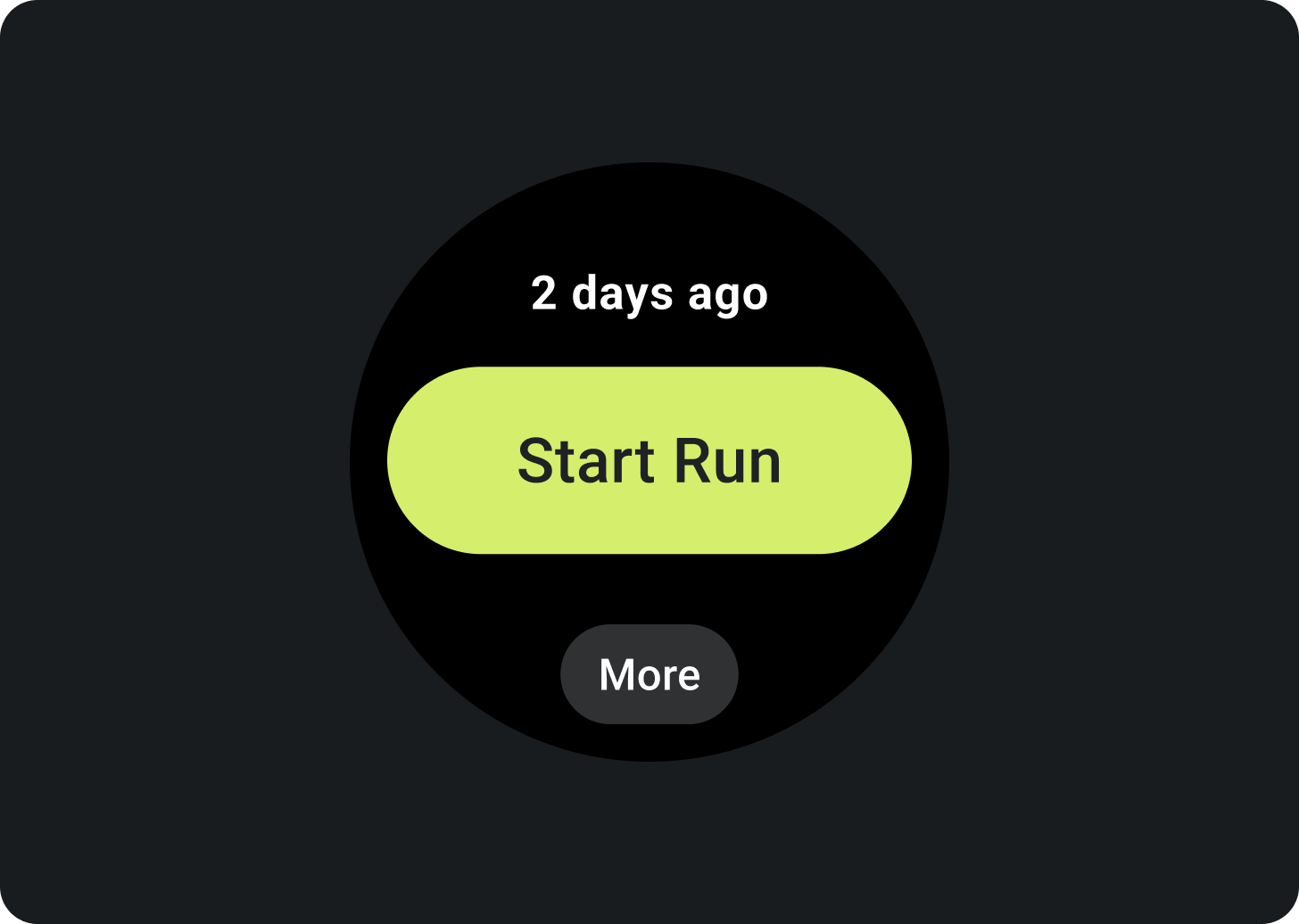
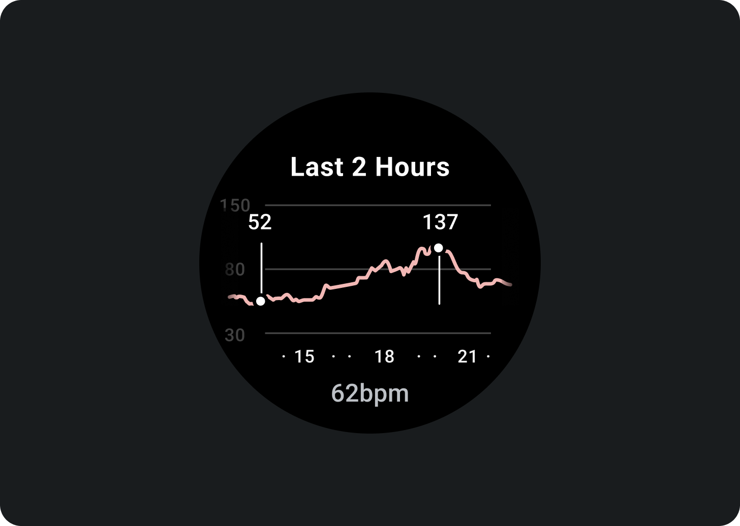
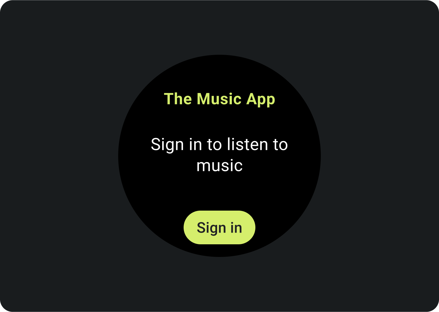
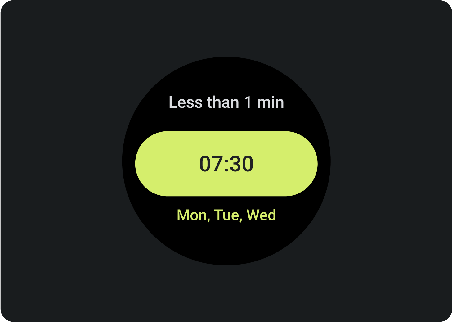
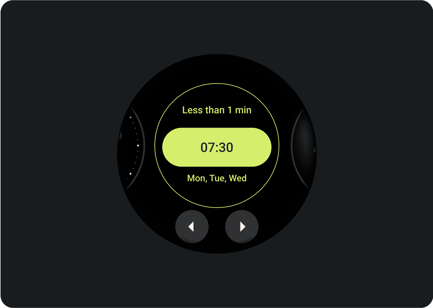
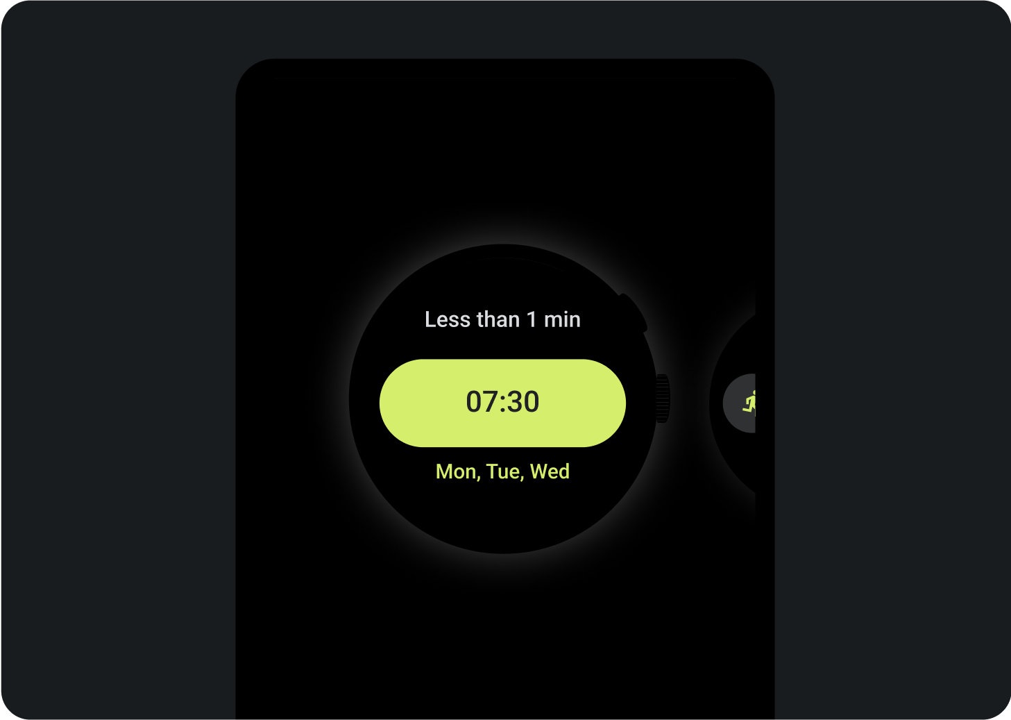
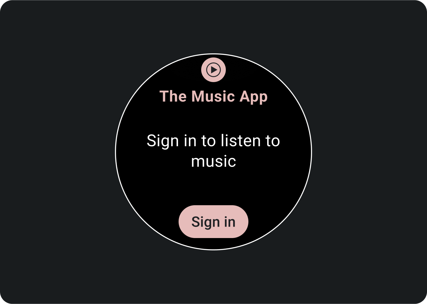
新增資訊方塊預覽,協助使用者透過 Wear OS 或手持裝置查看資訊方塊管理工具顯示的是哪些內容。每個資訊方塊都可以有一張代表性預覽圖片。該圖片應符合下列規定:
規定
以 400 x 400 像素匯出素材資源。
提供圓形預覽圖片。
使用純黑色背景。
儲存為 PNG 或 JPEG 檔案。
為應用程式的主要語言加入本地化素材資源。
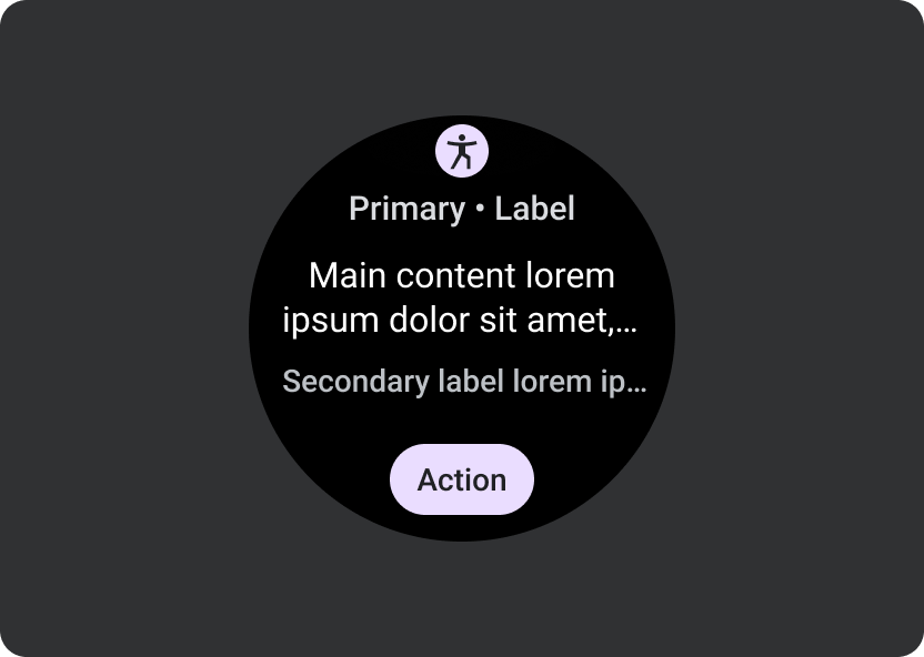
透過 Wear OS 裝置上的資訊方塊管理工具顯示的資訊方塊預覽。
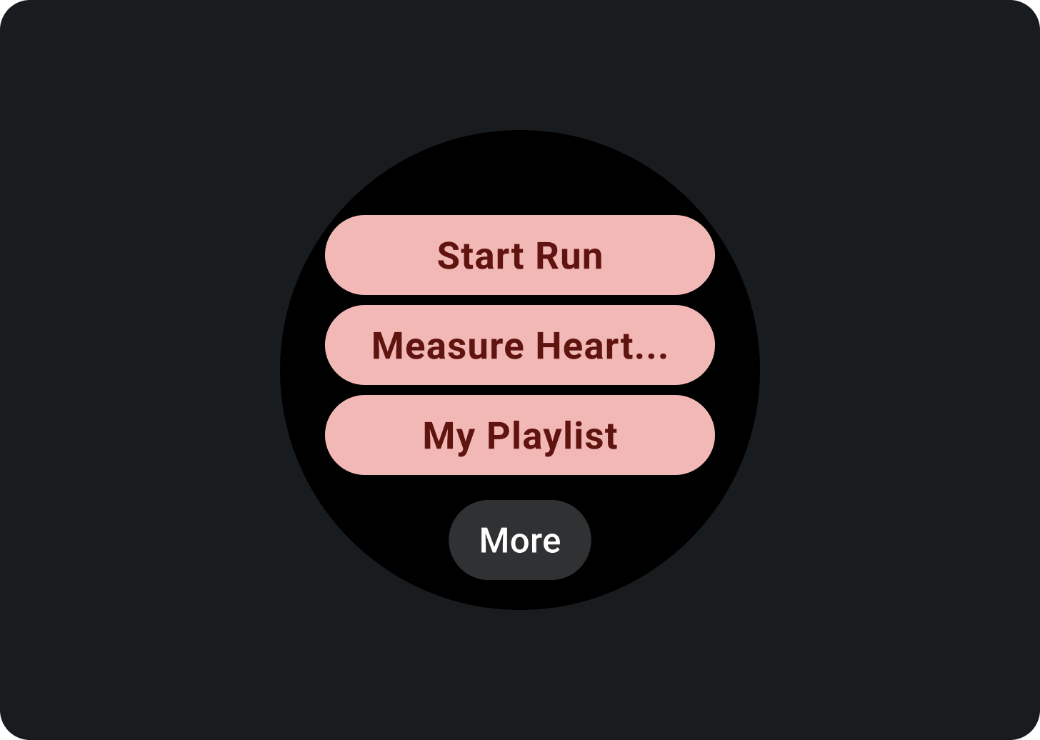
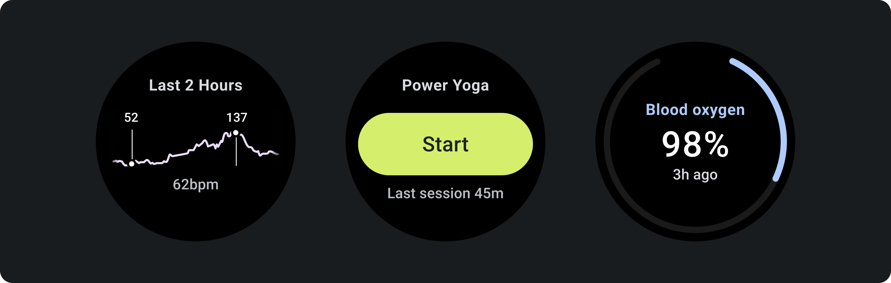
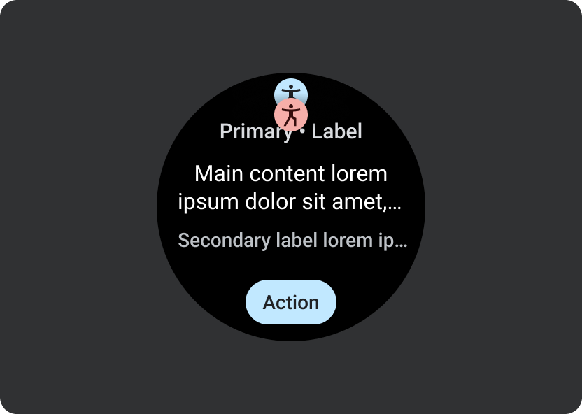
透過手機上的資訊方塊管理工具顯示的資訊方塊預覽。
check_circle
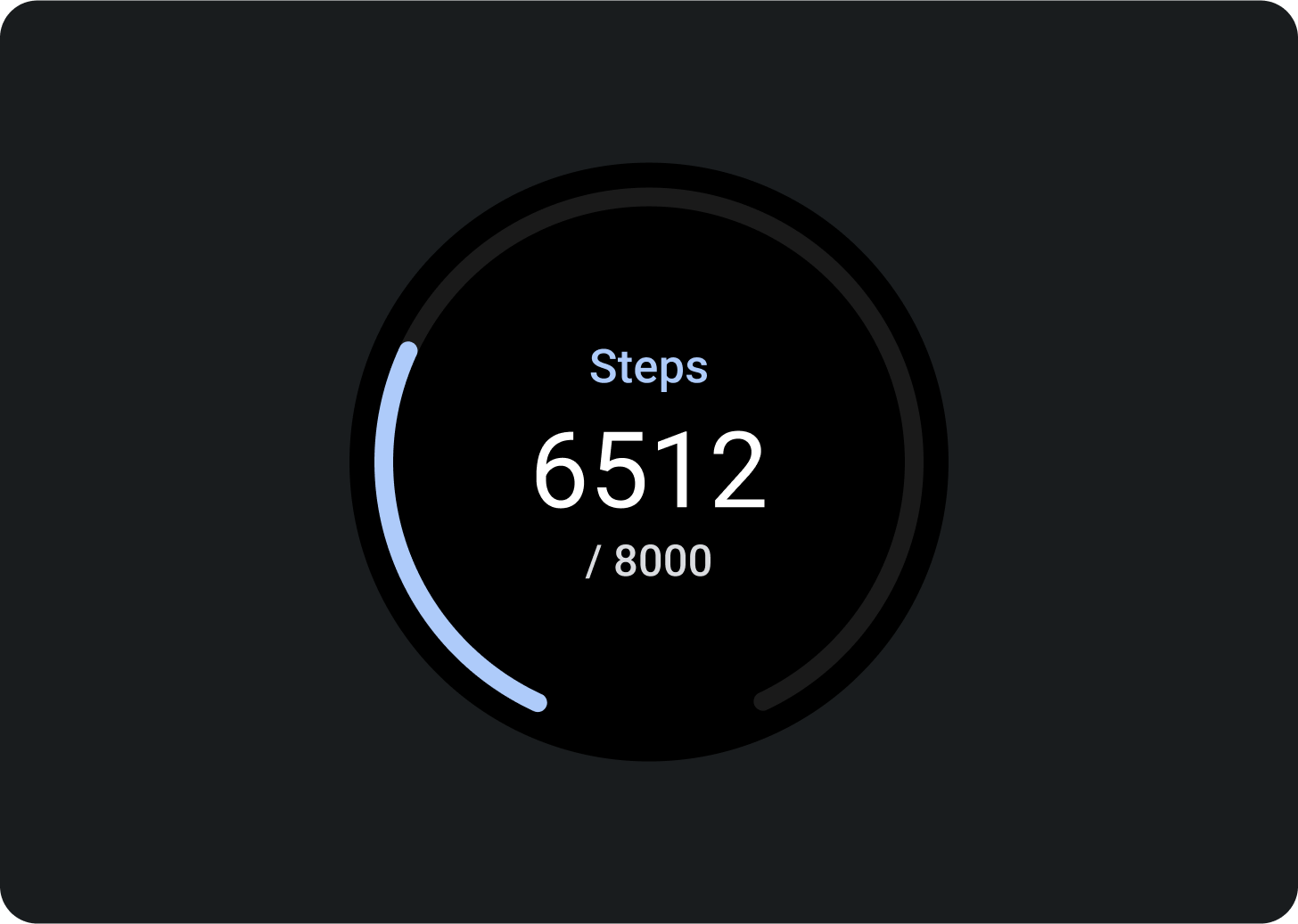
正確做法
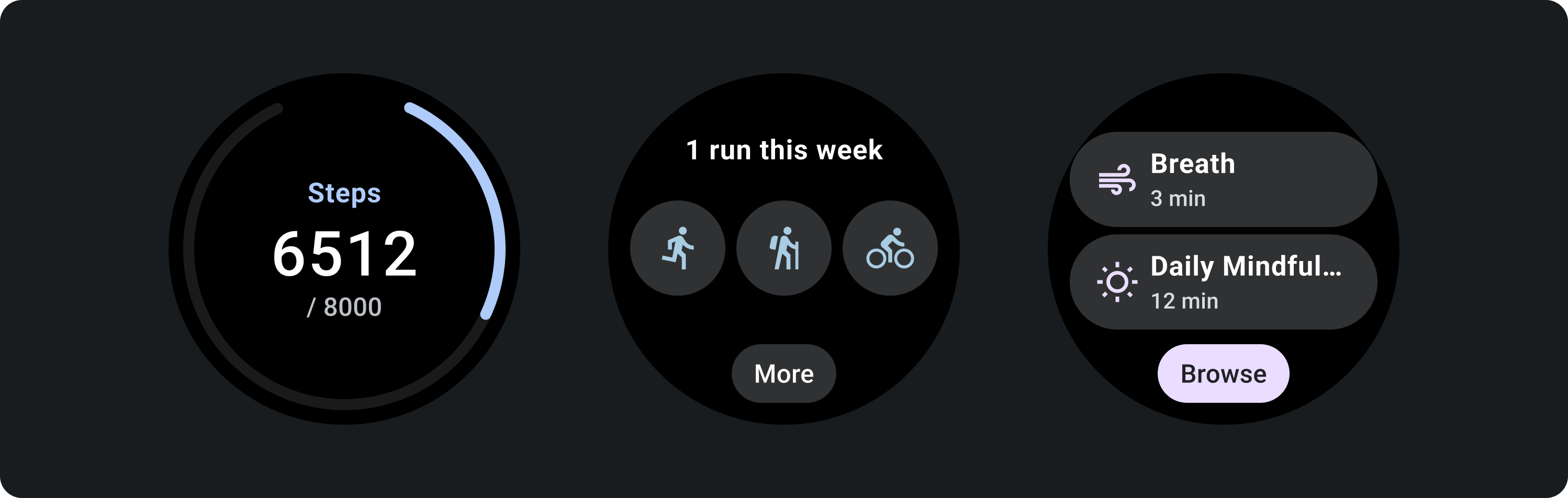
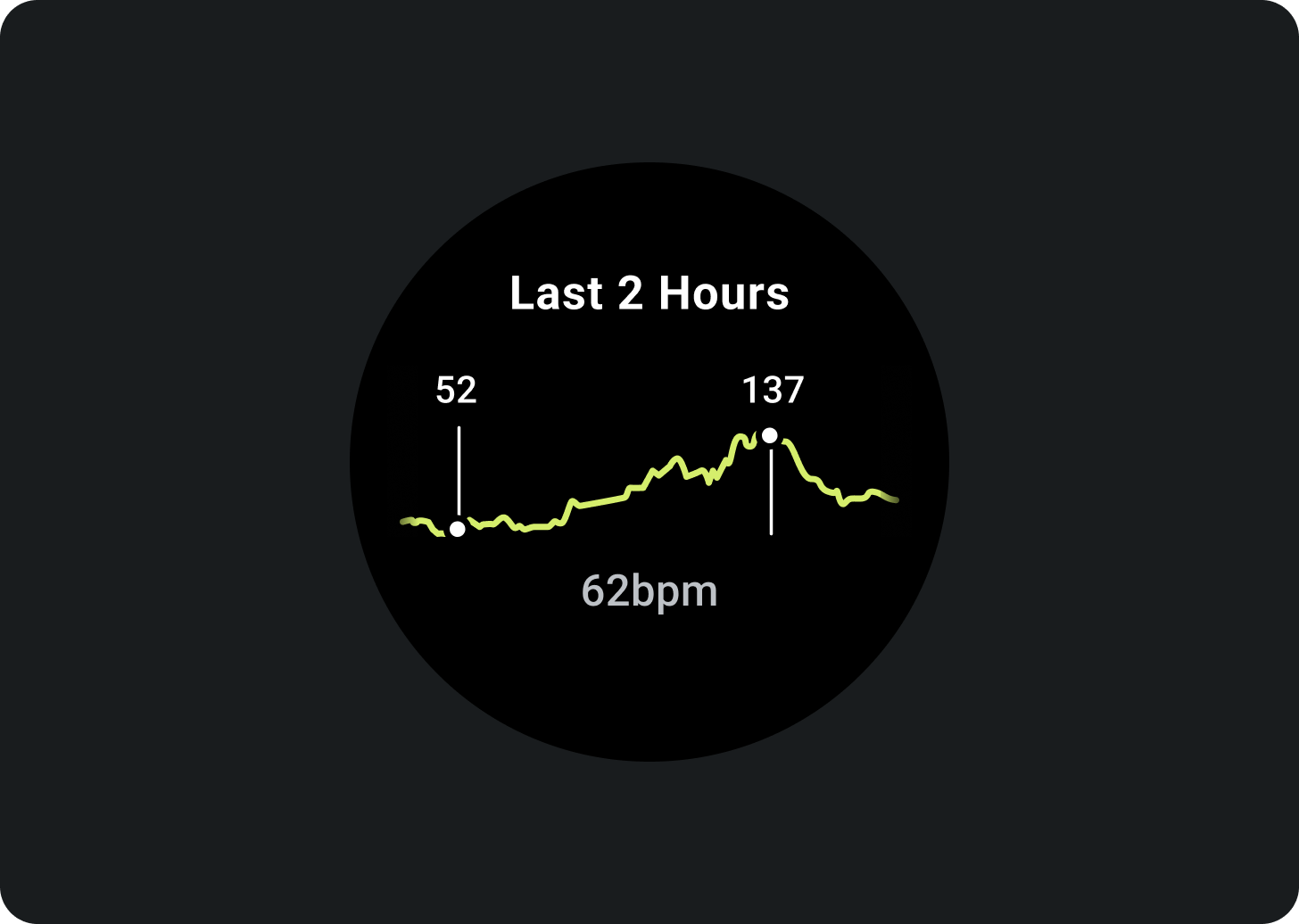
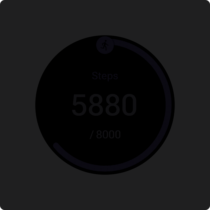
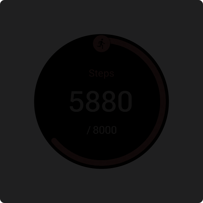
強調您是否會更新資訊方塊中的資訊,例如步數圖表中的進度。
cancel
錯誤做法
顯示空白狀態、在分頁 UI 中顯示資訊方塊圖示,或是在資訊方塊周圍放置框線。
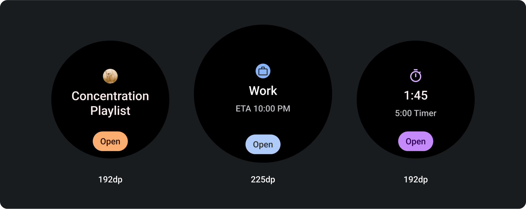
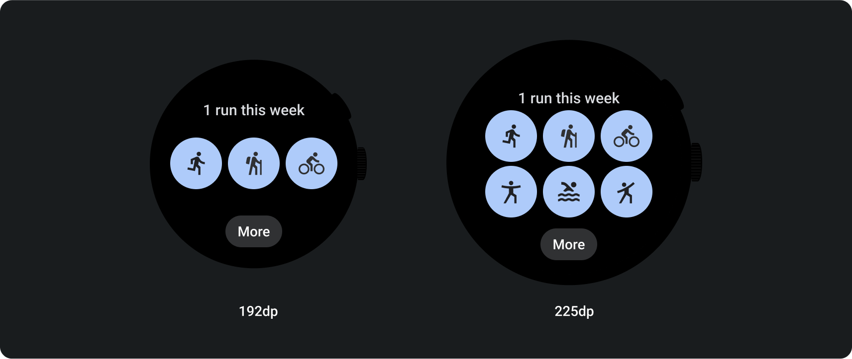
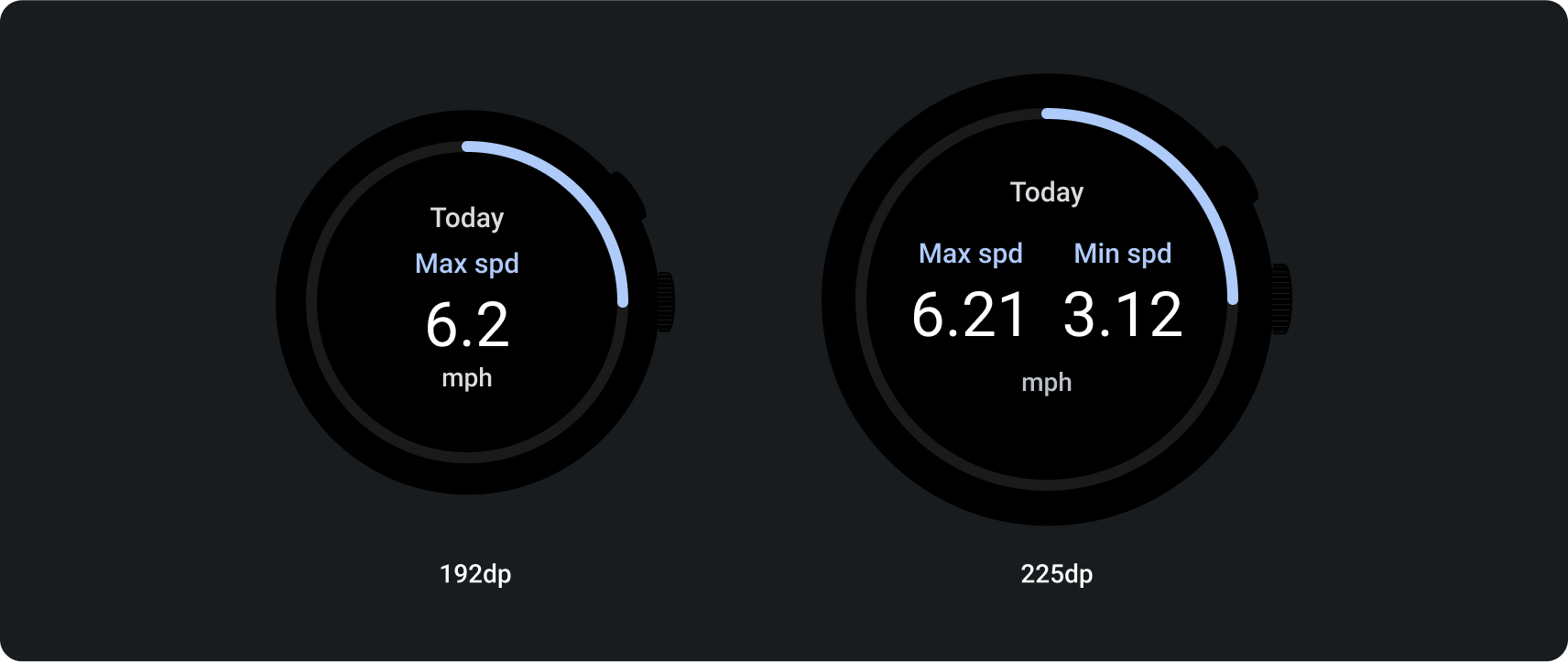
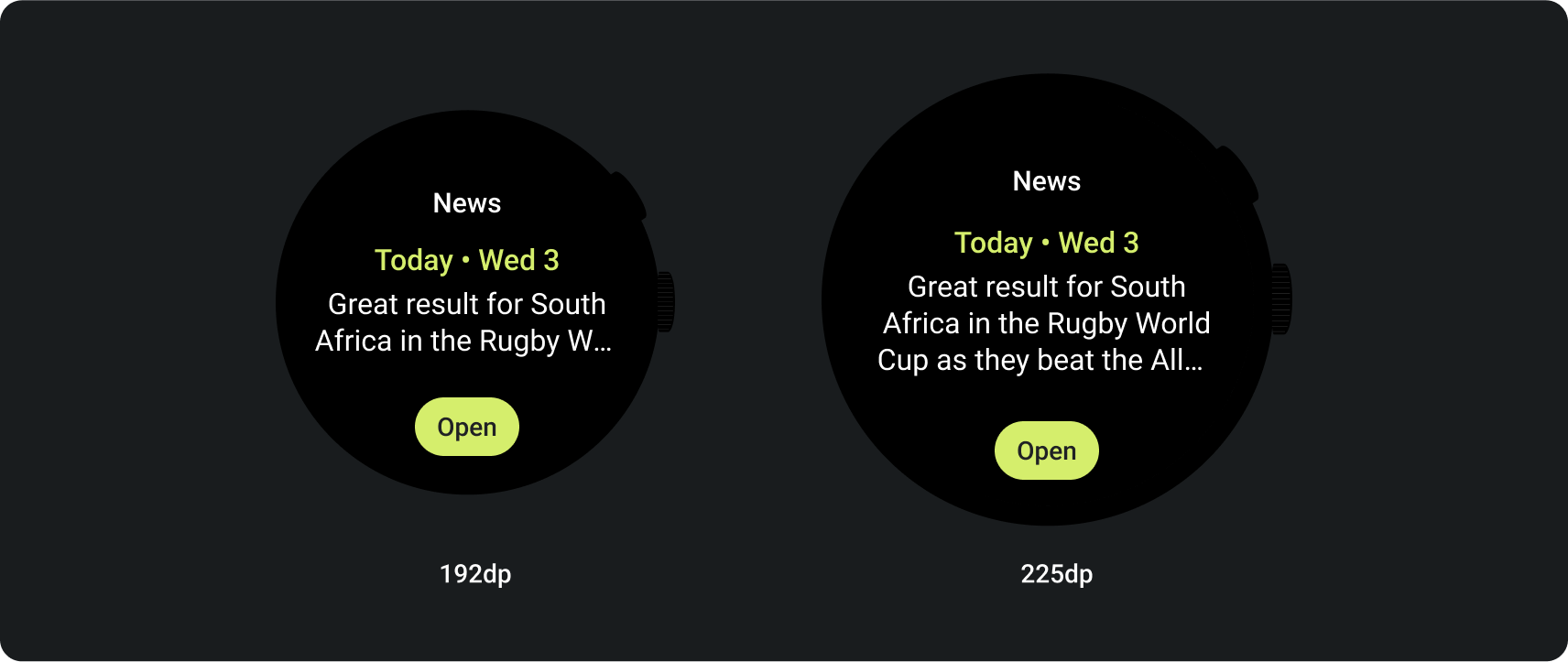
更大的螢幕尺寸
為因應各種 Wear OS 螢幕大小,ProtoLayout Material 版面配置範本和 Figma 設計版面配置會納入回應式行為,讓版面配置自動調整。運算單元會填滿可用的寬度。主要內容和次要標籤插槽會緊貼內容,但容納這些插槽的容器會填滿可用的高度。邊界會設為百分比,並在畫面底部和頂部的插槽中加入額外的內部邊界,以便在放大時考量畫面曲線的波動。
[null,null,["上次更新時間:2025-07-27 (世界標準時間)。"],[],[],null,["# Tiles design principles\n\nTiles provide quick access to information and actions users need to get things\ndone. After performing a swipe on the watch face, a user can see how they're\nprogressing toward their fitness goals, check the weather, and more. Users can\nalso launch apps and get essential tasks done quickly from tiles.\n\nUsers can choose what tiles they want to see on their Wear OS device, both from\nthe device itself and from the companion app.\n\nUX design principles\n--------------------\n\nThe system-provided tiles use a consistent design language, so users expect\ntiles to be each of the following:\n\n- **Immediate:** Tiles are designed to help users quickly complete frequent tasks. Display critical content in a clear information hierarchy so that users can understand the tile's content.\n- **Predictable:** Content within each tile should always focus on a user-facing task. This helps users predict what information they will be able to see on the tile, which improves recall.\n- **Relevant:** Users take their Wear OS devices wherever they go. Consider how the content in the tile is relevant to the user's current situation and context.\n\nApp icon\n--------\n\n| **Note:** The app icon is not displayed in any mocks that follow, since it's not part of the tile layout and might be added at a system level.\n\nThe app icon that may appear at the top of the screen is automatically generated\nby the system from the [launcher icon](/develop/ui/views/launch/icon_design_adaptive). Don't make this icon part of your tile's\nlayout. \ncheck_circle\n\n### Do\n\nWear OS may display the app icon automatically as the user scrolls through the tile carousel. There is no need to put the app icon in the tile design. \ncancel\n\n### Don't\n\nDo not add the app icon in the tile design as it may appear twice or overlapped if also displayed at the system level.\n\nDesign guidance\n---------------\n\nKeep the following guidelines in mind when creating tiles.\n\n### Focus on a single task\n\ncheck_circle\n\n### Do\n\nFocus each tile on a single task, such as **start run.** \ncancel\n\n### Don't\n\nSupport too many different tasks on a single tile.\n\n### Create separate tiles for each task\n\nIf your app supports multiple tasks, consider creating multiple tiles for each\ntask your app supports. For example, a fitness app could have both a goals tile\nand a workout activity tile.\n\n### Show glanceable representations of graphs and charts\n\ncheck_circle\n\n### Do\n\nShow quick, glanceable representations of numerical or statistical information and allow the user to tap to see more in an app if needed. \ncancel\n\n### Don't\n\nShow detailed numerical or statistical information on the tile.\n\n### Indicate latest data updates\n\nMake it clear to users how recent a tile's data is. If you show cached data,\nindicate when it was last updated.\n\n### Use an appropriate data refresh rate\n\nChoose an appropriate update rate for your tiles, considering the impact on\ndevice battery life. If you're using platform data sources such as heart rate\nand step count, Wear OS controls the update rate for you.\n\nEmpty states\n------------\n\nTiles have two types of empty states. For both, use\n[`PrimaryLayout`](/reference/androidx/wear/tiles/material/layouts/PrimaryLayout).\n\n\n**Errors or permission**\n\nTell the user that they need to update their settings or preferences from the\ntile. \n\n**Sign in**\n\nProvide a clear call to action on a sign-in tile.\n\n\u003cbr /\u003e\n\nShow ongoing activities\n-----------------------\n\nWhen an app performs a long-running activity---such as tracking a\nworkout or playing music---it should show the progress of the\n[ongoing activity](/training/wearables/notifications/ongoing-activity) in one of more tiles.\n\nIf your app also supports tiles that allow users to start these activities,\ndo the following to minimize user confusion:\n\n- Indicate that an ongoing activity is already in progress.\n- If the user taps on such a tile, launch your app and show the in-progress activity. Don't start a new instance of an ongoing activity.\n\n| **Note:** Typically, users can't stop an in-progress activity directly from a tile.\n\n### Required elements\n\n- **Primary data:** The main content that describes the activity.\n- **Label:** Displays the status of the activity.\n\n### Optional elements\n\n- **Icon or graphic:** Can be an animation or static image.\n- **Bottom compact chip:** Contains a call-to-action.\n\nMotion on tiles\n---------------\n\nWhen you add animations to tiles, help users understand changes: \ncheck_circle\n\n### Do\n\nEmphasize if you're updating information on a tile, such as progress toward a step count goal. \ncancel\n\n### Don't\n\nUnexpectedly toggle between values.\n\nPreviews\n--------\n\nAdd a tile preview to help your user see what content is shown in the tile\nmanager on their Wear OS or handheld device. Each tile can have one\nrepresentative preview image. That image should meet the following requirements:\n\n*** ** * ** ***\n\n\n**Requirements**\n\n- Export assets at 400px x 400px.\n- Provide a circular preview image.\n- Use a solid black background.\n- Save as a PNG or JPEG.\n- Add localized assets for your app's popular languages.\n\n\u003cbr /\u003e\n\n*** ** * ** ***\n\n\nA tile preview displayed in tile manager on a Wear OS device. \n\nA tile preview displayed in tile manager on a phone.\n\n\u003cbr /\u003e\n\n*** ** * ** ***\n\ncheck_circle\n\n### Do\n\nEmphasize if you're updating information on a tile, such as progress on a step count chart. \ncancel\n\n### Don't\n\nShow an empty state, show the tile icon in the pagination UI, or place a stroke around the tile.\n\nLarger screen sizes\n-------------------\n\nTo accommodate a variety of Wear OS screen sizes, the ProtoLayout Material\nlayout templates and Figma design layouts include responsive behavior, allowing\nthe slots to automatically adapt. Slots are designed to fill the available\nwidth. The main content and secondary label slots hug the content, but the\ncontainer holding them fills the available height. Margins are set as\npercentages, with additional inner margins added to slots at the bottom and top\nof the screen, accounting for fluctuations in the curve of the screen as it\nenlarges.\n\nTo maximize the larger screen size, use the additional space to provide more\nvalue by allowing users to access additional\ninformation or options. Achieving these layouts requires additional\ncustomization beyond the built-in responsive behavior, such as by creating an\nadditional layout with more content or by displaying previously hidden slots\nafter the breakpoint.\n\nNote that the recommended breakpoint is set at the 225dp\nscreen size.\n\n### Examples of how to design for a larger screen size\n\n#### Add buttons\n\n#### Add slots and content\n\n#### Add text"]]
