Wear OS provides a range of features to support more accessible typography. This includes ensuring sufficient color contrast between text and background, and supporting user-configurable text sizes. These features help create a more comfortable and inclusive user experience for all users.
Color and contrast
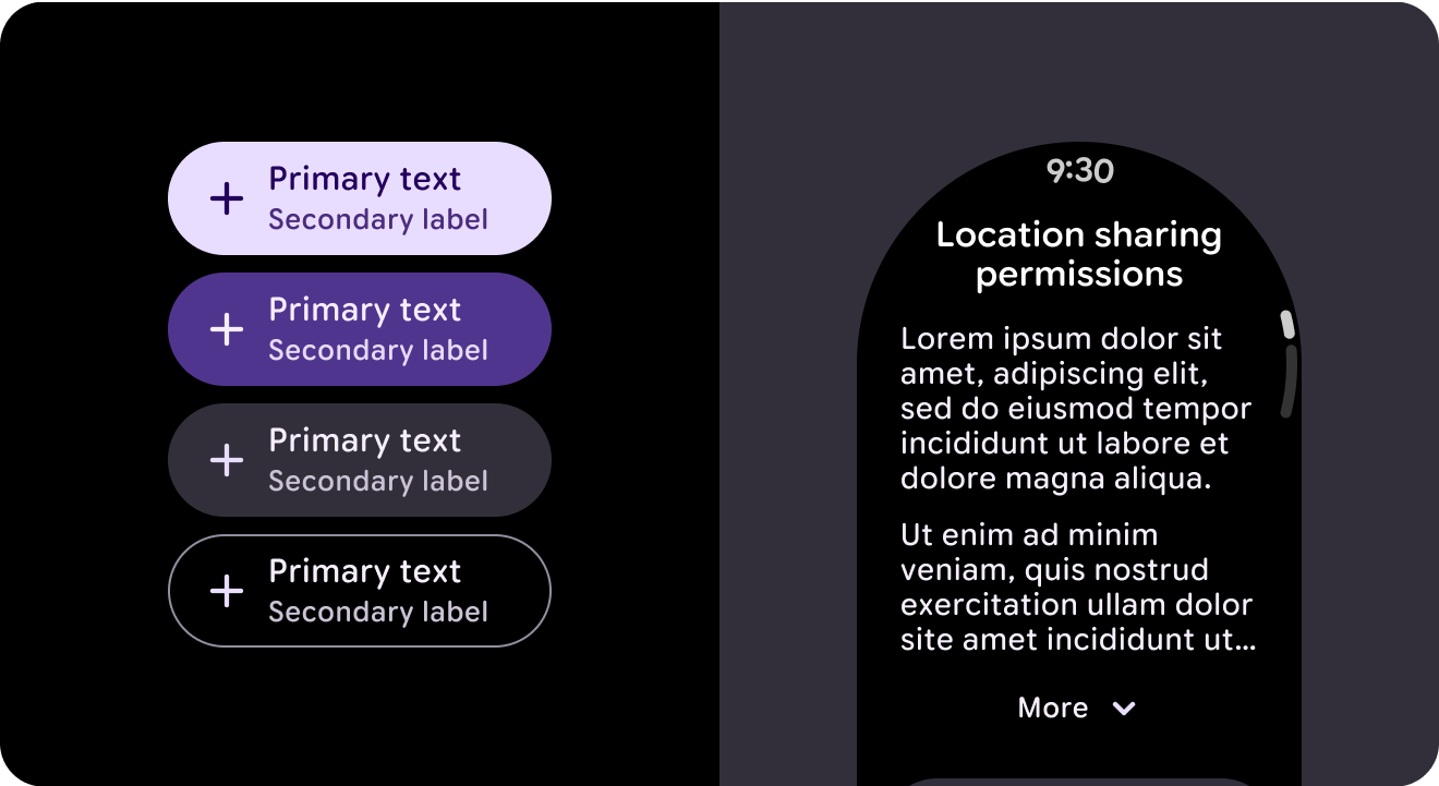
Support visual accessibility by choosing the appropriate color contrast between your product's text and background. Contrast is the perceived difference between the lightness or darkness of two colors, and is quantified by a contrast ratio. Key contrast ratios indicate levels of contrast that are sufficient for accessibility. In the case of typography this also includes the contrast between weight, scale and the size relationship between different type styles.
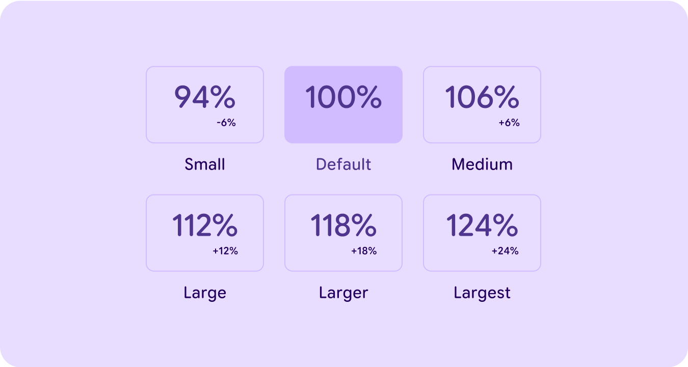
User-configurable sizes
Each block of text within a layout uses the Wear OS user-configurable font size framework, where each of the type styles and roles increase / decrease in scale by +/- 6% increments based on what is set by the user within system settings.
Layouts should be designed while considering the impact of the largest and smallest text sizes on the UI.