
Android 使用者會與各種媒體類型互動,包括有聲書、音樂、Podcast 和電台。重要的是,設計的應用程式能方便使用者透過智慧手錶存取媒體內容。手錶是獨一無二的介面,兼顧互動的便利性和速度是首要之務,因為使用者與手錶互動的時間遠比手機或平板電腦少。
詳情請參閱 GitHub 上的媒體工具包。
媒體應用程式架構
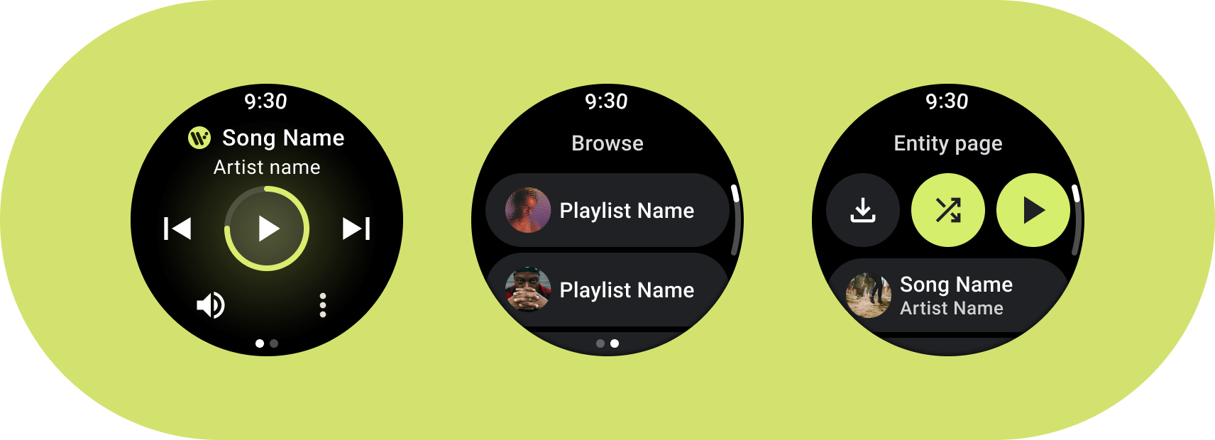
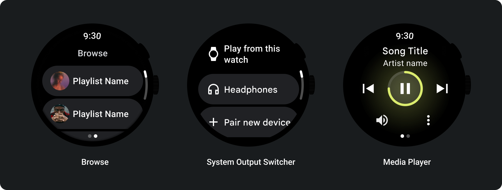
建立符合 Wear OS 設計規定的媒體應用程式。媒體應用程式通常提供瀏覽和實體頁面。
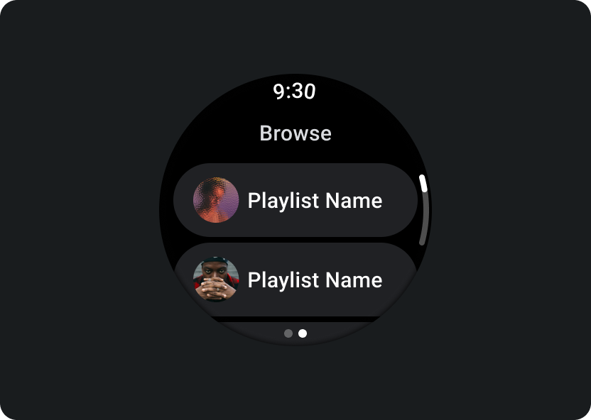
瀏覽
讓使用者尋找要播放的媒體。優先處理已下載的項目,協助使用者快速開始或繼續播放。
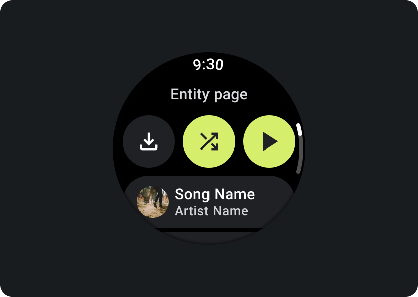
實體
為使用者提供特定媒體項目的詳細資訊。重要內容和關鍵動作應隨時可用,例如下載、播放或隨機播放。
減少應用程式階層,向使用者顯示媒體。採用平面式資訊架構設計,可讓使用者快速存取清單和展示縮圖。建議您使用 Wear OS 專用的自訂設計元件。詳情請參閱「方塊」和「資訊卡」的設計建議。
媒體控制畫面
此外,媒體應用程式也應提供媒體控制畫面。請使用 5 個按鈕的版面配置建立媒體控制項,這樣可確保符合最少輕觸目標的需求。以下是音樂應用程式和 Podcast 應用程式的媒體控制項範例:
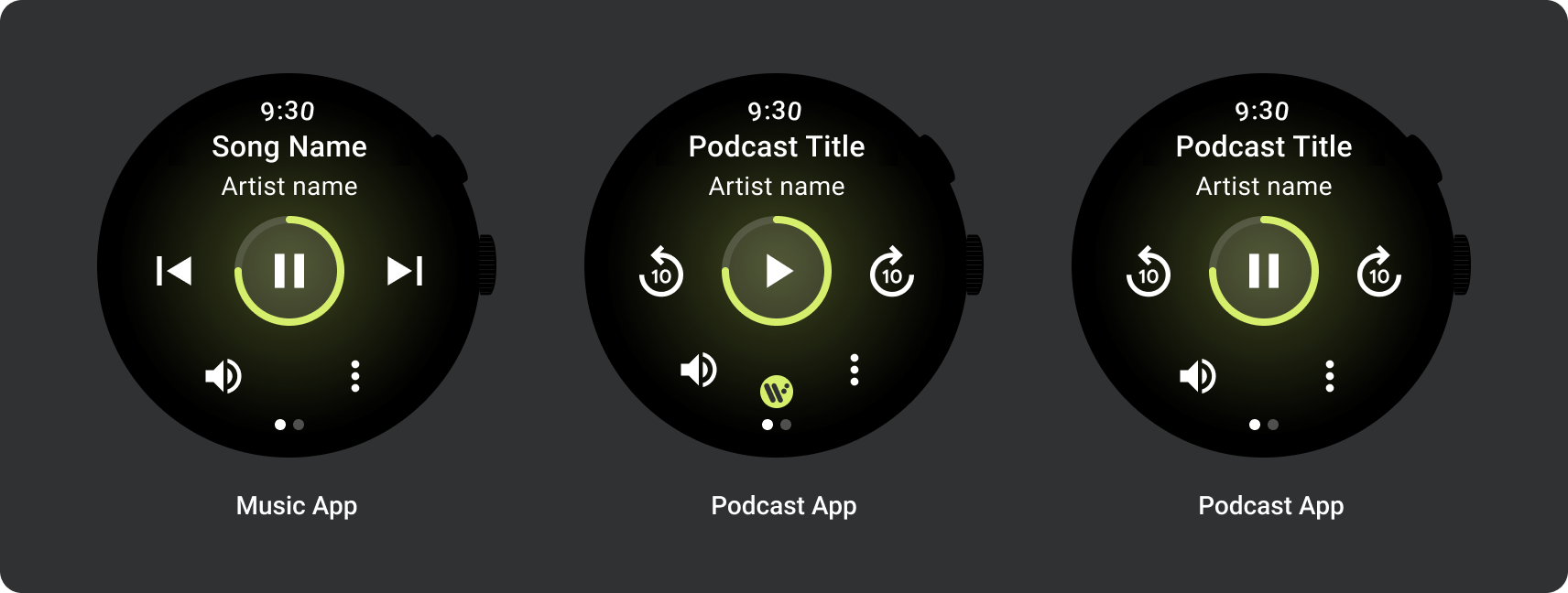
請根據內容類型調整顯示的媒體控制項。如果要新增超過 5 項動作,可使用三點溢位圖示,將使用者帶往其他頁面。您可以在應用程式中使用自訂圖示和字型。
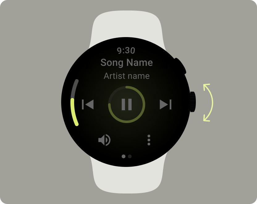
控制音量
音量控制項是使用者在手錶上最常用的媒體控制項之一。媒體控制項應包含音量按鈕,方便使用者進入音量控制畫面。
大多數 Wear OS 裝置都提供側邊旋轉按鈕 (RSB) 或邊框。部分 Wear OS 裝置也提供額外的硬體按鈕,用來控制音量。請使用 RSB、邊框或額外的按鈕控制音量。只有在使用者旋轉 RSB 或邊框時才顯示指標,如範例所示。
常見用途
設計媒體應用程式時,請務必將以下重要用途列為優先考量:
- 聆聽下載的媒體
- 透過手錶串流播放音樂
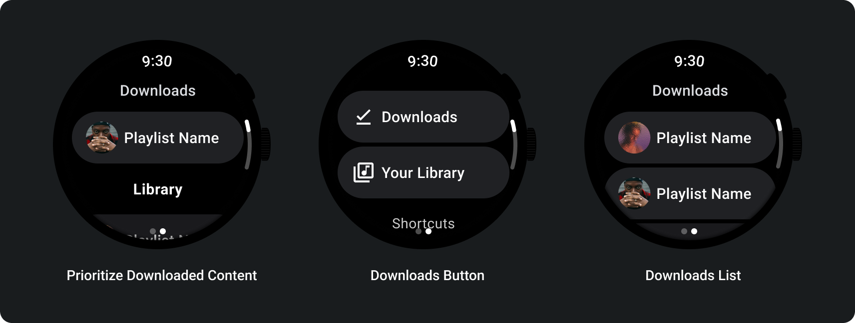
聆聽下載的媒體
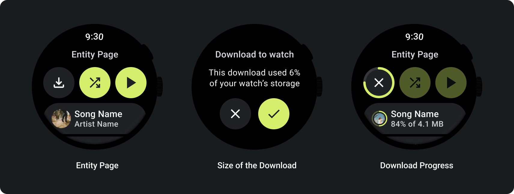
讓使用者能夠從實體頁面手動下載媒體項目。
告知使用者會在哪裡下載內容、下載進度、下載所需時間和下載大小,如以下範例所示:
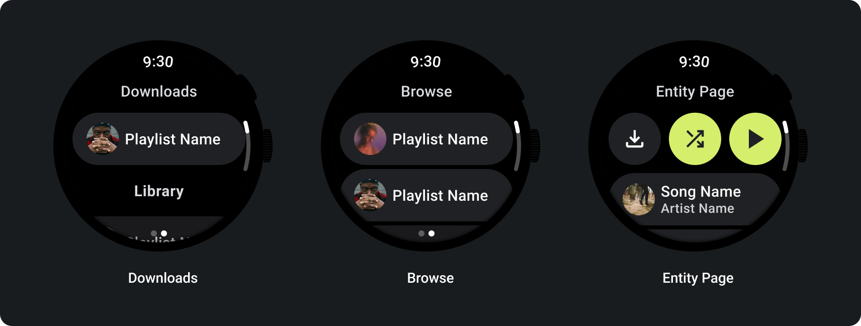
使用者瀏覽媒體時,顯示最近下載的媒體:
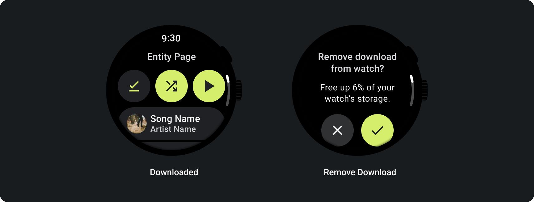
如果內容已下載完畢,請顯示用於從手錶移除下載內容的動作,清楚表明這個情況。在此情況下,您也必須顯示下載內容佔用多少手錶空間,如下圖所示:
如果來源裝置是手錶,請在使用者開始聆聽音樂之前,提示他們連接耳機。連接耳機後,即可播放媒體並開啟媒體控制項。
透過手錶串流播放音樂
透過手錶串流媒體會大幅影響 Wear OS 裝置的電池續航力。使用者選擇透過 Wear OS 裝置聆聽音樂時,可在瀏覽清單中顯示最近使用的下載內容,優先播放已下載的內容。建議您新增一個按鈕,用於將使用者帶往完整的下載內容清單,如下圖所示:
詳情請參閱 GitHub 上的媒體工具包。
自動調整式版面配置
媒體應用程式專為大螢幕進行的調整,只著重於媒體播放器體驗。所有其他元素都會在方塊、按鈕、對話方塊和清單頁面中擷取,這些頁面會說明適當的應用程式行為,以便配合更大的螢幕。
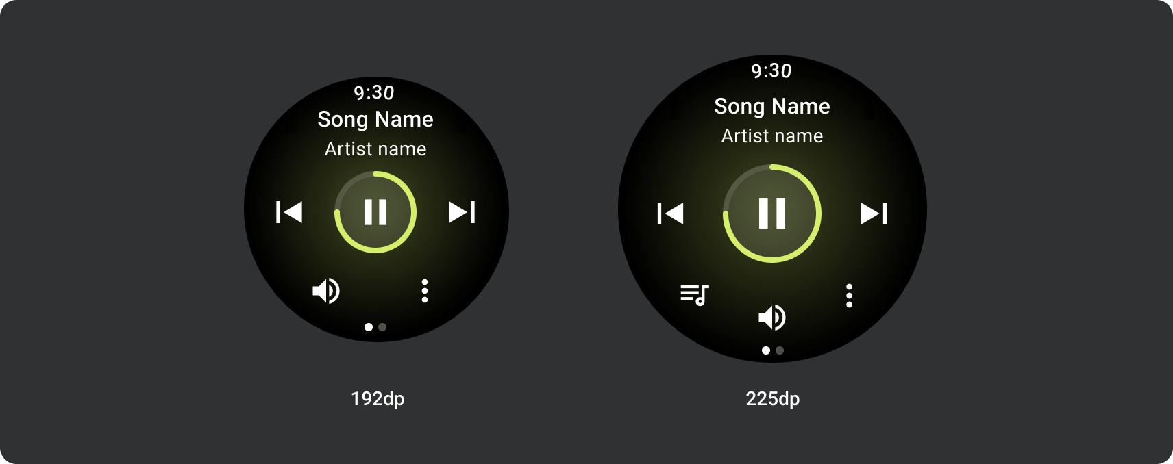
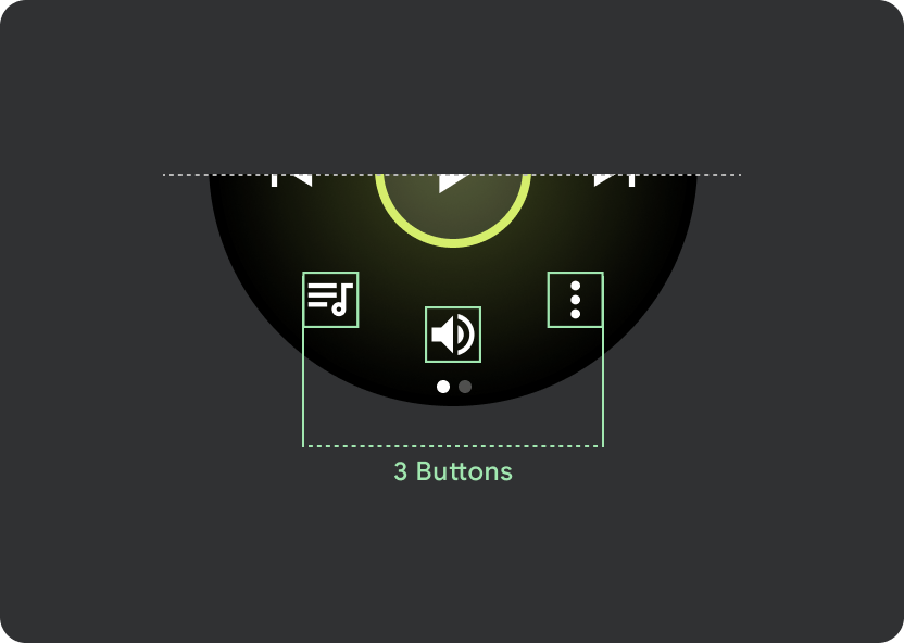
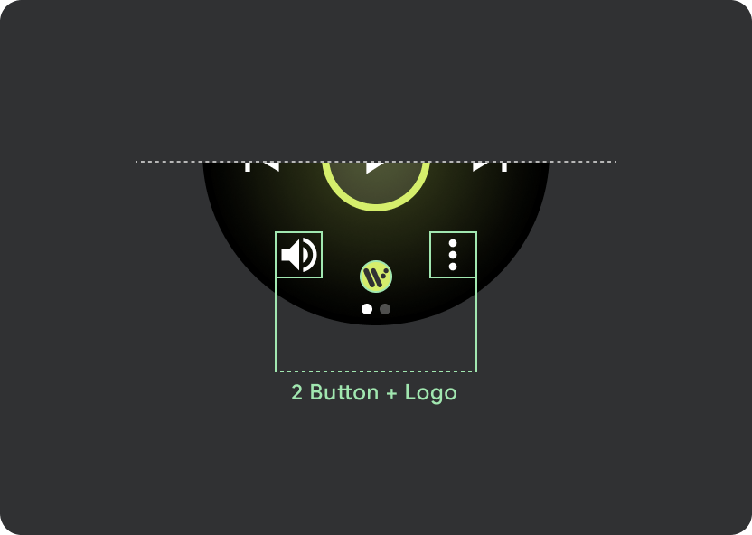
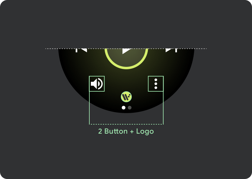
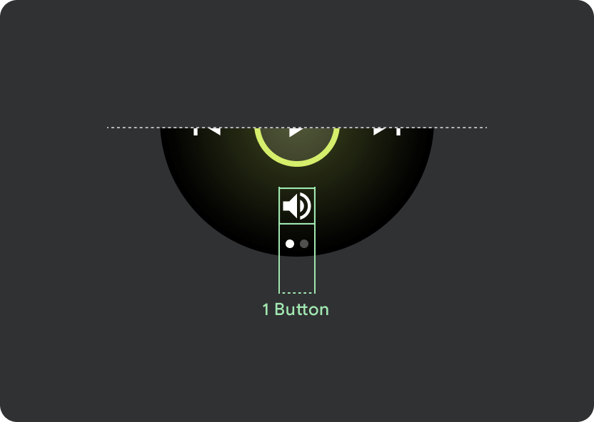
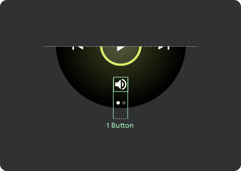
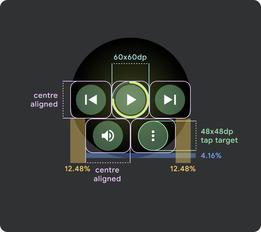
按鈕設定
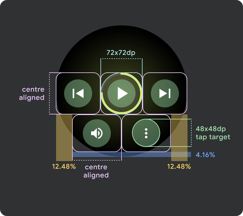
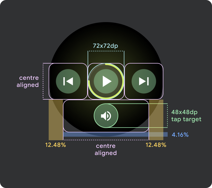
為了遵循觸控目標大小原則,請在螢幕大小小於 225 dp 的 Wear OS 裝置上顯示 2 個按鈕版面配置,在螢幕較大的裝置上顯示 3 個按鈕版面配置。下方圖片列出其他範例,例如單按鈕版面配置,以及含標誌的雙按鈕版面配置:
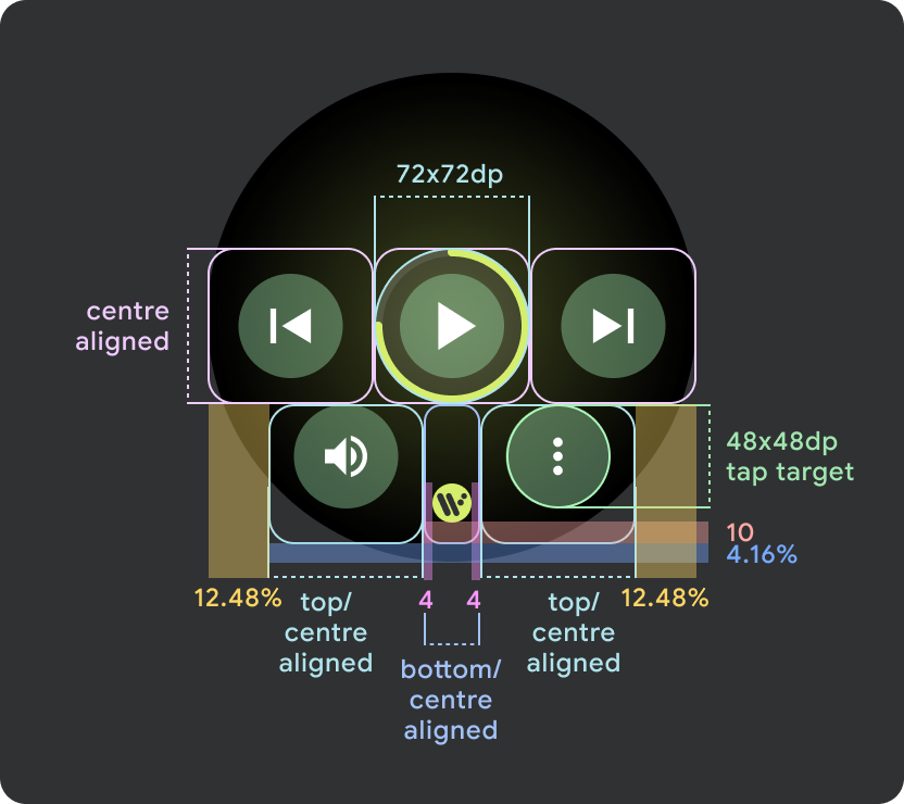
回應式控制項按鈕
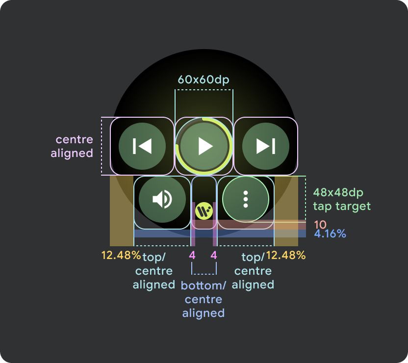
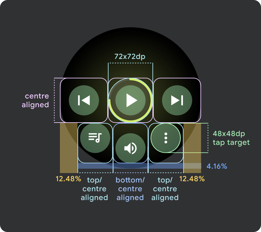
在大於 225 dp 的 Wear OS 裝置上,主控制項 (播放/暫停) 會從 60 dp 調整為 72 dp,使中間區段的 72 dp 高,並增加其內所有控制項的輕觸目標。這個內建的回應式行為會沿用媒體播放器範本。
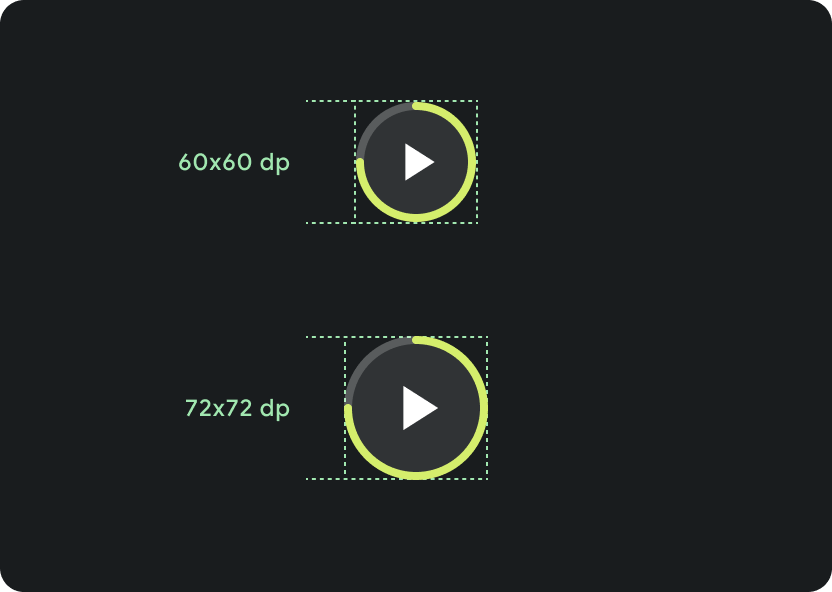
在不同螢幕大小上縮放:
< 225 dp:60 dp x 60 dp
> 225 dp:72 dp x 72 dp
看板標語行為
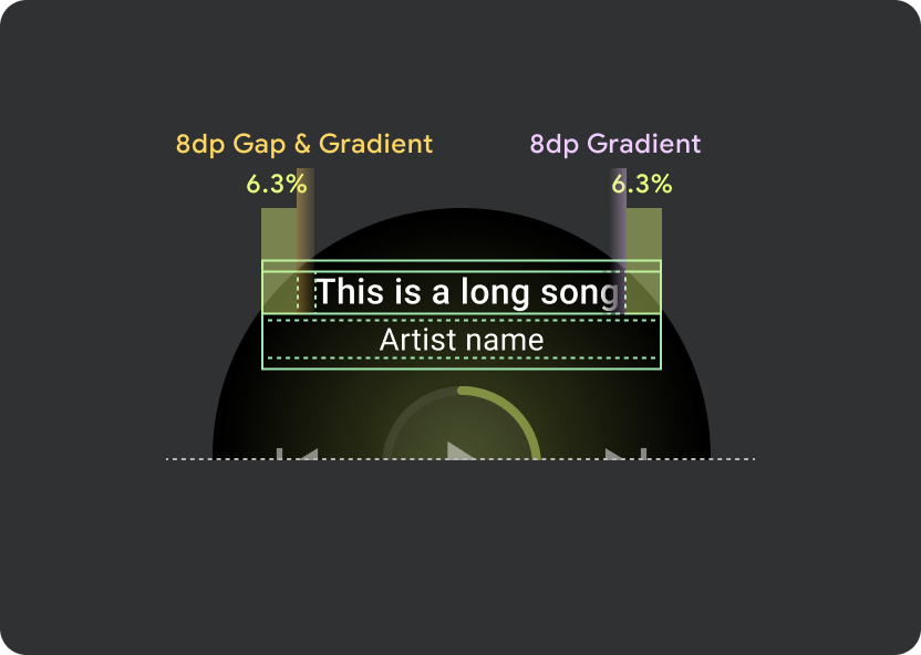
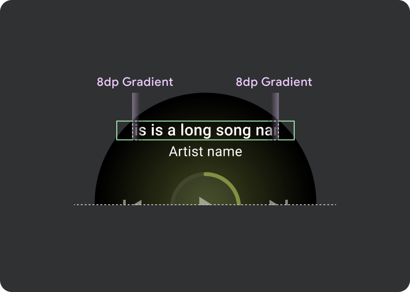
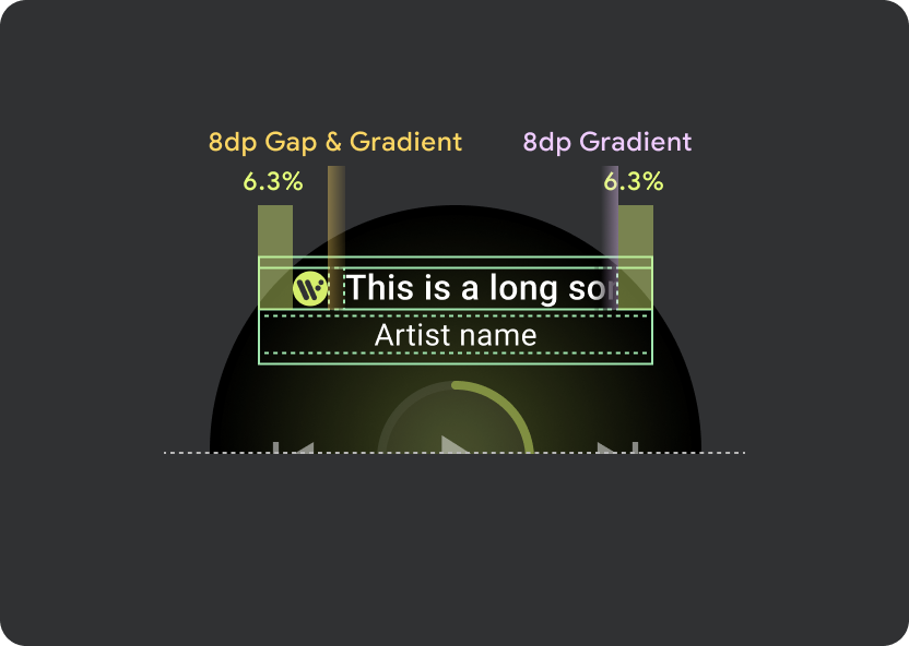
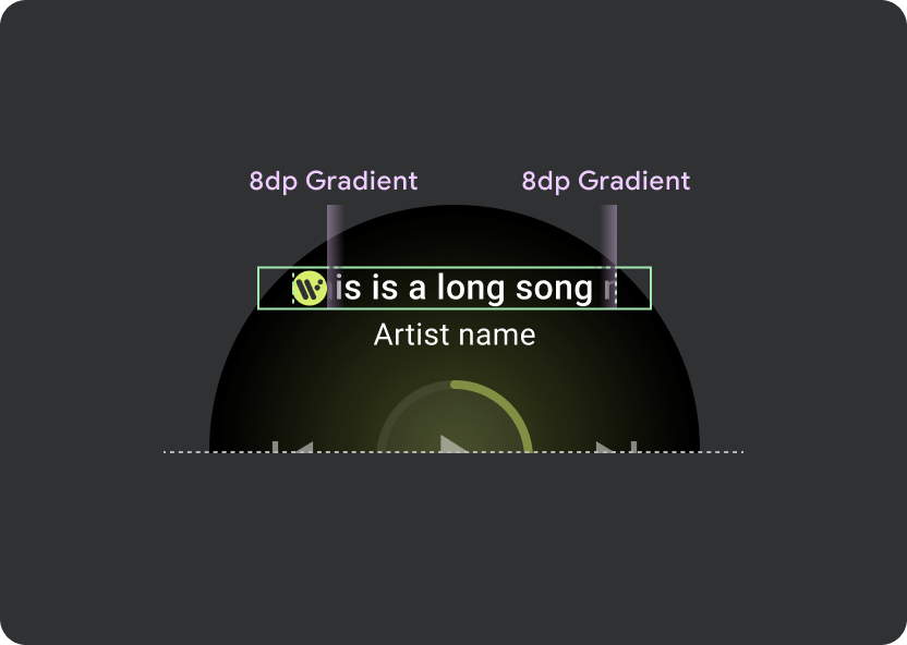
在標題中使用 9.38% 的通用利潤,並為歌曲標題提供 6.3% 的邊界。請為捲動標題使用 8dp 漸層,並在顯示圖示時增加 8dp 間距 (使用 8dp 漸層)。在圖示下方加入所有跑馬燈捲動轉場效果 (位置會保持固定)。
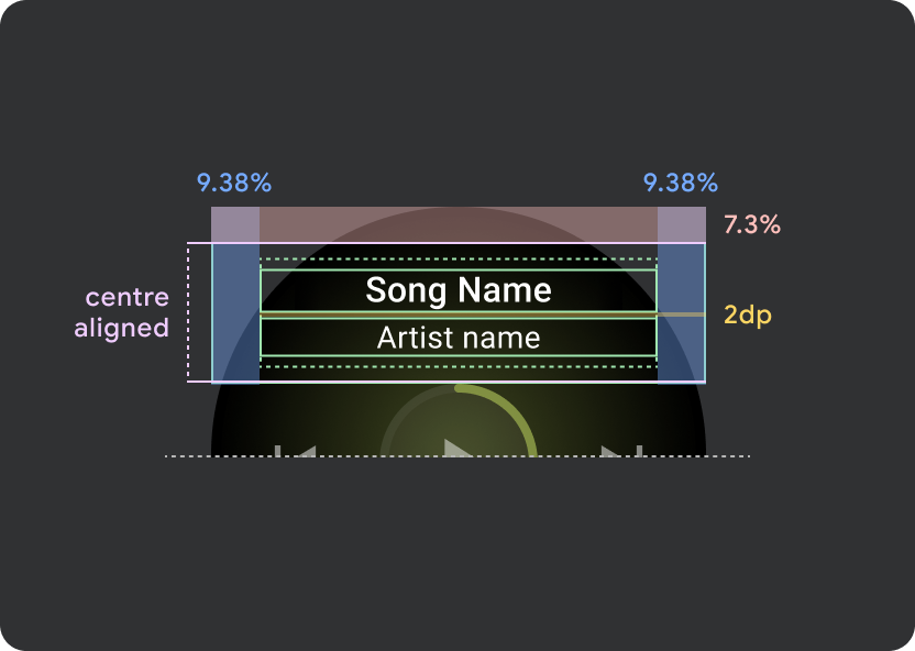
標題 Atom 邊界
9.38%
歌曲名稱內部邊界
6.3%
漸層
8 dp 溢位
額外的 8dp 左邊邊框 (以容納應用程式圖示)
圖示間距
8 dp
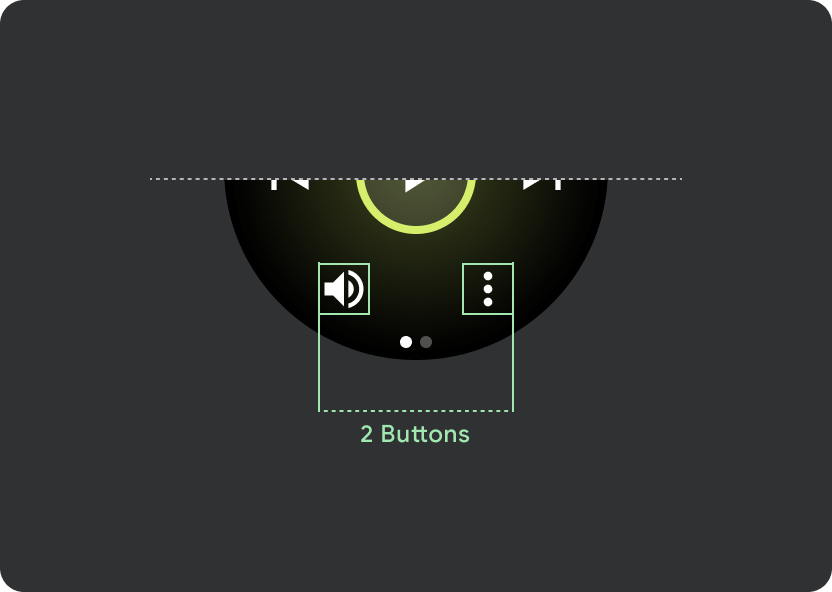
輕觸目標
在大螢幕的 Wear OS 裝置上,中間和頁尾部分的圖示可運用額外空間增加輕觸目標大小。也就是說,除了固定控制原子之外,系統會將「填滿可用空間」屬性套用至圖示容器:


小型 Wear OS 螢幕 (小於 225 dp)
- 建議在小螢幕裝置上最多顯示 2 個按鈕 在最小的螢幕大小上則有 2 個按鈕
- 底部按鈕的最小輕觸目標必須為 48dp (高) x 48dp (寬)
- 圖示應位於輕觸目標的中間
更大的 Wear OS 畫面 / 中斷點 (>225dp)
- 建議在較大螢幕上最多顯示 3 個按鈕,並在這些「較大螢幕」中最小的螢幕上顯示 3 個按鈕
- 底部按鈕的最小輕觸目標必須為 48dp (高) x 48dp (寬)
- 圖示應位於輕觸目標的中間區域 (但要有頂端/底部對齊和內部邊距,以產生圓角效果)