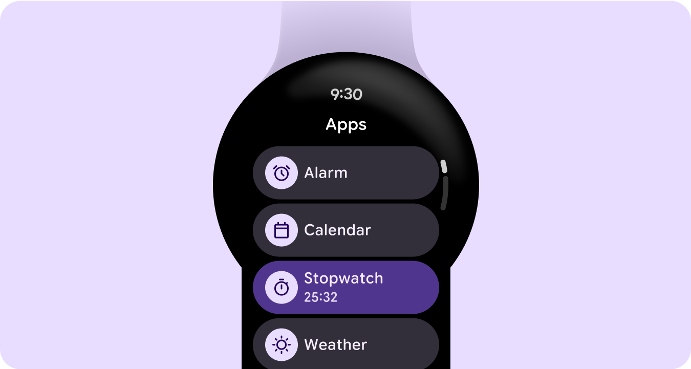
应用是 Wear OS 上的主要 surface 之一。应用与复杂功能或功能块不同。复杂功能或功能块可以一目了然地显示应用内容,而应用可以显示更多信息并支持更丰富的互动性。用户通常从其他 surface(例如启动器、最近用过的应用、通知、复杂功能、功能块或语音操作)进入应用。
原则
专注 专注于关键任务,帮助用户在数秒内完成任务。
浅层和线性 避免创建深度超过两个级别的层次结构。尽可能以内嵌方式显示内容和导航。
滚动 应用可以滚动。这是用户在手表上用于查看更多内容的自然手势。
内容容器类型
在应用中使用内容容器可对相关内容进行分组,并将其与其他内容或内容分组区分开来。
固定高度的容器
可变高度容器
高度和宽度大于视口
分页容器
全屏占用广告
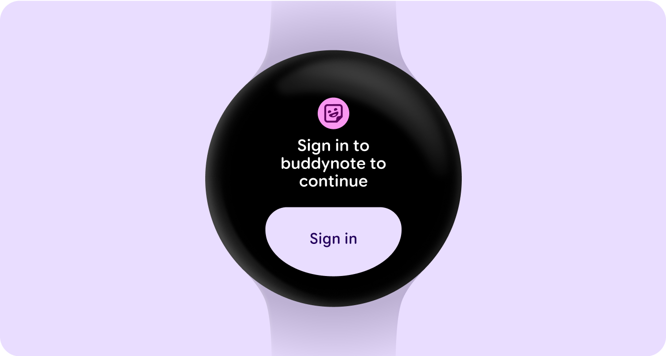
登录状态
让用户知道需要通过功能块在手表或移动应用中更新设置或偏好设置、登录账号或创建账号。