
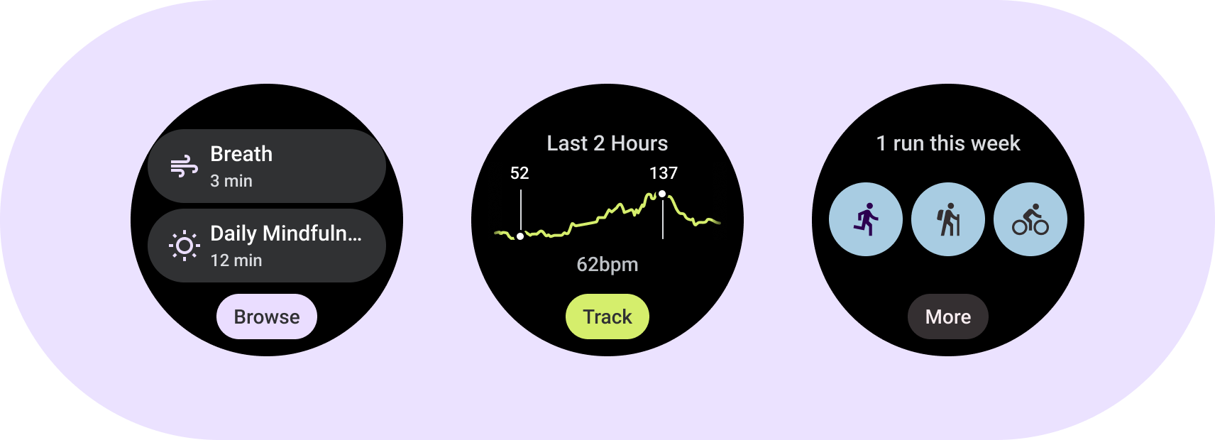
了解功能块基本元素。使用功能块模板、布局和组件为您的应用设计和构建独特的功能块。
基本元素
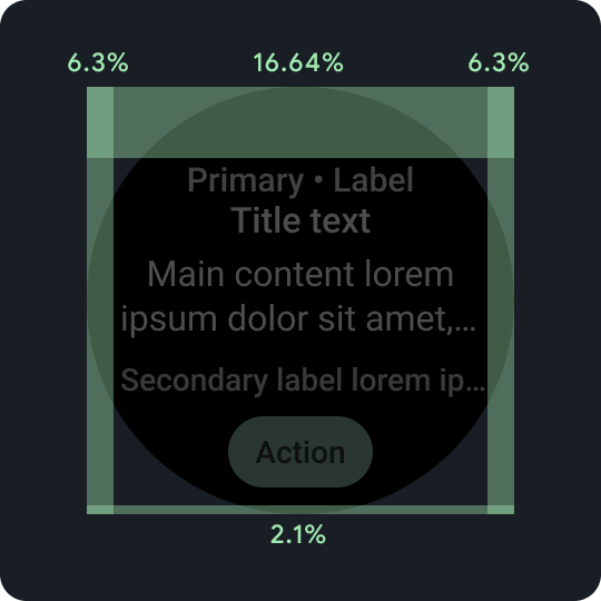
百分比内边距
上外边距、下外边距和侧边外边距都使用百分比(而非固定的外边距)来实现按比例缩放。
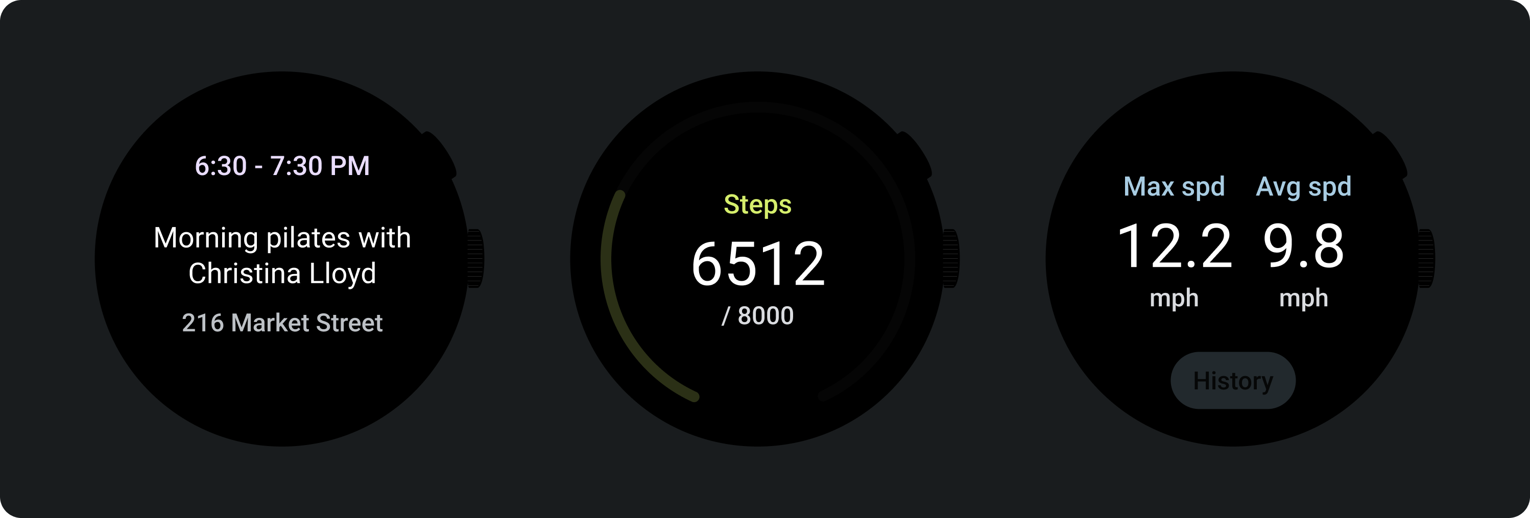
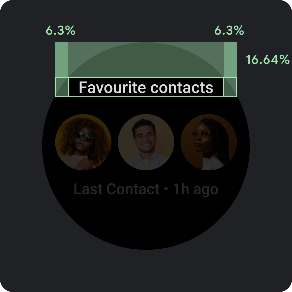
底部紧凑条状标签
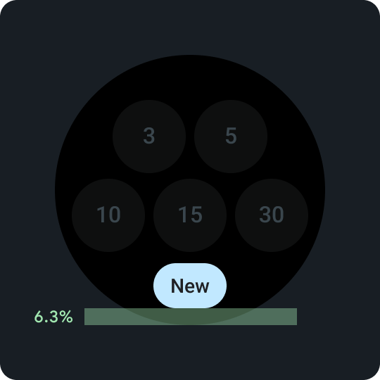
在功能块上启用次要操作非常重要。统一放置在底部 6.3% 的位置。
底部紧凑条状标签
在按钮内使用简短但特定于特定操作或目的地的字词。此号召性用语文字的翻译必须符合字符数限制。作为默认或后备值,您可以使用“更多”作为号召性用语文字。
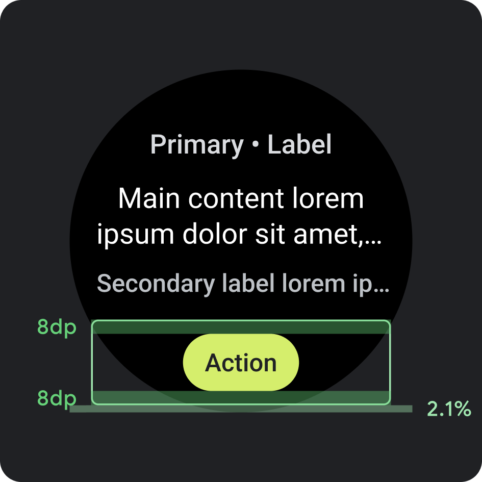
展示位置
- 边距:距底部 2.1%
- 内部内边距:上下 8dp
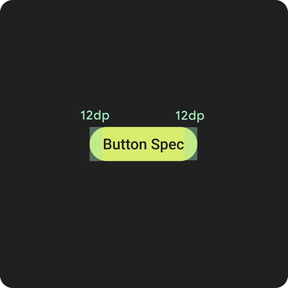
按钮规范
- 内部内边距:两侧均为 12 dp
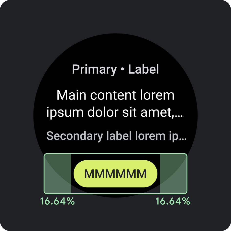
侧边内部内边距/外边距
- 16.64%
建议的字符数限制 <225 dp
- 行数上限:1
- 字符数上限:8
- 建议的字符数限制:6 个字符
- 截断:否
建议的转化操作 >225 dp
- 行数上限:1
- 字符数上限:9
- 建议的字符数限制:7
- 截断:否
颜色
应用品牌主题
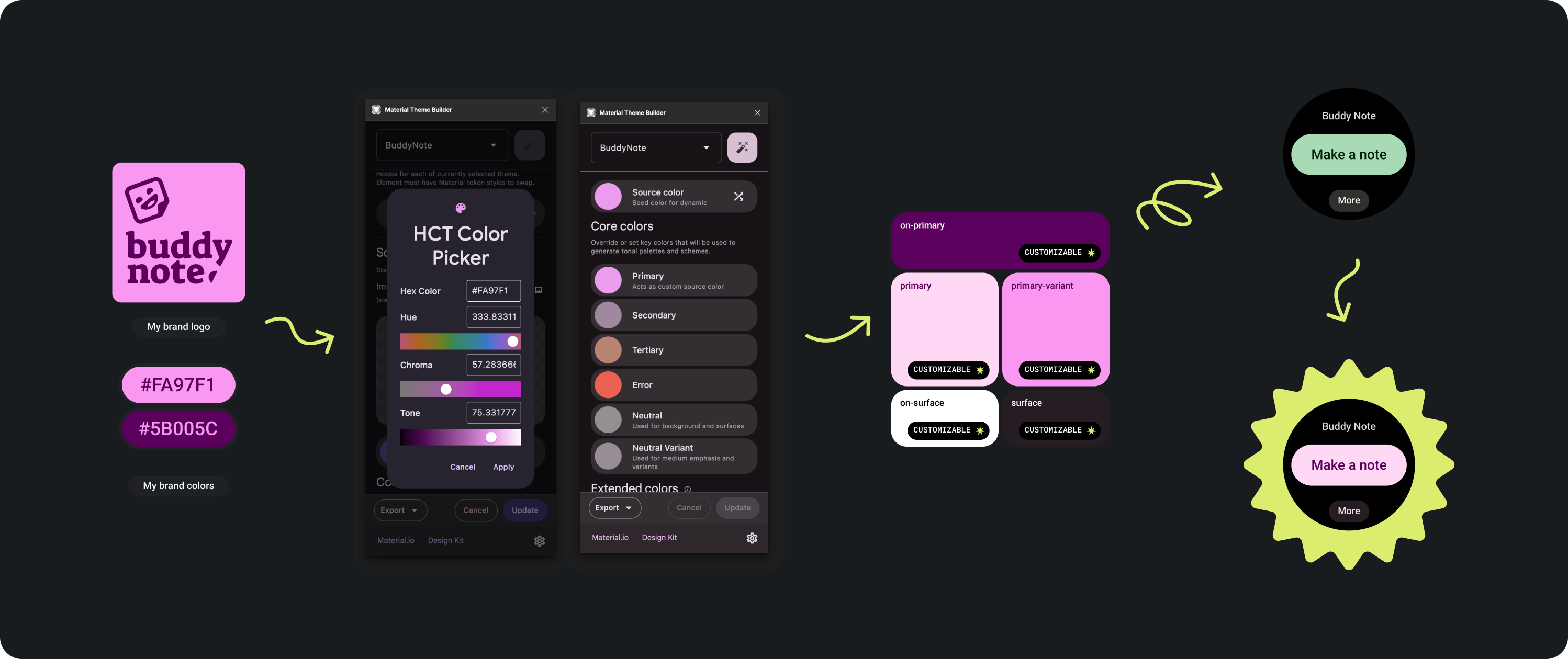
有多种品牌颜色可供选择。您还可以对它们进行自定义和更改,以适应应用的外观和风格。
使用 Material 主题工具和指南生成具有足够色彩对比度的颜色,将主色用作源颜色。在 Figma 中使用生成的调色板替换调色板中的 Primary、primary-variant、on-primary、surface 和 on-surface 颜色,以正确为功能块设置主题。为了实现不同图块间的一致性,所有其他颜色不能进行自定义。
其他 Material 主题构建工具:
颜色应用
始终将背景颜色设为黑色。
正确做法
请勿将背景设置为全宽图片或区块颜色。
错误做法
排版
Roboto 是 Wear OS 中使用的主要字体。建议将 Body 2 作为默认字体和最小字体大小,而 Display 2 则是适用于功能块的最大字体样式。
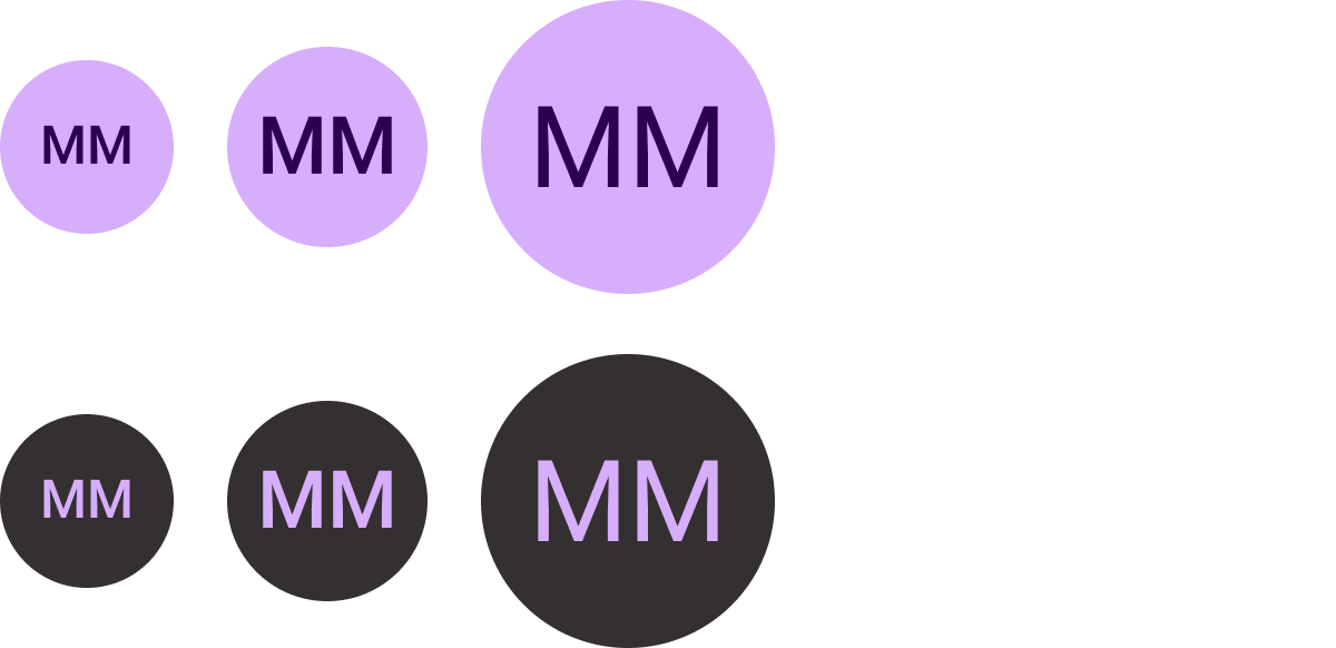
主标签
主标签文本始终距离上边缘 16.64%,内部内边距为 6.3%。颜色和字体也始终保持一致。
内部内边距
上边距:16.64%
边边距:6.3%
颜色
On-Background-Variant(灰色 300)
类型
Tiles3P (Roboto) / 按钮 - 15S 粗体
如需详细了解字体、粗细和大小,请参阅排版。
组件
有多个组件可用于构建应用的功能块。这些组件符合 Material Design 规范。
图标按钮
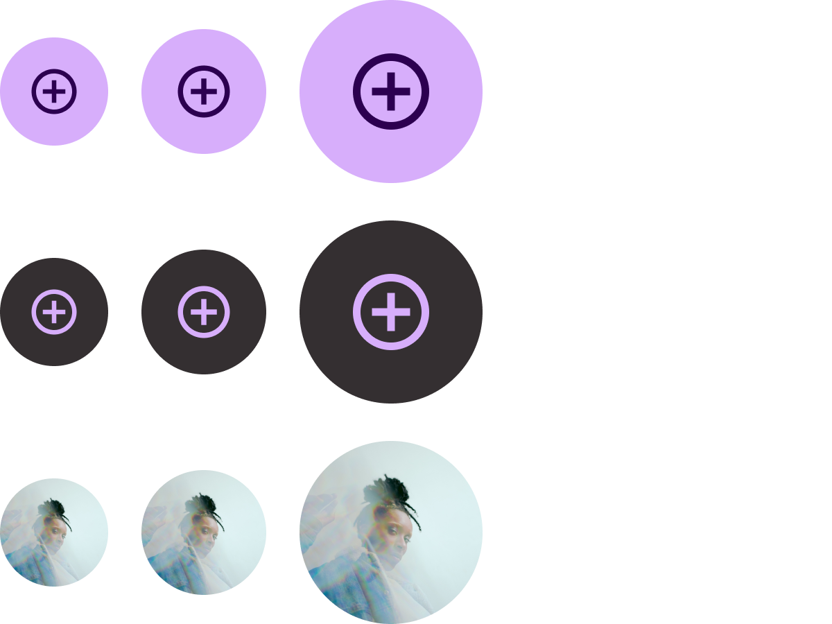
选项:按钮或切换按钮
尺寸:标准、XS、S、L
类型:填充、色调填充和图片
最多可列出 7 个选项。
文本按钮
选项:按钮或切换按钮
尺寸:标准、XS、S、L
类型:填充和色调填充
最多可列出 7 个选项。
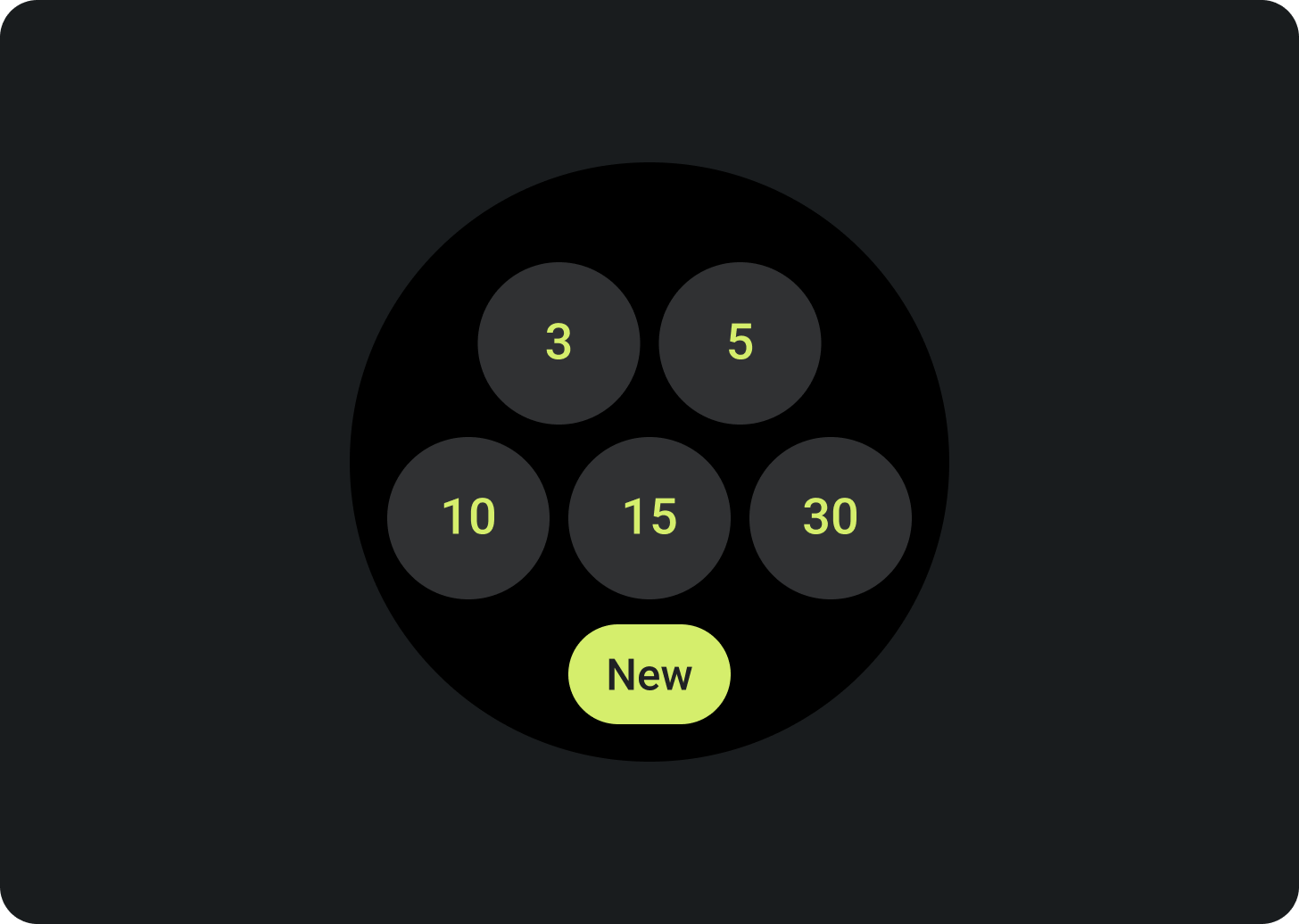
标准条状标签
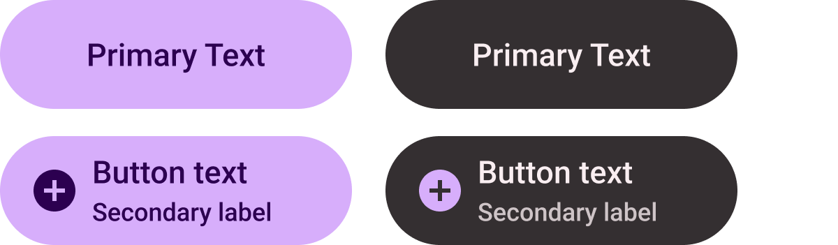
选项:图标、次级标签和文本对齐方式
最多可列出 2 个选项。
标题条状标签(仅限主要填充)

居中对齐文本
创建一条醒目的 CTA。
紧凑条状标签

类型:已填充和色调填充
选项:图标或无图标
用于底部按钮槽位。
进度指示器
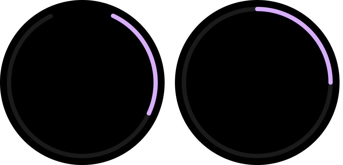
类型:可自定义的笔触宽度
(默认大小:8 dp 和 5 dp)
选项:底部间距或完整间距
指明进度和任务完成情况。
Figma 设计套件
下载 Wear OS 设计套件中的功能块,开始使用包含内置组件、选项和建议的功能块设计布局,创建符合您需求的不同布局,同时遵循 ProtoLayout 模板中的准则。