

media3-ui-compose 程式庫提供基礎元件,可用於在 Jetpack Compose 中建構媒體 UI。如果開發人員需要比 media3-ui-compose-material3 程式庫更多的自訂功能,就很適合使用這項功能。本頁說明如何使用核心元件和狀態容器,建立自訂媒體播放器 UI。
混合 Material 3 和自訂 Compose 元件
media3-ui-compose-material3 程式庫的設計具有彈性。您可以在大部分 UI 中使用預先建構的元件,但如果需要更多控制權,可以將單一元件換成自訂實作。這時 media3-ui-compose 程式庫就能派上用場。
舉例來說,假設您想使用 Material3 程式庫中的標準 PreviousButton 和 NextButton,但需要完全自訂的 PlayPauseButton。如要這麼做,請使用核心 media3-ui-compose 程式庫中的 PlayPauseButton,並將其與預先建構的元件並列。
Row { // Use prebuilt component from the Media3 UI Compose Material3 library PreviousButton(player) // Use the scaffold component from Media3 UI Compose library PlayPauseButton(player) { // `this` is PlayPauseButtonState FilledTonalButton( onClick = { Log.d("PlayPauseButton", "Clicking on play-pause button") this.onClick() }, enabled = this.isEnabled, ) { Icon( imageVector = if (showPlay) Icons.Default.PlayArrow else Icons.Default.Pause, contentDescription = if (showPlay) "Play" else "Pause", ) } } // Use prebuilt component from the Media3 UI Compose Material3 library NextButton(player) }
可用元件
media3-ui-compose 程式庫提供一組預先建構的可組合項,可用於常見的播放器控制項。以下是可直接在應用程式中使用的部分元件:
| 元件 | 說明 |
|---|---|
PlayPauseButton |
按鈕的狀態容器,可在播放和暫停之間切換。 |
SeekBackButton |
按鈕的狀態容器,可依定義的增量倒轉。 |
SeekForwardButton |
按鈕的狀態容器,可依定義的增量向前跳轉。 |
NextButton |
按鈕的狀態容器,用於跳轉至下一個媒體項目。 |
PreviousButton |
按鈕的狀態容器,用於跳轉至上一個媒體項目。 |
RepeatButton |
按鈕的狀態容器,可循環切換重複播放模式。 |
ShuffleButton |
切換隨機播放模式按鈕的狀態容器。 |
MuteButton |
按鈕的狀態容器,用於將播放器靜音及取消靜音。 |
TimeText |
可組合項的狀態容器,用於顯示玩家進度。 |
ContentFrame |
用於顯示媒體內容的介面,可處理顯示比例管理、調整大小和快門 |
PlayerSurface |
原始介面,在 AndroidView 中包裝 SurfaceView 和 TextureView。 |
自訂 Player 可組合函式
使用 media3-ui-compose-material3 程式庫時,Player 可組合項可提供完整的媒體播放體驗。您可以為內容版位提供自己的可組合函式,藉此自訂版面配置,也可以利用 PlayerDefaults 物件自訂 UI 的特定部分,例如 TopControls、CenterControls、BottomControls 和 ErrorOverlay。
圖 1 顯示 Player 可組合項放置版位的位置。圖 2 顯示繪製圖層的順序。
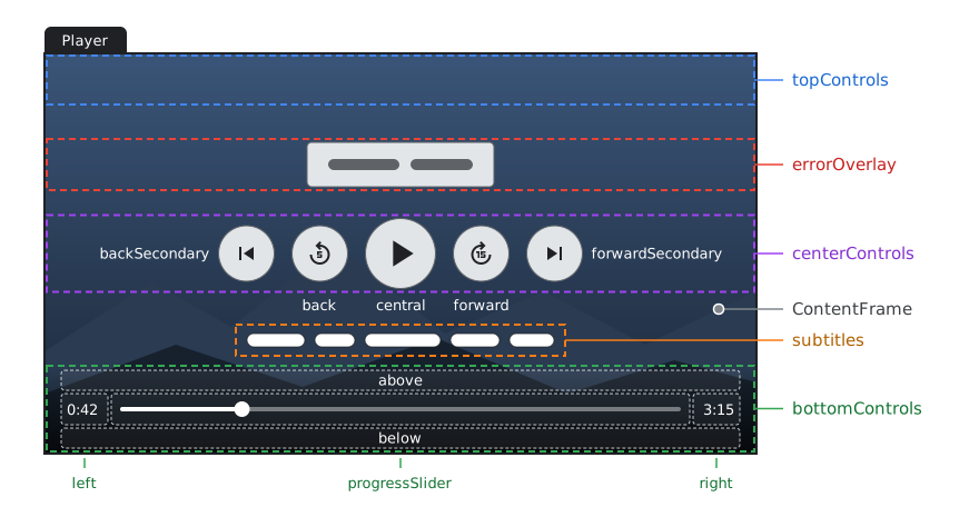
Player 可組合項的版位。中央和底部的控制項會顯示 PlayerDefaults.CenterControls 和 PlayerDefaults.BottomControls 的版位。topControls、above 和 below 槽預設為空白。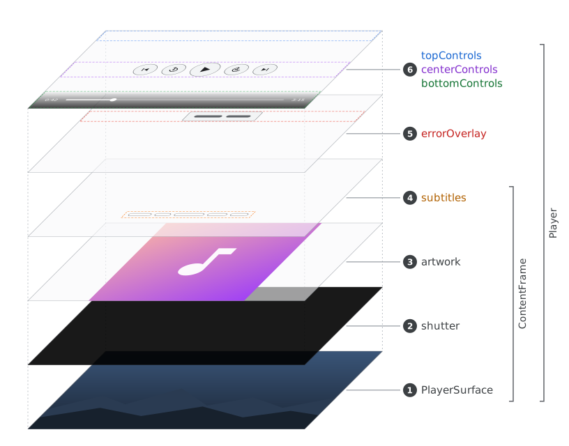
Player 可組合項的圖層,按照繪製順序編號。舉例來說,您可以使用 PlayerDefaults.CenterControls 僅覆寫中央播放/暫停按鈕,同時保留其餘中央控制項。您也可以為 topControls 等參數傳遞完全自訂的可組合函式,並完全省略 bottomControls 等其他參數,保留預設值。
@Composable fun CustomPlayerSlots(player: Player, showControls: Boolean, modifier: Modifier = Modifier) { Player( player = player, modifier = modifier, showControls = showControls, topControls = { // Fully custom top controls Text("My custom title") }, centerControls = { // Use default CenterControls but override the central button PlayerDefaults.CenterControls( player = player, central = { // A custom play/pause button Material3PlayPauseButton(player, modifier = Modifier.size(64.dp)) }, ) }, // bottomControls are left as default ) }
UI 狀態容器
如果沒有任何鷹架元件符合需求,您也可以直接使用狀態物件。一般建議使用對應的 remember 方法,在重組之間保留 UI 外觀。
如要進一步瞭解如何靈活運用 UI 狀態容器和可組合函式,請參閱 Compose 管理狀態的方式。
按鈕狀態容器
對於某些 UI 狀態,程式庫會假設這些狀態最有可能由類似按鈕的可組合項使用。
| 狀態 | remember*State | 類型 |
|---|---|---|
PlayPauseButtonState |
rememberPlayPauseButtonState |
2 個切換鈕 |
PreviousButtonState |
rememberPreviousButtonState |
常數 |
NextButtonState |
rememberNextButtonState |
常數 |
RepeatButtonState |
rememberRepeatButtonState |
3-切換 |
ShuffleButtonState |
rememberShuffleButtonState |
2 個切換鈕 |
PlaybackSpeedState |
rememberPlaybackSpeedState |
選單或 N-Toggle |
PlayPauseButtonState 的使用範例:
val state = rememberPlayPauseButtonState(player) IconButton(onClick = state::onClick, modifier = modifier, enabled = state.isEnabled) { Icon( imageVector = if (state.showPlay) Icons.Default.PlayArrow else Icons.Default.Pause, contentDescription = if (state.showPlay) stringResource(R.string.playpause_button_play) else stringResource(R.string.playpause_button_pause), ) }
視覺輸出狀態容器
CurrentMediaItemState 提供目前播放的 MediaItem 相關資訊,而 PlaylistState 則會公開播放器上設定的 MediaItems 相關資訊。這些方法可用於在自訂 UI 中顯示中繼資料資訊。
ErrorState 提供播放器目前的錯誤狀態資訊,可用於顯示錯誤疊加層。
PresentationState 包含 PlayerSurface 中影片輸出內容的顯示時機,或是否應由預留位置 UI 元素覆蓋。ContentFrame 可組合項結合了顯示比例處理功能,以及在尚未準備就緒的介面上顯示快門。
@Composable fun ContentFrame( player: Player?, modifier: Modifier = Modifier, surfaceType: @SurfaceType Int = SURFACE_TYPE_SURFACE_VIEW, contentScale: ContentScale = ContentScale.Fit, keepContentOnReset: Boolean = false, shutter: @Composable () -> Unit = { Box(Modifier.fillMaxSize().background(Color.Black)) }, ) { val presentationState = rememberPresentationState(player, keepContentOnReset) val scaledModifier = modifier.resizeWithContentScale(contentScale, presentationState.videoAspectRatio) // Always leave PlayerSurface to be part of the Compose tree because it will be initialized in // the process. If this composable is guarded by some condition, it might never become visible // because the Player won't emit the relevant event, e.g. the first frame being ready. PlayerSurface(player, scaledModifier, surfaceType) if (presentationState.coverSurface) { // Cover the surface that is being prepared with a shutter shutter() } }
在這裡,我們可以使用 presentationState.videoAspectRatio 將 Surface 縮放至所選顯示比例 (如需更多類型,請參閱「內容縮放」),並使用 presentationState.coverSurface 瞭解何時不適合顯示 Surface。在這種情況下,您可以在介面上方放置不透明的快門,當介面準備就緒時,快門就會消失。ContentFrame 可讓您將快門自訂為結尾 lambda,但根據預設,快門會是黑色 @Composable Box,填滿父項容器的大小。
Flows 在哪裡?
許多 Android 開發人員都熟悉使用 Kotlin Flow 物件收集不斷變化的 UI 資料。舉例來說,您可能正在尋找 Player.isPlaying 流程,以便透過生命週期感知方式 collect。或類似 Player.eventsFlow 的內容,為您提供 Flow<Player.Events>,讓您能以所需方式 filter。
不過,使用流程處理 Player UI 狀態有一些缺點。其中一項主要考量是資料移轉的非同步性質。我們希望盡可能縮短 Player.Event 與 UI 端消耗之間的延遲時間,避免顯示與 Player 不同步的 UI 元素。
其他重點包括:
- 包含所有
Player.Events的流程不符合單一責任原則,每個消費者都必須篩選出相關事件。 - 為每個
Player.Event建立流程時,您必須為每個 UI 元素合併這些流程 (使用combine)。Player.Event 和 UI 元素變更之間存在多對多對應關係。如果必須使用combine,UI 可能會進入非法狀態。
建立自訂 UI 狀態
如果現有狀態不符合需求,可以新增自訂 UI 狀態。查看現有狀態的原始碼,複製模式。一般 UI 狀態容器類別會執行下列操作:
- 接受
Player物件。 - 使用協同程式訂閱
Player。詳情請參閱Player.listen。 - 透過更新內部狀態,回應特定
Player.Events。 - 接受商業邏輯指令,並轉換為適當的
Player更新。 - 可在 UI 樹狀結構的多個位置建立,且一律會維持 Player 狀態的一致檢視畫面。
- 公開可由可組合函式使用的 Compose
State欄位,以動態方式回應變更。 - 隨附
remember*State函式,用於記住組合之間的例項。
幕後到底發生了什麼事?
class SomeButtonState(private val player: Player) { var isEnabled by mutableStateOf(player.isCommandAvailable(COMMAND_ACTION_A)) private set var someFieldValue by mutableStateOf(someFieldDefault) private set fun onClick() { player.actionA() } suspend fun observe(): Nothing = player.listen { events -> if (events.containsAny(EVENT_B_CHANGED, EVENT_C_CHANGED, EVENT_AVAILABLE_COMMANDS_CHANGED)) { someFieldValue = this.someField isEnabled = this.isCommandAvailable(COMMAND_ACTION_A) } } }
如要回應自己的 Player.Events,可以使用 Player.listen 擷取,這是一種 suspend fun,可讓您進入協同程式世界,並無限期監聽 Player.Events。Media3 實作各種 UI 狀態,可協助終端開發人員不必擔心學習 Player.Events。