
Android powers a diverse range of form factors beyond conventional portrait smartphones, including foldables, tablets, desktop windowing environments, and external displays. If you assume screen geometry is static, media content can end up stretched, cropped, or unintentionally letterboxed. Your app must dynamically adapt to varied source media aspect ratios (from classic 4:3 to ultra-wide) across evolving display modes.
Most media layout failures in Jetpack Compose stem from three common architectural pitfalls:
- Inconsistent window inset handling and edge-to-edge collisions.
- Inconsistent layout updates due to incorrect window size calculation.
- Misconfiguration of content scaling options.
This guide covers strategies and best practices for addressing each of these areas using Media3 and Jetpack Compose.
Handle window insets and edge-to-edge collisions
On devices running Android 15 (API level 35) and higher, apps that target API level 35 or higher are displayed edge-to-edge by default. System bars such as the status bar, navigation bar, and desktop caption bar draw over your app's content, and display cutouts can obscure parts of it.
Without proper window inset management, two major layout conflicts occur:
- System bar overlaps: Video frames, subtitles, and playback controls are partially obscured by the status bar (clock, battery icons), the gesture or navigation bar, or display cutouts (camera notches). For general setup guidance, see Set up edge-to-edge.
- Desktop mode caption bar interference: In desktop windowing mode, the system introduces a top caption bar for window management. Standard layouts that render custom headers or edge-to-edge media canvases without accounting for this caption bar end up with video frames and top playback controls obscured and unclickable. For more details on window states, see Support desktop windowing.
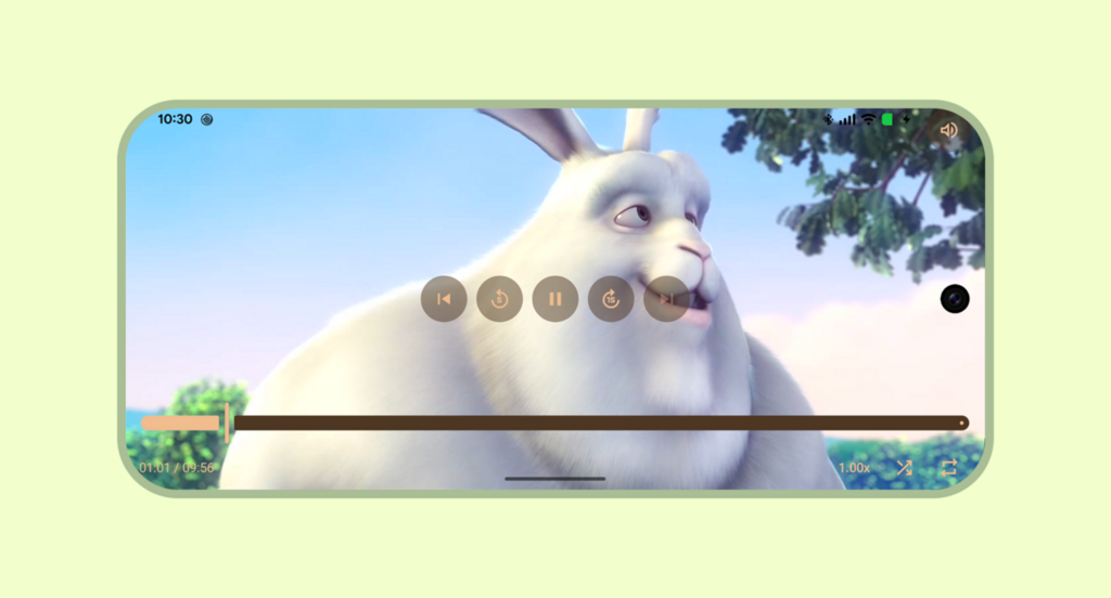

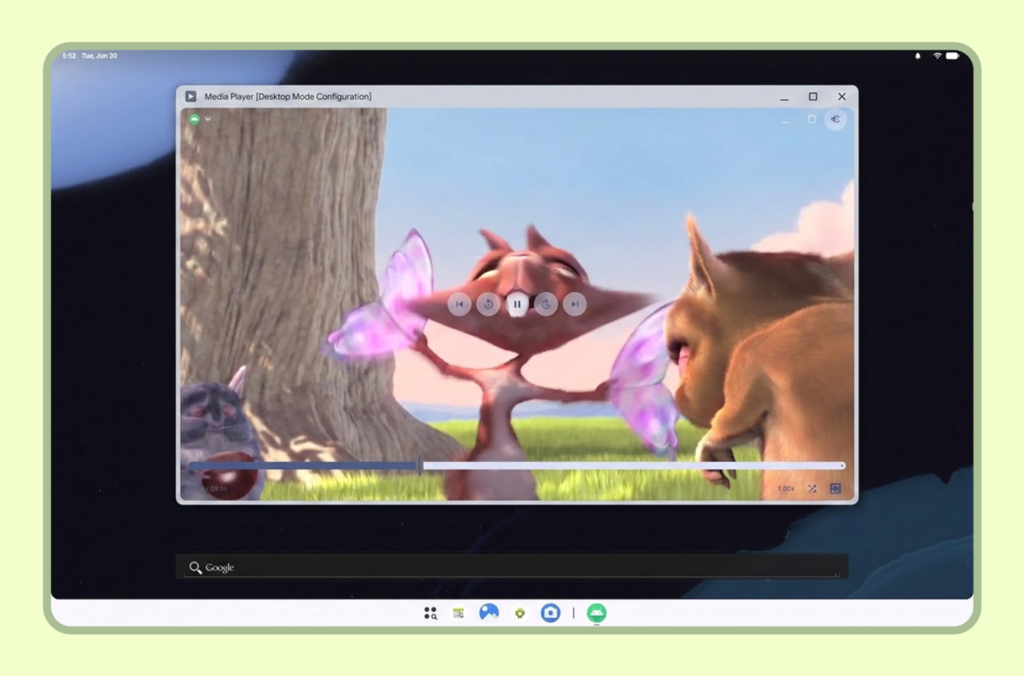
Inset management strategies
Your app should dynamically adapt to system insets based on whether the player is in a non-immersive or immersive mode.
Non-immersive configurations
In non-immersive playback, system bars remain visible to preserve device context.
When the player extends to the window edges, apply
windowInsetsPadding with
WindowInsets.safeDrawing and only to each
PlayerDefaults control bar on the edges where it meets the
system bars or display cutout (for example, Top + Horizontal on TopControls
and Bottom + Horizontal on BottomControls). This keeps the controls clear of
system bars while the video surface extends across the container.
@Composable fun NonImmersiveVideoPlayer( player: Player, showControls: Boolean, modifier: Modifier = Modifier, ) { Player( player = player, modifier = modifier, showControls = showControls, // Keep top controls clear of the status bar, caption bar, and display cutout topControls = { PlayerDefaults.TopControls( player = player, modifier = Modifier.fillMaxWidth() .windowInsetsPadding( WindowInsets.safeDrawing.only(WindowInsetsSides.Top + WindowInsetsSides.Horizontal) ), ) { MuteButton(player = player, modifier = Modifier.align(Alignment.TopEnd).padding(16.dp)) } }, // Keep bottom controls clear of the navigation bar and display cutout bottomControls = { PlayerDefaults.BottomControls( player = player, modifier = Modifier.fillMaxWidth() .windowInsetsPadding( WindowInsets.safeDrawing.only( WindowInsetsSides.Bottom + WindowInsetsSides.Horizontal ) ), ) }, ) }
Immersive configurations (portrait and landscape)
In full-screen immersive mode, the goal is to maximize the canvas for a cinematic experience while keeping playback controls accessible:
- Apply
windowInsetsPaddingto media control overlays (such as top and bottom controls) to prevent them from overlapping display cutouts or system gesture areas (for example, combiningWindowInsets.displayCutoutwithWindowInsets.systemGestureson the bottom controls so the seek bar does not conflict with edge-swipe gestures). - Hide system bars using
WindowInsetsControllerCompatinside aDisposableEffect, ensuring the system UI visibility is restored when leaving the composable.
@Composable fun ImmersiveVideoPlayer(player: Player, showControls: Boolean, modifier: Modifier = Modifier) { val view = LocalView.current // Manages the system UI lifecycle to create an edge-to-edge cinematic experience DisposableEffect(view) { // Finds the hosting Activity, unwrapping any ContextWrapper around the view's context val activity = generateSequence(view.context) { (it as? ContextWrapper)?.baseContext } .filterIsInstance<Activity>() .firstOrNull() val window = activity?.window ?: return@DisposableEffect onDispose {} val controller = WindowCompat.getInsetsController(window, view) // Records the current system bar state so it can be restored on dispose val insets = ViewCompat.getRootWindowInsets(view) val wereSystemBarsVisible = insets == null || insets.isVisible(WindowInsetsCompat.Type.statusBars()) || insets.isVisible(WindowInsetsCompat.Type.navigationBars()) val previousBehavior = controller.systemBarsBehavior // Hides status bars, navigation bars, and caption bars to maximize the video canvas controller.hide(WindowInsetsCompat.Type.systemBars()) // Allows hidden system bars to temporarily reappear with a swipe gesture from the edge controller.systemBarsBehavior = WindowInsetsControllerCompat.BEHAVIOR_SHOW_TRANSIENT_BARS_BY_SWIPE onDispose { // Restores the previous system bar state when leaving the composable controller.systemBarsBehavior = previousBehavior if (wereSystemBarsVisible) { controller.show(WindowInsetsCompat.Type.systemBars()) } } } Player( player = player, modifier = modifier, showControls = showControls, // Keep top controls clear of the display cutout while the system bars are hidden topControls = { PlayerDefaults.TopControls( player = player, modifier = Modifier.fillMaxWidth() .windowInsetsPadding( WindowInsets.displayCutout.only( WindowInsetsSides.Top + WindowInsetsSides.Horizontal ) ), ) { MuteButton(player = player, modifier = Modifier.align(Alignment.TopEnd).padding(16.dp)) } }, // Keep bottom controls clear of the display cutout and system gesture areas bottomControls = { PlayerDefaults.BottomControls( player = player, modifier = Modifier.fillMaxWidth() .windowInsetsPadding( WindowInsets.displayCutout .union(WindowInsets.systemGestures) .only(WindowInsetsSides.Bottom + WindowInsetsSides.Horizontal) ), ) }, ) }
Calculate dynamic window sizing and layout updates
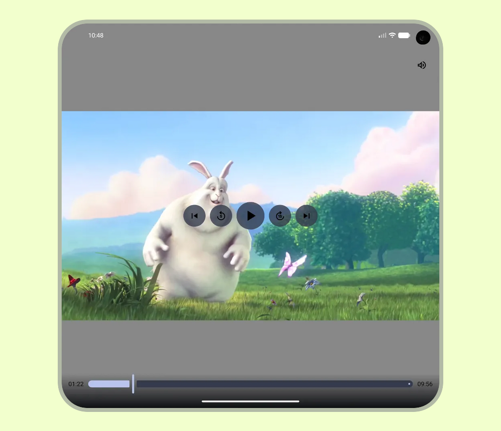
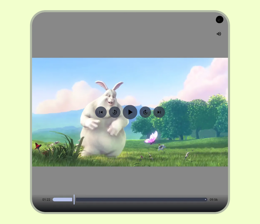
Calculating screen width or height only once at app startup causes layouts to rely on stale values when the device configuration changes—such as when a foldable device is unfolded, a multi-window session is resized, or the display is rotated.
In these cases, even if a child component correctly uses
Modifier.fillMaxWidth(), it will fail to adapt if its parent
container is constrained by stale dimensions, causing stretching, clipping, or
unresponsive layouts.
In the following example, the left frame illustrates correct rendering on a standard viewport, while the right frame demonstrates the failure of stale window dimensions to adapt when a device is unfolded, resulting in non-responsive content layout.
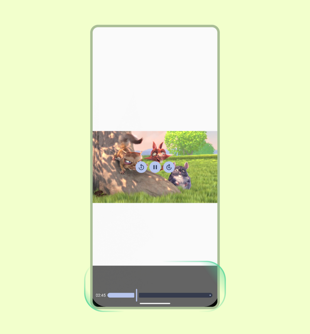
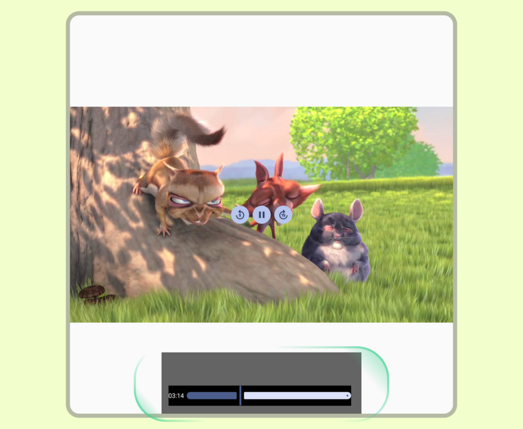
To avoid stale layout constraints, use the Jetpack Media Query
API. Because this API is experimental and disabled by default,
first enable the mediaQuery function by setting
ComposeUiFlags.isMediaQueryIntegrationEnabled = true (for example, before
calling setContent), and opt in with
@OptIn(ExperimentalMediaQueryApi::class).
Use derivedMediaQuery to evaluate conditions on the
current window size, such as windowWidth, so your layout updates when the
window changes without unnecessary recompositions. You can combine
derivedMediaQuery with WindowSizeClass breakpoints to
switch between single-pane and multi-pane player layouts as the window expands:
@OptIn(ExperimentalMediaQueryApi::class) @Composable fun AdaptiveVideoPlayerScreen( player: Player, modifier: Modifier = Modifier, relatedContent: @Composable () -> Unit, ) { val isWideWindow by derivedMediaQuery { windowWidth >= WindowSizeClass.WIDTH_DP_MEDIUM_LOWER_BOUND.dp } if (isWideWindow) { // Medium or expanded width: place the player alongside a details or playlist pane Row(modifier = modifier.fillMaxSize()) { Player(player = player, modifier = Modifier.weight(0.65f).fillMaxHeight()) Box(modifier = Modifier.weight(0.35f).fillMaxHeight()) { relatedContent() } } } else { // Compact width: stack a 16:9 player above the details pane Column(modifier = modifier.fillMaxSize()) { Player(player = player, modifier = Modifier.fillMaxWidth().aspectRatio(16f / 9f)) Box(modifier = Modifier.weight(1f).fillMaxWidth()) { relatedContent() } } } }
Configure content scaling and aspect ratios
Distinguish between managing the available container area and scaling the media content itself. Use inset management, such as safe area padding, to set container boundaries relative to system bars and display cutouts. Then apply scaling strategies within those boundaries. For design guidance on structuring containers and scaling visual content across aspect ratios, see Content composition and structure.
In the following example, the left image shows how a cropping strategy can cut off content when full visibility is required, while the right image shows how a fitting strategy preserves the native aspect ratio for full-frame rendering.
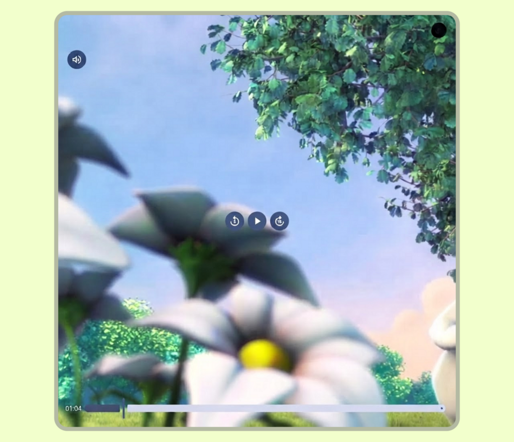
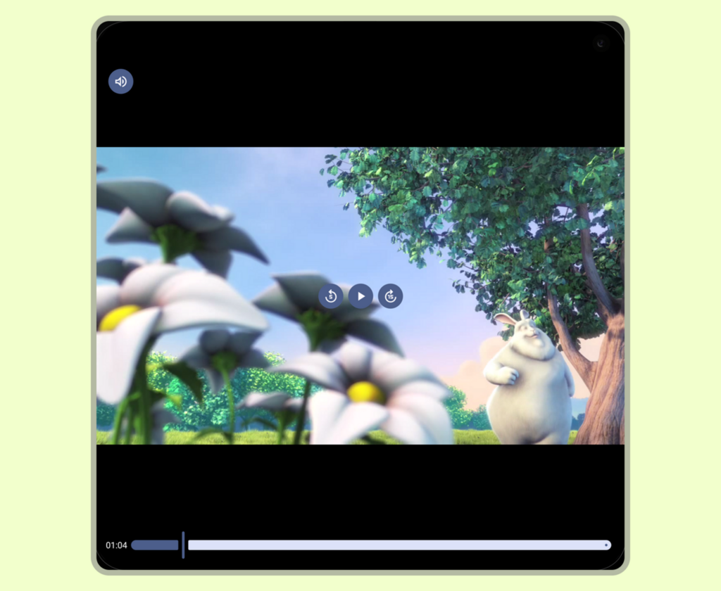
Media3 components handle standard video aspect ratios automatically, but
explicit ContentScale configurations become critical when
working with custom Compose layouts or constrained containers (such as
scrollable social feeds). Selecting an improper content scale can lead to layout
issues—such as video distortion (stretching) or unintended letterboxing that
leaves empty space in the viewport. Managing video surfaces manually without
these options can also result in broken layouts during screen rotations or
foldable device state changes.
Whether displaying a 16:9 video on a 4:3 screen or a 4:3 video on a 16:9
display, the Player composable defaults to
ContentScale.Fit. This keeps the full video visible
without clipping by applying letterboxing or pillarboxing.
Subsequent display mode changes (such as zooming or cropping) should be
user-driven. For example, switch to ContentScale.Crop to
fill the container completely. An interactive scaling toggle balances layout
requirements with user choice.
Sample implementations
You can enforce full frame visibility and handle aspect ratios using standard
Compose ContentScale properties.
Use the Player composable
The simplest and most direct approach is to use the Player
composable. Serving as a high-level wrapper that automatically handles scaling
boundaries, it pairs a ContentFrame for video rendering with
customizable control overlays (topControls, centerControls,
bottomControls) and a shutter layer:
@Composable fun FitVideoPlayer(player: Player, modifier: Modifier = Modifier) { Player( player = player, modifier = modifier.fillMaxSize(), // Fill the available space contentScale = ContentScale.Fit, // Default; shown for clarity ) }
When building a custom video player layout or placing custom UI layers directly
over the video stream, you can use ContentFrame directly for
precise, lower-level layout control.
Dynamic user-controlled scaling toggle
To enhance the viewing experience of your app, you can add an optional toggle to
switch between different content scaling options. By detecting a double-tap
gesture, you can instantly toggle the player's state between ContentScale.Fit
and ContentScale.Crop. You can also extend this functionality to support
dynamic ContentScale adjustments using pinch-to-zoom or other multi-touch
gestures, similar to modern video streaming applications.
@Composable fun ZoomableVideoPlayer(player: Player, modifier: Modifier = Modifier) { var isCropped by rememberSaveable { mutableStateOf(false) } Player( player = player, modifier = modifier .fillMaxSize() // Handle double-tap to toggle between Fit and Crop scaling .pointerInput(Unit) { detectTapGestures(onDoubleTap = { isCropped = !isCropped }) }, contentScale = if (isCropped) ContentScale.Crop else ContentScale.Fit, ) }
While there are several content scaling options, choose the scaling option based
on your use case: use ContentScale.Crop for short-form
video or scrollable feeds where filling the screen is the primary goal, and
default to ContentScale.Fit for media with vital margin
information, such as sports scores or subtitles, to safeguard essential visual
context.