
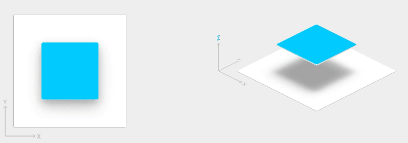
Material Design 為 UI 元素導入了 Z 軸高度。升級功能可協助使用者瞭解每個元素的相對重要性,並將注意力集中在目前的工作上。
檢視區塊的高度 (以 Z 屬性表示) 會決定陰影的視覺外觀。Z 值較高的檢視區塊會投射較大、較柔和的陰影,並遮蔽 Z 值較低的檢視區塊。不過,檢視區塊的 Z 值不會影響檢視區塊的大小。
陰影是由高架檢視區塊的父項繪製。這些檢視區塊會受到標準檢視區塊裁剪的影響,且預設會由父項裁剪。
此外,您也可以利用高度建立動畫,讓小工具在執行動作時暫時升起,高於檢視平面。
詳情請參閱「Material Design 中的高度」。
指定視圖的高度
檢視區塊的 Z 值包含兩個元件:
- 海拔:靜態分量
- 翻譯:用於動畫的動態元件
Z = elevation + translationZ
Z 值以 dp (密度獨立像素) 為單位。
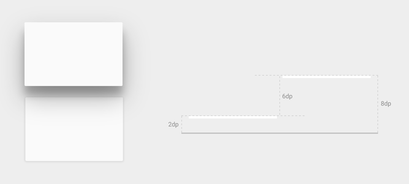
如要設定檢視區塊的預設 (靜止) 高度,請在 XML 版面配置中使用 android:elevation 屬性。如要在活動的程式碼中設定檢視區塊的高度,請使用 View.setElevation() 方法。
如要設定檢視區塊的翻譯,請使用 View.setTranslationZ() 方法。
ViewPropertyAnimator.z() 和 ViewPropertyAnimator.translationZ() 方法可讓您為檢視區塊的高度設定動畫效果。詳情請參閱 ViewPropertyAnimator 的 API 參考資料,以及屬性動畫開發人員指南。
您也可以使用 StateListAnimator 以宣告方式指定這些動畫。如果狀態變更會觸發動畫 (例如使用者輕觸按鈕時),這項功能就特別實用。詳情請參閱「使用 StateListAnimator 以動畫呈現檢視區塊狀態變化」。
自訂檢視區塊陰影和外框
檢視區塊背景可繪項目的邊界會決定陰影的預設形狀。外框代表圖像物件的外形,並定義觸控回饋的漣漪區域。
請參考下列檢視區塊,該檢視區塊是使用背景可繪項目定義:
<TextView
    android:id="@+id/myview"
    ...
    android:elevation="2dp"
    android:background="@drawable/myrect" />
背景可繪項目定義為圓角矩形:
<!-- res/drawable/myrect.xml -->
<shape xmlns:android="http://schemas.android.com/apk/res/android"
       android:shape="rectangle">
    <solid android:color="#42000000" />
    <corners android:radius="5dp" />
</shape>
由於背景可繪項目定義了檢視區塊的輪廓,因此檢視區塊會投射圓角陰影。提供自訂輪廓會覆寫檢視區塊陰影的預設形狀。
如要在程式碼中定義檢視區塊的自訂輪廓,請按照下列步驟操作:
- 擴充
ViewOutlineProvider類別。 - 覆寫
getOutline()方法。 - 使用
View.setOutlineProvider()方法,將新的輪廓供應器指派給檢視區塊。
您可以使用 Outline 類別中的方法,建立圓角橢圓形和矩形外框。檢視區塊的預設輪廓供應器會從檢視區塊的背景取得輪廓。如要防止檢視區塊投射陰影,請將其外框供應器設為 null。
短片觀看次數
剪裁檢視區塊可變更檢視區塊的形狀。您可以裁剪檢視區塊,確保與其他設計元素一致,或因應使用者輸入內容變更檢視區塊的形狀。您可以使用 View.setClipToOutline() 方法,將檢視區塊裁剪至輪廓區域。只有矩形、圓形和圓角矩形的外框支援裁剪,這由 Outline.canClip() 方法決定。
如要將檢視區塊裁剪為可繪項目的形狀,請將可繪項目設為檢視區塊的背景 (如上例所示),然後呼叫 View.setClipToOutline() 方法。
裁剪檢視區塊是耗費資源的作業,因此請勿為用於裁剪檢視區塊的形狀製作動畫。如要實現此效果,請使用顯示動畫。