Dialog 元件會在主要應用程式內容上方的圖層顯示對話方塊訊息,或要求使用者輸入內容。這會建立干擾式 UI 體驗,以吸引使用者注意。
對話方塊的用途包括:
- 確認使用者動作,例如刪除檔案。
- 要求使用者輸入內容,例如待辦事項應用程式。
- 顯示選項清單供使用者選取,例如在設定檔中選擇國家/地區。

快訊對話方塊
AlertDialog 可組合函式提供便利的 API,可建立 Material Design 主題對話方塊。AlertDialog 具有特定參數,可處理對話方塊的特定元素。包括:
title:顯示在對話方塊頂端的文字。text:顯示在對話方塊中央的文字。icon:顯示在對話方塊頂端的圖像。onDismissRequest:使用者關閉對話方塊時呼叫的函式,例如輕觸對話方塊外部區域。dismissButton:做為關閉按鈕的可組合函式。confirmButton:做為確認按鈕的可組合函式。
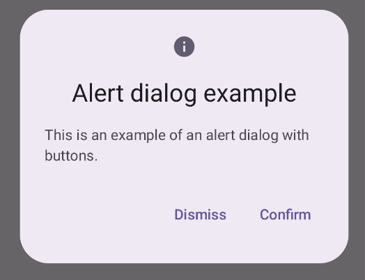
以下範例會在快訊對話方塊中導入兩個按鈕,一個用於關閉對話方塊,另一個則用於確認要求。
@Composable fun AlertDialogExample( onDismissRequest: () -> Unit, onConfirmation: () -> Unit, dialogTitle: String, dialogText: String, icon: ImageVector, ) { AlertDialog( icon = { Icon(icon, contentDescription = "Example Icon") }, title = { Text(text = dialogTitle) }, text = { Text(text = dialogText) }, onDismissRequest = { onDismissRequest() }, confirmButton = { TextButton( onClick = { onConfirmation() } ) { Text("Confirm") } }, dismissButton = { TextButton( onClick = { onDismissRequest() } ) { Text("Dismiss") } } ) }
這項實作方式表示父項可組合函式會以這種方式將引數傳遞至子項可組合函式:
@Composable fun DialogExamples() { // ... val openAlertDialog = remember { mutableStateOf(false) } // ... when { // ... openAlertDialog.value -> { AlertDialogExample( onDismissRequest = { openAlertDialog.value = false }, onConfirmation = { openAlertDialog.value = false println("Confirmation registered") // Add logic here to handle confirmation. }, dialogTitle = "Alert dialog example", dialogText = "This is an example of an alert dialog with buttons.", icon = Icons.Default.Info ) } } } }
實作方式如下:
對話方塊可組合函式
Dialog 是基本的可組合函式,不會提供任何樣式或內容的預先定義位置。這是相對簡單的容器,您應填入 Card 等容器。以下列出對話方塊的一些重要參數:
onDismissRequest:使用者關閉對話方塊時呼叫的 lambda。properties:DialogProperties的執行個體,可提供額外的自訂範圍。
基本範例
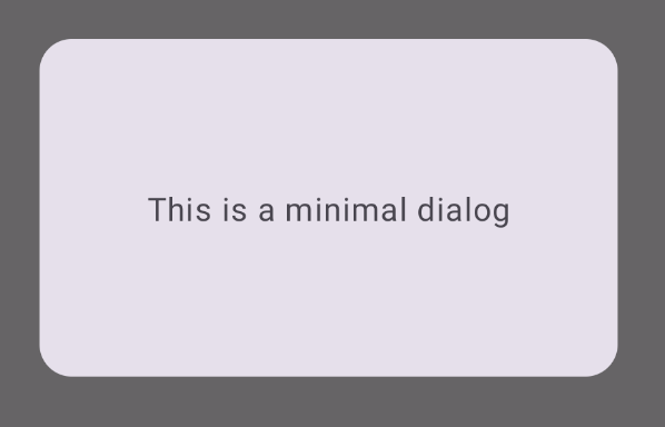
以下範例是 Dialog 可組合函式的基本實作方式。請注意,它會使用 Card 做為次要容器。如果沒有 Card,Text 元件就會單獨顯示在主要應用程式內容上方。
@Composable fun MinimalDialog(onDismissRequest: () -> Unit) { Dialog(onDismissRequest = { onDismissRequest() }) { Card( modifier = Modifier .fillMaxWidth() .height(200.dp) .padding(16.dp), shape = RoundedCornerShape(16.dp), ) { Text( text = "This is a minimal dialog", modifier = Modifier .fillMaxSize() .wrapContentSize(Alignment.Center), textAlign = TextAlign.Center, ) } } }
實作方式如下所示。請注意,對話方塊開啟時,下方的應用程式主要內容會變暗並呈現灰色:
進階範例
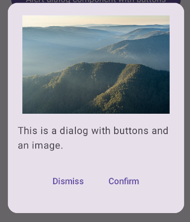
以下是 Dialog 可組合項的進階實作方式。在本例中,元件會手動實作與上述 AlertDialog 範例類似的介面。
@Composable fun DialogWithImage( onDismissRequest: () -> Unit, onConfirmation: () -> Unit, painter: Painter, imageDescription: String, ) { Dialog(onDismissRequest = { onDismissRequest() }) { // Draw a rectangle shape with rounded corners inside the dialog Card( modifier = Modifier .fillMaxWidth() .height(375.dp) .padding(16.dp), shape = RoundedCornerShape(16.dp), ) { Column( modifier = Modifier .fillMaxSize(), verticalArrangement = Arrangement.Center, horizontalAlignment = Alignment.CenterHorizontally, ) { Image( painter = painter, contentDescription = imageDescription, contentScale = ContentScale.Fit, modifier = Modifier .height(160.dp) ) Text( text = "This is a dialog with buttons and an image.", modifier = Modifier.padding(16.dp), ) Row( modifier = Modifier .fillMaxWidth(), horizontalArrangement = Arrangement.Center, ) { TextButton( onClick = { onDismissRequest() }, modifier = Modifier.padding(8.dp), ) { Text("Dismiss") } TextButton( onClick = { onConfirmation() }, modifier = Modifier.padding(8.dp), ) { Text("Confirm") } } } } } }
實作方式如下: