
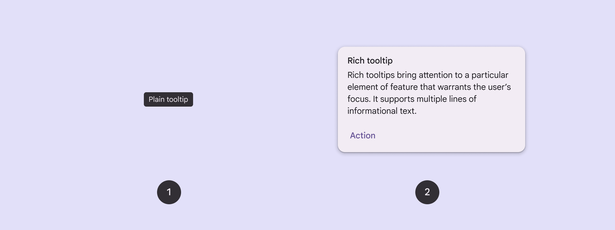
使用工具提示为按钮或其他界面元素添加上下文。 工具提示有两种类型:
- 普通工具提示:描述图标按钮的元素或操作。
- 富工具提示:提供更多详细信息,例如描述 特征的值。还可以包含可选的标题、链接和按钮。
API Surface
您可以使用 TooltipBox 可组合项在应用中实现工具提示。
您可以使用以下主要参数控制 TooltipBox 的外观:
positionProvider:相对于锚点内容放置工具提示。您通常使用TooltipDefaults中的默认位置提供程序,或者,如果您需要自定义定位逻辑,也可以提供自己的位置提供程序。tooltip:包含工具提示内容的可组合项。您通常使用PlainTooltip或RichTooltip可组合项。- 使用
PlainTooltip描述图标按钮的元素或操作。 - 使用
RichTooltip提供更多详细信息,例如描述特征的值。富工具提示可以包含可选的标题、链接和按钮。
- 使用
state:包含此工具提示的界面逻辑和元素状态的状态容器。content:工具提示所锚定的可组合内容。
显示普通工具提示
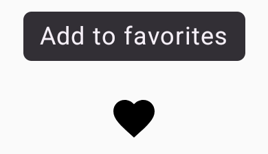
使用普通工具提示简要描述界面元素。以下代码段在标记为“添加到收藏夹”的图标按钮上方显示普通工具提示:
@Composable fun PlainTooltipExample( modifier: Modifier = Modifier, plainTooltipText: String = "Add to favorites" ) { TooltipBox( modifier = modifier, positionProvider = TooltipDefaults.rememberPlainTooltipPositionProvider(), tooltip = { PlainTooltip { Text(plainTooltipText) } }, state = rememberTooltipState() ) { IconButton(onClick = { /* Do something... */ }) { Icon( imageVector = Icons.Filled.Favorite, contentDescription = "Add to favorites" ) } } }
代码要点
TooltipBox生成一个包含文本“添加到收藏夹”的工具提示。TooltipDefaults.rememberPlainTooltipPositionProvider()为普通工具提示提供默认定位。tooltip是一个 lambda 函数,用于使用PlainTooltip可组合项定义工具提示的内容。Text(plainTooltipText)在工具提示中显示文本。tooltipState控制工具提示的状态。
IconButton创建一个带有图标的可点击按钮。Icon(...)在按钮内显示一个心形图标。- 当用户与
IconButton互动时,TooltipBox会显示包含文本“添加到收藏夹”的工具提示。根据设备的不同,用户可以通过以下方式触发工具提示: - 将光标悬停在图标上
- 在移动设备上长按图标
结果
此示例在图标上方生成一个普通工具提示:
显示富工具提示
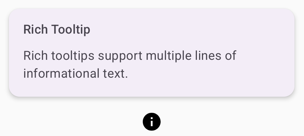
使用富工具提示提供有关界面元素的其他上下文。此示例创建一个多行富工具提示,其标题锚定到 Icon:
@Composable fun RichTooltipExample( modifier: Modifier = Modifier, richTooltipSubheadText: String = "Rich Tooltip", richTooltipText: String = "Rich tooltips support multiple lines of informational text." ) { TooltipBox( modifier = modifier, positionProvider = TooltipDefaults.rememberRichTooltipPositionProvider(), tooltip = { RichTooltip( title = { Text(richTooltipSubheadText) } ) { Text(richTooltipText) } }, state = rememberTooltipState() ) { IconButton(onClick = { /* Icon button's click event */ }) { Icon( imageVector = Icons.Filled.Info, contentDescription = "Show more information" ) } } }
代码要点
TooltipBox处理用户互动的事件监听器,并相应地更新TooltipState。当TooltipState指示应显示工具提示时,工具提示 lambda 会执行,并且TooltipBox会显示RichTooltip。TooltipBox充当内容和工具提示的锚点和容器。- 在本例中,内容是一个
IconButton组件,它提供可点按的操作行为。当在TooltipBox内容中的任何位置长按(在触控设备上)或悬停(使用鼠标指针)时,工具提示将显示以显示更多信息。
- 在本例中,内容是一个
RichTooltip可组合项定义工具提示的内容,包括标题和正文文本。TooltipDefaults.rememberRichTooltipPositionProvider()为富工具提示提供定位信息。
结果
此示例生成一个富工具提示,其标题附加到信息图标:
自定义富工具提示
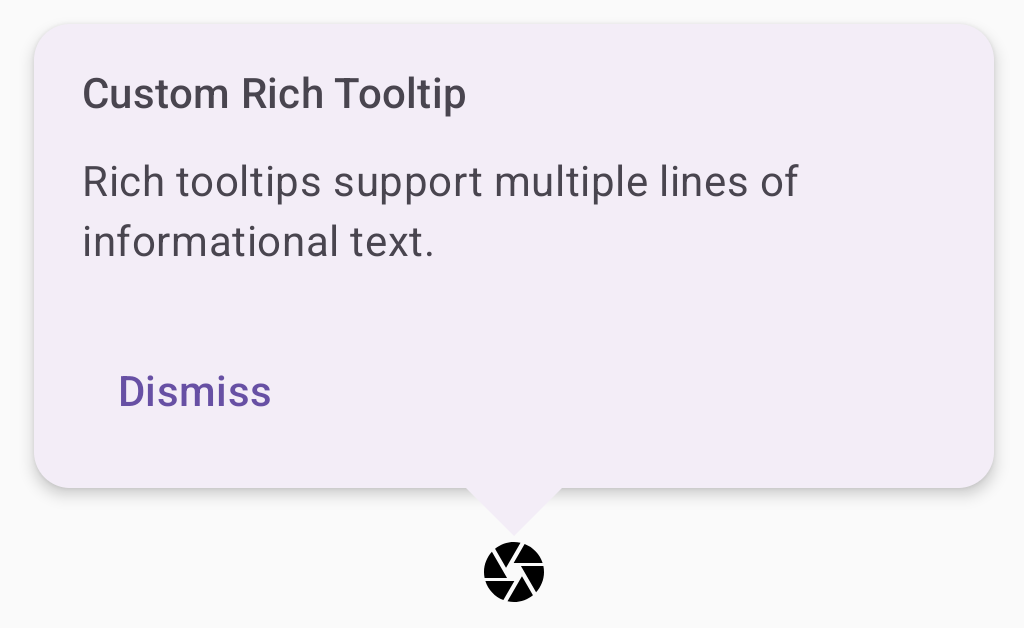
以下代码段显示一个富工具提示,其中包含标题、自定义操作和自定义插入符号(箭头),显示在相机图标按钮上方:
@Composable fun AdvancedRichTooltipExample( modifier: Modifier = Modifier, richTooltipSubheadText: String = "Custom Rich Tooltip", richTooltipText: String = "Rich tooltips support multiple lines of informational text.", richTooltipActionText: String = "Dismiss" ) { val tooltipState = rememberTooltipState() val coroutineScope = rememberCoroutineScope() TooltipBox( modifier = modifier, positionProvider = TooltipDefaults.rememberRichTooltipPositionProvider(), tooltip = { RichTooltip( title = { Text(richTooltipSubheadText) }, action = { Row { TextButton(onClick = { coroutineScope.launch { tooltipState.dismiss() } }) { Text(richTooltipActionText) } } }, ) { Text(richTooltipText) } }, state = tooltipState ) { IconButton(onClick = { coroutineScope.launch { tooltipState.show() } }) { Icon( imageVector = Icons.Filled.Camera, contentDescription = "Open camera" ) } } }
代码要点
RichTooltip显示一个带有标题和关闭操作的工具提示。- 当通过长按或使用鼠标指针悬停在
TooltipBox内容上激活时,工具提示会显示大约一秒钟。 您可以通过点按屏幕上的其他位置或使用关闭操作按钮来关闭此工具提示。 - 当关闭操作执行时,系统会启动一个协程来调用
tooltipState.dismiss。这会验证在显示工具提示时操作执行不会被阻止。 onClick = coroutineScope.launch { tooltipState.show() } }启动一个 协程,以使用tooltipState.show手动显示工具提示。- 借助
action参数,您可以向工具提示添加互动元素,例如按钮。 caretSize参数用于修改工具提示的箭头的大小。
结果
此示例生成以下内容:
其他资源
- Material Design:工具提示