כפתור פעולה צף (FAB) הוא כפתור מודגש שמאפשר למשתמש לבצע פעולה ראשית באפליקציה. הוא מעודד פעולה אחת וממוקדת, שהיא הנתיב הנפוץ ביותר שמשתמש עשוי לעבור, ובדרך כלל הוא מוצג בפינה השמאלית התחתונה של המסך.
ריכזנו כאן שלושה תרחישים לדוגמה שכדאי להשתמש בהם בכפתור פעולה צף:
- יצירת פריט חדש: באפליקציה לסיכום פגישות, אפשר להשתמש ב-FAB כדי ליצור במהירות הערה חדשה.
- הוספת איש קשר חדש: באפליקציית צ'אט, כפתור ה-FAB יכול לפתוח ממשק שמאפשר למשתמש להוסיף מישהו לשיחה.
- מרכוז המיקום: בממשק מפה, כפתור FAB יכול למרכז את המפה במיקום הנוכחי של המשתמש.
ב-Material Design יש ארבעה סוגים של כפתורי פעולה צפים:
- FAB: כפתור פעולה צף בגודל רגיל.
- FAB קטן: כפתור פעולה צף קטן יותר.
- FAB גדול: כפתור פעולה צף גדול יותר.
- FAB מורחב: כפתור פעולה צף שמכיל יותר מסמל.

פלטפורמת ה-API
אפשר להשתמש בכמה רכיבים קומפוזביליים כדי ליצור כפתורי פעולה צפים (FAB) שתואמים לעיצוב Material Design, אבל הפרמטרים שלהם לא שונים בהרבה. הנה כמה מהפרמטרים החשובים שכדאי לזכור:
-
onClick: הפונקציה שמופעלת כשהמשתמש לוחץ על הכפתור. -
containerColor: צבע הכפתור. -
contentColor: הצבע של הסמל.
כפתור פעולה צף (FAB)
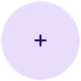
כדי ליצור כפתור פעולה צף כללי, משתמשים בקוד FloatingActionButton קומפוזבילי בסיסי. בדוגמה הבאה מוצגת הטמעה בסיסית של כפתור FAB:
@Composable fun Example(onClick: () -> Unit) { FloatingActionButton( onClick = { onClick() }, ) { Icon(Icons.Filled.Add, "Floating action button.") } }
ההטמעה הזו נראית כך:

כפתור קטן
כדי ליצור כפתור פעולה צף קטן, משתמשים בקוד SmallFloatingActionButton קומפוזבילי. בדוגמה הבאה אפשר לראות איך עושים את זה, עם הוספה של צבעים בהתאמה אישית.
@Composable fun SmallExample(onClick: () -> Unit) { SmallFloatingActionButton( onClick = { onClick() }, containerColor = MaterialTheme.colorScheme.secondaryContainer, contentColor = MaterialTheme.colorScheme.secondary ) { Icon(Icons.Filled.Add, "Small floating action button.") } }
ההטמעה הזו נראית כך:

כפתור גדול
כדי ליצור כפתור פעולה צף גדול, משתמשים בקוד LargeFloatingActionButton קומפוזבילי. הקוד הקומפוזבילי הזה לא שונה באופן משמעותי מהדוגמאות האחרות, מלבד העובדה שהוא יוצר כפתור גדול יותר.
הנה הטמעה פשוטה של כפתור פעולה צף גדול.
@Composable fun LargeExample(onClick: () -> Unit) { LargeFloatingActionButton( onClick = { onClick() }, shape = CircleShape, ) { Icon(Icons.Filled.Add, "Large floating action button") } }
ההטמעה הזו נראית כך:
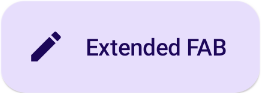
כפתור מורחב
אפשר ליצור כפתורי פעולה צפים מורכבים יותר באמצעות הרכיב הקומפוזבילי ExtendedFloatingActionButton. ההבדל העיקרי בינו לבין FloatingActionButton הוא שיש לו פרמטרים ייעודיים של icon ושל text. הם מאפשרים ליצור כפתור עם תוכן מורכב יותר שמשתנה בהתאם לתוכן שלו.
בקטע הקוד הבא אפשר לראות איך מטמיעים את ExtendedFloatingActionButton, עם ערכים לדוגמה שמועברים ל-icon ול-text.
@Composable fun ExtendedExample(onClick: () -> Unit) { ExtendedFloatingActionButton( onClick = { onClick() }, icon = { Icon(Icons.Filled.Edit, "Extended floating action button.") }, text = { Text(text = "Extended FAB") }, ) }
ההטמעה הזו נראית כך: