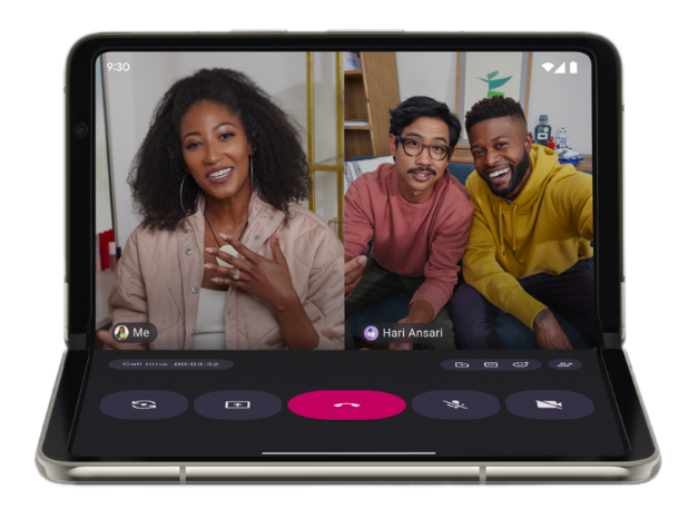
Android apps run on more form factors than just phones held in portrait mode. With the introduction of desktop windowing, connected displays, and foldable devices, your camera app must adapt to dynamic window sizes, varying aspect ratios, and external hardware.
Why phone logic breaks
Camera apps often make assumptions that cause critical failures on multi-form-factor environments.
Natural orientation
- Assumption: The device's natural orientation
ROTATION_0is always portrait - Reality: On tablets, inner display of some foldables, and desktop
monitors,
ROTATION_0is often landscape - Result: Preview incorrectly rotates 90 degrees
Sensor alignment
- Assumption: The camera sensor's long edge aligns with the screen's long edge
- Reality: A resizable window can be square or landscape while the sensor remains fixed (usually 4:3)
- Result: Stretched or otherwise distorted images
Screen density and size
- Assumption: The screen's density and size doesn't change at runtime
- Reality: In desktop environments, users freely resize windows
- Result: Restarting the camera session on every drag event disrupts the user experience and can cause crashes
Solution 1: Use system intents
If your app needs to take a photo or video but does not require a specialized custom camera interface, the best way to handle different form factors is to launch the device's pre-installed system camera (see Camera intents)
Using a system intent delegates the entire capture experience to the camera app developed by the device original equipment manufacturer (OEM). This effectively outsources the complexity of form factor support, including:
- Built-in resizing and rotation support — The default camera app on a foldable or tablet is explicitly built by the manufacturer to handle that specific device's geometry. The app is designed to behave properly when the device is unfolded, rotated, or put into multi-window mode.
- Access to advanced hardware features — OEM camera apps have exclusive access to hardware-tuned algorithms (night mode, HDR, specific lens switching) that are difficult or impossible to replicate manually.
Solution 2: Use Jetpack CameraX
CameraX is a Jetpack library built to help make camera app development easier. CameraX is lifecycle aware and surface oriented. Unlike Camera2, which requires manual recalculation of sensor orientation and surface sizes whenever a device folds, rotates, or resizes, CameraX automatically handles the reconfiguration of camera sessions during multi-window resizing or when an app moves to a connected display, ensuring the preview stream adapts without stuttering or stretching.
Components like PreviewView intelligently manage the aspect ratio and
scale types across different states, such as a foldable transitioning from
cover screen to inner screen, letting you support a diverse range of hardware
with a single, consistent implementation rather than an intricate collection of
device-specific edge cases.
Compose
With Jetpack Compose, use the dedicated androidx.camera:camera-compose
library. The library provides the CameraXViewfinder composable, which is
specifically designed to handle the complex geometry of resizing, rotation, and
aspect ratios within the Compose lifecycle.
The CameraXViewfinder component eliminates the most common sources of errors
in camera apps:
- Automatic coordinate transformation — One of the hardest parts of
building a camera app is mapping a user's tap (x, y on-screen coordinates)
to the camera sensor's coordinate system (0-1, 0-1 rotated) for focus and
metering.
CameraXViewfinderprovides aCoordinateTransformerthat handles the math automatically, even when the window is resized or the device is folded. - Correct layout behavior — Unlike
SurfaceVieworTextureView,CameraXViewfinderworks correctly with Compose's z-ordering. You can overlay UI elements (focus rings, controls) or apply modifiers (rounding corners, animations) without rendering artifacts. - Resizing and aspect ratio:
CameraXViewfinderinternally handles the center crop versus fit center logic, ensuring the preview does not stretch when the app window is resized into nonstandard aspect ratios (for example, split-screen or desktop windowing mode).
Views
On view-based apps, use PreviewView or ViewFinderView. If you use
SurfaceView or TextureView directly, you must calculate the aspect ratio and
apply the correct transformation matrix yourself.
Solution 3: Handle orientation and resizing dynamically
When utilizing platform APIs directly, keep device rotation, activity restarts, and aspect ratio in mind.
Stop using device rotation
Don't rely on Display#getRotation() or physical sensor orientation alone
to determine your UI layout.
- Use window metrics — Determine your layout (landscape versus portrait
UI) by comparing the width and height of your app window using
WindowManager#getCurrentWindowMetrics(). - Ignore natural orientation — Your app might be in a portrait-shaped window on a landscape monitor. The device orientation is irrelevant to your UI bounds.
Avoid activity restarts
Default Android behavior destroys your app's activity on configuration changes (like window resizing). For camera apps, this appears as a display flicker or a dropped connection during video calls.
- Manifest configuration — Declare configuration changes in your manifest to handle resizing without restarting.
- Dynamic updates — In
onConfigurationChanged(), update your camera preview's layout parameters to match the new window size.
Aspect ratio and cropping
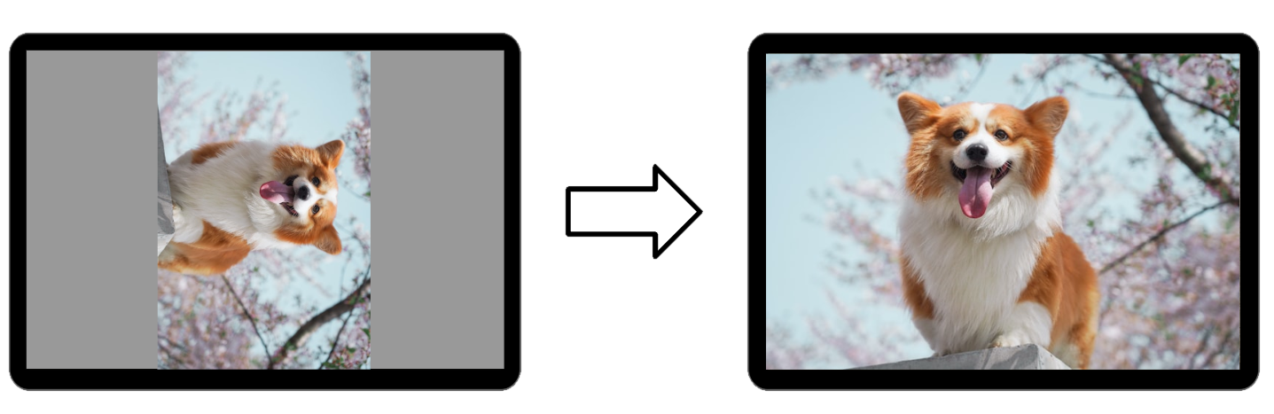
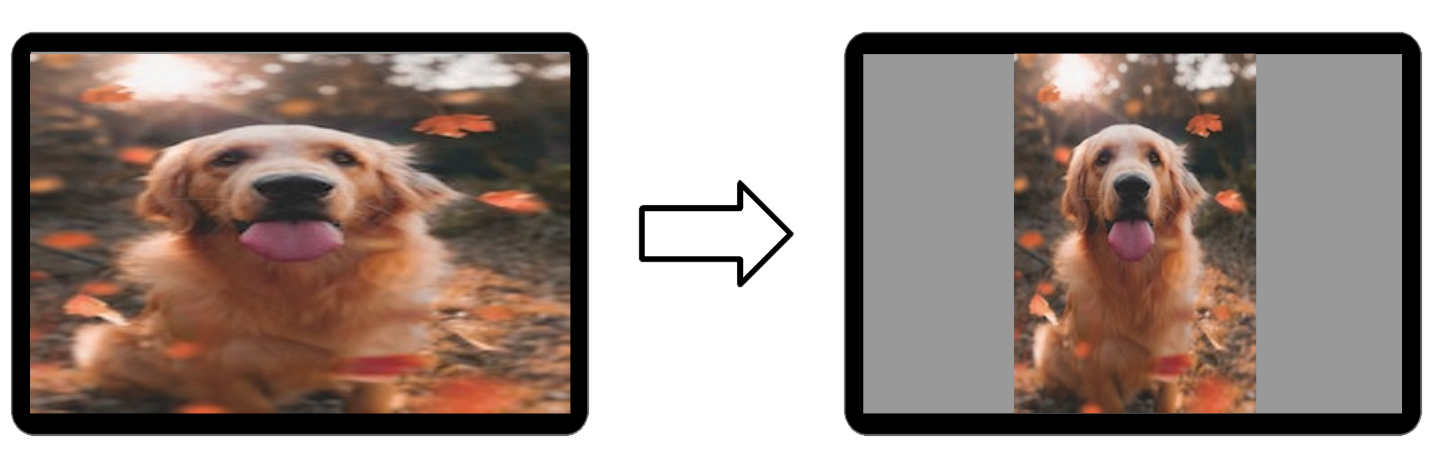
A common issue on foldables and desktop windows is preview stretching, where a 4:3 camera feed is forced into a 16:9 or 1:1 window.
- Do not stretch — Never force the camera buffer to match the view bounds exactly if the preview and window aspect ratios differ.
- Center crop (recommended): Scale the preview to fill the shortest dimension of the window and crop the excess. This ensures the subject remains undistorted and fills the frame.
- Fit center (alternative): If displaying the full field of view is critical (for example, scanning a document), letterbox the preview inside the window.
Bonus: Support for foldable-first experiences
Foldable devices are not just phones that bend. They also offer unique hardware states that can fundamentally improve how users take photos and videos. Instead of treating the fold as a problem to solve, use it to build features that are impossible on nonfoldable devices.
Tabletop mode (hands-free capture)
Tabletop mode lets users half fold the device and set it on a surface for extended video calls, time-lapse photography, and long-exposure night photography.
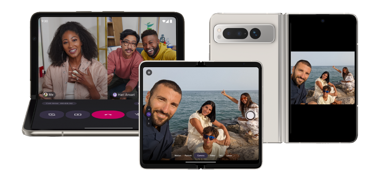
Rear-display mode (high-quality selfies)
- On foldables, rear cameras are typically higher quality than user-facing cameras. Rear display mode lets the user unfold the device and turn it around, using the small cover screen as a live viewfinder for the main rear camera.
- Rear-display mode enables 50MP+ selfies, ultra-wide group shots, and high-quality vlogging without carrying extra gear.
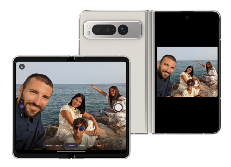
Dual-screen mode (subject preview)
- Dual-screen mode lets you show the camera preview on both the inner and outer screens simultaneously. This is perfect for photographing people: the photo subjects can see themselves on the outer screen and adjust their pose while you frame the shot on the inner screen.
- Unlike rear-display mode (which moves the entire app), dual-screen mode creates a secondary presentation window on the cover screen.