
androidx.wear.compose.material3
Interfaces
ButtonGroupScope |
|
MotionScheme |
A motion scheme provides all the |
PickerScope |
Receiver scope which is used by |
SurfaceTransformation |
Object to be used to apply different transformation to the content and the container (i.e. the background) of the composable. |
SwipeToRevealDragScope |
Scope used for suspending drag blocks. |
TimeSource |
Classes
AngularDirection |
Class to define angular direction - Clockwise and Counter Clockwise. |
AnimatedTextFontRegistry |
Generates fonts to be used by |
ButtonColors |
Represents the container and content colors used in buttons in different states. |
CardColors |
Represents Colors used in |
CheckboxButtonColors |
Represents the different container and content colors used for |
ColorScheme |
A |
ConfirmationDialogColors |
Represents the colors used in |
DatePickerColors |
Colors for |
DatePickerType |
Specifies the types of columns to display in the DatePicker. |
EdgeButtonSize |
Size of the |
IconButtonColors |
Represents the container and content colors used in an icon button in different states. |
IconButtonShapes |
Represents the shapes used for |
IconToggleButtonColors |
Represents the different container and content colors used for |
IconToggleButtonShapes |
Represents the shapes used for |
LevelIndicatorColors |
Represents the indicator and track colors used in |
OpenOnPhoneDialogColors |
Represents the colors used in |
PickerGroupScope |
|
PickerState |
A state object that can be hoisted to observe item selection. |
PlaceholderState |
A state object that can be used to control placeholders. |
ProgressIndicatorColors |
Represents the indicator and track colors used in progress indicator. |
RadioButtonColors |
Represents the different container and content colors used for |
RevealDirection |
Different values |
RevealState |
A class to keep track of the state of the composable. |
RevealValue |
Different values that determine the state of the |
RippleConfiguration |
Configuration for |
ScreenStage |
|
ScrollIndicatorColors |
Represents the indicator and track colors used in |
Shapes |
Material surfaces can be displayed in different shapes. |
SliderColors |
Represents the background and content colors used in |
SplitCheckboxButtonColors |
Represents the different colors used in |
SplitRadioButtonColors |
Represents the different colors used in |
SplitSwitchButtonColors |
Represents the different colors used in |
StepperColors |
Represents Colors used in |
SwipeToRevealScope |
Scope for the actions of a |
SwitchButtonColors |
Represents the different container and content colors used for |
TextButtonColors |
Represents the container and content colors used in a text button in different states. |
TextButtonShapes |
Represents the shapes used for |
TextConfiguration |
Class representing aspects of |
TextToggleButtonColors |
Represents the different container and content colors used for |
TextToggleButtonShapes |
Represents the shapes used for |
TimePickerColors |
Represents the colors used by a |
TimePickerSelection |
|
TimePickerType |
Specifies the types of columns to display in the TimePicker. |
Typography |
Class holding typography definitions as defined by the Wear Material typography specification. |
Objects
AlertDialogDefaults |
Contains the default values used by |
AnimatedTextDefaults |
Defaults for AnimatedText. |
ArcProgressIndicatorDefaults |
Contains default values for |
ButtonDefaults |
Contains the default values used by |
ButtonGroupDefaults |
Contains the default values used by |
CardDefaults |
Contains the default values used by |
CheckboxButtonDefaults |
Contains the default values used by |
CircularProgressIndicatorDefaults |
Contains default values for |
CompactButtonDefaults |
Contains the default values used by |
ConfirmationDialogDefaults |
Contains default values used by |
CurvedTextDefaults |
|
DatePickerDefaults |
Contains the default values used by |
EdgeButtonDefaults |
Contains the default values used by |
FadingExpandingLabelDefaults |
Contains default values for |
IconButtonDefaults |
Contains the default values used by |
IconToggleButtonDefaults |
Contains the default values used by |
LevelIndicatorDefaults |
Contains the default values used for |
LinearProgressIndicatorDefaults |
Contains defaults for Linear Progress Indicator. |
ListHeaderDefaults |
|
MaterialTheme |
|
OpenOnPhoneDialogDefaults |
Contains the default values used by |
PageIndicatorDefaults |
Contains the default values used by |
PagerScaffoldDefaults |
Contains default values used for |
PickerDefaults |
Contains the default values used by |
PlaceholderDefaults |
Contains the default values used for providing placeholders. |
ProgressIndicatorDefaults |
Contains defaults for Progress Indicators. |
RadioButtonDefaults |
Contains the default values used by |
ScreenScaffoldDefaults |
Contains the default values used by |
ScrollIndicatorDefaults |
Contains the default values used for |
ShapeDefaults |
Contains the default values used by |
SliderDefaults |
Defaults used by slider. |
StepperDefaults |
Defaults used by |
SwipeToRevealDefaults |
Defaults for Material 3 |
SwitchButtonDefaults |
Contains the default values used by |
TextButtonDefaults |
Contains the default values used by |
TextConfigurationDefaults |
Default values for |
TextDefaults |
Contains the default values used by |
TextToggleButtonDefaults |
Contains the default values used by |
TimePickerDefaults |
Contains the default values used by |
TimeTextDefaults |
Contains the default values used by |
WearComposeMaterial3Flags |
This is a collection of flags which are used to guard against regressions in some of the "riskier" refactors or new feature support that is added to this module. |
Annotations
Composables
AlertDialog |
Dialogs provide important prompts in a user flow. |
AlertDialogContent |
This |
AnimatedPage |
Animates a page within a |
AnimatedText |
A composable that displays an animated text. |
AppCard |
Opinionated Wear Material 3 |
AppScaffold |
|
ArcProgressIndicator |
Indeterminate Material Design arc progress indicator. |
Button |
Base level Wear Material3 |
ButtonGroup |
Layout component to implement an expressive group of buttons in a row, that react to touch by growing the touched button, (while the neighbor(s) shrink to accommodate and keep the group width constant). |
Card |
Base level Wear Material 3 |
CheckboxButton |
The Wear Material |
ChildButton |
Base level Wear Material3 |
CircularProgressIndicator |
Indeterminate Material Design circular progress indicator. |
CompactButton |
A Wear Material3 |
ConfirmationDialog |
Shows a transient |
ConfirmationDialogContent |
This overload of |
DatePicker |
Full screen |
Dialog |
A base dialog component used by |
EdgeButton |
Wear Material3 |
FadingExpandingLabel |
Animates label text for which the number of lines can vary, changing the size of the container component. |
FailureConfirmationDialog |
Shows a |
FailureConfirmationDialogContent |
|
FilledIconButton |
Wear Material |
FilledTonalButton |
Base level Wear Material3 |
FilledTonalIconButton |
Wear Material |
HorizontalPageIndicator |
Horizontal page indicator for use with |
HorizontalPagerScaffold |
|
Icon |
Icon component that draws |
IconButton |
Wear Material |
IconToggleButton |
Wear Material |
LevelIndicator |
Creates a |
LinearProgressIndicator |
Material Design linear progress indicator. |
ListHeader |
A slot based composable for creating a list header item. |
ListSubHeader |
A two slot based composable for creating a list sub-header item. |
MaterialTheme |
MaterialTheme defines the styling principles from the Wear Material3 design specification which extends the Material design specification. |
OpenOnPhoneDialog |
A full-screen dialog that displays an animated icon with a curved text at the bottom. |
OpenOnPhoneDialogContent |
This composable provides the content for an |
OutlinedButton |
Base level Wear Material3 |
OutlinedCard |
Outlined Wear Material 3 |
OutlinedIconButton |
Wear Material |
Picker |
A scrollable list of items to pick from. |
PickerGroup |
A group of |
ProvideTextStyle |
This function is used to set the current value of |
RadioButton |
The Wear Material |
ScreenScaffold |
|
ScrollIndicator |
A composable that displays a visual indicator of scrolling progress within a scrollable container. |
SegmentedCircularProgressIndicator |
Material Design segmented circular progress indicator. |
Slider |
|
SplitCheckboxButton |
The Wear Material |
SplitRadioButton |
The Wear Material |
SplitSwitchButton |
The Wear Material |
Stepper |
|
StepperLevelIndicator |
Creates a |
SuccessConfirmationDialog |
Shows a |
SuccessConfirmationDialogContent |
|
SwipeToDismissBox |
Wear Material 3 |
SwipeToReveal |
|
SwitchButton |
The Wear Material |
Text |
High level element that displays text and provides semantics / accessibility information. |
TextButton |
Wear Material |
TextToggleButton |
Wear Material |
TimePicker |
A full screen TimePicker with configurable columns that allows users to select a time. |
TimeText |
Layout to show the current time and a label, they will be drawn in a curve, following the top edge of the screen. |
TitleCard |
Opinionated Wear Material 3 |
VerticalPageIndicator |
Vertical page indicator for use with |
VerticalPagerScaffold |
|
contentColorFor |
The Material color system contains pairs of colors that are typically used for the background and content color inside a component. |
placeholder |
Modifier.placeholder draws a skeleton shape over a component, for situations when no provisional content (such as cached data) is available. |
placeholderShimmer |
Modifier.placeholderShimmer draws a periodic shimmer over content, indicating to the user that contents are loading or potentially out of date. |
rememberAnimatedTextFontRegistry |
Generates an |
rememberPickerState |
Creates a |
rememberPlaceholderState |
Creates a |
rememberRevealState |
Create and |
Modifiers
minimumInteractiveComponentSize |
Reserves at least 48.dp in size to disambiguate touch interactions if the element would measure smaller. |
rangeSemantics |
Modifier to add semantics signifying progress of the Stepper/Slider. |
scrollAway |
Scroll an item vertically in/out of view based on scroll state provided by a scrolling list. |
touchTargetAwareSize |
Modifier to set both the size and recommended touch target for |
Top-level functions summary
ColorScheme? |
dynamicColorScheme(context: Context)Creates a dynamic color scheme. |
IndicationNodeFactory |
Creates a Ripple using the provided values and values inferred from the theme. |
IndicationNodeFactory |
ripple(color: ColorProducer, bounded: Boolean, radius: Dp)Creates a Ripple using the provided values and values inferred from the theme. |
Extension functions summary
SurfaceTransformation |
Exposes |
Unit |
CurvedScope.confirmationDialogCurvedText(A customized variation of |
Color |
ColorScheme.contentColorFor(backgroundColor: Color)The Material color system contains pairs of colors that are typically used for the background and content color inside a component. |
Unit |
CurvedScope.curvedText(CurvedText is a component allowing developers to easily write curved text following the curvature a circle (usually at the edge of a circular screen). |
Unit |
DrawScope.drawCircularProgressIndicator(Draw a simple non-animating circular progress indicator. |
Unit |
CurvedScope.openOnPhoneDialogCurvedText(A customized variation of |
Unit |
CurvedScope.timeTextCurvedText(time: String, style: CurvedTextStyle?)Default curved text to use in a |
Unit |
CurvedScope.timeTextSeparator(A default implementation of Separator, to be shown between any text/composable and the time. |
Top-level properties summary
ProvidableCompositionLocal<Color> |
CompositionLocal containing the preferred content color for a given position in the hierarchy. |
ProvidableCompositionLocal<RippleConfiguration?> |
CompositionLocal used for providing |
ProvidableCompositionLocal<TextConfiguration> |
CompositionLocal containing the preferred |
ProvidableCompositionLocal<TextStyle> |
CompositionLocal containing the preferred |
Top-level functions
dynamicColorScheme
fun dynamicColorScheme(context: Context): ColorScheme?
Creates a dynamic color scheme.
Use this function to create a color scheme based on the current watchface. If the user changes the watchface colors, this color scheme will change accordingly. This function checks whether the dynamic color scheme can be used and returns null otherwise. It is expected that callers will check the return value and fallback to their own default color scheme if it is null.
Example using a dynamic color scheme to theme buttons in a column:
import androidx.compose.foundation.layout.Arrangement
import androidx.compose.foundation.layout.PaddingValues
import androidx.compose.foundation.layout.fillMaxWidth
import androidx.compose.ui.Alignment
import androidx.compose.ui.Modifier
import androidx.compose.ui.platform.LocalContext
import androidx.compose.ui.unit.dp
import androidx.wear.compose.foundation.lazy.TransformingLazyColumn
import androidx.wear.compose.material3.Button
import androidx.wear.compose.material3.ButtonDefaults
import androidx.wear.compose.material3.ColorScheme
import androidx.wear.compose.material3.MaterialTheme
import androidx.wear.compose.material3.SurfaceTransformation
import androidx.wear.compose.material3.Text
import androidx.wear.compose.material3.dynamicColorScheme
import androidx.wear.compose.material3.lazy.rememberTransformationSpec
import androidx.wear.compose.material3.lazy.transformedHeight

val dynamicColorScheme = dynamicColorScheme(LocalContext.current)
val transformationSpec = rememberTransformationSpec()

// Fallback to the default color scheme if dynamic colors are unavailable
MaterialTheme(colorScheme = dynamicColorScheme ?: ColorScheme()) {
    val hasDynamicColors = dynamicColorScheme != null
    TransformingLazyColumn(
        horizontalAlignment = Alignment.CenterHorizontally,
        verticalArrangement = Arrangement.spacedBy(4.dp),
        contentPadding = PaddingValues(20.dp),
    ) {
        if (!hasDynamicColors) {
            item { Text("Dynamic color is not available.") }
        }
        items(5) { index ->
            // The button's defaults will pick up the dynamic primary color from the
            // MaterialTheme
            Button(
                label = { Text("Primary Button ${index + 1}") },
                modifier =
                    Modifier.fillMaxWidth()
                        .transformedHeight(this, transformationSpec)
                        .minimumVerticalContentPadding(
                            ButtonDefaults.minimumVerticalListContentPadding
                        ),
                onClick = {},
                transformation = SurfaceTransformation(transformationSpec),
            )
        }
    }
}
| Parameters | |
|---|---|
context: Context |
The context required to get system resource data. |
ripple
fun ripple(
    bounded: Boolean = true,
    radius: Dp = Dp.Unspecified,
    color: Color = Color.Unspecified
): IndicationNodeFactory
Creates a Ripple using the provided values and values inferred from the theme.
A Ripple is a Material implementation of Indication that expresses different Interactions by drawing ripple animations and state layers.
A Ripple responds to PressInteraction.Press by starting a new ripple animation, and responds to other Interactions by showing a fixed state layer with varying alpha values depending on the Interaction.
MaterialTheme provides Ripples using androidx.compose.foundation.LocalIndication, so a Ripple will be used as the default Indication inside components such as androidx.compose.foundation.clickable and androidx.compose.foundation.indication, in addition to Material provided components that use a Ripple as well.
You can also explicitly create a Ripple and provide it to custom components in order to change the parameters from the default, such as to create an unbounded ripple with a fixed size.
To create a Ripple with a manually defined color that can change over time, see the other ripple overload with a ColorProducer parameter. This will avoid unnecessary recompositions when changing the color, and preserve existing ripple state when the color changes.
| Parameters | |
|---|---|
bounded: Boolean = true |
If true, ripples are clipped by the bounds of the target layout. Unbounded ripples always animate from the target layout center, bounded ripples animate from the touch position. |
radius: Dp = Dp.Unspecified |
the radius for the ripple. If |
color: Color = Color.Unspecified |
the color of the ripple. This color is usually the same color used by the text or iconography in the component. This color will then have alpha applied to calculate the final color used to draw the ripple. If |
ripple
fun ripple(
    color: ColorProducer,
    bounded: Boolean = true,
    radius: Dp = Dp.Unspecified
): IndicationNodeFactory
Creates a Ripple using the provided values and values inferred from the theme.
A Ripple is a Material implementation of Indication that expresses different Interactions by drawing ripple animations and state layers.
A Ripple responds to PressInteraction.Press by starting a new ripple animation, and responds to other Interactions by showing a fixed state layer with varying alpha values depending on the Interaction.
MaterialTheme provides Ripples using androidx.compose.foundation.LocalIndication, so a Ripple will be used as the default Indication inside components such as androidx.compose.foundation.clickable and androidx.compose.foundation.indication, in addition to Material provided components that use a Ripple as well.
You can also explicitly create a Ripple and provide it to custom components in order to change the parameters from the default, such as to create an unbounded ripple with a fixed size.
To create a Ripple with a static color, see the ripple overload with a Color parameter. This overload is optimized for Ripples that have dynamic colors that change over time, to reduce unnecessary recompositions.
| Parameters | |
|---|---|
color: ColorProducer |
the color of the ripple. This color is usually the same color used by the text or iconography in the component. This color will then have alpha applied to calculate the final color used to draw the ripple. If you are creating this |
bounded: Boolean = true |
If true, ripples are clipped by the bounds of the target layout. Unbounded ripples always animate from the target layout center, bounded ripples animate from the touch position. |
radius: Dp = Dp.Unspecified |
the radius for the ripple. If |
Extension functions
TransformingLazyColumnItemScope.SurfaceTransformation
fun TransformingLazyColumnItemScope.SurfaceTransformation(
    spec: TransformationSpec
): SurfaceTransformation
Exposes androidx.wear.compose.material3.lazy.TransformationSpec as SurfaceTransformation to be used with Material components.
| Parameters | |
|---|---|
spec: TransformationSpec |
|
CurvedScope.confirmationDialogCurvedText
fun CurvedScope.confirmationDialogCurvedText(
    text: String,
    style: CurvedTextStyle
): Unit
A customized variation of androidx.wear.compose.material3.curvedText that displays text along a curved path. This variation adopts suitable sweep angle and padding for use in ConfirmationDialogs.
| Parameters | |
|---|---|
text: String |
The text to display. |
style: CurvedTextStyle |
It is recommended to use |
ColorScheme.contentColorFor
fun ColorScheme.contentColorFor(backgroundColor: Color): Color
The Material color system contains pairs of colors that are typically used for the background and content color inside a component. For example, a Button typically uses primary for its background, and onPrimary for the color of its content (usually text or iconography).
This function tries to match the provided backgroundColor to a 'background' color in this ColorScheme, and then will return the corresponding color used for content. For example, when backgroundColor is ColorScheme.primary, this will return ColorScheme.onPrimary.
If backgroundColor does not match a background color in the theme, this will return Color.Unspecified.
| Returns | |
|---|---|
Color |
the matching content color for |
| See also | |
|---|---|
contentColorFor |
CurvedScope.curvedText
fun CurvedScope.curvedText(
    text: String,
    modifier: CurvedModifier = CurvedModifier,
    maxSweepAngle: Float = CurvedTextDefaults.ScrollableContentMaxSweepAngle,
    background: Color = Color.Unspecified,
    color: Color = Color.Unspecified,
    fontSize: TextUnit = TextUnit.Unspecified,
    fontFamily: FontFamily? = null,
    fontWeight: FontWeight? = null,
    fontStyle: FontStyle? = null,
    fontSynthesis: FontSynthesis? = null,
    letterSpacing: TextUnit = TextUnit.Unspecified,
    letterSpacingCounterClockwise: TextUnit = TextUnit.Unspecified,
    style: CurvedTextStyle? = null,
    angularDirection: CurvedDirection.Angular? = null,
    overflow: TextOverflow = TextOverflow.Clip
): Unit
CurvedText is a component allowing developers to easily write curved text following the curvature a circle (usually at the edge of a circular screen). CurvedText can be only created within the CurvedLayout to ensure the best experience, like being able to specify to positioning.
Note that Wear Material UX guidance recommends that curvedText should not exceed the sweep angle CurvedTextDefaults.ScrollableContentMaxSweepAngle on screens with scrollable content such as lists. This limit is enforced by default. For screens without scrollable content, CurvedTextDefaults.StaticContentMaxSweepAngle may be used instead.
The default style uses the LocalTextStyle provided by the MaterialTheme / components, converting it to a CurvedTextStyle. Note that not all parameters are used by curvedText.
If you are setting your own style, you may want to consider first retrieving LocalTextStyle, and using TextStyle.copy to keep any theme defined attributes, only modifying the specific attributes you want to override, then convert to CurvedTextStyle
For ease of use, commonly used parameters from CurvedTextStyle are also present here. The order of precedence is as follows:
-
If a parameter is explicitly set here (i.e, it is not
nullorTextUnit.Unspecified), then this parameter will always be used. -
If a parameter is not set, (
nullorTextUnit.Unspecified), then the corresponding value fromstylewill be used instead.
Additionally, for color, if color is not set, and style does not have a color, then LocalContentColor will be used.
For samples using curved text in a CurvedLayout see:
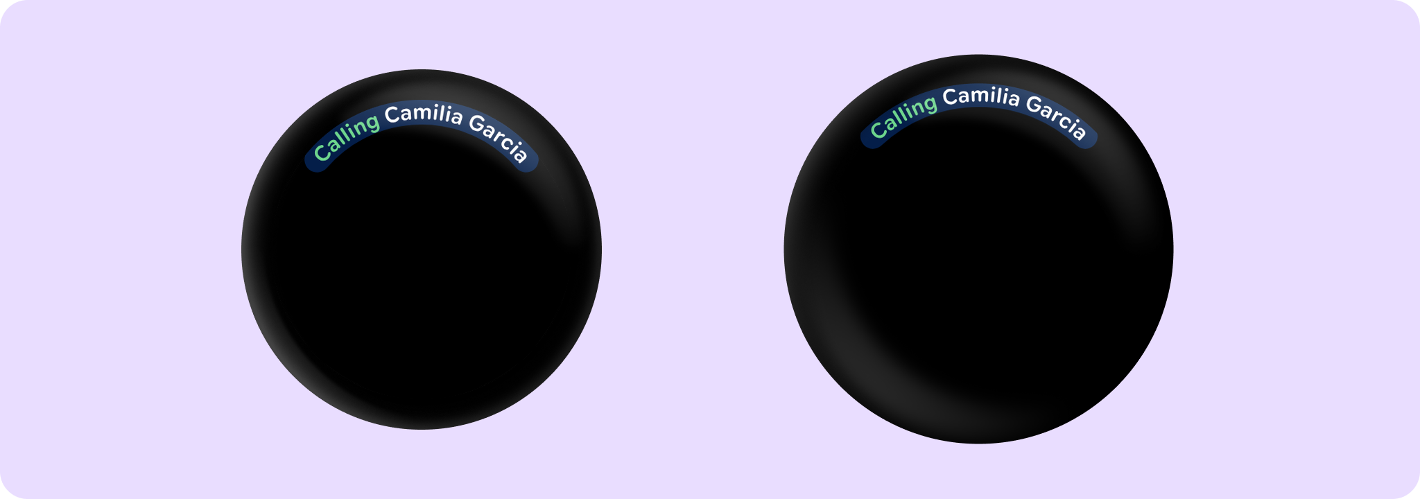
import androidx.compose.ui.Modifier
import androidx.compose.ui.graphics.StrokeCap.Companion.Round
import androidx.compose.ui.unit.dp
import androidx.wear.compose.foundation.CurvedLayout
import androidx.wear.compose.foundation.CurvedModifier
import androidx.wear.compose.foundation.angularSizeDp
import androidx.wear.compose.foundation.background
import androidx.wear.compose.foundation.curvedBox
import androidx.wear.compose.foundation.curvedRow
import androidx.wear.compose.material3.MaterialTheme
import androidx.wear.compose.material3.curvedText

val backgroundColor = MaterialTheme.colorScheme.onPrimary
val customColor = MaterialTheme.colorScheme.tertiaryDim
CurvedLayout {
    curvedRow(CurvedModifier.background(backgroundColor, Round)) {
        curvedText("Calling", color = customColor)
        curvedBox(CurvedModifier.angularSizeDp(5.dp)) {}
        curvedText("Camilia Garcia")
    }
}
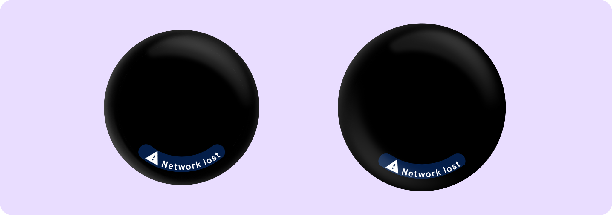
import androidx.compose.foundation.layout.size
import androidx.compose.material.icons.Icons
import androidx.compose.material.icons.filled.Warning
import androidx.compose.runtime.Composable
import androidx.compose.ui.Modifier
import androidx.compose.ui.graphics.StrokeCap.Companion.Round
import androidx.compose.ui.text.style.TextOverflow
import androidx.wear.compose.foundation.CurvedDirection
import androidx.wear.compose.foundation.CurvedLayout
import androidx.wear.compose.foundation.CurvedModifier
import androidx.wear.compose.foundation.background
import androidx.wear.compose.foundation.curvedComposable
import androidx.wear.compose.foundation.curvedRow
import androidx.wear.compose.material3.ButtonDefaults
import androidx.wear.compose.material3.CurvedTextDefaults
import androidx.wear.compose.material3.Icon
import androidx.wear.compose.material3.MaterialTheme
import androidx.wear.compose.material3.curvedText

val backgroundColor = MaterialTheme.colorScheme.onPrimary
CurvedLayout(anchor = 90f, angularDirection = CurvedDirection.Angular.Reversed) {
    curvedRow(CurvedModifier.background(backgroundColor, Round)) {
        curvedComposable {
            Icon(
                Icons.Filled.Warning,
                contentDescription = "Warning",
                modifier = Modifier.size(ButtonDefaults.IconSize),
            )
        }
        curvedText(
            "Network lost",
            maxSweepAngle = CurvedTextDefaults.StaticContentMaxSweepAngle,
            overflow = TextOverflow.Ellipsis,
        )
    }
}
For more information, see the Curved Text guide.
| Parameters | |
|---|---|
text: String |
The text to display |
modifier: CurvedModifier = CurvedModifier |
The |
maxSweepAngle: Float = CurvedTextDefaults.ScrollableContentMaxSweepAngle |
The default maximum sweep angle in degrees. For screens without scrollable content, |
background: Color = Color.Unspecified |
The background color for the text. |
color: Color = Color.Unspecified |
|
fontSize: TextUnit = TextUnit.Unspecified |
The size of glyphs to use when painting the text. See |
fontFamily: FontFamily? = null |
The font family to be used when rendering the text. |
fontWeight: FontWeight? = null |
The thickness of the glyphs, in a range of 1, 1000. see |
fontStyle: FontStyle? = null |
The typeface variant to use when drawing the letters (e.g. italic). |
fontSynthesis: FontSynthesis? = null |
Whether to synthesize font weight and/or style when the requested weight or style cannot be found in the provided font family. |
letterSpacing: TextUnit = TextUnit.Unspecified |
The amount of space (in em or sp) to add between each letter, when text is going clockwise. |
letterSpacingCounterClockwise: TextUnit = TextUnit.Unspecified |
The amount of space (in em or sp) to add between each letter, when text is going counterClockwise. Note that this usually needs to be bigger than |
style: CurvedTextStyle? = null |
Specifies the style to use. |
angularDirection: CurvedDirection.Angular? = null |
Specify if the text is laid out clockwise or anti-clockwise, and if those needs to be reversed in a Rtl layout. If not specified, it will be inherited from the enclosing |
overflow: TextOverflow = TextOverflow.Clip |
How visual overflow should be handled. Note that this takes into account only explicit size curved modifiers in this element, to size this element matching the parent's, add a CurvedModifier.weight here. |
DrawScope.drawCircularProgressIndicator
fun DrawScope.drawCircularProgressIndicator(
    progress: Float,
    colors: ProgressIndicatorColors,
    strokeWidth: Dp,
    enabled: Boolean = true,
    allowProgressOverflow: Boolean = false,
    startAngle: Float = CircularProgressIndicatorDefaults.StartAngle,
    endAngle: Float = startAngle,
    gapSize: Dp = CircularProgressIndicatorDefaults.calculateRecommendedGapSize(strokeWidth)
): Unit
Draw a simple non-animating circular progress indicator. Prefer to use CircularProgressIndicator directly instead of this method in order to access the recommended animations, but this method can be used when custom animations are required.
Example of a circular progress indicator with custom progress animation:
import androidx.compose.animation.core.Animatable
import androidx.compose.animation.core.LinearEasing
import androidx.compose.animation.core.tween
import androidx.compose.foundation.background
import androidx.compose.foundation.focusable
import androidx.compose.foundation.layout.Box
import androidx.compose.foundation.layout.Spacer
import androidx.compose.foundation.layout.fillMaxSize
import androidx.compose.foundation.layout.padding
import androidx.compose.runtime.LaunchedEffect
import androidx.compose.runtime.remember
import androidx.compose.ui.Modifier
import androidx.compose.ui.draw.drawBehind
import androidx.compose.ui.graphics.Color
import androidx.compose.ui.unit.dp
import androidx.wear.compose.material3.CircularProgressIndicator
import androidx.wear.compose.material3.CircularProgressIndicatorDefaults
import androidx.wear.compose.material3.MaterialTheme
import androidx.wear.compose.material3.ProgressIndicatorDefaults
import androidx.wear.compose.material3.drawCircularProgressIndicator

val animatedProgress = remember { Animatable(0f) }
val colors =
    ProgressIndicatorDefaults.colors(indicatorColor = Color.Green, trackColor = Color.White)

LaunchedEffect(Unit) {
    animatedProgress.animateTo(1f, tween(durationMillis = 1024, easing = LinearEasing))
    animatedProgress.animateTo(0f, tween(durationMillis = 1024, easing = LinearEasing))
}

Box(
    modifier =
        Modifier.background(MaterialTheme.colorScheme.background)
            .padding(CircularProgressIndicatorDefaults.FullScreenPadding)
            .fillMaxSize()
) {
    // Draw the circular progress indicator with custom animation
    Spacer(
        Modifier.fillMaxSize().focusable().drawBehind {
            drawCircularProgressIndicator(
                progress = animatedProgress.value,
                strokeWidth = 10.dp,
                colors = colors,
                startAngle = 120f,
                endAngle = 60f,
            )
        }
    )
}
| Parameters | |
|---|---|
progress: Float |
The progress of this progress indicator where 0.0 represents no progress and 1.0 represents completion. |
colors: ProgressIndicatorColors |
|
strokeWidth: Dp |
The stroke width for the progress indicator. The recommended values are |
enabled: Boolean = true |
controls the enabled state. Although this component is not clickable, it can be contained within a clickable component. When enabled is |
allowProgressOverflow: Boolean = false |
When progress overflow is allowed, values smaller than 0.0 will be coerced to 0, while values larger than 1.0 will be wrapped around and shown as overflow with a different track color |
startAngle: Float = CircularProgressIndicatorDefaults.StartAngle |
The starting position of the progress arc, measured clockwise in degrees (0 to 360) from the 3 o'clock position. For example, 0 and 360 represent 3 o'clock, 90 and 180 represent 6 o'clock and 9 o'clock respectively. Default is 270 degrees |
endAngle: Float = startAngle |
The ending position of the progress arc, measured clockwise in degrees (0 to 360) from the 3 o'clock position. For example, 0 and 360 represent 3 o'clock, 90 and 180 represent 6 o'clock and 9 o'clock respectively. By default equal to |
gapSize: Dp = CircularProgressIndicatorDefaults.calculateRecommendedGapSize(strokeWidth) |
The size (in Dp) of the gap between the ends of the progress indicator and the track. The stroke endcaps are not included in this distance. |
CurvedScope.openOnPhoneDialogCurvedText
fun CurvedScope.openOnPhoneDialogCurvedText(
    text: String,
    style: CurvedTextStyle
): Unit
A customized variation of androidx.wear.compose.material3.curvedText that displays text along a curved path. This variation adopts suitable sweep angle and padding for use in OpenOnPhoneDialog.
| Parameters | |
|---|---|
text: String |
The text to display. |
style: CurvedTextStyle |
The style to apply to the text. It is recommended to use |
CurvedScope.timeTextCurvedText
fun CurvedScope.timeTextCurvedText(time: String, style: CurvedTextStyle? = null): Unit
Default curved text to use in a TimeText, for displaying the time
| Parameters | |
|---|---|
time: String |
The time to display. |
style: CurvedTextStyle? = null |
A |
CurvedScope.timeTextSeparator
fun CurvedScope.timeTextSeparator(
    curvedTextStyle: CurvedTextStyle? = null,
    contentArcPadding: ArcPaddingValues = ArcPaddingValues(angular = 4.dp)
): Unit
A default implementation of Separator, to be shown between any text/composable and the time.
| Parameters | |
|---|---|
curvedTextStyle: CurvedTextStyle? = null |
A |
contentArcPadding: ArcPaddingValues = ArcPaddingValues(angular = 4.dp) |
|
Top-level properties
LocalContentColor
val LocalContentColor: ProvidableCompositionLocal<Color>
CompositionLocal containing the preferred content color for a given position in the hierarchy. This typically represents the on color for a color in ColorScheme. For example, if the background color is ColorScheme.surfaceContainer, this color is typically set to ColorScheme.onSurface.
This color should be used for any typography / iconography, to ensure that the color of these adjusts when the background color changes. For example, on a dark background, text should be light, and on a light background, text should be dark.
Defaults to Color.White if no color has been explicitly set.
LocalRippleConfiguration
val LocalRippleConfiguration: ProvidableCompositionLocal<RippleConfiguration?>
CompositionLocal used for providing RippleConfiguration down the tree. This acts as a tree-local 'override' for ripples used inside components that you cannot directly control, such as to change the color of a specific component's ripple, or disable it entirely by providing null.
In most cases you should rely on the default theme behavior for consistency with other components
-
this exists as an escape hatch for individual components and is not intended to be used for full theme customization across an application. For this use case you should instead build your own custom ripple that queries your design system theme values directly using
createRippleModifierNode.
LocalTextConfiguration
val LocalTextConfiguration: ProvidableCompositionLocal<TextConfiguration>
CompositionLocal containing the preferred TextConfiguration that will be used by Text components by default consisting of text alignment, overflow specification and max lines. Material3 components related to text such as Button, CheckboxButton, SwitchButton, RadioButton use LocalTextConfiguration to set values with which to style child text components.
LocalTextStyle
val LocalTextStyle: ProvidableCompositionLocal<TextStyle>
CompositionLocal containing the preferred TextStyle that will be used by Text components by default. To set the value for this CompositionLocal, see ProvideTextStyle which will merge any missing TextStyle properties with the existing TextStyle set in this CompositionLocal.
| See also | |
|---|---|
ProvideTextStyle |