
В Compose есть множество встроенных механизмов анимации, и выбрать подходящий может быть непросто. Ниже приведён список распространённых сценариев использования анимации. Для получения более подробной информации о полном наборе доступных вам параметров API ознакомьтесь с полной документацией по анимации в Compose .
Анимировать общие составные свойства
Compose предоставляет удобные API, позволяющие решать множество распространенных задач анимации. В этом разделе показано, как анимировать распространенные свойства объекта Compose.
Анимированное появление/исчезновение
Use AnimatedVisibility to hide or show a Composable. Children inside AnimatedVisibility can use Modifier.animateEnterExit() for their own enter or exit transition.
var visible by remember { mutableStateOf(true) } // Animated visibility will eventually remove the item from the composition once the animation has finished. AnimatedVisibility(visible) { // your composable here // ... }
Параметры ввода и вывода AnimatedVisibility позволяют настроить поведение составного элемента при его появлении и исчезновении. Для получения дополнительной информации ознакомьтесь с полной документацией .
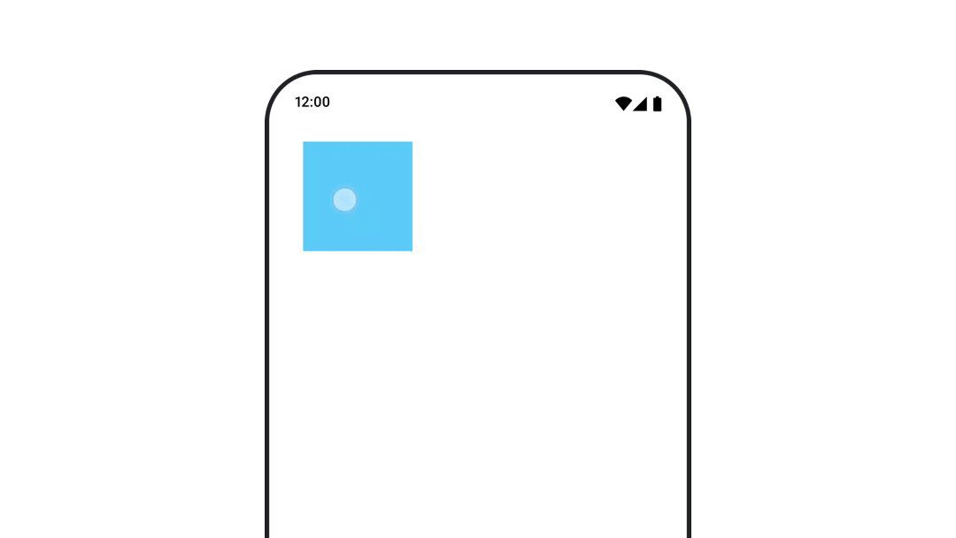
Ещё один вариант анимации видимости составного элемента — анимация альфа-канала во времени с помощью animateFloatAsState :
var visible by remember { mutableStateOf(true) } val animatedAlpha by animateFloatAsState( targetValue = if (visible) 1.0f else 0f, label = "alpha" ) Box( modifier = Modifier .size(200.dp) .graphicsLayer { alpha = animatedAlpha } .clip(RoundedCornerShape(8.dp)) .background(colorGreen) .align(Alignment.TopCenter) ) { }
However, changing the alpha comes with the caveat that the composable remains in the composition and continues to occupy the space it's laid out in. This could cause screen readers and other accessibility mechanisms to still consider the item on screen. On the other hand, AnimatedVisibility eventually removes the item from the composition.
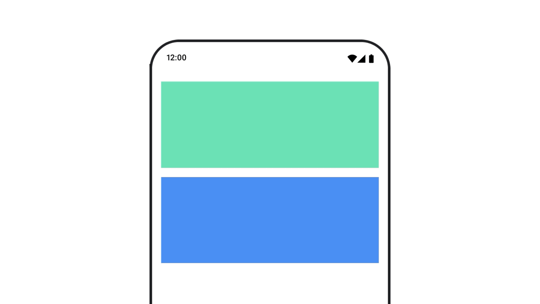
Анимированный цвет фона
val animatedColor by animateColorAsState( if (animateBackgroundColor) colorGreen else colorBlue, label = "color" ) Column( modifier = Modifier.drawBehind { drawRect(animatedColor) } ) { // your composable here }
Этот вариант более производительный, чем использование Modifier.background() . Modifier.background() приемлем для однократной настройки цвета, но при анимации цвета во времени это может привести к большему количеству перекомпозиций, чем необходимо.
For infinitely animating the background color, see repeating an animation section .
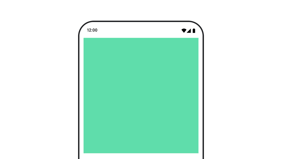
Анимировать размер составного элемента
Compose позволяет анимировать изменение размера элементов, которые можно комбинировать, несколькими способами. Используйте animateContentSize() для анимации между изменениями размера элементов.
Например, если у вас есть блок с текстом, который может разворачиваться из одной строки в несколько, вы можете использовать Modifier.animateContentSize() для более плавного перехода:
var expanded by remember { mutableStateOf(false) } Box( modifier = Modifier .background(colorBlue) .animateContentSize() .height(if (expanded) 400.dp else 200.dp) .fillMaxWidth() .clickable( interactionSource = remember { MutableInteractionSource() }, indication = null ) { expanded = !expanded } ) { }
Также можно использовать AnimatedContent с SizeTransform для описания того, как должны происходить изменения размера.
Анимированное положение составного объекта
Для анимации положения составного объекта используйте Modifier.offset{ } в сочетании с animateIntOffsetAsState() .
var moved by remember { mutableStateOf(false) } val pxToMove = with(LocalDensity.current) { 100.dp.toPx().roundToInt() } val offset by animateIntOffsetAsState( targetValue = if (moved) { IntOffset(pxToMove, pxToMove) } else { IntOffset.Zero }, label = "offset" ) Box( modifier = Modifier .offset { offset } .background(colorBlue) .size(100.dp) .clickable( interactionSource = remember { MutableInteractionSource() }, indication = null ) { moved = !moved } )
Если вы хотите гарантировать, что элементы, являющиеся составными, не будут отображаться поверх или под другими элементами при анимации положения или размера, используйте Modifier.layout{ } . Этот модификатор передает изменения размера и положения родительскому элементу, что затем влияет на другие дочерние элементы.
Например, если вы перемещаете Box внутри Column , и другие дочерние элементы должны перемещаться вместе с Box , укажите информацию о смещении с помощью Modifier.layout{ } следующим образом:
var toggled by remember { mutableStateOf(false) } val interactionSource = remember { MutableInteractionSource() } Column( modifier = Modifier .padding(16.dp) .fillMaxSize() .clickable(indication = null, interactionSource = interactionSource) { toggled = !toggled } ) { val offsetTarget = if (toggled) { IntOffset(150, 150) } else { IntOffset.Zero } val offset = animateIntOffsetAsState( targetValue = offsetTarget, label = "offset" ) Box( modifier = Modifier .size(100.dp) .background(colorBlue) ) Box( modifier = Modifier .layout { measurable, constraints -> val offsetValue = if (isLookingAhead) offsetTarget else offset.value val placeable = measurable.measure(constraints) layout(placeable.width + offsetValue.x, placeable.height + offsetValue.y) { placeable.placeRelative(offsetValue) } } .size(100.dp) .background(colorGreen) ) Box( modifier = Modifier .size(100.dp) .background(colorBlue) ) }
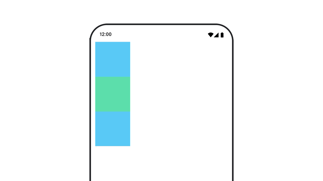
Modifier.layout{ }Анимированное отступы в составном элементе
Для анимации отступов составного элемента используйте animateDpAsState в сочетании с Modifier.padding() :
var toggled by remember { mutableStateOf(false) } val animatedPadding by animateDpAsState( if (toggled) { 0.dp } else { 20.dp }, label = "padding" ) Box( modifier = Modifier .aspectRatio(1f) .fillMaxSize() .padding(animatedPadding) .background(Color(0xff53D9A1)) .clickable( interactionSource = remember { MutableInteractionSource() }, indication = null ) { toggled = !toggled } )
Анимированное возвышение составного объекта
Для анимации изменения высоты составного объекта используйте animateDpAsState в сочетании с Modifier.graphicsLayer{ } . Для однократных изменений высоты используйте Modifier.shadow() . Если вы анимируете тень, использование модификатора Modifier.graphicsLayer{ } будет более производительным вариантом.
val mutableInteractionSource = remember { MutableInteractionSource() } val pressed = mutableInteractionSource.collectIsPressedAsState() val elevation = animateDpAsState( targetValue = if (pressed.value) { 32.dp } else { 8.dp }, label = "elevation" ) Box( modifier = Modifier .size(100.dp) .align(Alignment.Center) .graphicsLayer { this.shadowElevation = elevation.value.toPx() } .clickable(interactionSource = mutableInteractionSource, indication = null) { } .background(colorGreen) ) { }
Alternatively, use the Card composable, and set the elevation property to different values per state.
Анимируйте масштабирование, перемещение или вращение текста.
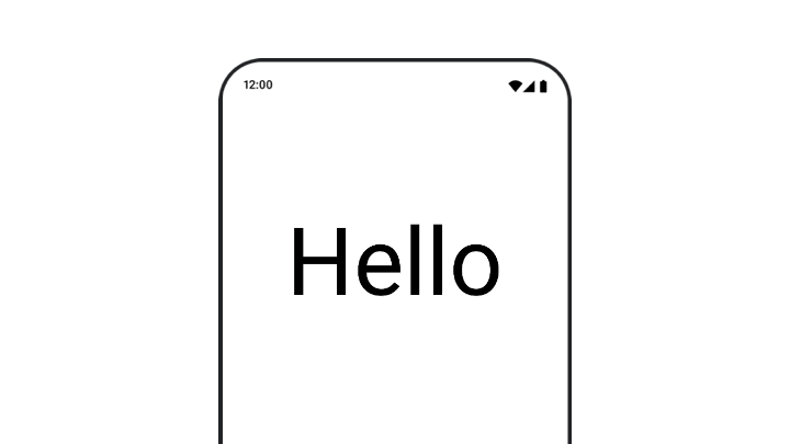
When animating scale, translation, or rotation of text, set the textMotion parameter on TextStyle to TextMotion.Animated . This ensures smoother transitions between text animations. Use Modifier.graphicsLayer{ } to translate, rotate or scale the text.
val infiniteTransition = rememberInfiniteTransition(label = "infinite transition") val scale by infiniteTransition.animateFloat( initialValue = 1f, targetValue = 8f, animationSpec = infiniteRepeatable(tween(1000), RepeatMode.Reverse), label = "scale" ) Box(modifier = Modifier.fillMaxSize()) { Text( text = "Hello", modifier = Modifier .graphicsLayer { scaleX = scale scaleY = scale transformOrigin = TransformOrigin.Center } .align(Alignment.Center), // Text composable does not take TextMotion as a parameter. // Provide it via style argument but make sure that we are copying from current theme style = LocalTextStyle.current.copy(textMotion = TextMotion.Animated) ) }
Анимированный цвет текста
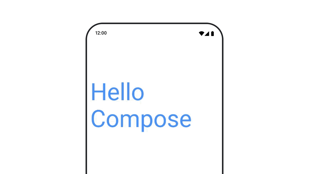
To animate text color, use the color lambda on the BasicText composable:
val infiniteTransition = rememberInfiniteTransition(label = "infinite transition") val animatedColor by infiniteTransition.animateColor( initialValue = Color(0xFF60DDAD), targetValue = Color(0xFF4285F4), animationSpec = infiniteRepeatable(tween(1000), RepeatMode.Reverse), label = "color" ) BasicText( text = "Hello Compose", color = { animatedColor }, // ... )
Переключайтесь между различными типами контента
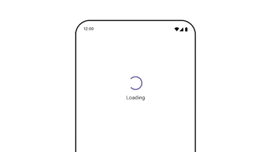
Используйте AnimatedContent для анимации перехода между различными компонентами; если вам нужен просто стандартный эффект затухания между компонентами, используйте Crossfade .
var state by remember { mutableStateOf(UiState.Loading) } AnimatedContent( state, transitionSpec = { fadeIn( animationSpec = tween(3000) ) togetherWith fadeOut(animationSpec = tween(3000)) }, modifier = Modifier.clickable( interactionSource = remember { MutableInteractionSource() }, indication = null ) { state = when (state) { UiState.Loading -> UiState.Loaded UiState.Loaded -> UiState.Error UiState.Error -> UiState.Loading } }, label = "Animated Content" ) { targetState -> when (targetState) { UiState.Loading -> { LoadingScreen() } UiState.Loaded -> { LoadedScreen() } UiState.Error -> { ErrorScreen() } } }
AnimatedContent можно настроить для отображения множества различных типов переходов при появлении и исчезновении контента. Для получения дополнительной информации ознакомьтесь с документацией по AnimatedContent или прочтите эту статью в блоге, посвященную AnimatedContent .
Анимируйте перемещение между различными пунктами назначения.
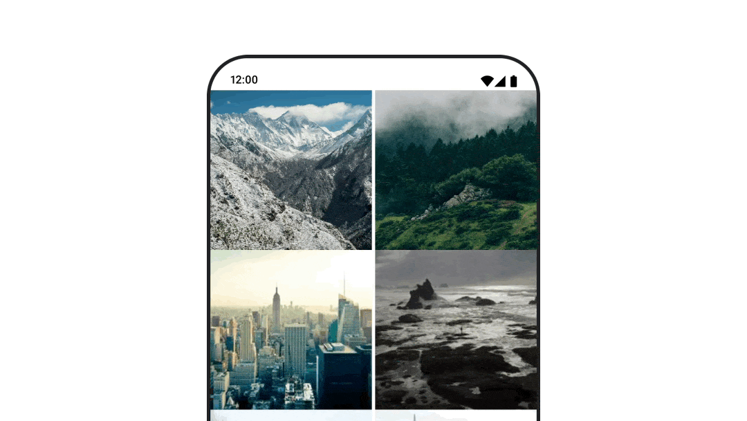
Для анимации переходов между компонентами при использовании артефакта navigation-compose укажите параметры enterTransition и exitTransition для каждого компонента. Вы также можете установить анимацию по умолчанию для всех пунктов назначения на верхнем уровне NavHost :
val navController = rememberNavController() NavHost( navController = navController, startDestination = "landing", enterTransition = { EnterTransition.None }, exitTransition = { ExitTransition.None } ) { composable("landing") { ScreenLanding( // ... ) } composable( "detail/{photoUrl}", arguments = listOf(navArgument("photoUrl") { type = NavType.StringType }), enterTransition = { fadeIn( animationSpec = tween( 300, easing = LinearEasing ) ) + slideIntoContainer( animationSpec = tween(300, easing = EaseIn), towards = AnimatedContentTransitionScope.SlideDirection.Start ) }, exitTransition = { fadeOut( animationSpec = tween( 300, easing = LinearEasing ) ) + slideOutOfContainer( animationSpec = tween(300, easing = EaseOut), towards = AnimatedContentTransitionScope.SlideDirection.End ) } ) { backStackEntry -> ScreenDetails( // ... ) } }
Существует множество различных типов переходов при входе и выходе, которые применяют разные эффекты к входящему и исходящему контенту; подробнее см. в документации .
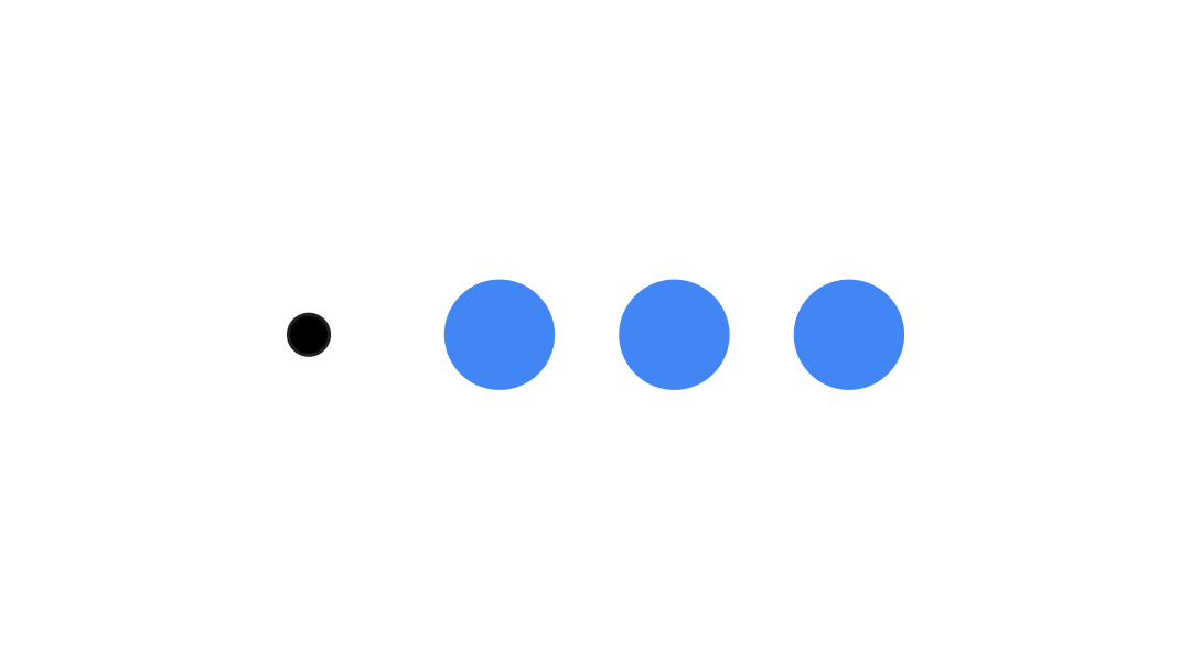
Повторить анимацию
Используйте rememberInfiniteTransition с infiniteRepeatable animationSpec для непрерывного повторения анимации. Измените RepeatModes , чтобы указать, как должна происходить анимация вперед и назад.
Используйте repeatable для повторения заданного количества раз.
val infiniteTransition = rememberInfiniteTransition(label = "infinite") val color by infiniteTransition.animateColor( initialValue = Color.Green, targetValue = Color.Blue, animationSpec = infiniteRepeatable( animation = tween(1000, easing = LinearEasing), repeatMode = RepeatMode.Reverse ), label = "color" ) Column( modifier = Modifier.drawBehind { drawRect(color) } ) { // your composable here }
Запустить анимацию при запуске составного элемента
LaunchedEffect runs when a composable enters the composition. It starts an animation on launch of a composable, you can use this to drive the animation state change. Using Animatable with the animateTo method to start the animation on launch:
val alphaAnimation = remember { Animatable(0f) } LaunchedEffect(Unit) { alphaAnimation.animateTo(1f) } Box( modifier = Modifier.graphicsLayer { alpha = alphaAnimation.value } )
Создавайте последовательные анимации
Используйте API сопрограмм Animatable для выполнения последовательных или параллельных анимаций. Вызов функции animateTo для Animatable один за другим приводит к тому, что каждая анимация ожидает завершения предыдущих анимаций, прежде чем продолжить выполнение. Это связано с тем, что это функция приостановки.
val alphaAnimation = remember { Animatable(0f) } val yAnimation = remember { Animatable(0f) } LaunchedEffect("animationKey") { alphaAnimation.animateTo(1f) yAnimation.animateTo(100f) yAnimation.animateTo(500f, animationSpec = tween(100)) }
Создание параллельных анимаций
Use the coroutine APIs ( Animatable#animateTo() or animate ), or the Transition API to achieve concurrent animations. If you use multiple launch functions in a coroutine context, it launches the animations at the same time:
val alphaAnimation = remember { Animatable(0f) } val yAnimation = remember { Animatable(0f) } LaunchedEffect("animationKey") { launch { alphaAnimation.animateTo(1f) } launch { yAnimation.animateTo(100f) } }
Вы можете использовать API updateTransition , чтобы с помощью одного и того же состояния одновременно управлять анимацией множества различных свойств. В следующем примере анимируются два свойства, управляемые изменением состояния: rect и borderWidth :
var currentState by remember { mutableStateOf(BoxState.Collapsed) } val transition = updateTransition(currentState, label = "transition") val rect by transition.animateRect(label = "rect") { state -> when (state) { BoxState.Collapsed -> Rect(0f, 0f, 100f, 100f) BoxState.Expanded -> Rect(100f, 100f, 300f, 300f) } } val borderWidth by transition.animateDp(label = "borderWidth") { state -> when (state) { BoxState.Collapsed -> 1.dp BoxState.Expanded -> 0.dp } }
Оптимизация производительности анимации
Анимация в Compose может вызывать проблемы с производительностью. Это связано с самой природой анимации: быстрое перемещение или изменение пикселей на экране, кадр за кадром, для создания иллюзии движения.
Consider the different phases of Compose : composition, layout and draw. If your animation changes the layout phase, it requires all affected composables to relayout and redraw. If your animation occurs in the draw phase, it is by default more performant than if you were to run the animation in the layout phase, as it would have less work to do overall.
To ensure your app does as little as possible while animating, choose the lambda version of a Modifier where possible. This skips recomposition and performs the animation outside of the composition phase, otherwise use Modifier.graphicsLayer{ } , as this modifier always runs in the draw phase. For more information on this, see the deferring reads section in the performance documentation.
Изменить время анимации
Compose by default uses spring animations for most animations. Springs, or physics-based animations, feel more natural. They are also interruptible as they take into account the object's current velocity, instead of a fixed time. If you want to override the default, all the animation APIs demonstrated previously have the ability to set an animationSpec to customize how an animation runs, whether you'd like it to execute over a certain duration or be more bouncy.
Ниже приведено краткое описание различных параметров animationSpec :
-
spring: Физически обоснованная анимация, используемая по умолчанию для всех анимаций. Вы можете изменить жесткость или коэффициент демпфирования, чтобы добиться другого внешнего вида и ощущения анимации. -
tween(сокращенно от " между "): анимация, основанная на длительности, плавно переключается между двумя значениями с помощью функцииEasing. -
keyframes: Спецификация для задания значений в определенных ключевых точках анимации. -
repeatable: Duration-based spec that runs a certain number of times, specified byRepeatMode. -
infiniteRepeatable: Duration-based spec that runs forever. -
snap: Мгновенно фиксирует значение в конечной точке без какой-либо анимации.
Read the full documentation for more information about animationSpecs .
Дополнительные ресурсы
Больше примеров забавных анимаций в Compose вы найдете по следующим ссылкам:
- 5 быстрых анимаций в Compose
- Как заставить медузу двигаться в Compose
- Настройка
AnimatedContentв Compose - Плавное освоение функций плавного перехода в Compose