

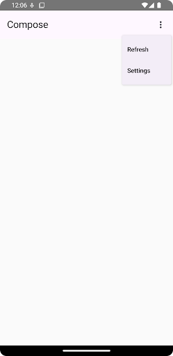
使用者可以點選下拉式選單中的圖示、文字欄位或其他元件,然後從暫時介面的選項清單中選取所需項目。本指南說明如何建立基本選單,以及含有分隔線和圖示的複雜選單。
API 介面
使用 DropdownMenu、DropdownMenuItem 和 IconButton 元件實作自訂下拉式選單。DropdownMenu 和 DropdownMenuItem 元件用於顯示選單項目,而 IconButton 則是顯示或隱藏下拉式選單的觸發條件。
DropdownMenu 元件的主要參數包括:
expanded:指出是否顯示選單。onDismissRequest:用於處理選單關閉。content:選單的可組合內容,通常包含DropdownMenuItem可組合函式。
DropdownMenuItem 的主要參數包括:
text:定義選單項目中顯示的內容。onClick:回呼,用於處理與選單中項目的互動。
建立基本下拉式選單
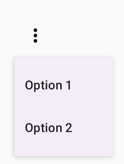
下列程式碼片段示範了最基本的 DropdownMenu 實作方式:
@Composable fun MinimalDropdownMenu() { var expanded by remember { mutableStateOf(false) } Box( modifier = Modifier .padding(16.dp) ) { IconButton(onClick = { expanded = !expanded }) { Icon(painter = rememberVectorPainter(AppIcons.MoreVert), contentDescription = "More options") } DropdownMenu( expanded = expanded, onDismissRequest = { expanded = false } ) { DropdownMenuItem( text = { Text("Option 1") }, onClick = { /* Do something... */ } ) DropdownMenuItem( text = { Text("Option 2") }, onClick = { /* Do something... */ } ) } } }
程式碼重點
- 定義包含兩個選單項目的基本
DropdownMenu。 expanded參數可控制選單的顯示狀態 (展開或收合)。onDismissRequest參數定義了使用者關閉選單時執行的回呼。DropdownMenuItem可組合項代表下拉式選單中的可選取項目。IconButton會觸發展開和收合選單。
結果
建立較長的下拉式選單
如果無法一次顯示所有選單項目,DropdownMenu 預設為可捲動。以下程式碼片段會建立較長的可捲動下拉式選單:
@Composable fun LongBasicDropdownMenu() { var expanded by remember { mutableStateOf(false) } // Placeholder list of 100 strings for demonstration val menuItemData = List(100) { "Option ${it + 1}" } Box( modifier = Modifier .padding(16.dp) ) { IconButton(onClick = { expanded = !expanded }) { Icon(painter = rememberVectorPainter(AppIcons.MoreVert), contentDescription = "More options") } DropdownMenu( expanded = expanded, onDismissRequest = { expanded = false } ) { menuItemData.forEach { option -> DropdownMenuItem( text = { Text(option) }, onClick = { /* Do something... */ } ) } } } }
程式碼重點
- 當內容總高度超過可用空間時,
DropdownMenu可捲動。這段程式碼會建立可捲動的DropdownMenu,顯示 100 個預留位置項目。 forEach迴圈會動態產生DropdownMenuItem可組合項。這些項目並非延遲建立,也就是說,所有 100 個下拉式項目都會建立並存在於組合結構中。IconButton會在使用者點選時觸發DropdownMenu的展開和收合動作。- 每個
DropdownMenuItem中的onClicklambda 可讓您定義使用者選取選單項目時執行的動作。
結果
上述程式碼片段會產生以下可捲動選單:

建立較長的下拉式選單 (含分隔線)
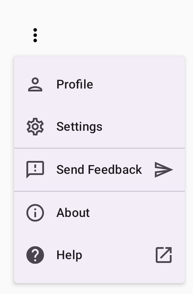
下列程式碼片段顯示下拉式選單的進階實作方式。在這個程式碼片段中,前置和後置圖示會新增至選單項目,而分隔線會分隔選單項目群組。
@Composable fun DropdownMenuWithDetails() { var expanded by remember { mutableStateOf(false) } Box( modifier = Modifier .fillMaxWidth() .padding(16.dp) ) { IconButton(onClick = { expanded = !expanded }) { Icon(painter = rememberVectorPainter(AppIcons.MoreVert), contentDescription = "More options") } DropdownMenu( expanded = expanded, onDismissRequest = { expanded = false } ) { // First section DropdownMenuItem( text = { Text("Profile") }, leadingIcon = { Icon(painter = rememberVectorPainter(AppIcons.Person), contentDescription = null) }, onClick = { /* Do something... */ } ) DropdownMenuItem( text = { Text("Settings") }, leadingIcon = { Icon(painter = rememberVectorPainter(AppIcons.Settings), contentDescription = null) }, onClick = { /* Do something... */ } ) HorizontalDivider() // Second section DropdownMenuItem( text = { Text("Send Feedback") }, leadingIcon = { Icon(painter = rememberVectorPainter(AppIcons.Feedback), contentDescription = null) }, trailingIcon = { Icon(painter = rememberVectorPainter(AppIcons.Send), contentDescription = null) }, onClick = { /* Do something... */ } ) HorizontalDivider() // Third section DropdownMenuItem( text = { Text("About") }, leadingIcon = { Icon(painter = rememberVectorPainter(AppIcons.Info), contentDescription = null) }, onClick = { /* Do something... */ } ) DropdownMenuItem( text = { Text("Help") }, leadingIcon = { Icon(painter = rememberVectorPainter(AppIcons.Help), contentDescription = null) }, trailingIcon = { Icon(painter = rememberVectorPainter(AppIcons.OpenInNew), contentDescription = null) }, onClick = { /* Do something... */ } ) } } }
這段程式碼會在 Box 中定義 DropdownMenu。
程式碼重點
leadingIcon和trailingIcon參數會在DropdownMenuItem的開頭和結尾新增圖示。IconButton會觸發選單展開。DropdownMenu包含多個DropdownMenuItem可組合項,每個可組合項都代表一個可選取的動作。HorizontalDivider可組合函式會插入水平線,分隔選單項目群組。
結果
上述程式碼片段會產生含有圖示和分隔線的下拉式選單:
其他資源
- Material Design:選單