


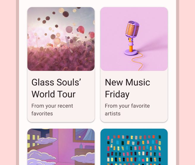
应用通常需要在样式相似的容器中显示数据,例如包含列表中商品相关信息的容器。借助系统提供的 CardView API,您可以轻松地在卡片内显示信息。这些卡片在整个平台都具有一致的外观,例如,卡片以默认高度位于所属视图组上方,因此系统会在其下方绘制阴影。卡片可用来包含一组视图,同时为容器提供一致的样式。
添加依赖项
CardView widget 是 AndroidX 的一部分。如需在项目中使用该微件,请将以下依赖项添加到应用模块的 build.gradle 文件中:
Groovy
dependencies {
    implementation "androidx.cardview:cardview:1.0.0"
}
Kotlin
dependencies {
    implementation("androidx.cardview:cardview:1.0.0")
}
创建卡片
如需使用 CardView,请将其添加到布局文件中。将其用作视图组以包含其他视图。在以下示例中,CardView 包含一个 ImageView 和几个 TextViews,用于向用户显示一些信息:
<?xml version="1.0" encoding="utf-8"?>
<androidx.constraintlayout.widget.ConstraintLayout
    xmlns:android="http://schemas.android.com/apk/res/android"
    xmlns:app="http://schemas.android.com/apk/res-auto"
    android:padding="16dp"
    android:background="#E0F7FA"
    android:layout_width="match_parent"
    android:layout_height="match_parent">

    <androidx.cardview.widget.CardView
        android:layout_width="match_parent"
        android:layout_height="wrap_content"
        app:layout_constraintBottom_toBottomOf="parent"
        app:layout_constraintEnd_toEndOf="parent"
        app:layout_constraintStart_toStartOf="parent"
        app:layout_constraintTop_toTopOf="parent">

        <androidx.constraintlayout.widget.ConstraintLayout
            android:padding="4dp"
            android:layout_width="match_parent"
            android:layout_height="match_parent">

            <ImageView
                android:id="@+id/header_image"
                android:layout_width="match_parent"
                android:layout_height="200dp"
                android:src="@drawable/logo"
                app:layout_constraintEnd_toEndOf="parent"
                app:layout_constraintStart_toStartOf="parent"
                app:layout_constraintTop_toTopOf="parent" />

            <TextView
                android:id="@+id/title"
                style="@style/TextAppearance.MaterialComponents.Headline3"
                android:layout_width="match_parent"
                android:layout_height="wrap_content"
                android:layout_marginTop="4dp"
                android:text="I'm a title"
                app:layout_constraintEnd_toEndOf="parent"
                app:layout_constraintStart_toStartOf="parent"
                app:layout_constraintTop_toBottomOf="@id/header_image" />

            <TextView
                android:id="@+id/subhead"
                style="@style/TextAppearance.MaterialComponents.Subtitle2"
                android:layout_width="match_parent"
                android:layout_height="wrap_content"
                android:layout_marginTop="4dp"
                android:text="I'm a subhead"
                app:layout_constraintEnd_toEndOf="parent"
                app:layout_constraintStart_toStartOf="parent"
                app:layout_constraintTop_toBottomOf="@id/title" />

            <TextView
                android:id="@+id/body"
                style="@style/TextAppearance.MaterialComponents.Body1"
                android:layout_width="match_parent"
                android:layout_height="wrap_content"
                android:layout_marginTop="4dp"
                android:text="I'm a supporting text. Very Lorem ipsum dolor sit amet, consectetur adipiscing elit, sed do eiusmod tempor incididunt ut labore et dolore magna aliqua. Ut enim ad minim veniam, quis nostrud exercitation ullamco laboris nisi ut aliquip ex ea commodo consequat. Duis aute irure dolor in reprehenderit in voluptate velit esse cillum dolore eu fugiat nulla pariatur. Excepteur sint occaecat cupidatat non proident, sunt in culpa qui officia deserunt mollit anim id est laborum."
                app:layout_constraintEnd_toEndOf="parent"
                app:layout_constraintStart_toStartOf="parent"
                app:layout_constraintTop_toBottomOf="@id/subhead" />
        </androidx.constraintlayout.widget.ConstraintLayout>
    </androidx.cardview.widget.CardView>
</androidx.constraintlayout.widget.ConstraintLayout>
假设您使用相同的 Android 徽标图片,则上述代码段会生成类似于以下内容的输出:
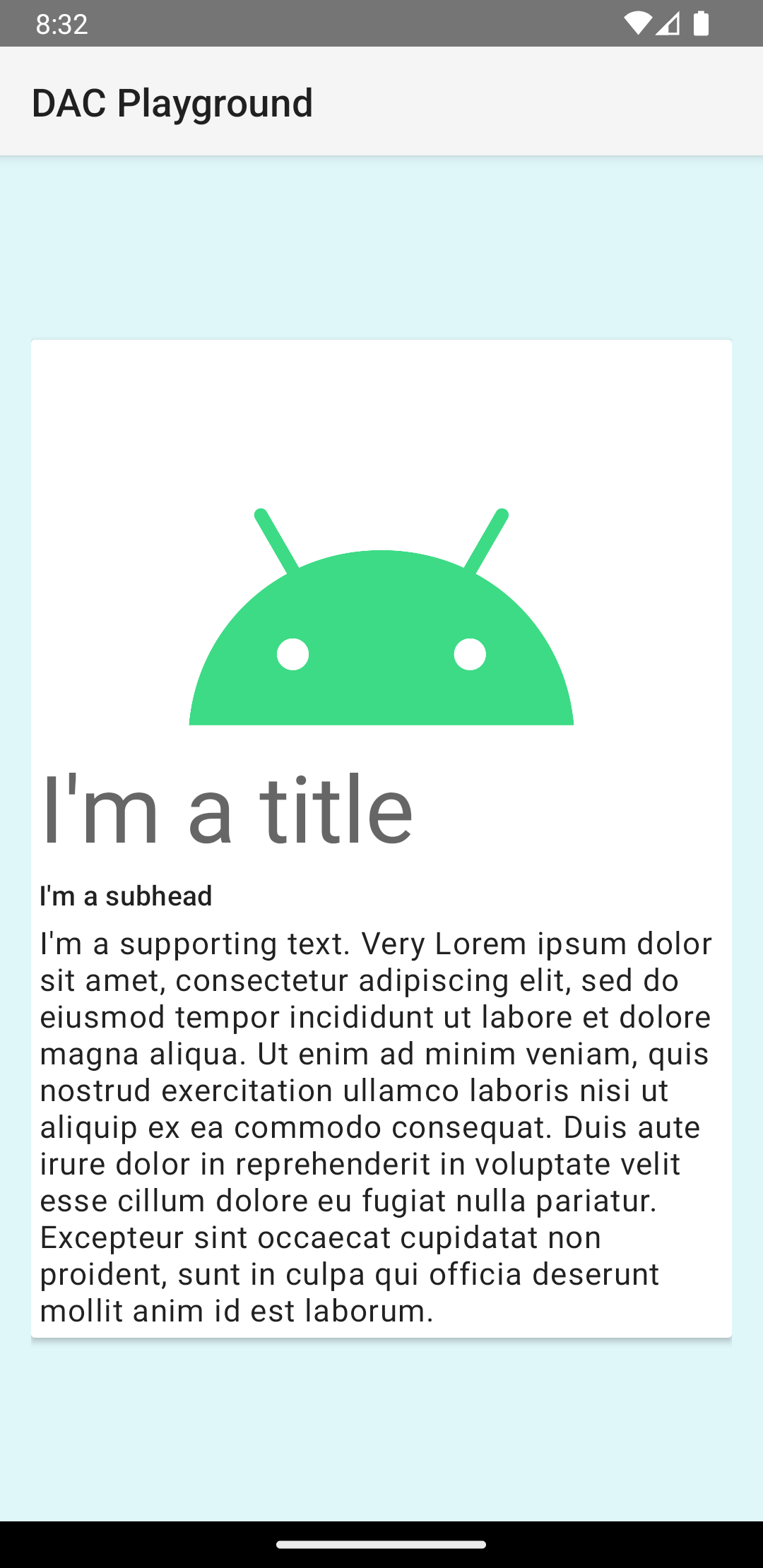
在此示例中,卡片会以默认高度绘制到屏幕上,这会导致系统在其下方绘制阴影。您可以使用 card_view:cardElevation 属性为卡片提供自定义高程。高程值越大,卡片的阴影越明显;高程值越小,卡片的阴影越淡。CardView 在 Android 5.0(API 级别 21)及更高版本中使用实际高程和动态阴影。
使用以下属性自定义 CardView widget 的外观:
- 如需在布局中设置圆角半径,请使用
card_view:cardCornerRadius属性。 - 如需在代码中设置圆角半径,请使用
CardView.setRadius方法。 - 如需设置卡片的背景色,请使用
card_view:cardBackgroundColor属性。