
ChildButton
Functions summary
Unit |
@ComposableBase level Wear Material3 |
Unit |
@ComposableWear Material3 |
Functions
ChildButton
@Composable
fun ChildButton(
    onClick: () -> Unit,
    modifier: Modifier = Modifier,
    onLongClick: (() -> Unit)? = null,
    onLongClickLabel: String? = null,
    enabled: Boolean = true,
    shape: Shape = ButtonDefaults.shape,
    colors: ButtonColors = ButtonDefaults.childButtonColors(),
    border: BorderStroke? = null,
    contentPadding: PaddingValues = ButtonDefaults.ContentPadding,
    interactionSource: MutableInteractionSource? = null,
    transformation: SurfaceTransformation? = null,
    content: @Composable RowScope.() -> Unit
): Unit
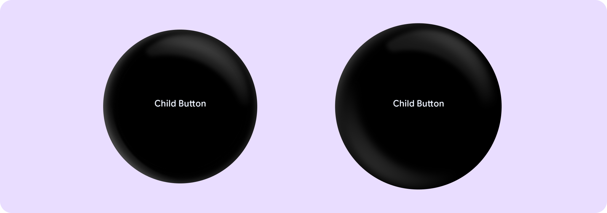
Base level Wear Material3 ChildButton that offers a single slot to take any content. Used as the container for more opinionated ChildButton components that take specific content such as icons and labels.
The ChildButton is stadium-shaped by default and its standard height is designed to take 2 lines of text. With localisation and/or large font sizes, the text can extend to a maximum of 3 lines in which case, the ChildButton height adjusts to accommodate the contents. The ChildButton can have an icon or image horizontally parallel to the two lines of text.
ChildButton takes the ButtonDefaults.childButtonColors color scheme by default, with a transparent background and no border. This is a low-emphasis button for optional or supplementary actions with the least amount of prominence.
Other recommended buttons with ButtonColors for different levels of emphasis are: Button which defaults to ButtonDefaults.buttonColors, FilledTonalButton which defaults to ButtonDefaults.filledTonalButtonColors, OutlinedButton which defaults to ButtonDefaults.outlinedButtonColors. For a background image, see the overload of Button with a containerPainter parameter.
ChildButton can be enabled or disabled. A disabled button will not respond to click events.
Example of a ChildButton:
import androidx.compose.foundation.layout.fillMaxWidth
import androidx.compose.ui.Modifier
import androidx.compose.ui.semantics.onClick
import androidx.compose.ui.text.style.TextAlign
import androidx.wear.compose.material3.Button
import androidx.wear.compose.material3.ChildButton
import androidx.wear.compose.material3.Text

ChildButton(
    onClick = { /* Do something */ },
    label = {
        Text("Child Button", textAlign = TextAlign.Center, modifier = Modifier.fillMaxWidth())
    },
    modifier = modifier,
)
| Parameters | |
|---|---|
onClick: () -> Unit |
Will be called when the user clicks the button |
modifier: Modifier = Modifier |
Modifier to be applied to the button |
onLongClick: (() -> Unit)? = null |
Called when this button is long clicked (long-pressed). When this callback is set, |
onLongClickLabel: String? = null |
Semantic / accessibility label for the |
enabled: Boolean = true |
Controls the enabled state of the button. When |
shape: Shape = ButtonDefaults.shape |
Defines the button's shape. It is strongly recommended to use the default as this shape is a key characteristic of the Wear Material3 Theme |
colors: ButtonColors = ButtonDefaults.childButtonColors() |
|
border: BorderStroke? = null |
Optional |
contentPadding: PaddingValues = ButtonDefaults.ContentPadding |
The spacing values to apply internally between the container and the content |
interactionSource: MutableInteractionSource? = null |
an optional hoisted |
transformation: SurfaceTransformation? = null |
Transformation to be used when button appears inside a container that needs to dynamically change its content separately from the background. |
content: @Composable RowScope.() -> Unit |
Slot for composable body content displayed on the ChildButton |
ChildButton
@Composable
fun ChildButton(
    onClick: () -> Unit,
    modifier: Modifier = Modifier,
    onLongClick: (() -> Unit)? = null,
    onLongClickLabel: String? = null,
    secondaryLabel: (@Composable RowScope.() -> Unit)? = null,
    icon: (@Composable BoxScope.() -> Unit)? = null,
    enabled: Boolean = true,
    shape: Shape = ButtonDefaults.shape,
    colors: ButtonColors = ButtonDefaults.childButtonColors(),
    border: BorderStroke? = null,
    contentPadding: PaddingValues = ButtonDefaults.ContentPadding,
    interactionSource: MutableInteractionSource? = null,
    transformation: SurfaceTransformation? = null,
    label: @Composable RowScope.() -> Unit
): Unit
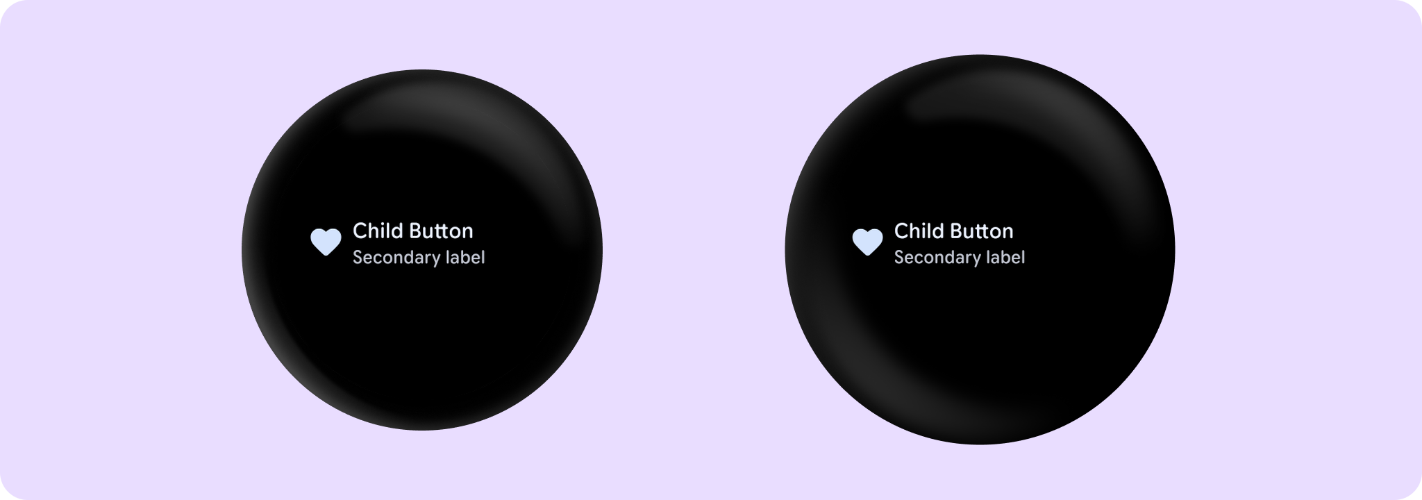
Wear Material3 ChildButton that offers three slots and a specific layout for an icon, label and secondaryLabel. The icon and secondaryLabel are optional. The items are laid out with the icon, if provided, at the start of a row, with a column next containing the two label slots.
The ChildButton is stadium-shaped by default and its standard height is designed to take 2 lines of text - either a two-line label or both a single line label and a secondary label. With localisation and/or large font sizes, the ChildButton height adjusts to accommodate the contents. The label and secondary label should be consistently aligned.
If a icon is provided then the labels should be "start" aligned, e.g. left aligned in ltr so that the text starts next to the icon.
ChildButton takes the ButtonDefaults.childButtonColors color scheme by default, with a transparent background and no border. This is a low-emphasis button for optional or supplementary actions with the least amount of prominence.
Other recommended buttons with ButtonColors for different levels of emphasis are: Button which defaults to ButtonDefaults.buttonColors, FilledTonalButton which defaults to ButtonDefaults.filledTonalButtonColors, OutlinedButton which defaults to ButtonDefaults.outlinedButtonColors. For a background image, see the overload of Button with a containerPainter parameter.
ChildButton can be enabled or disabled. A disabled button will not respond to click events.
Example of a ChildButton with an icon and secondary label:
import androidx.compose.foundation.layout.size
import androidx.compose.ui.Modifier
import androidx.compose.ui.res.painterResource
import androidx.compose.ui.semantics.onClick
import androidx.wear.compose.material3.Button
import androidx.wear.compose.material3.ButtonDefaults
import androidx.wear.compose.material3.ChildButton
import androidx.wear.compose.material3.Icon
import androidx.wear.compose.material3.Text

ChildButton(
    onClick = { /* Do something */ },
    label = { Text("Child Button") },
    secondaryLabel = { Text("Secondary label") },
    icon = {
        Icon(
            painter = painterResource(R.drawable.ic_favorite_rounded),
            contentDescription = "Favorite icon",
            modifier = Modifier.size(ButtonDefaults.IconSize),
        )
    },
    modifier = modifier,
)
| Parameters | |
|---|---|
onClick: () -> Unit |
Will be called when the user clicks the button |
modifier: Modifier = Modifier |
Modifier to be applied to the button |
onLongClick: (() -> Unit)? = null |
Called when this button is long clicked (long-pressed). When this callback is set, |
onLongClickLabel: String? = null |
Semantic / accessibility label for the |
secondaryLabel: (@Composable RowScope.() -> Unit)? = null |
A slot for providing the button's secondary label. The contents are expected to be text which is "start" aligned if there is an icon present and "start" or "center" aligned if not. label and secondaryLabel contents should be consistently aligned. |
icon: (@Composable BoxScope.() -> Unit)? = null |
A slot for providing the button's icon. The contents are expected to be a horizontally and vertically aligned icon of size |
enabled: Boolean = true |
Controls the enabled state of the button. When |
shape: Shape = ButtonDefaults.shape |
Defines the button's shape. It is strongly recommended to use the default as this shape is a key characteristic of the Wear Material3 Theme |
colors: ButtonColors = ButtonDefaults.childButtonColors() |
|
border: BorderStroke? = null |
Optional |
contentPadding: PaddingValues = ButtonDefaults.ContentPadding |
The spacing values to apply internally between the container and the content |
interactionSource: MutableInteractionSource? = null |
an optional hoisted |
transformation: SurfaceTransformation? = null |
Transformation to be used when button appears inside a container that needs to dynamically change its content separately from the background. |
label: @Composable RowScope.() -> Unit |
A slot for providing the button's main label. The contents are expected to be text which is "start" aligned if there is an icon present and "start" or "center" aligned if not. |