
StepperLevelIndicator
Functions summary
Unit |
@ComposableCreates a |
Unit |
@ComposableCreates a |
Functions
StepperLevelIndicator
@Composable
fun StepperLevelIndicator(
    value: () -> Float,
    modifier: Modifier = Modifier,
    valueRange: ClosedFloatingPointRange<Float> = 0f..1f,
    enabled: Boolean = true,
    colors: LevelIndicatorColors = LevelIndicatorDefaults.colors(),
    strokeWidth: Dp = LevelIndicatorDefaults.StrokeWidth,
    sweepAngle: @FloatRange(from = 0.0, to = 360.0) Float = LevelIndicatorDefaults.SweepAngle,
    reverseDirection: Boolean = false
): Unit
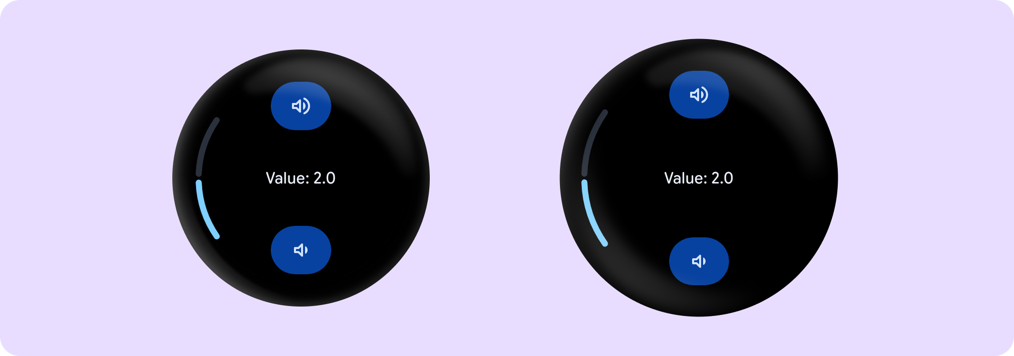
Creates a StepperLevelIndicator for screens that that control a setting, such as volume, with a Stepper.
Example of LevelIndicator with a Stepper:
import androidx.compose.foundation.layout.Box
import androidx.compose.foundation.layout.fillMaxSize
import androidx.compose.runtime.mutableFloatStateOf
import androidx.compose.runtime.remember
import androidx.compose.ui.Alignment
import androidx.compose.ui.Modifier
import androidx.wear.compose.material3.Stepper
import androidx.wear.compose.material3.StepperDefaults
import androidx.wear.compose.material3.StepperLevelIndicator
import androidx.wear.compose.material3.Text
import androidx.wear.compose.material3.samples.icons.VolumeDownIcon
import androidx.wear.compose.material3.samples.icons.VolumeUpIcon

var value by remember { mutableFloatStateOf(2f) }
val valueRange = remember { 0f..4f }
Box(modifier = Modifier.fillMaxSize()) {
    Stepper(
        value = value,
        onValueChange = { value = it },
        valueRange = valueRange,
        steps = 7,
        decreaseIcon = { VolumeDownIcon(StepperDefaults.IconSize) },
        increaseIcon = { VolumeUpIcon(StepperDefaults.IconSize) },
    ) {
        Text(String.format("Value: %.1f".format(value)))
    }
    StepperLevelIndicator(
        value = { value },
        valueRange = valueRange,
        modifier = Modifier.align(Alignment.CenterStart),
    )
}
| Parameters | |
|---|---|
value: () -> Float |
Value of the indicator in the |
modifier: Modifier = Modifier |
Modifier to be applied to the component |
valueRange: ClosedFloatingPointRange<Float> = 0f..1f |
range of values that |
enabled: Boolean = true |
Controls the enabled state of |
colors: LevelIndicatorColors = LevelIndicatorDefaults.colors() |
|
strokeWidth: Dp = LevelIndicatorDefaults.StrokeWidth |
The stroke width for the indicator and track strokes |
sweepAngle: @FloatRange(from = 0.0, to = 360.0) Float = LevelIndicatorDefaults.SweepAngle |
The angle covered by the curved LevelIndicator, in degrees |
reverseDirection: Boolean = false |
Reverses direction of PositionIndicator if true |
StepperLevelIndicator
@Composable
fun StepperLevelIndicator(
    value: () -> Int,
    valueProgression: IntProgression,
    modifier: Modifier = Modifier,
    enabled: Boolean = true,
    colors: LevelIndicatorColors = LevelIndicatorDefaults.colors(),
    strokeWidth: Dp = LevelIndicatorDefaults.StrokeWidth,
    sweepAngle: @FloatRange(from = 0.0, to = 360.0) Float = LevelIndicatorDefaults.SweepAngle,
    reverseDirection: Boolean = false
): Unit
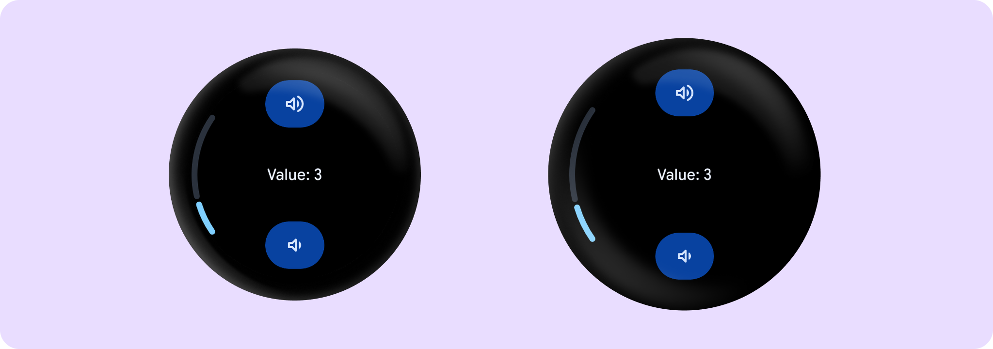
Creates a StepperLevelIndicator for screens that that control a setting, such as volume, with a Stepper.
Example of LevelIndicator with a Stepper working on an IntProgression:
import androidx.compose.foundation.layout.Box
import androidx.compose.foundation.layout.fillMaxSize
import androidx.compose.runtime.mutableIntStateOf
import androidx.compose.runtime.remember
import androidx.compose.ui.Alignment
import androidx.compose.ui.Modifier
import androidx.wear.compose.material3.Stepper
import androidx.wear.compose.material3.StepperDefaults
import androidx.wear.compose.material3.StepperLevelIndicator
import androidx.wear.compose.material3.Text
import androidx.wear.compose.material3.samples.icons.VolumeDownIcon
import androidx.wear.compose.material3.samples.icons.VolumeUpIcon

var value by remember { mutableIntStateOf(3) }
val valueProgression = remember { 0..10 }
Box(modifier = Modifier.fillMaxSize()) {
    Stepper(
        value = value,
        onValueChange = { value = it },
        valueProgression = valueProgression,
        decreaseIcon = { VolumeDownIcon(StepperDefaults.IconSize) },
        increaseIcon = { VolumeUpIcon(StepperDefaults.IconSize) },
    ) {
        Text(String.format("Value: %d".format(value)))
    }
    StepperLevelIndicator(
        value = { value },
        valueProgression = valueProgression,
        modifier = Modifier.align(Alignment.CenterStart),
    )
}
| Parameters | |
|---|---|
value: () -> Int |
Current value of the Stepper. If outside of |
valueProgression: IntProgression |
Progression of values that |
modifier: Modifier = Modifier |
Modifier to be applied to the component |
enabled: Boolean = true |
Controls the enabled state of |
colors: LevelIndicatorColors = LevelIndicatorDefaults.colors() |
|
strokeWidth: Dp = LevelIndicatorDefaults.StrokeWidth |
The stroke width for the indicator and track strokes |
sweepAngle: @FloatRange(from = 0.0, to = 360.0) Float = LevelIndicatorDefaults.SweepAngle |
The angle covered by the curved LevelIndicator, in degrees |
reverseDirection: Boolean = false |
Reverses direction of PositionIndicator if true |