
TitleCard
Functions summary
Unit |
@ComposableOpinionated Wear Material 3 |
Unit |
@ComposableThis |
Unit |
@ComposableOpinionated Wear Material 3 |
Unit |
@ComposableThis |
Functions
TitleCard
@Composable
fun TitleCard(
    title: @Composable RowScope.() -> Unit,
    modifier: Modifier = Modifier,
    time: (@Composable () -> Unit)? = null,
    subtitle: (@Composable ColumnScope.() -> Unit)? = null,
    shape: Shape = CardDefaults.shape,
    colors: CardColors = CardDefaults.cardColors(),
    border: BorderStroke? = null,
    contentPadding: PaddingValues = CardDefaults.ContentPadding,
    transformation: SurfaceTransformation? = null,
    content: (@Composable () -> Unit)? = null
): Unit
Opinionated Wear Material 3 Card that offers a specific layout to show interactive information about an application, e.g. a message. TitleCards are designed for use within an application.
This TitleCard does not handle input events - see the other TitleCard overloads if you want a clickable TitleCard.
The time, subtitle and content fields are optional, but it is expected that at least one of these is provided. The layout will vary according to which fields are supplied - see samples.
If the content is text it can be single or multiple line and is expected to be Top and Start aligned. When subtitle is used content shouldn't exceed 2 lines height. Overall the title, content and subtitle text should be no more than 5 rows of text combined.
If more than one composable is provided in the content slot it is the responsibility of the caller to determine how to layout the contents, e.g. provide either a row or a column.
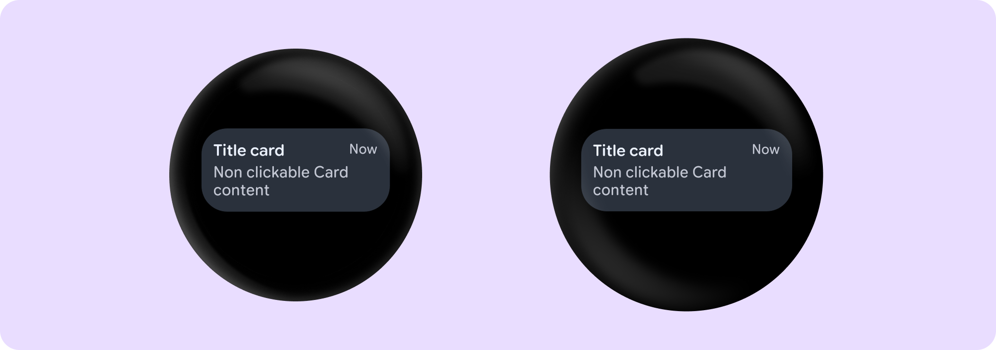
Example of a non-clickable TitleCard with time, title and content:
import androidx.wear.compose.material3.Card
import androidx.wear.compose.material3.Text
import androidx.wear.compose.material3.TitleCard

TitleCard(title = { Text("Title card") }, time = { Text("Now") }) {
    Text("Non clickable Card content")
}
For more information, see the Cards guide.
| Parameters | |
|---|---|
title: @Composable RowScope.() -> Unit |
A slot for displaying the title of the card, expected to be one or two lines of text. |
modifier: Modifier = Modifier |
Modifier to be applied to the card |
time: (@Composable () -> Unit)? = null |
An optional slot for displaying the time relevant to the contents of the card, expected to be a short piece of text. Depending on whether we have a |
subtitle: (@Composable ColumnScope.() -> Unit)? = null |
An optional slot for displaying the subtitle of the card, expected to be one line of text. |
shape: Shape = CardDefaults.shape |
Defines the card's shape. It is strongly recommended to use the default as this shape is a key characteristic of the Wear Material Theme |
colors: CardColors = CardDefaults.cardColors() |
|
border: BorderStroke? = null |
A BorderStroke object which is used for drawing outlines. |
contentPadding: PaddingValues = CardDefaults.ContentPadding |
The spacing values to apply internally between the container and the content |
transformation: SurfaceTransformation? = null |
Transformation to be used when card appears inside a container that needs to dynamically change its content separately from the background. |
content: (@Composable () -> Unit)? = null |
The optional body content of the card. If not provided then title and subtitle are expected to be provided |
TitleCard
@Composable
fun TitleCard(
    containerPainter: Painter,
    title: @Composable RowScope.() -> Unit,
    modifier: Modifier = Modifier,
    time: (@Composable () -> Unit)? = null,
    subtitle: (@Composable ColumnScope.() -> Unit)? = null,
    shape: Shape = CardDefaults.shape,
    colors: CardColors = CardDefaults.cardWithContainerPainterColors(),
    border: BorderStroke? = null,
    contentPadding: PaddingValues = CardDefaults.CardWithContainerPainterContentPadding,
    transformation: SurfaceTransformation? = null,
    content: (@Composable () -> Unit)? = null
): Unit
This TitleCard overload supports an image container background and provides an opinionated Wear Material 3 Card with a specific layout to show interactive information about an application, similar to TitleCard.
This TitleCard does not handle input events - see the other TitleCard overloads if you want a clickable TitleCard.
An image background is a means to reinforce the meaning of information in a Card. Cards should have a content color that contrasts with the background image and scrim. This TitleCard takes containerPainter for the container image background to be drawn (the CardColors containerColor property is ignored). It is recommended to use CardDefaults.containerPainter to create the painter so that a scrim is drawn on top of the container image, ensuring that any content above the background is legible.
The time, subtitle and content fields are optional, but it is expected that at least one of these is provided. The layout will vary according to which fields are supplied - see samples.
If the content is text it can be single or multiple line and is expected to be Top and Start aligned. When subtitle is used content shouldn't exceed 2 lines height. Overall the title, content and subtitle text should be no more than 5 rows of text combined.
If more than one composable is provided in the content slot it is the responsibility of the caller to determine how to layout the contents, e.g. provide either a row or a column.
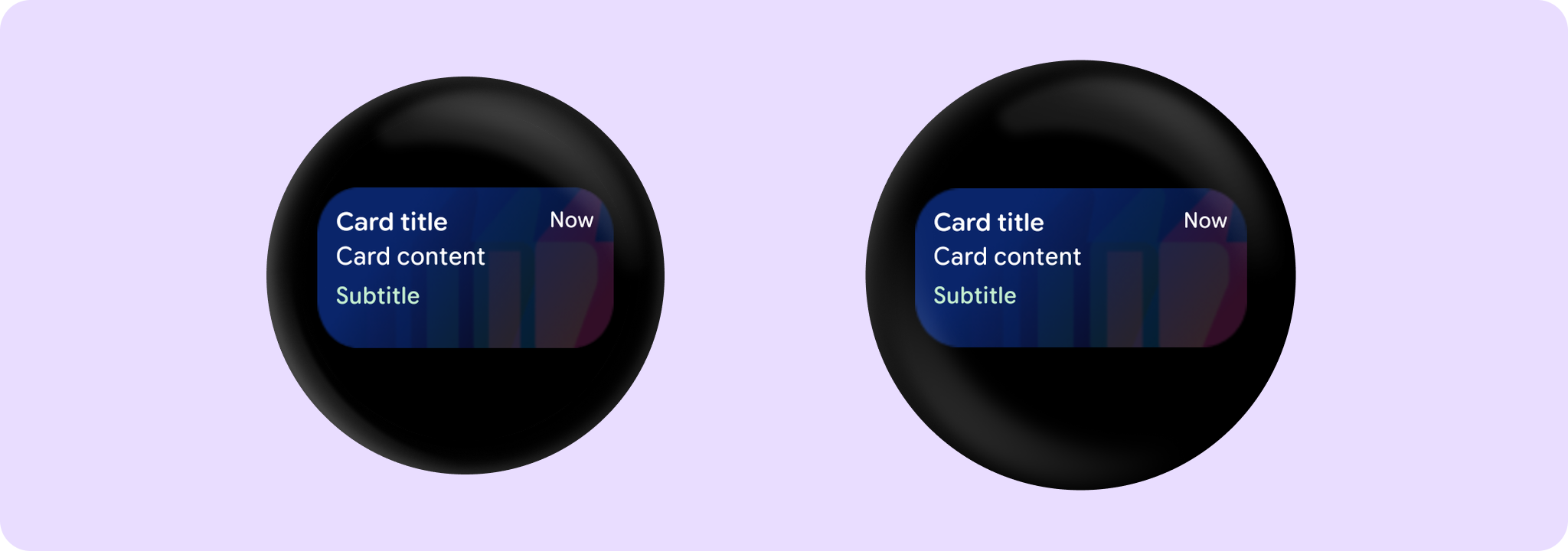
Example of a Card with a background image:
import androidx.compose.foundation.background
import androidx.compose.ui.Modifier
import androidx.compose.ui.res.painterResource
import androidx.compose.ui.semantics.contentDescription
import androidx.compose.ui.semantics.semantics
import androidx.wear.compose.material3.Card
import androidx.wear.compose.material3.CardDefaults
import androidx.wear.compose.material3.Text
import androidx.wear.compose.material3.TitleCard

TitleCard(
    containerPainter =
        CardDefaults.containerPainter(image = painterResource(id = R.drawable.backgroundimage)),
    title = { Text("Card title") },
    subtitle = { Text("Subtitle") },
    time = { Text("Now") },
    contentPadding = CardDefaults.CardWithContainerPainterContentPadding,
    modifier = Modifier.semantics { contentDescription = "Background image" },
) {
    Text("Card content")
}
For more information, see the Cards guide.
| Parameters | |
|---|---|
containerPainter: Painter |
The |
title: @Composable RowScope.() -> Unit |
A slot for displaying the title of the card, expected to be one or two lines of text. |
modifier: Modifier = Modifier |
Modifier to be applied to the card |
time: (@Composable () -> Unit)? = null |
An optional slot for displaying the time relevant to the contents of the card, expected to be a short piece of text. Depending on whether we have a |
subtitle: (@Composable ColumnScope.() -> Unit)? = null |
An optional slot for displaying the subtitle of the card, expected to be one line of text. |
shape: Shape = CardDefaults.shape |
Defines the card's shape. It is strongly recommended to use the default as this shape is a key characteristic of the Wear Material Theme |
colors: CardColors = CardDefaults.cardWithContainerPainterColors() |
|
border: BorderStroke? = null |
A BorderStroke object which is used for drawing outlines. |
contentPadding: PaddingValues = CardDefaults.CardWithContainerPainterContentPadding |
The spacing values to apply internally between the container and the content |
transformation: SurfaceTransformation? = null |
Transformation to be used when card appears inside a container that needs to dynamically change its content separately from the background. |
content: (@Composable () -> Unit)? = null |
The optional body content of the card. If not provided then title and subtitle are expected to be provided |
TitleCard
@Composable
fun TitleCard(
    onClick: () -> Unit,
    title: @Composable RowScope.() -> Unit,
    modifier: Modifier = Modifier,
    onLongClick: (() -> Unit)? = null,
    onLongClickLabel: String? = null,
    time: (@Composable () -> Unit)? = null,
    subtitle: (@Composable ColumnScope.() -> Unit)? = null,
    enabled: Boolean = true,
    shape: Shape = CardDefaults.shape,
    colors: CardColors = CardDefaults.cardColors(),
    border: BorderStroke? = null,
    contentPadding: PaddingValues = CardDefaults.ContentPadding,
    interactionSource: MutableInteractionSource? = null,
    transformation: SurfaceTransformation? = null,
    content: (@Composable () -> Unit)? = null
): Unit
Opinionated Wear Material 3 Card that offers a specific layout to show interactive information about an application, e.g. a message. TitleCards are designed for use within an application.
The time, subtitle and content fields are optional, but it is expected that at least one of these is provided. The layout will vary according to which fields are supplied - see samples.
If the content is text it can be single or multiple line and is expected to be Top and Start aligned. When subtitle is used content shouldn't exceed 2 lines height. Overall the title, content and subtitle text should be no more than 5 rows of text combined.
If more than one composable is provided in the content slot it is the responsibility of the caller to determine how to layout the contents, e.g. provide either a row or a column.
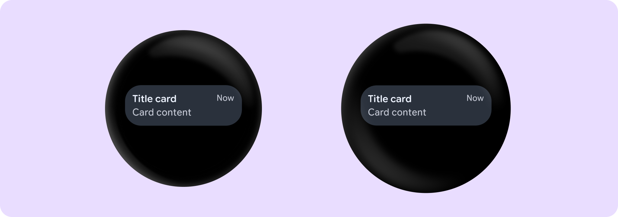
Example of a TitleCard with onClick, time, title and content:
import androidx.wear.compose.material3.Card
import androidx.wear.compose.material3.Text
import androidx.wear.compose.material3.TitleCard

TitleCard(
    onClick = { /* Do something */ },
    title = { Text("Title card") },
    time = { Text("Now") },
) {
    Text("Card content")
}
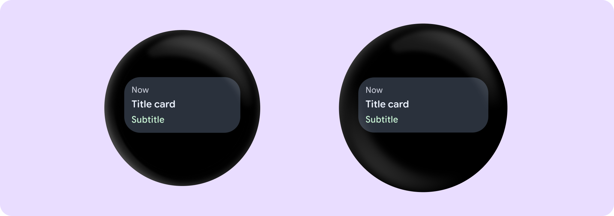
Example of a TitleCard with time, title and subtitle:
import androidx.wear.compose.material3.Card
import androidx.wear.compose.material3.Text
import androidx.wear.compose.material3.TitleCard

TitleCard(
    onClick = { /* Do something */ },
    time = { Text("Now") },
    title = { Text("Title card") },
    subtitle = { Text("Subtitle") },
)
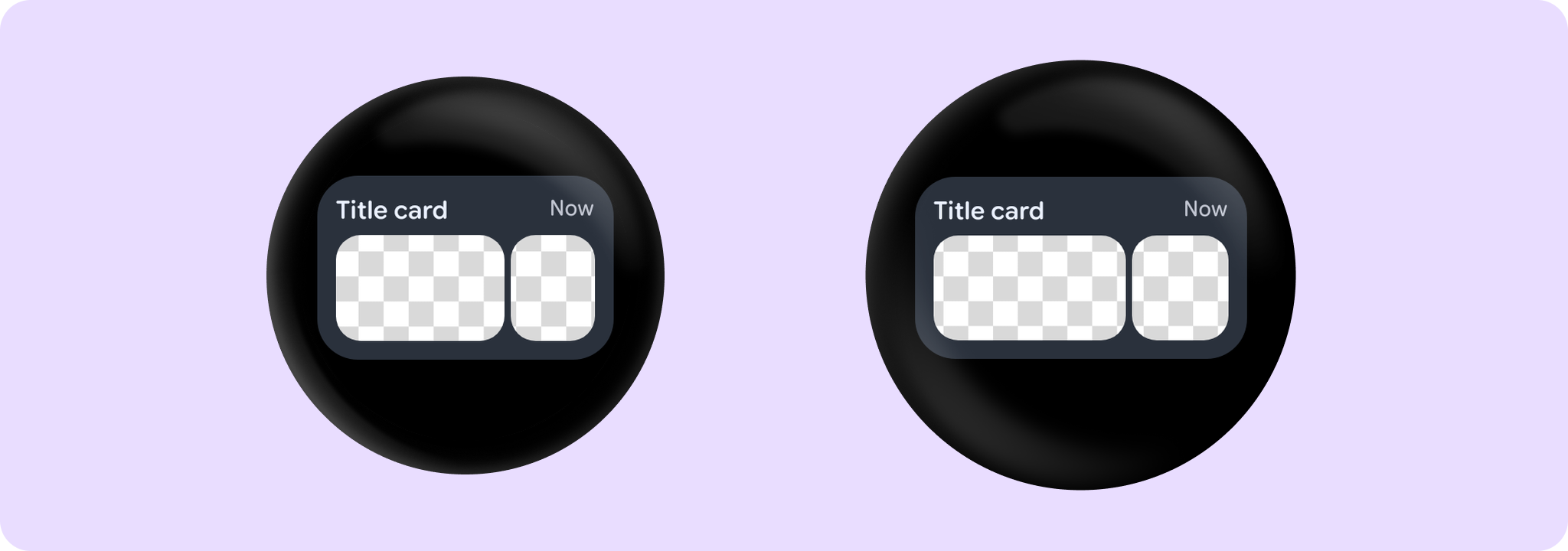
Example of a TitleCard with images content:
import androidx.compose.foundation.Image
import androidx.compose.foundation.layout.Row
import androidx.compose.foundation.layout.Spacer
import androidx.compose.foundation.layout.fillMaxWidth
import androidx.compose.foundation.layout.height
import androidx.compose.foundation.layout.width
import androidx.compose.foundation.shape.RoundedCornerShape
import androidx.compose.ui.Alignment
import androidx.compose.ui.Modifier
import androidx.compose.ui.draw.clip
import androidx.compose.ui.layout.ContentScale
import androidx.compose.ui.res.painterResource
import androidx.compose.ui.semantics.contentDescription
import androidx.compose.ui.semantics.semantics
import androidx.compose.ui.unit.dp
import androidx.wear.compose.material3.Card
import androidx.wear.compose.material3.Text
import androidx.wear.compose.material3.TitleCard

TitleCard(
    onClick = { /* Do something */ },
    title = { Text("Title card") },
    time = { Text("Now") },
    modifier = Modifier.semantics { contentDescription = "Background image" },
) {
    Spacer(Modifier.height(4.dp))
    Row(modifier = Modifier.fillMaxWidth()) {
        Image(
            modifier =
                Modifier.weight(2f)
                    .height(68.dp)
                    .align(Alignment.CenterVertically)
                    .clip(RoundedCornerShape(16.dp)),
            painter = painterResource(id = R.drawable.card_content_image),
            contentScale = ContentScale.Crop,
            contentDescription = null,
        )
        Spacer(Modifier.width(4.dp))
        Image(
            modifier =
                Modifier.weight(1f)
                    .height(68.dp)
                    .align(Alignment.CenterVertically)
                    .clip(RoundedCornerShape(16.dp)),
            painter = painterResource(id = R.drawable.card_content_image),
            contentScale = ContentScale.Crop,
            contentDescription = null,
        )
    }
}
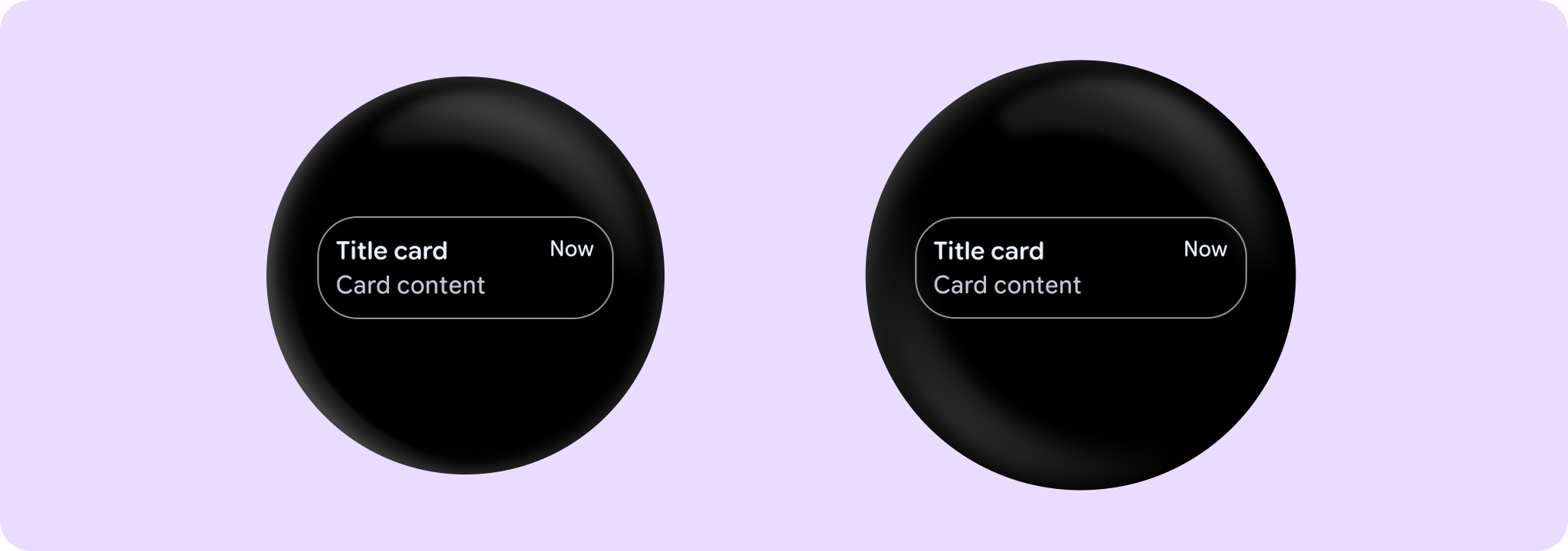
Example of an outlined TitleCard:
import androidx.wear.compose.material3.Card
import androidx.wear.compose.material3.CardDefaults
import androidx.wear.compose.material3.Text
import androidx.wear.compose.material3.TitleCard

TitleCard(
    onClick = { /* Do something */ },
    title = { Text("Title card") },
    time = { Text("Now") },
    colors = CardDefaults.outlinedCardColors(),
    border = CardDefaults.outlinedCardBorder(),
) {
    Text("Card content")
}
For more information, see the Cards guide.
| Parameters | |
|---|---|
onClick: () -> Unit |
Will be called when the user clicks the card |
title: @Composable RowScope.() -> Unit |
A slot for displaying the title of the card, expected to be one or two lines of text. |
modifier: Modifier = Modifier |
Modifier to be applied to the card |
onLongClick: (() -> Unit)? = null |
Called when this card is long clicked (long-pressed). When this callback is set, |
onLongClickLabel: String? = null |
Semantic / accessibility label for the |
time: (@Composable () -> Unit)? = null |
An optional slot for displaying the time relevant to the contents of the card, expected to be a short piece of text. Depending on whether we have a |
subtitle: (@Composable ColumnScope.() -> Unit)? = null |
An optional slot for displaying the subtitle of the card, expected to be one line of text. |
enabled: Boolean = true |
Controls the enabled state of the card. When false, this card will not be clickable and there will be no ripple effect on click. Wear cards do not have any specific elevation or alpha differences when not enabled - they are simply not clickable. |
shape: Shape = CardDefaults.shape |
Defines the card's shape. It is strongly recommended to use the default as this shape is a key characteristic of the Wear Material Theme |
colors: CardColors = CardDefaults.cardColors() |
|
border: BorderStroke? = null |
A BorderStroke object which is used for drawing outlines. |
contentPadding: PaddingValues = CardDefaults.ContentPadding |
The spacing values to apply internally between the container and the content |
interactionSource: MutableInteractionSource? = null |
an optional hoisted |
transformation: SurfaceTransformation? = null |
Transformation to be used when card appears inside a container that needs to dynamically change its content separately from the background. |
content: (@Composable () -> Unit)? = null |
The optional body content of the card. If not provided then title and subtitle are expected to be provided |
TitleCard
@Composable
fun TitleCard(
    onClick: () -> Unit,
    containerPainter: Painter,
    title: @Composable RowScope.() -> Unit,
    modifier: Modifier = Modifier,
    onLongClick: (() -> Unit)? = null,
    onLongClickLabel: String? = null,
    time: (@Composable () -> Unit)? = null,
    subtitle: (@Composable ColumnScope.() -> Unit)? = null,
    enabled: Boolean = true,
    shape: Shape = CardDefaults.shape,
    colors: CardColors = CardDefaults.cardWithContainerPainterColors(),
    border: BorderStroke? = null,
    contentPadding: PaddingValues = CardDefaults.CardWithContainerPainterContentPadding,
    interactionSource: MutableInteractionSource? = null,
    transformation: SurfaceTransformation? = null,
    content: (@Composable () -> Unit)? = null
): Unit
This TitleCard overload supports an image container background and provides an opinionated Wear Material 3 Card with a specific layout to show interactive information about an application, similar to TitleCard.
An image background is a means to reinforce the meaning of information in a Card. Cards should have a content color that contrasts with the background image and scrim. This TitleCard takes containerPainter for the container image background to be drawn (the CardColors containerColor property is ignored). It is recommended to use CardDefaults.containerPainter to create the painter so that a scrim is drawn on top of the container image, ensuring that any content above the background is legible.
The time, subtitle and content fields are optional, but it is expected that at least one of these is provided. The layout will vary according to which fields are supplied - see samples.
If the content is text it can be single or multiple line and is expected to be Top and Start aligned. When subtitle is used content shouldn't exceed 2 lines height. Overall the title, content and subtitle text should be no more than 5 rows of text combined.
If more than one composable is provided in the content slot it is the responsibility of the caller to determine how to layout the contents, e.g. provide either a row or a column.
Example of a Card with a background image:
import androidx.compose.foundation.background
import androidx.compose.ui.Modifier
import androidx.compose.ui.res.painterResource
import androidx.compose.ui.semantics.contentDescription
import androidx.compose.ui.semantics.semantics
import androidx.wear.compose.material3.Card
import androidx.wear.compose.material3.CardDefaults
import androidx.wear.compose.material3.Text
import androidx.wear.compose.material3.TitleCard

TitleCard(
    onClick = { /* Do something */ },
    containerPainter =
        CardDefaults.containerPainter(image = painterResource(id = R.drawable.backgroundimage)),
    title = { Text("Card title") },
    subtitle = { Text("Subtitle") },
    time = { Text("Now") },
    contentPadding = CardDefaults.CardWithContainerPainterContentPadding,
    modifier = Modifier.semantics { contentDescription = "Background image" },
) {
    Text("Card content")
}

For more information, see the Cards guide.
| Parameters | |
|---|---|
onClick: () -> Unit |
Will be called when the user clicks the card |
containerPainter: Painter |
The |
title: @Composable RowScope.() -> Unit |
A slot for displaying the title of the card, expected to be one or two lines of text. |
modifier: Modifier = Modifier |
Modifier to be applied to the card |
onLongClick: (() -> Unit)? = null |
Called when this card is long clicked (long-pressed). When this callback is set, |
onLongClickLabel: String? = null |
Semantic / accessibility label for the |
time: (@Composable () -> Unit)? = null |
An optional slot for displaying the time relevant to the contents of the card, expected to be a short piece of text. Depending on whether we have a |
subtitle: (@Composable ColumnScope.() -> Unit)? = null |
An optional slot for displaying the subtitle of the card, expected to be one line of text. |
enabled: Boolean = true |
Controls the enabled state of the card. When false, this card will not be clickable and there will be no ripple effect on click. Wear cards do not have any specific elevation or alpha differences when not enabled - they are simply not clickable. |
shape: Shape = CardDefaults.shape |
Defines the card's shape. It is strongly recommended to use the default as this shape is a key characteristic of the Wear Material Theme |
colors: CardColors = CardDefaults.cardWithContainerPainterColors() |
|
border: BorderStroke? = null |
A BorderStroke object which is used for drawing outlines. |
contentPadding: PaddingValues = CardDefaults.CardWithContainerPainterContentPadding |
The spacing values to apply internally between the container and the content |
interactionSource: MutableInteractionSource? = null |
an optional hoisted |
transformation: SurfaceTransformation? = null |
Transformation to be used when card appears inside a container that needs to dynamically change its content separately from the background. |
content: (@Composable () -> Unit)? = null |
The optional body content of the card. If not provided then title and subtitle are expected to be provided |