
RadioButton
Functions summary
Unit |
@ComposableThe Wear Material |
Functions
RadioButton
@Composable
fun RadioButton(
    selected: Boolean,
    onSelect: () -> Unit,
    modifier: Modifier = Modifier,
    enabled: Boolean = true,
    shape: Shape = RadioButtonDefaults.radioButtonShape,
    colors: RadioButtonColors = RadioButtonDefaults.radioButtonColors(),
    contentPadding: PaddingValues = RadioButtonDefaults.ContentPadding,
    interactionSource: MutableInteractionSource? = null,
    transformation: SurfaceTransformation? = null,
    icon: (@Composable BoxScope.() -> Unit)? = null,
    secondaryLabel: (@Composable RowScope.() -> Unit)? = null,
    label: @Composable RowScope.() -> Unit
): Unit
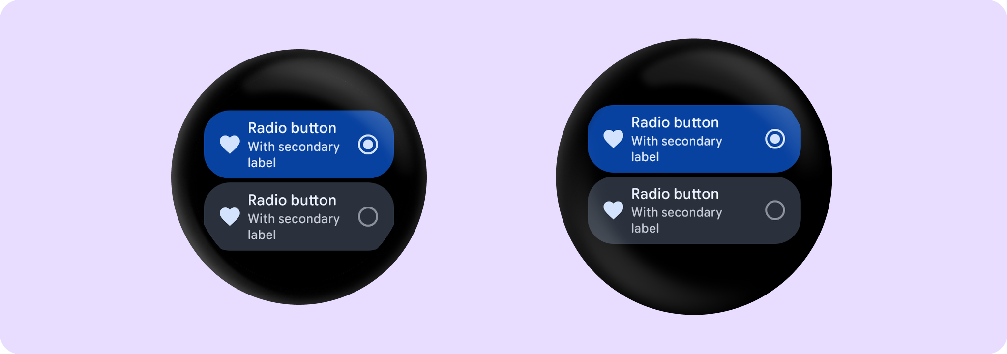
The Wear Material RadioButton offers slots and a specific layout for an icon, a label and a secondaryLabel. The icon and secondaryLabel are optional. The items are laid out in a row with the optional icon at the start, a column containing the two label slots in the middle and the selection control at the end.
The RadioButton is Stadium shaped. The label should take no more than 3 lines of text. The secondary label should take no more than 2 lines of text. With localisation and/or large font sizes, the RadioButton height adjusts to accommodate the contents. The label and secondary label are start aligned by default.
Note that Modifier.selectableGroup() must be present on the parent control (such as Column) to ensure correct accessibility behavior.
Samples: Example of a RadioButton:
import androidx.compose.foundation.layout.Column
import androidx.compose.foundation.layout.Spacer
import androidx.compose.foundation.layout.fillMaxSize
import androidx.compose.foundation.layout.height
import androidx.compose.foundation.selection.selectableGroup
import androidx.compose.material.icons.Icons
import androidx.compose.material.icons.filled.Favorite
import androidx.compose.runtime.mutableStateOf
import androidx.compose.runtime.remember
import androidx.compose.ui.Modifier
import androidx.compose.ui.text.style.TextOverflow
import androidx.compose.ui.unit.dp
import androidx.wear.compose.material3.Icon
import androidx.wear.compose.material3.RadioButton
import androidx.wear.compose.material3.Text

Column(modifier = Modifier.selectableGroup().fillMaxSize()) {
    var selectedButton by remember { mutableStateOf(0) }
    // RadioButton uses the Radio selection control by default.
    RadioButton(
        label = { Text("Radio button", maxLines = 3, overflow = TextOverflow.Ellipsis) },
        secondaryLabel = {
            Text("With secondary label", maxLines = 2, overflow = TextOverflow.Ellipsis)
        },
        selected = selectedButton == 0,
        onSelect = { selectedButton = 0 },
        icon = { Icon(Icons.Filled.Favorite, contentDescription = "Favorite icon") },
        enabled = true,
    )
    Spacer(modifier = Modifier.height(4.dp))
    RadioButton(
        label = { Text("Radio button", maxLines = 3, overflow = TextOverflow.Ellipsis) },
        secondaryLabel = {
            Text("With secondary label", maxLines = 3, overflow = TextOverflow.Ellipsis)
        },
        selected = selectedButton == 1,
        onSelect = { selectedButton = 1 },
        icon = { Icon(Icons.Filled.Favorite, contentDescription = "Favorite icon") },
        enabled = true,
    )
}
RadioButton can be enabled or disabled. A disabled button will not respond to click events.
The recommended set of RadioButton colors can be obtained from RadioButtonDefaults, e.g. RadioButtonDefaults.radioButtonColors.
| Parameters | |
|---|---|
selected: Boolean |
Boolean flag indicating whether this button is currently selected. |
onSelect: () -> Unit |
Callback to be invoked when this button has been selected by clicking. |
modifier: Modifier = Modifier |
Modifier to be applied to the |
enabled: Boolean = true |
Controls the enabled state of the button. When |
shape: Shape = RadioButtonDefaults.radioButtonShape |
Defines the button's shape. It is strongly recommended to use the default as this shape is a key characteristic of the Wear Material Theme. |
colors: RadioButtonColors = RadioButtonDefaults.radioButtonColors() |
|
contentPadding: PaddingValues = RadioButtonDefaults.ContentPadding |
The spacing values to apply internally between the container and the content. |
interactionSource: MutableInteractionSource? = null |
an optional hoisted |
transformation: SurfaceTransformation? = null |
Transformation to be used when button appears inside a container that needs to dynamically change its content separately from the background. |
icon: (@Composable BoxScope.() -> Unit)? = null |
An optional slot for providing an icon to indicate the purpose of the button. The contents are expected to be center-aligned, both horizontally and vertically, and should be an icon of size 24.dp. |
secondaryLabel: (@Composable RowScope.() -> Unit)? = null |
A slot for providing the button's secondary label. The contents are expected to be text which is "start" aligned. |
label: @Composable RowScope.() -> Unit |
A slot for providing the button's main label. The contents are expected to be text which is "start" aligned. |