
Slider
Functions summary
Unit |
@Composable
|
Unit |
@Composable
|
Functions
Slider
@Composable
fun Slider(
    value: Int,
    onValueChange: (Int) -> Unit,
    valueProgression: IntProgression,
    modifier: Modifier = Modifier,
    decreaseIcon: @Composable () -> Unit = { SliderDefaults.DecreaseIcon() },
    increaseIcon: @Composable () -> Unit = { SliderDefaults.IncreaseIcon() },
    enabled: Boolean = true,
    segmented: Boolean = valueProgression.stepsNumber() <= MaxSegmentSteps,
    shape: Shape = SliderDefaults.shape,
    colors: SliderColors = SliderDefaults.sliderColors()
): Unit
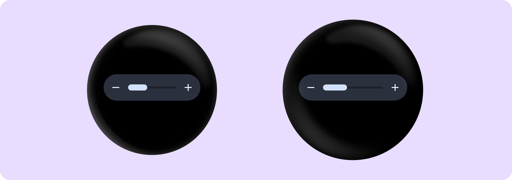
Slider allows users to make a selection from a range of values. The range of selections is shown as a bar between the minimum and maximum values of the range, from which users may select a single value. Slider is ideal for adjusting settings such as volume or brightness.
Value can be increased and decreased by clicking on the increase and decrease buttons, located accordingly to the start and end of the control. Buttons can have custom icons - decreaseIcon and increaseIcon.
The bar in the middle of control can have separators if segmented flag is set to true. A number of steps is calculated as the difference between max and min values of valueProgression divided by valueProgression.step - 1. For example, with a range of 100..120 and a step 5, number of by valueProgression.step - 1. For example, with a range of 100..120 and a step 5, number of steps will be (120-100)/ 5 - 1 = 3. Steps are 100(first), 105, 110, 115, 120(last)
If valueProgression range is not equally divisible by valueProgression.step, then valueProgression.last will be adjusted to the closest divisible value in the range. For example, 1..13 range and a step = 5, steps will be 1(first) , 6 , 11(last)
A continuous non-segmented slider sample:
import androidx.compose.runtime.mutableStateOf
import androidx.compose.runtime.remember
import androidx.wear.compose.material3.Slider

var value by remember { mutableStateOf(4) }
Slider(
    value = value,
    onValueChange = { value = it },
    valueProgression = 0..10,
    segmented = false,
)
A segmented slider sample:
import androidx.compose.runtime.mutableStateOf
import androidx.compose.runtime.remember
import androidx.wear.compose.material3.Slider

var value by remember { mutableStateOf(2f) }
Slider(
    value = value,
    onValueChange = { value = it },
    valueRange = 1f..4f,
    steps = 2,
    segmented = true,
)

| Parameters | |
|---|---|
value: Int |
Current value of the Slider. If outside of |
onValueChange: (Int) -> Unit |
Lambda in which value should be updated. |
valueProgression: IntProgression |
Progression of values that Slider value can take. Consists of rangeStart, rangeEnd and step. Range will be equally divided by step size. |
modifier: Modifier = Modifier |
Modifiers for the Slider layout. |
decreaseIcon: @Composable () -> Unit = { SliderDefaults.DecreaseIcon() } |
A slot for an icon which is placed on the decrease (start) button such as |
increaseIcon: @Composable () -> Unit = { SliderDefaults.IncreaseIcon() } |
A slot for an icon which is placed on the increase (end) button such as |
enabled: Boolean = true |
Controls the enabled state of the slider. When |
segmented: Boolean = valueProgression.stepsNumber() <= MaxSegmentSteps |
A boolean value which specifies whether a bar will be split into segments or not. Recommendation is while using this flag do not have more than |
shape: Shape = SliderDefaults.shape |
Defines slider's shape. It is strongly recommended to use the default as this shape is a key characteristic of the Wear Material3 Theme. |
colors: SliderColors = SliderDefaults.sliderColors() |
|
Slider
@Composable
fun Slider(
    value: Float,
    onValueChange: (Float) -> Unit,
    steps: Int,
    modifier: Modifier = Modifier,
    decreaseIcon: @Composable () -> Unit = { SliderDefaults.DecreaseIcon() },
    increaseIcon: @Composable () -> Unit = { SliderDefaults.IncreaseIcon() },
    enabled: Boolean = true,
    valueRange: ClosedFloatingPointRange<Float> = 0f..(steps + 1).toFloat(),
    segmented: Boolean = steps <= MaxSegmentSteps,
    shape: Shape = SliderDefaults.shape,
    colors: SliderColors = SliderDefaults.sliderColors()
): Unit
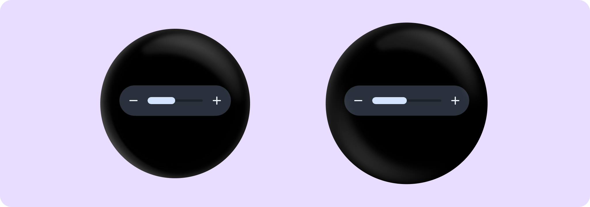
Slider allows users to make a selection from a range of values. The range of selections is shown as a bar between the minimum and maximum values of the range, from which users may select a single value. Slider is ideal for adjusting settings such as volume or brightness.
Value can be increased and decreased by clicking on the increase and decrease buttons, located accordingly to the start and end of the control. Buttons can have custom icons - decreaseIcon and increaseIcon.
The bar in the middle of control can have separators if segmented flag is set to true. A single step value is calculated as the difference between min and max values of valueRange divided by steps + 1 value.
A continuous non-segmented slider sample:
import androidx.compose.runtime.mutableStateOf
import androidx.compose.runtime.remember
import androidx.wear.compose.material3.Slider

var value by remember { mutableStateOf(4.5f) }
Slider(
    value = value,
    onValueChange = { value = it },
    valueRange = 3f..6f,
    steps = 5,
    segmented = false,
)
A segmented slider sample:
import androidx.compose.runtime.mutableStateOf
import androidx.compose.runtime.remember
import androidx.wear.compose.material3.Slider

var value by remember { mutableStateOf(2f) }
Slider(
    value = value,
    onValueChange = { value = it },
    valueRange = 1f..4f,
    steps = 2,
    segmented = true,
)
| Parameters | |
|---|---|
value: Float |
Current value of the Slider. If outside of |
onValueChange: (Float) -> Unit |
Lambda in which value should be updated. |
steps: Int |
Specifies the number of discrete values, excluding min and max values, evenly distributed across the whole value range. Must not be negative. If 0, slider will have only min and max values and no steps in between. |
modifier: Modifier = Modifier |
Modifiers for the Slider layout. |
decreaseIcon: @Composable () -> Unit = { SliderDefaults.DecreaseIcon() } |
A slot for an icon which is placed on the decrease (start) button such as |
increaseIcon: @Composable () -> Unit = { SliderDefaults.IncreaseIcon() } |
A slot for an icon which is placed on the increase (end) button such as |
enabled: Boolean = true |
Controls the enabled state of the slider. When |
valueRange: ClosedFloatingPointRange<Float> = 0f..(steps + 1).toFloat() |
Range of values that Slider value can take. Passed |
segmented: Boolean = steps <= MaxSegmentSteps |
A boolean value which specifies whether a bar will be split into segments or not. Recommendation is while using this flag do not have more than |
shape: Shape = SliderDefaults.shape |
Defines slider's shape. It is strongly recommended to use the default as this shape is a key characteristic of the Wear Material3 Theme. |
colors: SliderColors = SliderDefaults.sliderColors() |
|