
SwitchButton
Functions summary
Unit |
@ComposableThe Wear Material |
Functions
SwitchButton
@Composable
fun SwitchButton(
    checked: Boolean,
    onCheckedChange: (Boolean) -> Unit,
    modifier: Modifier = Modifier,
    enabled: Boolean = true,
    shape: Shape = SwitchButtonDefaults.switchButtonShape,
    colors: SwitchButtonColors = SwitchButtonDefaults.switchButtonColors(),
    contentPadding: PaddingValues = SwitchButtonDefaults.ContentPadding,
    interactionSource: MutableInteractionSource? = null,
    transformation: SurfaceTransformation? = null,
    icon: (@Composable BoxScope.() -> Unit)? = null,
    secondaryLabel: (@Composable RowScope.() -> Unit)? = null,
    label: @Composable RowScope.() -> Unit
): Unit
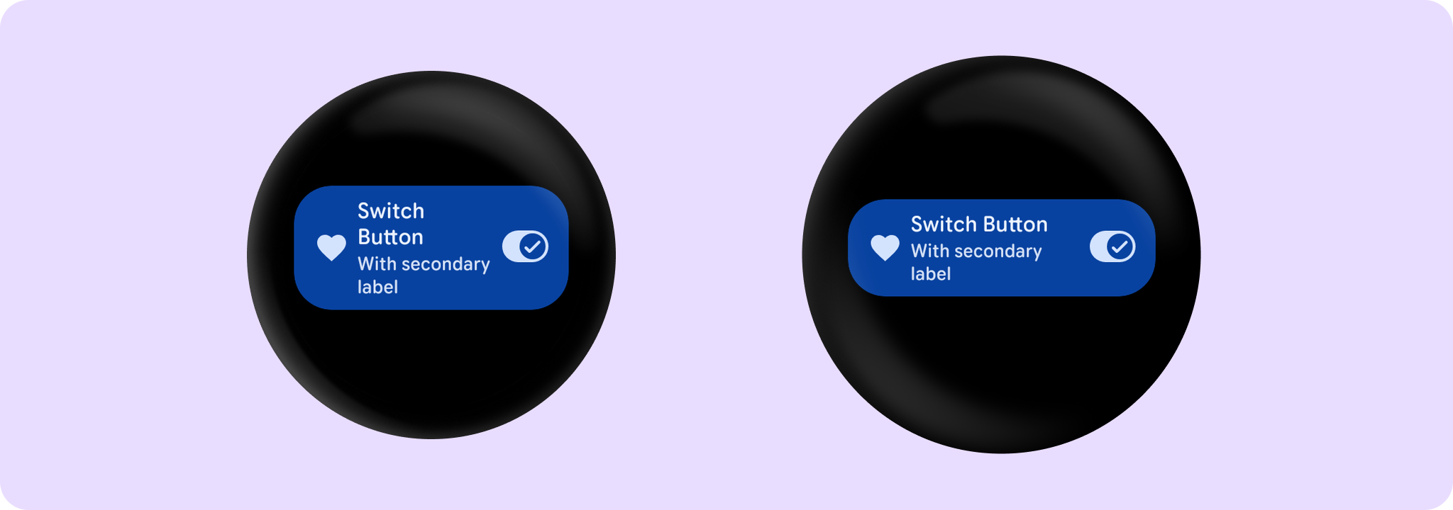
The Wear Material SwitchButton offers three slots and a specific layout for an icon, a label, and a secondaryLabel. The icon and secondaryLabel are optional. The items are laid out in a row with the optional icon at the start and a column containing the two label slots in the middle.
The SwitchButton is Stadium shaped. The label should take no more than 3 lines of text. The secondary label should take no more than 2 lines of text. With localisation and/or large font sizes, the SwitchButton height adjusts to accommodate the contents. The label and secondary label are start aligned by default.
Example of a SwitchButton:
import androidx.compose.material.icons.Icons
import androidx.compose.material.icons.filled.Favorite
import androidx.compose.runtime.mutableStateOf
import androidx.compose.runtime.remember
import androidx.compose.ui.text.style.TextOverflow
import androidx.wear.compose.material3.Icon
import androidx.wear.compose.material3.SwitchButton
import androidx.wear.compose.material3.Text

var checked by remember { mutableStateOf(true) }
SwitchButton(
    label = { Text("Switch Button", maxLines = 3, overflow = TextOverflow.Ellipsis) },
    secondaryLabel = {
        Text("With secondary label", maxLines = 2, overflow = TextOverflow.Ellipsis)
    },
    checked = checked,
    onCheckedChange = { checked = it },
    icon = { Icon(Icons.Filled.Favorite, contentDescription = "Favorite icon") },
    enabled = true,
)
SwitchButton can be enabled or disabled. A disabled button will not respond to click events.
The recommended set of SwitchButton colors can be obtained from SwitchButtonDefaults, e.g. SwitchButtonDefaults.switchButtonColors.
| Parameters | |
|---|---|
checked: Boolean |
Boolean flag indicating whether this button is currently checked. |
onCheckedChange: (Boolean) -> Unit |
Callback to be invoked when this buttons checked status is changed. |
modifier: Modifier = Modifier |
Modifier to be applied to the |
enabled: Boolean = true |
Controls the enabled state of the button. When |
shape: Shape = SwitchButtonDefaults.switchButtonShape |
Defines the button's shape. It is strongly recommended to use the default as this shape is a key characteristic of the Wear Material Theme. |
colors: SwitchButtonColors = SwitchButtonDefaults.switchButtonColors() |
|
contentPadding: PaddingValues = SwitchButtonDefaults.ContentPadding |
The spacing values to apply internally between the container and the content. |
interactionSource: MutableInteractionSource? = null |
an optional hoisted |
transformation: SurfaceTransformation? = null |
Transformation to be used when button appears inside a container that needs to dynamically change its content separately from the background. |
icon: (@Composable BoxScope.() -> Unit)? = null |
An optional slot for providing an icon to indicate the purpose of the button. The contents are expected to be a horizontally and vertically center aligned icon of size 24.dp. |
secondaryLabel: (@Composable RowScope.() -> Unit)? = null |
A slot for providing the button's secondary label. The contents are expected to be text which is "start" aligned. |
label: @Composable RowScope.() -> Unit |
A slot for providing the button's main label. The contents are expected to be text which is "start" aligned and no more than 3 lines of text. |