
OpenOnPhoneDialogContent
Functions summary
Unit |
@ComposableThis composable provides the content for an |
Functions
OpenOnPhoneDialogContent
@Composable
fun OpenOnPhoneDialogContent(
    curvedText: (CurvedScope.() -> Unit)?,
    durationMillis: Long,
    modifier: Modifier = Modifier,
    colors: OpenOnPhoneDialogColors = OpenOnPhoneDialogDefaults.colors(),
    content: @Composable () -> Unit
): Unit
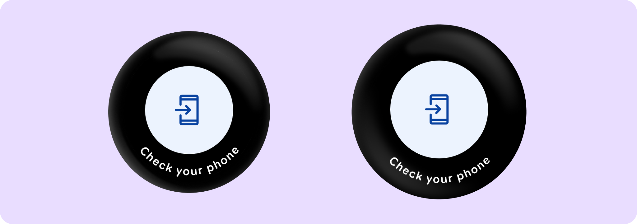
This composable provides the content for an OpenOnPhoneDialog that displays an animated icon with curved text at the bottom.
Prefer using OpenOnPhoneDialog directly, which provides built-in animations when showing/hiding the dialog. This composable may be used to provide the content for an openOnPhone dialog if custom show/hide animations are required.
Example of an OpenOnPhoneDialog usage:
import androidx.compose.foundation.layout.Box
import androidx.compose.foundation.layout.fillMaxSize
import androidx.compose.runtime.mutableStateOf
import androidx.compose.runtime.remember
import androidx.compose.ui.Alignment
import androidx.compose.ui.Modifier
import androidx.wear.compose.material3.FilledTonalButton
import androidx.wear.compose.material3.OpenOnPhoneDialog
import androidx.wear.compose.material3.OpenOnPhoneDialogDefaults
import androidx.wear.compose.material3.Text
import androidx.wear.compose.material3.openOnPhoneDialogCurvedText

var showConfirmation by remember { mutableStateOf(false) }

Box(Modifier.fillMaxSize()) {
    FilledTonalButton(
        modifier = Modifier.align(Alignment.Center),
        onClick = { showConfirmation = true },
        label = { Text("Open on phone") },
    )
}

val text = OpenOnPhoneDialogDefaults.text
val style = OpenOnPhoneDialogDefaults.curvedTextStyle
OpenOnPhoneDialog(
    visible = showConfirmation,
    onDismissRequest = { showConfirmation = false },
    curvedText = { openOnPhoneDialogCurvedText(text = text, style = style) },
)
| Parameters | |
|---|---|
curvedText: (CurvedScope.() -> Unit)? |
A slot for displaying curved text content which will be shown along the bottom edge of the dialog. We recommend using |
durationMillis: Long |
The duration in milliseconds for which the progress indicator inside of this content is animated. This value should be previously adjusted by the accessibility manager according to the content displayed. See |
modifier: Modifier = Modifier |
Modifier to be applied to the openOnPhone content. |
colors: OpenOnPhoneDialogColors = OpenOnPhoneDialogDefaults.colors() |
|
content: @Composable () -> Unit |
A slot for displaying an icon inside the open on phone dialog, which can be animated. Defaults to |