
TextButton
Functions summary
Unit |
@ComposableWear Material |
Functions
TextButton
@Composable
fun TextButton(
    onClick: () -> Unit,
    modifier: Modifier = Modifier,
    onLongClick: (() -> Unit)? = null,
    onLongClickLabel: String? = null,
    enabled: Boolean = true,
    shapes: TextButtonShapes = TextButtonDefaults.shapes(),
    colors: TextButtonColors = TextButtonDefaults.textButtonColors(),
    border: BorderStroke? = null,
    interactionSource: MutableInteractionSource? = null,
    content: @Composable BoxScope.() -> Unit
): Unit
Wear Material TextButton is a circular, text-only button with transparent background and no border. It offers a single slot for text.
Set the size of the TextButton with Modifier.touchTargetAwareSize to ensure that the recommended minimum touch target size is available. The recommended TextButton sizes are TextButtonDefaults.DefaultButtonSize, TextButtonDefaults.LargeButtonSize and TextButtonDefaults.SmallButtonSize. The recommended text styles for each corresponding button size are TextButtonDefaults.defaultButtonTextStyle, TextButtonDefaults.largeButtonTextStyle and TextButtonDefaults.smallButtonTextStyle.
The default TextButton has no border and a transparent background for low emphasis actions. For actions that require high emphasis, set colors to TextButtonDefaults.filledTextButtonColors. For a medium-emphasis, outlined TextButton, set border to ButtonDefaults.outlinedButtonBorder. For a middle ground between outlined and filled, set colors to TextButtonDefaults.filledTonalTextButtonColors.
TextButton can be enabled or disabled. A disabled button will not respond to click events.
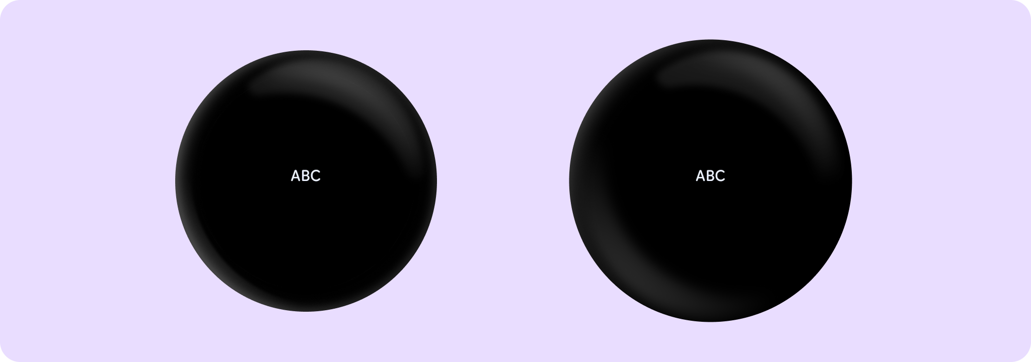
Example of a TextButton:
import androidx.wear.compose.material3.Text
import androidx.wear.compose.material3.TextButton

TextButton(onClick = { /* Do something */ }) { Text(text = "ABC") }
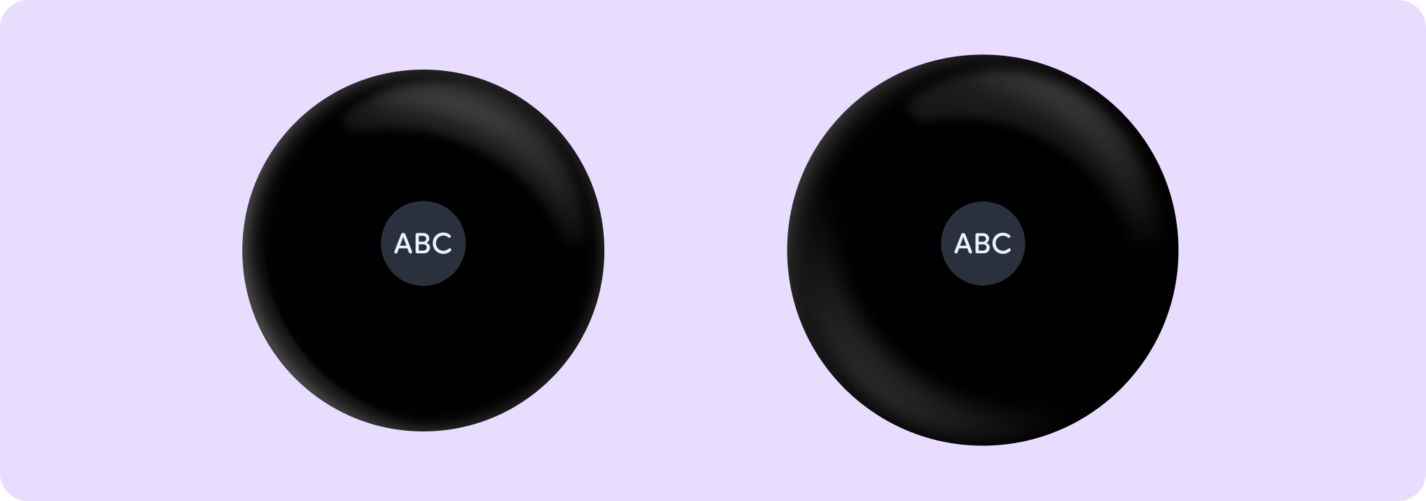
Example of a large, filled tonal TextButton:
import androidx.compose.foundation.layout.size
import androidx.compose.ui.Modifier
import androidx.wear.compose.material3.ButtonDefaults
import androidx.wear.compose.material3.Text
import androidx.wear.compose.material3.TextButton
import androidx.wear.compose.material3.TextButtonDefaults

TextButton(
    onClick = { /* Do something */ },
    colors = TextButtonDefaults.filledTonalTextButtonColors(),
    modifier = Modifier.size(TextButtonDefaults.LargeButtonSize),
) {
    Text(text = "ABC", style = TextButtonDefaults.largeButtonTextStyle)
}
Example of TextButton with onLongClick:
import androidx.wear.compose.material3.Text
import androidx.wear.compose.material3.TextButton

TextButton(
    onClick = { /* Do something for onClick*/ },
    onLongClick = onLongClick,
    onLongClickLabel = "Long click",
) {
    Text(text = "ABC")
}
Example of an TextButton with shape animation of rounded corners on press:
import androidx.wear.compose.material3.ButtonDefaults
import androidx.wear.compose.material3.Text
import androidx.wear.compose.material3.TextButton
import androidx.wear.compose.material3.TextButtonDefaults

TextButton(onClick = { /* Do something */ }, shapes = TextButtonDefaults.animatedShapes()) {
    Text(text = "ABC")
}
| Parameters | |
|---|---|
onClick: () -> Unit |
Will be called when the user clicks the button. |
modifier: Modifier = Modifier |
Modifier to be applied to the button. |
onLongClick: (() -> Unit)? = null |
Called when this button is long clicked (long-pressed). When this callback is set, |
onLongClickLabel: String? = null |
Semantic / accessibility label for the |
enabled: Boolean = true |
Controls the enabled state of the button. When |
shapes: TextButtonShapes = TextButtonDefaults.shapes() |
Defines the shape for this button. Defaults to a static shape based on |
colors: TextButtonColors = TextButtonDefaults.textButtonColors() |
|
border: BorderStroke? = null |
Optional |
interactionSource: MutableInteractionSource? = null |
an optional hoisted |
content: @Composable BoxScope.() -> Unit |
The content displayed on the text button, expected to be text or image. |